1.GroupBox
注意: GroupBox仍然需要布局容器来放置元素。如: StackPanel面板
| 1 2 3 4 5 6 7 |
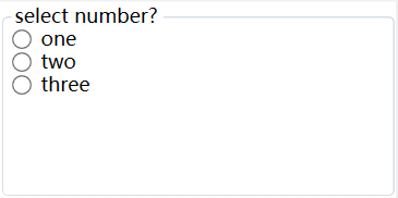
<GroupBox Header="select number?">
<StackPanel>
<RadioButton>one</RadioButton>
<RadioButton>two</RadioButton>
<RadioButton>three</RadioButton>
</StackPanel>
</GroupBox>
|
2.TabControl
像这种标签页控件, 在winform种非常常见, Tabpge子页面, 而在WPF种, 对应的则是TabItem类。
所示的代码示意图:
| 1 2 3 4 5 6 7 8 9 10 11 12 13 14 15 16 17 18 |
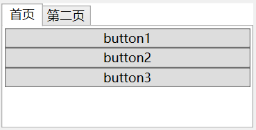
<TabControl>
<TabItem Header="首页">
<StackPanel>
<Button>button1</Button>
<Button>button2</Button>
<Button>button3</Button>
</StackPanel>
</TabItem>
<TabItem Header="第二页">
<StackPanel>
<Button>button4</Button>
<Button>button5</Button>
<Button>button6</Button>
</StackPanel>
</TabItem>
</TabControl>
|
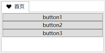
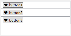
与Content属性相同, TabItem的Header同样可以接收任何类型的对象。这意味着可以创建一个组合框或选项卡。在他们的页标题中包含任意图形和任意元素。如下所示:
| 1 2 3 4 5 6 7 8 9 10 11 12 13 14 15 16 17 |
<TabControl>
<TabItem >
<TabItem.Header>
<StackPanel Orientation="Horizontal">
<Button Background="Transparent" BorderBrush="Transparent">♥</Button>
<TextBox BorderBrush="Transparent">首页</TextBox>
</StackPanel>
</TabItem.Header>
<StackPanel>
<Button>button1</Button>
<Button>button2</Button>
<Button>button3</Button>
</StackPanel>
</TabItem>
</TabControl>
|
3.Expander菜单控件
具备标题的内容收缩控件, 在web中很普遍, 用于左侧菜单。
代码如下所示:
| 1 2 3 4 5 6 7 8 9 10 11 12 13 14 15 16 |
<StackPanel>
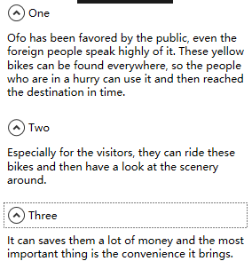
<Expander Header="One" Margin="5" Padding="5">
<TextBlock TextWrapping="Wrap">Ofo has been favored by the public, even the foreign people speak highly of it. These yellow
bikes can be found everywhere, so the people who are in a hurry can
use it and then reached the destination in time.</TextBlock>
</Expander>
<Expander Header="Two" Margin="5" Padding="5">
<TextBlock TextWrapping="Wrap">Especially for the visitors, they can ride these bikes and then have a look at the scenery around.</TextBlock>
</Expander>
<Expander Header="Three" Margin="5" Padding="5">
<TextBlock TextWrapping="Wrap">It can saves them a lot of money and the most important thing is the convenience it brings.</TextBlock>
</Expander>
</StackPanel>
|
4.ListBox控件
ListBox控件是一个非常灵活的控件, 它不仅包含子元素ListBoxItem对象。而且也可以驻留其他元素, 这也就是ListBoxItem类继承于ContentControl类,从而ListBoxItem能够包含一段嵌套的内容。
例如, 创建一个包含普通按钮的列表。如下所示:
| 1 2 3 4 5 6 7 8 9 10 11 12 13 14 15 16 17 18 19 |
<StackPanel>
<ListBox>
<ListBoxItem>
<Button>♥ button1</Button>
</ListBoxItem>
</ListBox>
<ListBox>
<ListBoxItem>
<Button>♥ button2</Button>
</ListBoxItem>
</ListBox>
<ListBox>
<ListBoxItem>
<Button>♥ button3</Button>
</ListBoxItem>
</ListBox>
</StackPanel>
|
5. ProgressBar进度条
IsIndeterminate属性设置为True, 控件则会周期性的显示一个绿色(默认)从左到右的脉冲。
| 1 2 3 |
<Grid>
<ProgressBar IsIndeterminate="True" Height="30"></ProgressBar>
</Grid>
|
当然, 我们也可以通过修改Foreground 属性, 修改其滚动的颜色。如下所示
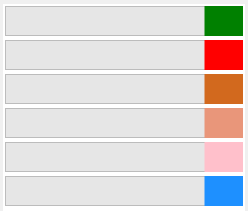
| 1 2 3 4 5 6 7 8 |
<StackPanel>
<ProgressBar Margin="2" IsIndeterminate="True" Height="30" Foreground="Green" ></ProgressBar>
<ProgressBar Margin="2" IsIndeterminate="True" Height="30" Foreground="Red" ></ProgressBar>
<ProgressBar Margin="2" IsIndeterminate="True" Height="30" Foreground="Chocolate" ></ProgressBar>
<ProgressBar Margin="2" IsIndeterminate="True" Height="30" Foreground="DarkSalmon" ></ProgressBar>
<ProgressBar Margin="2" IsIndeterminate="True" Height="30" Foreground="Pink" ></ProgressBar>
<ProgressBar Margin="2" IsIndeterminate="True" Height="30" Foreground="DodgerBlue" ></ProgressBar>
</StackPanel>
|
6.日期控件
WPF中有两个日期控件, Calendar和DatePicker, 前者是以一个日历的形式, 后者则像是一个文本框的形式。
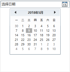
| 1 2 3 4 |
<StackPanel>
<DatePicker></DatePicker>
<Calendar></Calendar>
</StackPanel>
|
同时, 控件还具备众多属性。
| DisplayDateStart和 DisplayDateEnd |
设置在日历视图中显示的日期范闱,从第一个妯早的日期(DisplayDateStart)到最后最近
的日期(DisplayDateEnd),用户不能导航到没打包含能够显示的日期的月份。为了显示所 有日期,可以将DisplayDateStart属性设置为DateTime.MinValue,并将DisplayDateEnd W性设置为DateTime.MaxValue |
| BlackoutDates |
保存在日历中将被禁用或不能选择的日期集合?如果这呰日期不在可以显示的曰期范ra 内,或芥如果己经选择了这些曰期中的苁个日期,将接收到一个异常, 为了阻止选择任 何过去的日期,可以调用BlackoutDates.AddDatcsInPast()方法 |
| SelectedDate |
作为一个DateTime对象提供选择的日期(或名?没冇日期被选中时使用null值)。可以通过 代码、通过单击日历中的日期、或通过用户键入一个日期字符审(在DatePicker控件中> 设置该属性.在日历视图中,选抒的日期使用一个具有阴影的方框标识,只有当曰期控 件具有焦点时才会显示该方框 |
| SelectedDates |
作为 DateTime 对象的集合提供选择的日期。 Calcndar 控件支持该属性,并目.只有当修改了 SelectionMode 属性,以允许选择多个日期时,该属性才有用 |
| DispalyDate |
(使用Datetime 对象确定在日历视图中最初显示的日期.如果该属性为空,显示selectedDate属性的值。如果 DisPlayDate 和 select 曰 LDate 属性均为空,使用当前日期.显示的日期决定了日历视图中最初的月份页面。当日期控件具有焦点时,在该月份中恰当的某天周围显示一个方形边框(该边框和用于当前选择日期的阴影方框是有区别的) |
| FristDayOfweek |
确定在日历中每行的开始位置(最左边)显示一星期中的哪一天 |
| IsToDayHighighted |
确定日历视图是否通过突出显示指出当前日期 |


