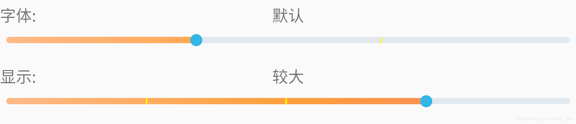
相信很多朋友都用过SeekBar,但项目中可能根据不同功能有各式各样的显示。今天就自定义一个带刻度的拖动条。
类似设置中字体、显示大小拖动的形式。
话不多说上干货:
一、重写SeekBar 组件
package com.lenovo.fonthelp;


import android.content.Context;
import android.graphics.Canvas;
import android.graphics.Color;
import android.graphics.Paint;
import android.graphics.Rect;
import android.os.Build;

import android.util.AttributeSet;
import android.widget.SeekBar;

public class RulerSeekBar extends SeekBar {

    /**
     * 刻度线画笔
     */
    private Paint mRulerPaint;

    /**
     * 刻度线的个数,等分数等于刻度线的个数加1
     */
    private int mRulerCount = 2;

    /**
     * 每条刻度线的宽度
     */
    private int mRulerWidth = 2;

    /**
     * 刻度线的颜色
     */
    private int mRulerColor = Color.WHITE;

    /**
     * 滑块上面是否要显示刻度线
     */
    private boolean isShowTopOfThumb = false;

    public RulerSeekBar(Context context) {
        super(context);
        init();
    }

    public RulerSeekBar(Context context, AttributeSet attrs) {
        super(context, attrs);
        init();
    }

    public RulerSeekBar(Context context, AttributeSet attrs, int defStyleAttr) {
        super(context, attrs, defStyleAttr);
        init();
    }

    /**
     * 初始化
     */
    private void init() {
        //创建绘制刻度线的画笔
        mRulerPaint = new Paint();
        mRulerPaint.setColor(mRulerColor);
        mRulerPaint.setAntiAlias(true);

        //Api21及以上调用,去掉滑块后面的背景
        if (Build.VERSION.SDK_INT >= Build.VERSION_CODES.LOLLIPOP) {
            setSplitTrack(false);
        }
    }

    /**
     * 重写onDraw方法绘制刻度线
     *
     * @param canvas
     */
    @Override
    protected synchronized void onDraw(Canvas canvas) {
        super.onDraw(canvas);

        //极限条件校验
        if (getWidth() <= 0 || mRulerCount <= 0) {
            return;
        }

        //获取每一份的长度
        int length = (getWidth() - getPaddingLeft() - getPaddingRight() - mRulerCount * mRulerWidth) / (mRulerCount + 1);

        //计算刻度线的顶部坐标和底部坐标
        int rulerTop = getHeight() / 2 - getMinimumHeight() / 2;
        int rulerBottom = rulerTop + getMinimumHeight();

        //获取滑块的位置信息
        Rect thumbRect = null;
        if (getThumb() != null) {
            thumbRect = getThumb().getBounds();
        }

        //绘制刻度线
        for (int i = 1; i <= mRulerCount; i++) {
            //计算刻度线的左边坐标和右边坐标
            int rulerLeft = i * length + getPaddingLeft();
            int rulerRight = rulerLeft + mRulerWidth;

            //判断是否需要绘制刻度线
            if (!isShowTopOfThumb && thumbRect != null && rulerLeft - getPaddingLeft() > thumbRect.left && rulerRight - getPaddingLeft() < thumbRect.right) {
                continue;
            }

            //进行绘制
            canvas.drawRect(rulerLeft, rulerTop, rulerRight, rulerBottom, mRulerPaint);
        }
    }

    /**
     * 设置刻度线的个数
     *
     * @param mRulerCount
     */
    public void setRulerCount(int mRulerCount) {
        this.mRulerCount = mRulerCount;
        requestLayout();
    }

    /**
     * 设置刻度线的宽度,单位(px)
     *
     * @param mRulerWidth
     */
    public void setRulerWidth(int mRulerWidth) {
        this.mRulerWidth = mRulerWidth;
        requestLayout();
    }

    /**
     * 设置刻度线的颜色
     *
     * @param mRulerColor
     */
    public void setRulerColor(int mRulerColor) {
        this.mRulerColor = mRulerColor;
        if (mRulerPaint != null) {
            mRulerPaint.setColor(mRulerColor);
            requestLayout();
        }
    }

    /**
     * 滑块上面是否需要显示刻度线
     *
     * @param isShowTopOfThumb
     */
    public void setShowTopOfThumb(boolean isShowTopOfThumb) {
        this.isShowTopOfThumb = isShowTopOfThumb;
        requestLayout();
    }
}
二、在布局中直接使用
    <com.lenovo.fonthelp.RulerSeekBar
        android:id="@+id/dpi_seek_bar"
        style="@style/Widget.AppCompat.ProgressBar.Horizontal"
        android:layout_width="match_parent"
        android:layout_height="wrap_content"
        android:layout_centerInParent="true"
        android:layout_marginTop="20dp"
        android:background="@null"
        android:max="4"
        android:maxHeight="16dp"
        android:minHeight="16dp"
        android:progress="0"
        android:progressDrawable="@drawable/shape_progress_drawable"
        android:thumb="@drawable/shape_thumb_icon"
        android:thumbOffset="0dp" />
三、在需要调用的地方使用
    private RulerSeekBar mFontSeekBar;

    ...

    mFontSeekBar = findViewById(R.id.font_seek_bar);

    mFontSeekBar.setRulerCount(2);
    mFontSeekBar.setRulerColor(Color.YELLOW);
    mFontSeekBar.setRulerWidth(5);
    mFontSeekBar.setShowTopOfThumb(false);
    mFontSeekBar.setProgress(1);

    mFontSeekBar.setOnSeekBarChangeListener(new SeekBar.OnSeekBarChangeListener() {
        @Override
        public void onProgressChanged(SeekBar seekBar, int progress, boolean fromUser) {
                Log.d(TAG, "onProgressChanged: index = " + progress);
            }

            @Override
            public void onStartTrackingTouch(SeekBar seekBar) {

            }

            @Override
            public void onStopTrackingTouch(SeekBar seekBar) {

            }
        });
四、附上布局shape 文件
在drawable 文件夹下创建如下文件:

shape_progress_drawable.xml

<?xml version="1.0" encoding="utf-8"?>
<layer-list xmlns:android="http://schemas.android.com/apk/res/android">
    <item android:id="@android:id/background">
        <shape>
            <solid android:color="#e1e8f0" />
            <size android:height="8dp" />
            <corners android:radius="8dp" />
        </shape>
    </item>

    <item android:id="@android:id/progress">
        <clip>
            <shape>
                <gradient
                    android:centerColor="#fc9f3b"
                    android:endColor="#fa8569"
                    android:startColor="#feb987" />
                <size android:height="8dp" />
                <corners android:radius="8dp" />
            </shape>
        </clip>
    </item>
</layer-list>


shape_thumb_icon.xml

<?xml version="1.0" encoding="utf-8"?>
<shape xmlns:android="http://schemas.android.com/apk/res/android"
    android:shape="oval">

    <size
        android:width="30dp"
        android:height="30dp" />

    <solid android:color="@android:color/holo_blue_light" />
</shape>
转载请标明出处:
https://blog.csdn.net/hj_key/article/details/106835434