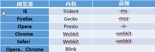
浏览器前缀
CSS3去兼容不同的浏览器,针对旧的浏览器做兼容,新浏览器基本不需要添加前缀。
transition过渡
- transition-property : 规定设置过渡效果的CSS属性的名称。
- transition-duration : 规定完成过渡效果需要多少秒或毫秒。
- transition-delay : 定义过渡效果何时开始。 ( 延迟(数值为正数),也可以提前(数值为负数) )
- transition-timing-function : 规定速度效果的速度曲线。
- 速度曲线:

注:不要加到hover上。
eg:
- 速度曲线:
<!DOCTYPE html>
<html lang="en">

<head>
    <meta charset="UTF-8">
    <meta name="viewport" content="width=device-width, initial-scale=1.0">
    <title>transition过渡</title>
    <style>
        div {
            width: 100px;
            height: 100px;
            background-color: aqua;
            /* 横向过渡效果 */
            /* transition-property: width; */
            transition: all;
            /* 过渡的时间 */
            transition-duration: 1s;
            /* 过渡延迟 */
            /* transition-delay: 2s; */
            /* 过渡曲线 */
            transition-timing-function: ease;

            /* 复合样式写法 */
            /* transition: 1s 2s ease; */
        }
        div:hover {
            width: 200px;
            height: 200px;
            background-color: blue;
        }
    </style>
</head>

<body>
    <div></div>
</body>

</html>
transform变形
-
translate : 位移
translateX:
translateY
translateZ ( 3d ) -
scale : 缩放 (值是一个比例值,正常大小就是1,会已当前元素中心点进行缩放)
scaleX
scaleY
scaleZ (3d) -
rotate : 旋转 ( 旋转的值,单位是角度 deg )
rotateX (3d)
rotateY (3d)
rotateZ ( 和rotate是等级关系,那正值按顺时针旋转,负值按逆时针旋转 ) -
skew : 斜切
skewX : 单位也是角度,正值向左倾斜,负值向右倾斜。
skewY -
transform的注意事项:
- 变形操作不会影响到其他元素。
- 变形操作只能添加给块元素,但是不能添加给内联元素。
- 复合写法,可以同时添加多个变形操作。
执行是有顺序的,先执行后面的操作,再执行前面的操作。
translate会受到 rotate、scale、skew的影响 - transform-origin : 基点的位置
x y z(3d)
eg:
<!DOCTYPE html>
<html lang="en">

<head>
    <meta charset="UTF-8">
    <meta name="viewport" content="width=device-width, initial-scale=1.0">
    <title>transform</title>
    <style>
        .box {
            width: 500px;
            height: 500px;
            border: 1px solid red;
            margin: 100px auto;
        }

        .box1 {
            width: 200px;
            height: 200px;
            background-color: blue;
            /* 变形的时间 */
            transition: 2s;

        }

        .box:hover .box1 {
            /* 位移到具体的位置 */
            /* transform: translate(100px, 100px); */
            /* 向x轴方向位移100px */
            /* transform: translateX(100px); */

            /* 放大两倍 */
            /* transform: scale(2); */
            /* 缩小一半 */
            /* transform: scale(0.5); */
            /* x轴方向发大两倍 */
            /* transform: scaleX(2); */

            /* 旋转45度角 */
            /* transform: rotate(45deg); */

            /* 斜切 */
            /* transform: skew(45deg); */
            /* x轴斜切 */
            /* transform: skew(30deg, 0); */
            /* x 、y 都斜切*/
            transform: skew(30deg, 30deg);

        }
    </style>
</head>

<body>
    <div class="box">
        <div class="box1"></div>
    </div>
</body>

</html>
animation动画
- animation-name : 设置动画的名字 (自定义的)
- animation-duration : 动画的持续时间
- animation-delay : 动画的延迟时间
- animation-iteration-count : 动画的重复次数 ,默认值就是1 ,infinite无限次数
- animation-timing-function : 动画的运动形式
注:
    1. 运动结束后,默认情况下会停留在起始位置。
    2. @keyframes :  from -> 0%   ,  to ->  100%
-
animation-fill-mode : 规定动画播放之前或之后,其动画效果是否可见。
- none (默认值) : 在运动结束之后回到初始位置,在延迟的情况下,让0%在延迟后生效
- backwards : 在延迟的情况下,让0%在延迟前生效
- forwards : 在运动结束的之后,停到结束位置
- both : backwards和forwards同时生效
-
animation-direction : 属性定义是否应该轮流反向播放动画。
- alternate : 一次正向(0%100%),一次反向(100%0%)
- reverse : 永远都是反向 , 从100%~0%
- normal (默认值) : 永远都是正向 , 从0%~100%
<!DOCTYPE html>
<html lang="en">

<head>
    <meta charset="UTF-8">
    <meta name="viewport" content="width=device-width, initial-scale=1.0">
    <title>Document</title>
    <style>
        .box {
            width: 300px;
            height: 300px;
            border: 1px solid red;

        }

        .box1 {
            width: 100px;
            height: 100px;
            background-color: blue;

            /* 映射 */
            animation-name: myBox;

            /* 动画执行时间 */
            animation-duration: 4s;

            /* 延迟执行 */
            animation-delay: 2s;

            /* 重复次数 */
            /* animation-iteration-count: 3; */
            /* 无限循环 */
            animation-iteration-count: infinite;
            /* 运动形式 */
            animation-timing-function: linear;

            /*  复合写法*/
            /* animation: 4s 2s infinite linear; */
        }

        /* @keyframes myBox { */

        /* 起点 */
        /* from {
            transform: translate(0, 0);
        } */

        /* 终点 */
        /* to {
            transform: translate(200px, 0);
        } */
        /* } */
        @keyframes myBox {
            0% {
                transform: translate(0, 0);
            }

            25% {
                transform: translate(200px, 0);
            }

            50% {
                transform: translate(200px, 200px);
            }

            75% {
                transform: translate(0, 200px);
            }

            100% {
                transform: translate(0, 0);
            }
        }
    </style>
</head>

<body>
    <div class="box">
        <div class="box1"></div>
    </div>
</body>

</html>
animate.css
一款强大的预设css3动画库。
官网地址:https://daneden.github.io/animate.css/
基本使用:
animated : 基类(基础的样式,每个动画效果都需要加)
infinite : 动画的无限次数