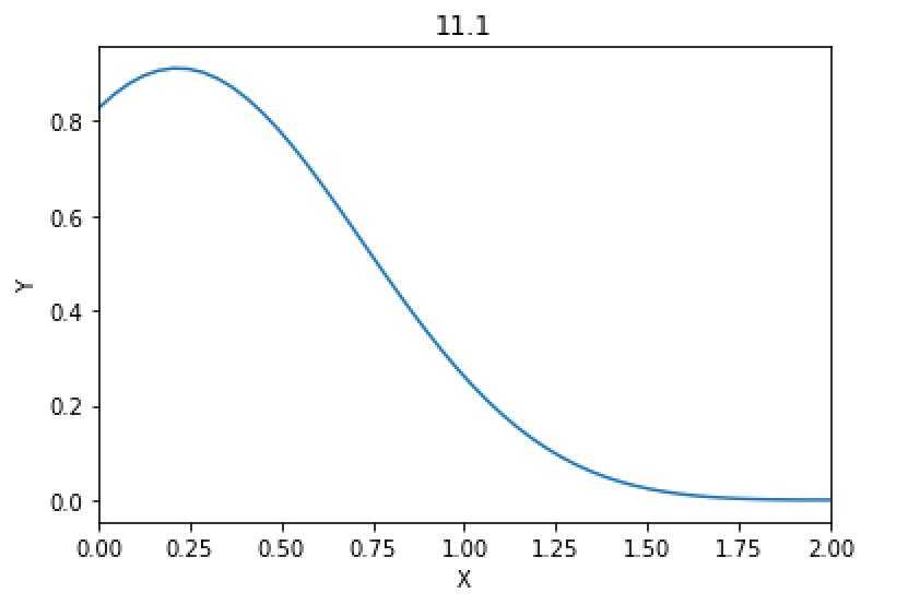
Exercise 11.1: Plotting a function
Plot the function f(x) = sin2(x − 2)e−x2 over the interval [0, 2]. Add proper axis labels, a title, etc.
import numpy as np
import matplotlib.pyplot as plt

x = np.linspace(0, 2)
y = np.power(np.sin(x - 2), 2) * np.exp ( - x ** 2)
plt.plot(x, y)
plt.title("11.1")
plt.xlabel("X")
plt.ylabel("Y")
plt.xlim(0,2)
plt.show()
画出来的结果如图所示
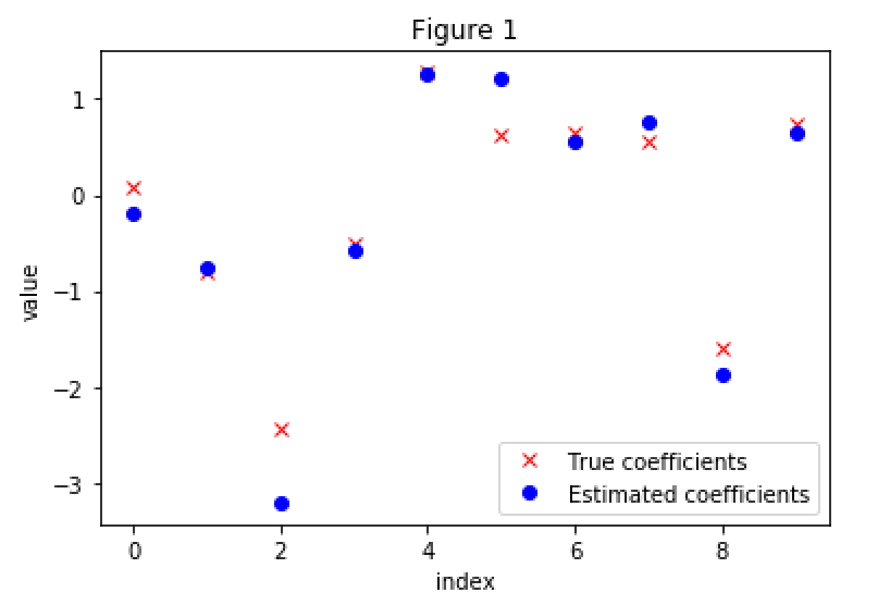
Exercise 11.2: Data
Create a data matrix X with 20 observations of 10 variables. Generate a vector b with parameters. Then generate the response vector y = Xb+z where z is a vector with standard normally distributed variables. Now (by only using y and X), find an estimator for b, by solving b = arg min ∥Xb − y∥2. Plot the true parameters b and estimated parameters ˆb. See Figure 1 for an example plot.
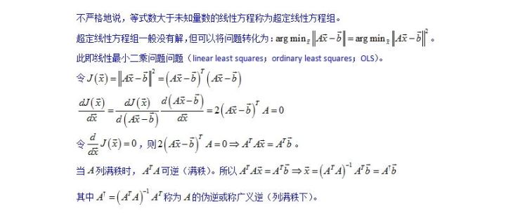
关于最小二乘解的解法,参加下图,转自知乎~
import matplotlib.pyplot as plt
import numpy as np
import numpy.matlib as npm
import numpy.linalg

#X = np.random.randn(20, 10)
#b = np.random.randn(1, 10)
#z = np.random.randn(20, 1)
X = npm.randn(20, 10)
b = npm.randn(10, 1)
z = npm.randn(20, 1)
y = X * b + z

x = np.linspace(0, 9, 10)
paramb, = plt.plot(x, b, 'rx', label = 'True coefficients')
B = np.linalg.solve(X.T * X, X.T* y)
#B = np.linalg.inv(X.T * X) * X.T * y
#B = np.linalg.pinv(X) * y
print(b)
print(B)
paramB, = plt.plot(x, B, 'bo', label = 'Estimated coefficients')
plt.ylabel('value')
plt.xlabel('index')
plt.title('Figure 1')
plt.legend(handles=[paramb, paramB])
plt.show()
得到的参数图如下所示,
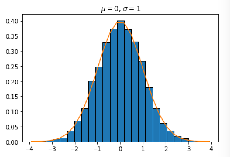
Exercise 11.3: Histogram and density estimation
Generate a vector z of 10000 observations from your favorite exotic distribution. Then make a plot that shows a histogram of z (with 25 bins), along with an estimate for the density, using a Gaussian kernel density estimator (see scipy.stats). See Figure 2 for an example plot.
from scipy import stats
import numpy as np
import matplotlib.pyplot as plt

A = np.random.normal(size = 10000)
n, bins, patches = plt.hist(A, bins = 25, edgecolor='black', density=1)
plt.plot(bins, stats.norm.pdf(bins))
plt.title('$\mu=0$, $\sigma=1$')
plt.show()
画出来的图片如下所示,