小白学习之路
1.问题描述:
在学习kaggle经典学习项目Titanic,进行数据可视化处理时,对于每个特征进行相关性分析(也就是绘制pearson correlation heatmap )热力相关性矩阵时, plt.show() 图形绘制出来,字体会重叠.导致无法观察
# Visualisations
"""将数据进行可视化"""
print(train.head(3))
# correlation heatmap   相关性热点矩阵

plt.figure(figsize=(14,12))
plt.title('Pearson Correlation of Features',y=1.05,size=15)
sns.heatmap(train.astype(float).corr(),linewidths=0.1,vmax=1.0,
            square=True,linecolor='white',annot=True)
plt.show()
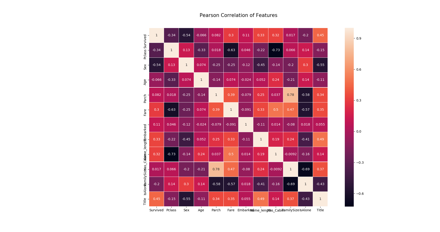
导致看不清坐标轴每个特征的含义
2.解决问题:
思路:只要找到plt所含有的命令,将X.Y坐标轴字体进行旋转即可
寻找python xlabel 的文档
Help on function xlabel in module matplotlib.pyplot:

xlabel(s, *args, **kwargs)
    Set the *x* axis label of the current axis.

    Default override is::

      override = {
          'fontsize'            : 'small',
          'verticalalignment'   : 'top',
          'horizontalalignment' : 'center'
          }

    .. seealso::

        :func:`~matplotlib.pyplot.text`
            For information on how override and the optional args work
发现没有关于xlabel进行旋转的参数,
寻找 python xticks 文档
Help on function xticks in module matplotlib.pyplot:

xticks(*args, **kwargs)
    Get or set the *x*-limits of the current tick locations and labels.

    ::

      # return locs, labels where locs is an array of tick locations and
      # labels is an array of tick labels.
      locs, labels = xticks()

      # set the locations of the xticks
      xticks( arange(6) )

      # set the locations and labels of the xticks
      xticks( arange(5), ('Tom', 'Dick', 'Harry', 'Sally', 'Sue') )

    The keyword args, if any, are :class:`~matplotlib.text.Text`
    properties. For example, to rotate long labels::

      xticks( arange(12), calendar.month_name[1:13], rotation=17 )
上面黑体下划线,rotate long label
找到参数 rotation
plt.figure(figsize=(14,12))
plt.title('Pearson Correlation of Features',y=1.05,size=15)
sns.heatmap(train.astype(float).corr(),linewidths=0.1,vmax=1.0,
            square=True,linecolor='white',annot=True)
plt.xticks(rotation=90)    # 将字体进行旋转
plt.yticks(rotation=360)
plt.show()
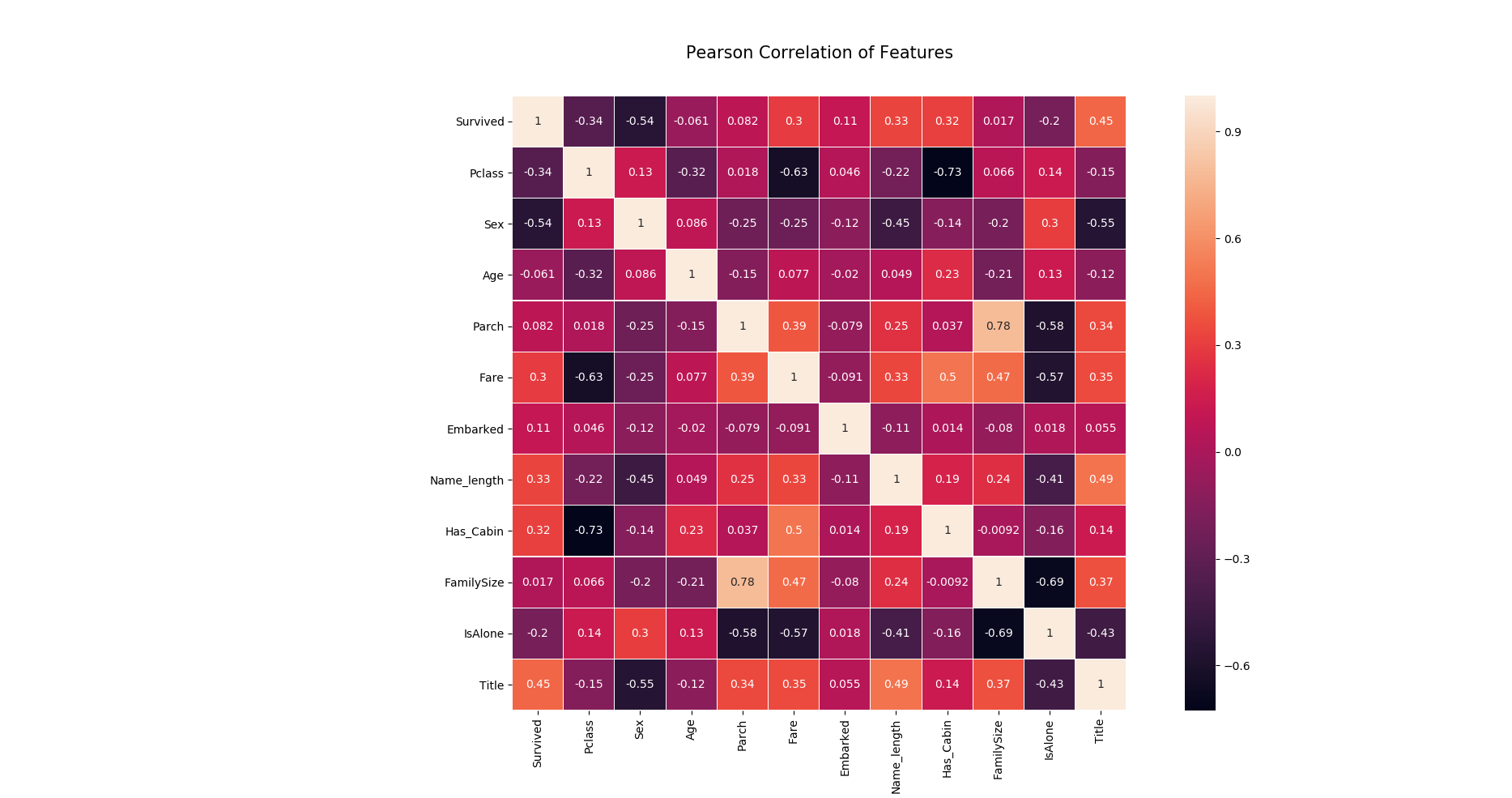
标签旋转,可清晰看到每个特征的含义
问题思考:
就是plt.show() 输出不了中文字体,这个问题还没有解决