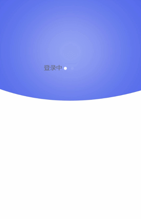
需求:实现点击登入按钮有一个预加载效果,如下图
实例参考一:
实例参考二:

实例一:
 <view class="body">
    <view class="onLoad" wx:if="{{flag2}}">
      <view class="loading">
        <view class="login" style="color: #5F5F5F">登录中</view>
        <view class="dot" animation="{{alpha[0]}}"></view>
        <view class="dot" animation="{{alpha[1]}}"></view>
        <view class="dot" animation="{{alpha[2]}}"></view>
      </view>
    </view>
  </view>
Page({
data: {
alpha: [ 1, 1, 1],
},
onLoad: function(options) {
//加载动画
var self = this;
var _index = 0;
var _alpha = self.data.alpha;
var _speed = 500;
var timer = setInterval(function () {
var an_show = wx.createAnimation({});
var an_hide = wx.createAnimation({});
an_show.opacity(1).step({ duration: _speed });
an_hide.opacity(0).step({ duration: _speed });
_alpha[_index] = an_show;
_alpha[_index == 0 ? 2 : _index - 1] = an_hide;
self.setData({
alpha: _alpha
})
_index = _index == 2 ? 0 : _index + 1;
}, _speed);
},
})实例二:
<view class="tui-loading-row">
  <view class="tui-loading-cell">
    <view class="circle-line">
      <text></text>
      <text></text>
      <text></text>
      <text></text>
      <text></text>
      <text></text>
      <text></text>
      <text></text>
    </view>
  </view>
</view>//js不需要/*css*/
.tui-loading-row{
width: 100%;
display: table;
table-layout: fixed;
}
.tui-loading-cell{
width: 100%;
display: table-cell;
text-align: center;
}
.circle-line{
width: 100px;
height: 100px;
display: inline-block;
position: relative;
}
.circle-line text{
display: block;
width: 50%;
height: 5px;
opacity: .7;
position: absolute;
top: calc(50% - 2.5px);
left: 0px;
transform-origin: center right;
animation: circle 1.5s linear infinite;
}
.circle-line text::before{
content: '';
display: block;
width: 15px;
height: 5px;
position: absolute;
top: 0;
right: 10px;
background-color: red;
}
.circle-line text:nth-child(1){
transform: rotate(0deg);
animation-delay: 0.2s;
}
.circle-line text:nth-child(2){
transform: rotate(45deg);
animation-delay: 0.4s;
}
.circle-line text:nth-child(3){
transform: rotate(90deg);
animation-delay: 0.6s;
}
.circle-line text:nth-child(4){
transform: rotate(135deg);
animation-delay: 0.8s;
}
.circle-line text:nth-child(5){
transform: rotate(180deg);
animation-delay: 1s;
}
.circle-line text:nth-child(6){
transform: rotate(225deg);
animation-delay: 1.2s;
}
.circle-line text:nth-child(7){
transform: rotate(270deg);
animation-delay: 1.4s;
}
.circle-line text:nth-child(8){
transform: rotate(315deg);
animation-delay: 1.6s;
}
@keyframes circle {
0%{
opacity: 0.05;
}
100%{
opacity: 0.9;
}
}
参考:
https://blog.csdn.net/ruixue0117/article/details/83508362
❤如果文章对您有所帮助,就在文章的右上角或者文章的末尾点个赞吧!(づ ̄ 3 ̄)づ
❤如果喜欢大白兔分享的文章,就给大白兔点个关注吧!(๑′ᴗ‵๑)づ╭❤~
❤对文章有任何问题欢迎小伙伴们下方留言或者入群探讨【群号:708072830】
❤鉴于个人经验有限,所有观点及技术研点,如有异议,请直接回复讨论(请勿发表攻击言论)。
