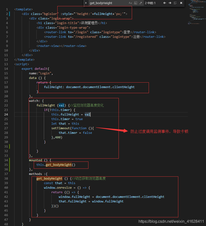
通过定义属性进行双向绑定改变body的高度,watch监测窗口大小变化时触发,改变属性值达到预期效果,代码贴上
<template>
	<div class="bgColor" :style="'height:'+fullHeight+'px;'">
		<div class="login-wrap">
			<h1 class="login-title">评测管理员</h1>
			<div class="login-type-wrap">
				<router-link to="/login" class="logintype">登录</router-link>
				<router-link to="/registered" class="logintype">注册</router-link>
			</div>
			<router-view></router-view>
		</div>
	</div>
</template>
<script>
	export default{
		name:"Login",
		data () {
			return {
				fullHeight: document.documentElement.clientHeight
			}
		},
		watch: {
			fullHeight (val) {//监控浏览器高度变化
				if(!this.timer) {
					this.fullHeight = val
					this.timer = true
					let that = this
					setTimeout(function (){
						that.timer = false
					},400)
				}

			}
		},
		mounted () {
			this.get_bodyHeight()
		},
		methods :{
			get_bodyHeight () {//动态获取浏览器高度
				const that = this
				window.onresize = () => {
					return (() => {
						window.fullHeight = document.documentElement.clientHeight
						that.fullHeight = window.fullHeight
					})()
				}
			}
		}
	}
</script>

<style scoped>
@import '../../assets/style/auth/loginOrReg.css';
</style>
对于整个适应的背景图不让其平铺 ,宽高100%就ok
	background: url('../image/2.jpg') no-repeat center;
    background-size: 100% 100%;
