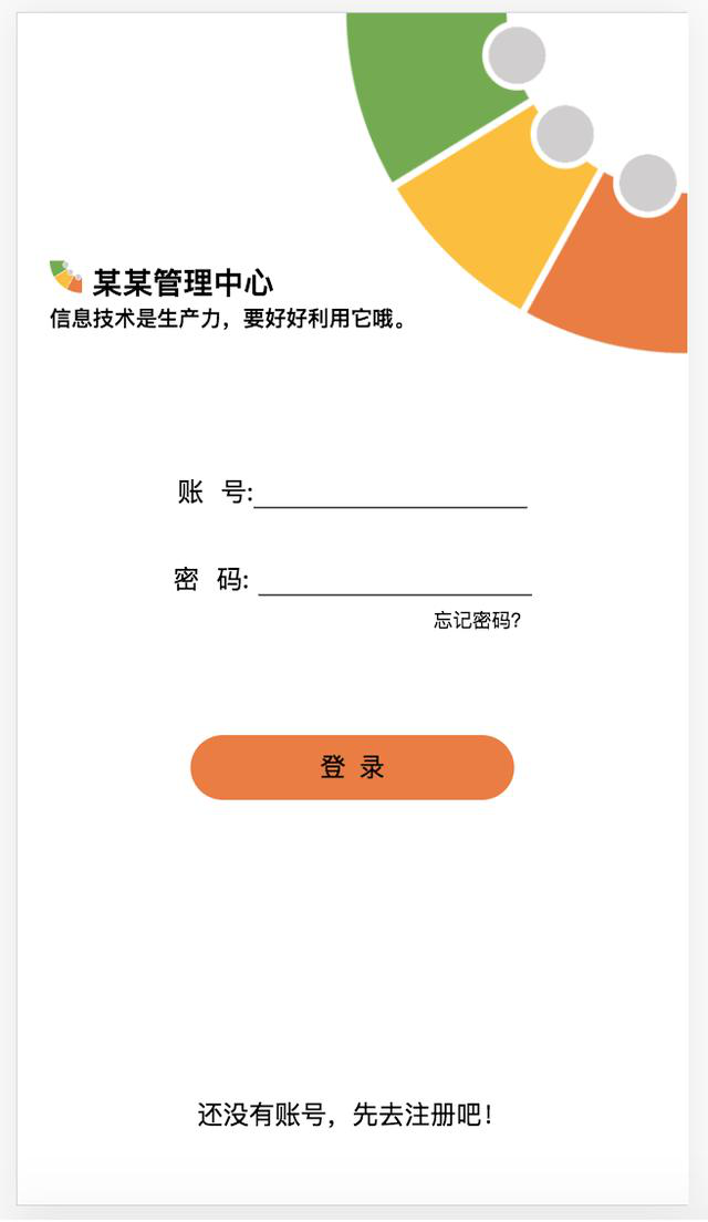
一个简单的手机的登录界面,用flex布局,无数据处理后台。效果图:
这个例子用flex,弹性布局。素材有以下一些图片:


根据效果图,规划为flex的列布局,划分比例大概如下图:

操作步骤:
1 做个DIV容器盒子main,它就是主要的盒子。
2 再放各个盒子,一共五个,五个盒子挤在了一起,因为他们没有分配比例,也就没有按比例布满它们的父盒子main,还没有弹性。这些盒子都给它们加flex样式,按原先我标的比例(比例是2:2:3:2:1)分配添加样式。
扫描二维码关注公众号,回复:
10958253 查看本文章

 body {
            margin: 0px;
        }

        .main {
            width: 100vw;
            height: 100vh;
            /* vh,vw是可视面积的单位100为满*/
            background: url(bg.png) no-repeat;
            /* 背景图不重复 */
            background-size: 100% auto;
            /* 背景图以宽度100%,高度随图大小自动 */
            display: flex;
            /* 用flex布局 */
            flex-direction: column;
            /* 列排布局 */
        }

        .flex1 {
            flex: 1;
        }

        .flex2 {
            flex: 2;
        }

        .flex3 {
            flex: 3;
        }
<div class="main">
        <div class="flex2"></div>
        <div class="flex2"></div>
        <div class="flex3"></div>
        <div class="flex2"></div>
        <div class="flex1"></div>
    </div>

3 ·再继续填放内容
最终代码:
<!DOCTYPE html>
<html lang="en">

<head>
    <meta charset="UTF-8">
    <meta name="viewport" content="width=device-width, initial-scale=1.0">
    <meta http-equiv="X-UA-Compatible" content="ie=edge">
    <title>Document</title>
    <style>
        body {
            margin: 0px;
        }

        .main {
            width: 100vw;
            height: 100vh;
            /* vh,vw是可视面积的单位100为满*/
            background: url(bg.png) no-repeat;
            /* 背景图不重复 */
            background-size: 100% auto;
            /* 背景图以宽度100%,高度随图大小自动 */
            display: flex;
            /* 用flex布局 */
            flex-direction: column;
            /* 列排布局 */
        }

        .flex1 {
            flex: 1;
        }

        .flex2 {
            flex: 2;
        }

        .flex3 {
            flex: 3;
        }

        img {
            width: 20px;
            height: 20px;
        }

        .box2 {
            padding: 0px 10px;
            /* 让它有左右边距10 */
        }

        .box2 h5 {
            position: relative;
            top: -20px;
            /* h5和h3分得太开了,往上靠20px */
        }

        .box3 {
            text-align: center;
            /* 内容水平居中 */
        }

        .box3 input {
            font-size: 18px;
            /* 改输入框字的大小 */
            border: none;
            /* 去掉边框 */
            border-bottom: 1px solid #333;
            /* 加底部边框 */
        }

        .box3 span {
            font-size: 12px;
            /* 字变小 */
            position: relative;
            /* 相对定位 */
            top: -20px;
            right: -100px;
        }

        .box3 button {
            width: 200px;
            height: 40px;
            font-size: 16px;
            background: #ed7d31;
            border: none;
            border-radius: 20px;
        }

        .box5 {
            text-align: center;
        }
    </style>
</head>

<body>
    <div class="main">
        <div class="box1 flex2"></div>
        <div class="box2 flex2">
            <h3><img src="logo.png" alt=""> 某某管理中心</h3>
            <h5>信息技术是生产力,要好好利用它哦</h5>
        </div>
        <div class="box3 flex3">
            <p>账号:<input type="text"></p>
            <br>
            <p>密码:<input type="password"></p>
            <span>忘记密码?</span>
            <br><br>
            <!-- 请原谅的我的不严谨,用br来换行加大距离 -->
            <button>登 录</button>
        </div>
        <div class="box4 flex2"></div>
        <div class="box5 flex1">还没有账号?先去注册吧!</div>
    </div>
</body>

</html>