HTML5兼容性
caniuse工具
1、查看各个浏览器对h5的支持情况:https://caniuse.com/
2、将要查询的标签填进去,如header
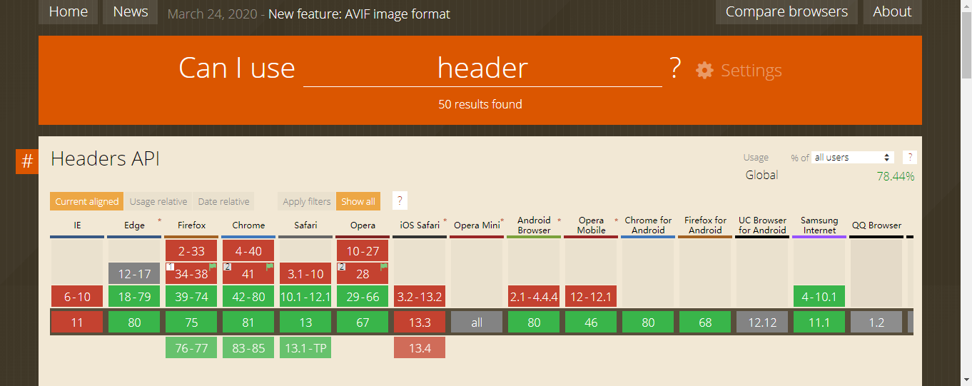
//绿色支持,红色不支持,黄色要加前缀,灰色未知
html5shiv工具
1、低版本IE浏览器支持最新的h5标签,用
https://github.com/aFarkas/html5shiv
2、下载完,解压
//复制
dist/html5shiv.js
//或
dist/html5shiv-printshiv.js
//到项目中,二选一即可
3、在页面中引入
<script type="text/javascript" src="html5shiv.js"></script>
4、就可以正常使用html5的新标签了
CSS3兼容性
Modernizr工具
//用来检测html/css/js是否支持某属性
使用
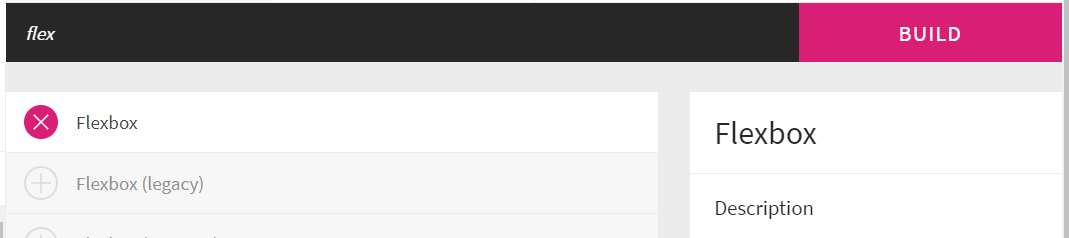
如现在用来检测浏览器是否支持flex。
1、打开网址,点击添加检测(Add your detects),后输入flexbox,加号选择。(当然可以检测多种属性)
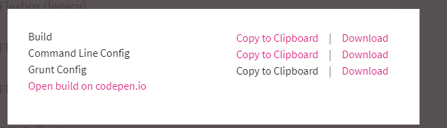
2、点击build生成你的检测代码,然后可以选择复制该代码,还是下载代码后引入。(我是下载后引入)
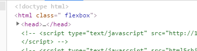
3、把下载的代码塞到项目目录,在html引入
<script type="text/javascript" src="modernizr-custom.js"></script>
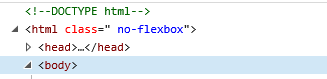
4、打开该文件,若支持flexbox的话,html会加上类名flexbox;若不支持,html会加上类名no-flexbox
5、根据不同的类名,指定不同的方案,如:
.flexbox header{    //支持flex的采用这种方案
    display:-webkit-flex;
    display:-moz-flex;
    display:-ms-flex;
    display:-o-flex;
    display:flex;
    justify-content:center;
    -ms-align-items:center;
    align-items:center;
}

.no-flexbox header{        //不支持flex的采用这种方案
    text-align:center;
    line-hieght:40px;
}
Javascript的兼容性
如检测:requestAnimationFrame
//当然,可以使用上面的modernizr工具
1、检测浏览器是否支持这个方法
if(window.requestAnimationFrame){
    console.log("支持");
}else{
    console.log("不支持");
}
//判断时不能用if(requestAnimationFrame),若不支持会报错
2、若不支持,可以
//兼容性定义
var requestAnimationFrame = window.requestAnimationFrame ||
window.webkit-RequestAnimationFrame ||
window.mozRequestAnimationFrame ||
oRequestAnimationFrame ||
msRequestAnimationFrame ||
function(fn){ setTimeout(fn,1000); };

//调用requestAnimationFrame
requestAnimationFrame(function(){ console.log("执行"); });
移动端click事件的300ms延迟
原因:移动端有个dbclick事件,只要300ms内再点一次就完成dbclick操作。dbclick操作会使页面放大。
解决方法一:在一些浏览器中,只要 viewport 中含有 width=device-width ,那么300ms延迟就不会有
解决方法二:
fastclick工具
1、下载地址:https://github.com/ftlabs/fastclick
2、解压复制 lib 下的 fastclick.js 到项目中。后引入
<script type='application/javascript' src='fastclick.js'></script>
3、在js部分直接粘贴
if ('addEventListener' in document) {
    document.addEventListener('DOMContentLoaded', function() {
        FastClick.attach(document.body);
    }, false);
}
即可解决
单行文字溢出省略
.text-ellipsis{        /*单行文字溢出隐藏*/
    overflow: hidden;
    text-overflow: ellipsis;
    white-space: nowrap;
}/*不能直接与flex布局使用。不过可以在孙元素使用*/
多行文字溢出省略
.multiline-ellipsis{    /*多行文字溢出隐藏*/
    overflow: hidden;
    text-overflow: ellipsis;
    display: -webkit-box;
    -webkit-line-clamp:3;/*显示3行,多出就省略号*/
    white-space:normal !important;
    word-wrap: break-word;
}/*可以搭配flex。容器最好不要设置高度,若容器太高就没效果*/
水平居中和垂直居中
没有指定宽高
内联元素
/*一种*/
span{
    display:inline;
    padding: 0 30px;
}
<span>内联文字 垂直水平居中</span>

/*二种*/
span{
    display:inline;
    position:absolute;
    left:50%;
    top:50%;
    transform:translate(-50%,-50%);
}
<span>内联容器 垂直水平居中</span>

/*三种*/
div{
    display:flex;
    justify-content:center;
    align-items:center;
}
<div>
<span>内联文字 和 内联容器</span>
</div>
内联块元素
/*一种*/
span{
    display:inline-block;
    padding:30px 20px;
}
<span>内联块元素,设置了内边框里面的内容都会居中</span>

/*二种*/
span{
    display:inline-block;
    position:absolute;
    left:50%;
    top:50%;
    tansform:translate(-50%,-50%);
}
<span>内联块元素</span>
块元素
/*一种*/
span{
    display:block;
    text-align:center;
    padding:30px 0;
}
<span>块元素内文字居中</span>

/*二种*/
span{
    display:block;
    position:absolute; /*定位之后,相当于做了display:inline-block*/
    width:100%; /*这样就可以解决*/
    left:50%;
    top:50%;
    tansform:translate(-50%,-50%);
}
<span>块元素的居中</span>
指定宽高
内联块元素
/*一种,单行文字居中*/
span{
    display:inline-block;
    width:300px;
    height:200px;
    text-align:center;
    line-height:300px;
}
<span>内联块元素,有宽高的居中</span>

/*二种,多行文字居中*/
span{
    display:flex;
    width:300px;
    height:200px;
    justify-content:center;
    align-items:center;
    text-align:center; /*flex布局居中的是文字的整体,而不是每一行,若有需求可以加这个*/
}
<span>内联块元素,有宽高的居中</span>

/*三种,容器居中*/
span{
    display:inline-block;
    width:300px;
    height:200px;
    position:absolute;
    left:50%;
    top:50%;
    margin-left:-150px;
    margin-top:-100px;
}
<span>内联块元素居中</span>
块元素
/*一种,文本*/
span{
    display:block;
    width:300px;
    height:200px;
    text-align:center;
    lin-hieght:200px;
}  /*或者使用flex布局*/
<span>块级元素内,文本居中</span>

/*二种,容器*/
span{
    display:block;
    width:300px;
    height:200px;
    left:50%;
    top:50%;
    /*这个*/
    transform:translate(-50%,-50%);
    /*或者
    margin-left:-150px;
    margin-top:-100px;
    */

}
<span>块元素,容器居中</span>