复选框CheckBox
在android体系中,CompoundButton类是抽象的复合按钮,因为是抽象类,所有不能直接使用。而在实际的开发过程中用的是CompoundButton类的几个派生类,主要有复选框CheckBox、单选按钮RadioButton、开关按钮Switch。
CompoundButton在布局文件中常常使用的属性:
- checked:设定按钮的勾选状态,true是勾选,false是未勾选。默认是未勾选的状态。
勾选状态:
 android:checked="true"
- button:指定左侧勾选图标的图形。不指定的话,使用的是系统的默认图标。(下面的例子主要使用了这个属性进行了设置)
下面主要介绍自己定义复选框左侧的勾选图像:
1)首先准备了选中、未选中的两个图像。
注:图标可以去https://www.iconfont.cn/下载。
check_unchoose.png

check_choose.png

把图像放到项目的res的drawable文件夹中。
2)在项目的res的drawable文件夹下创建checkbox_selector.xml文件:
如果是勾选状态,就显示图形check_choose;如果取消勾选,就显示图形check_unchoose。
<?xml version="1.0" encoding="utf-8"?>
<selector xmlns:android="http://schemas.android.com/apk/res/android">
    <item android:state_checked="true" android:drawable="@drawable/check_choose"/>
    <item android:drawable="@drawable/check_unchoose"/>
</selector>
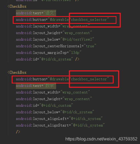
3)在layout文件中设置:android:button="@drawable/checkbox_selector"
下面仅仅是一个测试的例子:
<?xml version="1.0" encoding="utf-8"?>
<RelativeLayout
    xmlns:android="http://schemas.android.com/apk/res/android"
    xmlns:tools="http://schemas.android.com/tools"
    android:id="@+id/activity_main"
    android:layout_width="match_parent"
    android:layout_height="match_parent"
    android:paddingLeft="@dimen/activity_horizontal_margin"
    android:paddingRight="@dimen/activity_horizontal_margin"
    android:paddingTop="@dimen/activity_vertical_margin"
    android:paddingBottom="@dimen/activity_vertical_margin"
    tools:context="cn.edu.hznu.relativelayout_text1.MainActivity">
    <TextView
        android:text="选择你喜欢的科目"
        android:layout_width="wrap_content"
        android:layout_height="wrap_content"
        android:layout_alignParentTop="true"
        android:layout_centerHorizontal="true"
        android:layout_marginTop="55dp"
        android:id="@+id/textView2" />
    <CheckBox
        android:text="语文"
        android:button="@drawable/checkbox_selector"
        android:layout_width="wrap_content"
        android:layout_height="wrap_content"
        android:layout_below="@+id/textView2"
        android:layout_centerHorizontal="true"
        android:layout_marginTop="13dp"
        android:id="@+id/ck_system" />

    <CheckBox
        android:button="@drawable/checkbox_selector"
        android:text="数学"
        android:layout_width="wrap_content"
        android:layout_height="wrap_content"
        android:id="@+id/ck_custom"
        android:layout_below="@+id/ck_system"
        android:layout_alignLeft="@+id/ck_system"
        android:layout_alignStart="@+id/ck_system"
        />
</RelativeLayout>
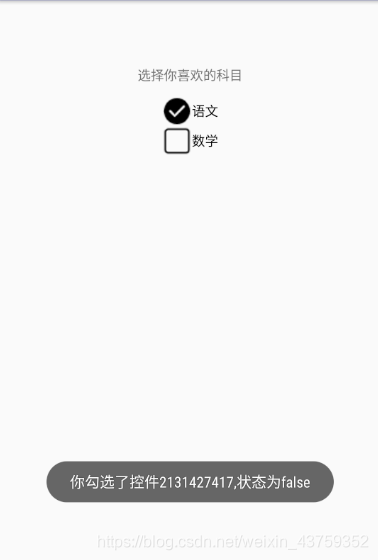
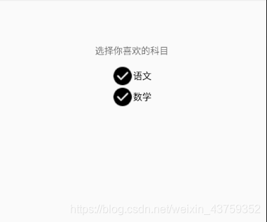
4)效果如下:

当我选中的时候:
CheckBox通过setOnCheckedChangeListener方法设置勾选监听器,对应的监听器要实现CompoundButton.OnCheckedChangeListener 下面是针对上面的测试例子自定义勾选监听器的代码:
package cn.edu.hznu.relativelayout_text1;
import android.support.v7.app.AppCompatActivity;
import android.os.Bundle;
import android.widget.CheckBox;
import android.widget.CompoundButton;
import android.widget.Toast;
public class MainActivity extends AppCompatActivity implements CompoundButton.OnCheckedChangeListener {
    @Override
    protected void onCreate(Bundle savedInstanceState) {
        super.onCreate(savedInstanceState);
        setContentView(R.layout.activity_main);
        CheckBox ck_system = (CheckBox) findViewById(R.id.ck_system);
        CheckBox ck_custom = (CheckBox) findViewById(R.id.ck_custom);
        ck_system.setOnCheckedChangeListener(this);
        ck_custom.setOnCheckedChangeListener(this);
        /**(1)、setChecked(true):设置为勾选状态
         */
        ck_system.setChecked(true);
    }
    @Override
    public void onCheckedChanged(CompoundButton buttonView, boolean isChecked) {
        String desc=String.format("你勾选了控件%d,状态为%b",buttonView.getId(),isChecked);
        Toast.makeText(MainActivity.this,desc,Toast.LENGTH_LONG).show();
    }
}
上面的代码主要实现了当CheckBox勾选的时候,显示此时的状态情况。
效果: