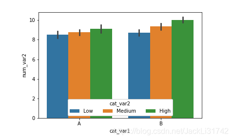
1、两个分类变量和一个数值变量
ax = sb.barplot(data = df, x = 'cat_var1', y = 'num_var2', hue = 'cat_var2')
ax.legend(loc = 8, ncol = 3, framealpha = 1, title = 'cat_var2')
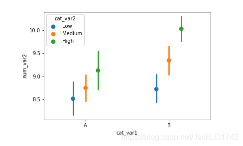
2、“hue” 参数也可以在函数 boxplot, violinplot 和 pointplot 中完成一样的功能,以分组显示的方式添加第三个分类变量。
pointplot 的温馨提示:默认会将分类变量的所有类别以垂直对齐的方式呈现。使用 “dodge” 参数可以将这些类别不再重叠,转换成分组显示的形式:
ax = sb.pointplot(data = df, x = 'cat_var1', y = 'num_var2', hue = 'cat_var2',dodge = 0.3, linestyles = "")
3、折线图 中添加分类变量,将其调整为多折线图
def mean_poly(x, y, bins = 10, **kwargs):
    """ Custom adapted line plot code. """
    # set bin edges if none or int specified
    if type(bins) == int:
        bins = np.linspace(x.min(), x.max(), bins+1)
    bin_centers = (bin_edges[1:] + bin_edges[:-1]) / 2

    # compute counts
    data_bins = pd.cut(x, bins, right = False,
                       include_lowest = True)
    means = y.groupby(data_bins).mean()

    # create plot
    plt.errorbar(x = bin_centers, y = means, **kwargs)

bin_edges = np.arange(0.25, df['num_var1'].max()+0.5, 0.5)
g = sb.FacetGrid(data = df, hue = 'cat_var2', size = 5)
g.map(mean_poly, "num_var1", "num_var2", bins = bin_edges)
g.set_ylabels('mean(num_var2)')
g.add_legend()

