在前端开发中,三列布局是很基础的一种场景,这篇文章就总结一下实现三列布局的方法及优缺点,还有一些和三列布局相关的布局方式。
三列布局的要求一般为:
1、左右两边宽度固定,中间宽度自适应。
2、中间列的内容可以完整显示。
这种情况用定位和浮动都可以实现。
1、使用定位,使用定位主要是将左右两列通过绝对定位的偏移量定位到左右两边的位置。
#middle{
 background: deeppink;
 padding: 0 200px; //这一句一定要加,不然中间列的内容有一部分会被左边的列遮住
}
#left{
 position: absolute;
 left: 0;
 top: 0;
 width: 200px;
 background: pink;
}
#right{
 position: absolute;
 right: 0;
 top: 0;
 width: 200px;
 background: pink;
}
效果:

注意:使用浮动时,middle对应的DOM元素要在最下面。
#left,#right{
 width: 200px;
 background: pink;
}
#left{
 float: left;
}
#right{
 float: right;
}
#middle{
 background: deeppink;
}
效果:
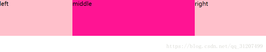
两种情况的问题:1、使用定位在缩小窗口时,会出现问题(和定位的包含块有关);
2、使用浮动时,由于中间列对应DOM元素在html结构的最后,因为也是最后加载,可能会影响用户体验;
3、两种方法都还有一个共同的问题,就是在其中一列的高度发生变化时,另外两列不会随之改变,视觉效果 特别丑;
针对上述问题,也出现相应的布局方案来解决这些问题:
1、伪等高布局,这种布局方式是在视觉上实现了等高布局,然而实际上并不是等高布局;
#wrap{
 width: 750px;
 border: 1px solid;
 margin: 0 auto;
 overflow: hidden;
}
#wrap .left{
 float: left;
 width: 200px;
 background: pink;
 padding-bottom: 1000px;
 margin-bottom: -1000px;
}
#wrap .right{
 float: left;
 width: 500px;
 background: deeppink;
 padding-bottom: 1000px;
 margin-bottom: -1000px;
}
.clearfix{
 *zoom: 1;
}
.clearfix:after{
 content: "";
 display: block;
 clear: both;
}
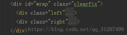
2、圣杯布局,实现中间列最先加载;

#content{
 overflow: hidden;
 padding: 0 200px;
}
#header,#footer{
 height: 20px;
 text-align: center;
 border: 1px solid  deeppink;
 background: gray;
}
#content .middle,#content .left,#content .right{
 padding-bottom: 10000px;
 margin-bottom: -10000px;
}
#content .middle{
 float: left;
 width: 100%;
 background: pink;
 /*padding: 0 200px;*/
}
#content .left{
 position: relative;
 left: -200px;
 margin-left: -100%;
 float: left;
 width: 200px;
 background: yellow;
}
#content .right{
 position: relative;
 right: -200px;
 margin-left: -200px;
 float: left;
 width: 200px;
 background: yellow;
}
.clearfix{
 *zoom: 1;
}
.clearfix:after{
 content: "";
 display: block;
 clear: both;
}
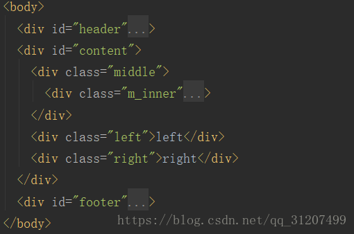
3、双飞翼布局,也是实现中间列最先加载
#header,#footer{
 border: 1px solid;
 background: gray;
 text-align: center;
}
#content .middle,#content .left,#content .right{
 height: 50px;
 line-height: 50px;
 float: left;
}

/*双飞翼布局*/
#content{
 overflow: hidden;
}
#content .middle{
 width: 100%;
 background: deeppink;
}
#content .middle .m_inner{
 padding: 0 200px;
}
#content .left,#content .right{
 background: pink;
 width: 200px;
 text-align: center;
}
#content .left{
 margin-left: -100%;
}
#content .right{
 margin-left: -200px;
}
