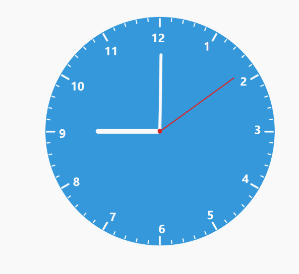
效果图
1.html代码
<div class="box">
    <div class="clock">
        <div class="nmb">
            <div><span>9</span></div>
            <div><span>10</span></div>
            <div><span>11</span></div>
            <div><span>12</span></div>
            <div><span>1</span></div>
            <div><span>2</span></div>
            <div><span>3</span></div>
            <div><span>4</span></div>
            <div><span>5</span></div>
            <div><span>6</span></div>
            <div><span>7</span></div>
            <div><span>8</span></div>
        </div>
        <div class="keduxian"></div>
        <div class="sec"></div>
        <div class="min"></div>
        <div class="hou"></div>
        <div class="yuanxin"></div>
    </div>
</div>
2*.css代码*
* {
    padding: 0;
    margin: 0;
    border: none;
}
body, html {
    width: 100%;
    height: 100%;
}
.box {
    width: 100%;
    height: 100%;
    position: relative;
}
.box_top, .box_bottom {
    width: 100%;
    height: 50%;
    position: absolute;
    z-index: 0;
    left: 0;
    top: 0;
}
.box_bottom {
    background: #FFF1C2;
    position: absolute;
    z-index: 0;
    left: 0;
    top: 50%;
}
.clock {
    width: 500px;
    height: 500px;
    position: relative;
    left: 50%;
    top: 50%;
    margin: -250px 0 0 -250px;
    background: #3598db;
    border-radius: 50%;
}
.nmb {
    position: relative;
    width: 100%;
    height: 100%;
}
.nmb div {
    position: absolute;
    width: 220px;
    height: 24px;
    left: 30px;
    top: 50%;
    margin: -12px 0 0 0;
    display: block;
    font-weight: bold;
    font-size: 24px;
    transform: rotate(0deg);
    transform-origin: right center;
}
.nmb div span {
    position: absolute;
    color: #fff;
}
.sec, .min, .hou {
    position: absolute;
    left: 50%;
    transform-origin: center bottom;
    z-index: 10;
}
.sec {
    background: #d22;
    height: 200px;
    width: 2px;
    margin: 0 0 0 -1px;
    top: 50px;
    z-index: 100;
}
.min {
    height: 170px;
    width: 6px;
    margin: 0 0 0 -3px;
    top: 80px;
    background: #fff;
    border-radius: 4px;
}
.hou {
    height: 140px;
    width: 10px;
    margin: 0 0 0 -5px;
    top: 110px;
    background: #fff;
    border-radius: 5px;
}
.keduxian div {
    width: 248px;
    position: absolute;
    left: 2px;
    top: 50%;
    margin: -1px 0 0 0;
    transform-origin: right center;
}
.keduxian p {
    background: #fff;
    width: 8px;
    height: 2px;
    border-radius: 0 2px 2px 0;
}
.yuanxin {
    width: 10px;
    height: 10px;
    background: #d22;
    border-radius: 5px;
    top: 50%;
    left: 50%;
    margin: -5px 0 0 -5px;
    position: absolute;
    z-index: 999;
}
3.js代码
$(function() {
//使用两个for循环来使表盘转动效果
    for (var i = 0; i < 12; i++) {
        $('.nmb div').eq(i).css('transform', 'rotate(' + i * 30 + 'deg)');
        $('.nmb div').eq(i).find('span').css('transform', 'rotate(' + i * -30 + 'deg)');
    }

    for (var j = 0; j < 60; j++) {
        var keduxian = $('<div><p></p></div>');
        $('.keduxian').append(keduxian);
        $('.keduxian div').eq(j).css('transform', 'rotate(' + j * 6 + 'deg)');
        //分针的移动
        if (j % 5 == 0) {
            $('.keduxian div').eq(j).find('p').css('width', '20px').css('height', '4px');
        }
    }
    //每隔1秒刷新
    setInterval('aa()', 1000);
})
//获取当前时间
function aa() {
    var time = new Date();
    var sec = time.getSeconds();
    var min = time.getMinutes() + time.getSeconds() / 60;
    var hou = time.getHours() + time.getMinutes() / 60;
    $('.sec').css('transform', 'rotate(' + sec * 6 + 'deg)');
    $('.min').css('transform', 'rotate(' + min * 6 + 'deg)');
    $('.hou').css('transform', 'rotate(' + hou * 30 + 'deg)');
}
