1.bootstrap的安装
(1)使用在线文件或下载引入使用
在线使用
<!-- 最新版本的 Bootstrap 核心 CSS 文件 -->
<link rel="stylesheet" href="https://cdn.jsdelivr.net/npm/[email protected]/dist/css/bootstrap.min.css" integrity="sha384-BVYiiSIFeK1dGmJRAkycuHAHRg32OmUcww7on3RYdg4Va+PmSTsz/K68vbdEjh4u" crossorigin="anonymous">

<!-- 可选的 Bootstrap 主题文件(一般不用引入) -->
<link rel="stylesheet" href="https://cdn.jsdelivr.net/npm/[email protected]/dist/css/bootstrap-theme.min.css" integrity="sha384-rHyoN1iRsVXV4nD0JutlnGaslCJuC7uwjduW9SVrLvRYooPp2bWYgmgJQIXwl/Sp" crossorigin="anonymous">

<!-- 最新的 Bootstrap 核心 JavaScript 文件 -->
<script src="https://cdn.jsdelivr.net/npm/[email protected]/dist/js/bootstrap.min.js" integrity="sha384-Tc5IQib027qvyjSMfHjOMaLkfuWVxZxUPnCJA7l2mCWNIpG9mGCD8wGNIcPD7Txa" crossorigin="anonymous"></script>
本地引入
<head>
    <meta charset="utf-8">
    <meta http-equiv="X-UA-Compatible" content="IE=edge">
    <meta name="viewport" content="width=device-width, initial-scale=1"> <!-- 上述3个meta标签*必须*放在最前面,任何其他内容都*必须*跟随其后! -->
    <title>Bootstrap Template</title>
    <!-- Bootstrap -->
    <link href="lib/css/bootstrap.css" rel="stylesheet">
</head>

<!-- jQuery (Bootstrap 的所有 JavaScript 插件都依赖 jQuery,所以必须放在前边) -->
    <script src="lib/JS/jquery.js"></script>
    <!-- 加载 Bootstrap 的所有 JavaScript 插件。你也可以根据需要只加载单个插件。 -->
    <script src="lib/JS/bootstrap.js"></script>
(2)通过npm方式安装
$ npm install bootstrap@3
require('bootstrap') 代码的作用是加载 Bootstrap 的所有 jQuery 插件。其中,bootstrap 模块自身并不导出任何内容。你可以通过加载安装包顶级目录下的 /js/*.js文件的方式手动加载单个的 Bootstrap 插件。
Bootstrap 的 package.json文件包含了一些额外的元数据:
less - Bootstrap源码的入口 Less 文件的路径
style - Bootstrap 的未压缩 CSS 文件的路径
(3)基本模板示例
<!DOCTYPE html>
<html lang="zh-CN">
  <head>
    <meta charset="utf-8">
    <meta http-equiv="X-UA-Compatible" content="IE=edge">
    <meta name="viewport" content="width=device-width, initial-scale=1">
    <!-- 上述3个meta标签*必须*放在最前面,任何其他内容都*必须*跟随其后! -->
    <title>Bootstrap 101 Template</title>

    <!-- Bootstrap -->
    <link href="https://cdn.jsdelivr.net/npm/[email protected]/dist/css/bootstrap.min.css" rel="stylesheet">

    <!-- HTML5 shim 和 Respond.js 是为了让 IE8 支持 HTML5 元素和媒体查询(media queries)功能 -->
    <!-- 警告:通过 file:// 协议(就是直接将 html 页面拖拽到浏览器中)访问页面时 Respond.js 不起作用 -->
    <!--[if lt IE 9]>
      <script src="https://cdn.jsdelivr.net/npm/[email protected]/dist/html5shiv.min.js"></script>
      <script src="https://cdn.jsdelivr.net/npm/[email protected]/dest/respond.min.js"></script>
    <![endif]-->
  </head>
  <body>
    <h1>你好,世界!</h1>

    <!-- jQuery (Bootstrap 的所有 JavaScript 插件都依赖 jQuery,所以必须放在前边) -->
    <script src="https://cdn.jsdelivr.net/npm/[email protected]/dist/jquery.min.js"></script>
    <!-- 加载 Bootstrap 的所有 JavaScript 插件。你也可以根据需要只加载单个插件。 -->
    <script src="https://cdn.jsdelivr.net/npm/[email protected]/dist/js/bootstrap.min.js"></script>
  </body>
</html>
2.全局样式
(1)Bootstrap 是移动设备优先的
为了确保适当的绘制和触屏缩放,需要在 之中添加 viewport 元数据标签。
<meta name="viewport" content="width=device-width, initial-scale=1">
在移动设备浏览器上,通过为视口(viewport)设置 meta 属性为 user-scalable=no 可以禁用其缩放(zooming)功能。这样禁用缩放功能后,用户只能滚动屏幕,就能让网站看上去更像原生应用的感觉。
<meta name="viewport" content="width=device-width, initial-scale=1, maximum-scale=1, user-scalable=no">
(2)布局和容器
.container类用于固定宽度并支持响应式布局的容器。
<div class="container">
  ...
</div>
.container-fluid类用于 100% 宽度,占据全部视口(viewport)的容器。
<div class="container">
  ...
</div>
(3)栅格系统
栅格系统用于通过一系列的行(row)与列(column)的组合来创建页面布局。

<div class="row">
  <div class="col-md-1">bootstrap1</div>
  <div class="col-md-1">bootstrap1</div>
  <div class="col-md-1">bootstrap1</div>
  <div class="col-md-1">bootstrap1</div>
  <div class="col-md-1">bootstrap1</div>
  <div class="col-md-1">bootstrap1</div>
  <div class="col-md-1">bootstrap1</div>
  <div class="col-md-1">bootstrap1</div>
  <div class="col-md-1">bootstrap1</div>
  <div class="col-md-1">bootstrap1</div>
  <div class="col-md-1">bootstrap1</div>
  <div class="col-md-1">bootstrap1</div>
</div>
<div class="row">
  <div class="col-md-8">bootstrap-8</div>
  <div class="col-md-4">bootstrap-4</div>
</div>
<div class="row">
  <div class="col-md-4">bootstrap-4</div>
  <div class="col-md-4">bootstrap-4</div>
  <div class="col-md-4">bootstrap-4</div>
</div>
<div class="row">
  <div class="col-md-6">bootstrap-6</div>
  <div class="col-md-6">bootstrap-6</div>
</div>
(4)表格
为任意<table> 标签添加 .table类可以为其赋予基本的样式 — 少量的内补(padding)和水平方向的分隔线。
<table class="table">
  ...
</table>
添加 .table-bordered 类为表格和其中的每个单元格增加边框。
<table class="table table-bordered">
  ...
</table>
通过添加 .table-hover 类可以让 中的每一行对鼠标悬停状态作出响应。
<table class="table table-hover">
  ...
</table>
通过这些状态类可以为行或单元格设置颜色。
| Class | 描述 |
|---|---|
| .active | 鼠标悬停在行或单元格上时所设置的颜色 |
| .success | 标识成功或积极的动作 |
| .info | .info |
| .warning | 标识警告或需要用户注意 |
| .danger | 标识危险或潜在的带来负面影响的动作 |
(5)表单
单独的表单控件会被自动赋予一些全局样式。所有设置了.form-control类的 <input>、<textarea> 和<select>元素都将被默认设置宽度属性为 width: 100%;。 将label元素和前面提到的控件包裹在.form-group中可以获得最好的排列。
<form>
  <div class="form-group">
    <label for="exampleInputEmail1">Email address</label>
    <input type="email" class="form-control" id="exampleInputEmail1" placeholder="Email">
  </div>
  <div class="form-group">
    <label for="exampleInputPassword1">Password</label>
    <input type="password" class="form-control" id="exampleInputPassword1" placeholder="Password">
  </div>
  <div class="form-group">
    <label for="exampleInputFile">File input</label>
    <input type="file" id="exampleInputFile">
    <p class="help-block">Example block-level help text here.</p>
  </div>
  <div class="checkbox">
    <label>
      <input type="checkbox"> Check me out
    </label>
  </div>
  <button type="submit" class="btn btn-default">Submit</button>
</form>
1.内联表单
为 <form> 元素添加.form-inline类可使其内容左对齐并且表现为inline-block级别的控件。只适用于视口(viewport)至少在 768px 宽度时(视口宽度再小的话就会使表单折叠)。
2.水平排列的表单
通过为表单添加.form-horizontal 类,并联合使用Bootstrap 预置的栅格类,可以将label 标签和控件组水平并排布局。这样做将改变.form-group的行为,使其表现为栅格系统中的行(row),因此就无需再额外添加.row了。
3.内联单选和多选框
通过将.checkbox-inline或 .radio-inline类应用到一系列的多选框(checkbox)或单选框(radio)控件上,可以使这些控件排列在一行。
4.静态控件
如果需要在表单中将一行纯文本和label元素放置于同一行,为<p> 元素添加 .form-control-static 类即可。
5.焦点状态
我们将某些表单控件的默认outline样式移除,然后对:focus 状态赋予 box-shadow 属性。
6.禁用状态
为输入框设置disabled属性可以禁止其与用户有任何交互(焦点、输入等)。被禁用的输入框颜色更浅,并且还添加了not-allowed鼠标状态。
<input class="form-control" id="disabledInput" type="text" placeholder="Disabled input here..." disabled>
7.被禁用的 fieldset
为<fieldset> 设置 disabled 属性,可以禁用<fieldset> 中包含的所有控件。
<form>
  <fieldset disabled>
    <div class="form-group">
      <label for="disabledTextInput">Disabled input</label>
      <input type="text" id="disabledTextInput" class="form-control" placeholder="Disabled input">
    </div>
    <div class="form-group">
      <label for="disabledSelect">Disabled select menu</label>
      <select id="disabledSelect" class="form-control">
        <option>Disabled select</option>
      </select>
    </div>
    <div class="checkbox">
      <label>
        <input type="checkbox"> Can't check this
      </label>
    </div>
    <button type="submit" class="btn btn-primary">Submit</button>
  </fieldset>
</form>
8.按钮
为 <a>、<button>或 <input>元素添加按钮类(button class)即可使用 Bootstrap 提供的样式。
<a class="btn btn-default" href="#" role="button">Link</a>
<button class="btn btn-default" type="submit">Button</button>
<input class="btn btn-default" type="button" value="Input">
<input class="btn btn-default" type="submit" value="Submit">
预定义样式
<!-- Standard button -->
<button type="button" class="btn btn-default">(默认样式)Default</button>

<!-- Provides extra visual weight and identifies the primary action in a set of buttons -->
<button type="button" class="btn btn-primary">(首选项)Primary</button>

<!-- Indicates a successful or positive action -->
<button type="button" class="btn btn-success">(成功)Success</button>

<!-- Contextual button for informational alert messages -->
<button type="button" class="btn btn-info">(一般信息)Info</button>

<!-- Indicates caution should be taken with this action -->
<button type="button" class="btn btn-warning">(警告)Warning</button>

<!-- Indicates a dangerous or potentially negative action -->
<button type="button" class="btn btn-danger">(危险)Danger</button>

<!-- Deemphasize a button by making it look like a link while maintaining button behavior -->
<button type="button" class="btn btn-link">(链接)Link</button>
使用.btn-lg、.btn-sm或.btn-xs 就可以获得不同尺寸的按钮。
通过给按钮添加.btn-block类可以将其拉伸至父元素100%的宽度,而且按钮也变为了块级(block)元素。
激活状态
当按钮处于激活状态时,其表现为被按压下去(底色更深、边框夜色更深、向内投射阴影)。对于<button>元素,是通过 :active 状态实现的。对于 <a> 元素,是通过 .active 类实现的。然而,你还可以将 .active 应用到 <button>上(包含 aria-pressed="true" 属性)),并通过编程的方式使其处于激活状态。
button 元素
由于 :active 是伪状态,因此无需额外添加,但是在需要让其表现出同样外观的时候可以添加 .active 类。
链接(<a>)元素
可以为基于<a>元素创建的按钮添加 .active 类。
禁用状态
通过为按钮的背景设置 opacity 属性就可以呈现出无法点击的效果。
button 元素
为<button> 元素添加 disabled 属性,使其表现出禁用状态。
链接(<a>)元素
为基于<a>元素创建的按钮添加.disabled 类。
(6)图片
在 Bootstrap 版本 3 中,通过为图片添加 .img-responsive 类可以让图片支持响应式布局。其实质是为图片设置了 max-width: 100%;、 height: auto; 和 display: block; 属性,从而让图片在其父元素中更好的缩放。
如果需要让使用了 .img-responsive 类的图片水平居中,请使用 .center-block 类,不要用 .text-center。
通过为 <img>元素添加以下相应的类,可以让图片呈现不同的形状。
<img src="..." alt="..." class="img-rounded">
<img src="..." alt="..." class="img-circle">
<img src="..." alt="..." class="img-thumbnail">
3.组件
(1)Glyphicons 字体图标
(2)下拉菜单
将下拉菜单触发器和下拉菜单都包裹在 .dropdown 里,或者另一个声明了 position: relative; 的元素。然后加入组成菜单的 HTML 代码。
<div class="dropdown">
  <button class="btn btn-default dropdown-toggle" type="button" id="dropdownMenu1" data-toggle="dropdown" aria-haspopup="true" aria-expanded="true">
    Dropdown
    <span class="caret"></span>
  </button>
  <ul class="dropdown-menu" aria-labelledby="dropdownMenu1">
    <li><a href="#">Action</a></li>
    <li><a href="#">Another action</a></li>
    <li><a href="#">Something else here</a></li>
    <li role="separator" class="divider"></li>
    <li><a href="#">Separated link</a></li>
  </ul>
</div>
为下拉菜单中的 <li>元素添加 .disabled 类,从而禁用相应的菜单项。
(3)按钮组
把一组 <div class="btn-group">组合进一个 <div class="btn-toolbar">中就可以做成更复杂的组件。
<div class="btn-toolbar" role="toolbar" aria-label="...">
  <div class="btn-group" role="group" aria-label="...">...</div>
  <div class="btn-group" role="group" aria-label="...">...</div>
  <div class="btn-group" role="group" aria-label="...">...</div>
</div>
(4)导航
Bootstrap 中的导航组件都依赖同一个 .nav 类,状态类也是共用的。改变修饰类可以改变样式。
<ul class="nav nav-tabs">
  <li role="presentation" class="active"><a href="#">Home</a></li>
  <li role="presentation"><a href="#">Profile</a></li>
  <li role="presentation"><a href="#">Messages</a></li>
</ul>
注意 .nav-tabs 类依赖 .nav 基类。
(5)分页
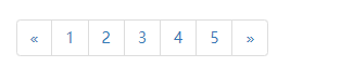
<nav aria-label="Page navigation">
<ul class="pagination">
<li>
<a href="#" aria-label="Previous">
<span aria-hidden="true">«</span>
</a>
</li>
<li><a href="#">1</a></li>
<li><a href="#">2</a></li>
<li><a href="#">3</a></li>
<li><a href="#">4</a></li>
<li><a href="#">5</a></li>
<li>
<a href="#" aria-label="Next">
<span aria-hidden="true">»</span>
</a>
</li>
</ul>
</nav>
(6)徽章
给链接、导航等元素嵌套 元素,可以很醒目的展示新的或未读的信息条目。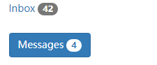
<a href="#">Inbox <span class="badge">42</span></a>

<button class="btn btn-primary" type="button">
  Messages <span class="badge">4</span>
</button>
(7)警告框
将任意文本和一个可选的关闭按钮组合在一起就能组成一个警告框,.alert 类是必须要设置的,另外我们还提供了有特殊意义的4个类(例如,.alert-success),代表不同的警告信息。
<div class="alert alert-success" role="alert">...</div>
<div class="alert alert-info" role="alert">...</div>
<div class="alert alert-warning" role="alert">...</div>
<div class="alert alert-danger" role="alert">...</div>
(8)进度条
将设置了 .sr-only 类的 标签从进度条组件中移除 类,从而让当前进度显示出来。
<div class="progress">
  <div class="progress-bar" role="progressbar" aria-valuenow="60" aria-valuemin="0" aria-valuemax="100" style="width: 60%;">
    60%
  </div>
</div>
为 .progress-bar-striped 添加 .active 类,使其呈现出由右向左运动的动画效果。IE9 及更低版本的浏览器不支持。
<div class="progress">
  <div class="progress-bar progress-bar-striped active" role="progressbar" aria-valuenow="45" aria-valuemin="0" aria-valuemax="100" style="width: 45%">
    <span class="sr-only">45% Complete</span>
  </div>
</div>
4.JavaScript插件
(1)模态框

<div class="modal fade" tabindex="-1" role="dialog">
<div class="modal-dialog" role="document">
<div class="modal-content">
<div class="modal-header">
<button type="button" class="close" data-dismiss="modal" aria-label="Close"><span aria-hidden="true">×</span></button>
<h4 class="modal-title">Modal title</h4>
</div>
<div class="modal-body">
<p>One fine body…</p>
</div>
<div class="modal-footer">
<button type="button" class="btn btn-default" data-dismiss="modal">Close</button>
<button type="button" class="btn btn-primary">Save changes</button>
</div>
</div><!-- /.modal-content -->
</div><!-- /.modal-dialog -->
</div><!-- /.modal -->
(2)弹出框
静态弹出框
4个可能的弹出方向:顶部、右侧、底部和左侧。
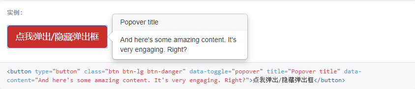
点击并让弹出框消失
通过使用 focus 触发器可以在用户点击弹出框是让其消失。

(3)手风琴

<!DOCTYPE html>
<html lang="zh-CN">

<head>
    <meta charset="utf-8">
    <meta http-equiv="X-UA-Compatible" content="IE=edge">
    <meta name="viewport" content="width=device-width, initial-scale=1"> <!-- 上述3个meta标签*必须*放在最前面,任何其他内容都*必须*跟随其后! -->
    <title>Bootstrap Template</title>
    <!-- Bootstrap -->
    <link href="lib/css/bootstrap.css" rel="stylesheet">
</head>

<body>
    <div class="container">
        <div class="panel-group" id="accordion" role="tablist" aria-multiselectable="true">
            <div class="panel panel-default">
              <div class="panel-heading" role="tab" id="headingOne">
                <h4 class="panel-title">
                  <a role="button" data-toggle="collapse" data-parent="#accordion" href="#collapseOne" aria-expanded="true" aria-controls="collapseOne">
                    手风琴系列 #1
                  </a>
                </h4>
              </div>
              <div id="collapseOne" class="panel-collapse collapse in" role="tabpanel" aria-labelledby="headingOne">
                <div class="panel-body">
                  手风琴(accordion)是一种既能够独奏,又能伴奏的键盘乐器,不仅能够演奏单声部的优美旋律,还可以演奏多声部的乐曲,更可以如钢琴一样双手演奏丰富的和声。手风琴声音宏大,音色变化丰富,手指与风箱的巧妙结合,能够演奏出多种不同风格的乐曲,这是许多乐器无法比拟的;除了独立演奏外,也可参加重奏、合奏,可以说一架手风琴就是一个小型乐队。加之音高固定,易学易懂,体积小,携带方便,因此,手风琴很适合不同年龄的演奏者自娱自乐,也可以很方便地携带到学校、剧场参加演出。
                </div>
              </div>
            </div>
            <div class="panel panel-default">
              <div class="panel-heading" role="tab" id="headingTwo">
                <h4 class="panel-title">
                  <a class="collapsed" role="button" data-toggle="collapse" data-parent="#accordion" href="#collapseTwo" aria-expanded="false" aria-controls="collapseTwo">
                    手风琴系列 #2
                  </a>
                </h4>
              </div>
              <div id="collapseTwo" class="panel-collapse collapse" role="tabpanel" aria-labelledby="headingTwo">
                <div class="panel-body">
                  手风琴(accordion)是一种既能够独奏,又能伴奏的键盘乐器,不仅能够演奏单声部的优美旋律,还可以演奏多声部的乐曲,更可以如钢琴一样双手演奏丰富的和声。手风琴声音宏大,音色变化丰富,手指与风箱的巧妙结合,能够演奏出多种不同风格的乐曲,这是许多乐器无法比拟的;除了独立演奏外,也可参加重奏、合奏,可以说一架手风琴就是一个小型乐队。加之音高固定,易学易懂,体积小,携带方便,因此,手风琴很适合不同年龄的演奏者自娱自乐,也可以很方便地携带到学校、剧场参加演出。
                </div>
              </div>
            </div>
            <div class="panel panel-default">
              <div class="panel-heading" role="tab" id="headingThree">
                <h4 class="panel-title">
                  <a class="collapsed" role="button" data-toggle="collapse" data-parent="#accordion" href="#collapseThree" aria-expanded="false" aria-controls="collapseThree">
                    手风琴系列 #3
                  </a>
                </h4>
              </div>
              <div id="collapseThree" class="panel-collapse collapse" role="tabpanel" aria-labelledby="headingThree">
                <div class="panel-body">
                  手风琴(accordion)是一种既能够独奏,又能伴奏的键盘乐器,不仅能够演奏单声部的优美旋律,还可以演奏多声部的乐曲,更可以如钢琴一样双手演奏丰富的和声。手风琴声音宏大,音色变化丰富,手指与风箱的巧妙结合,能够演奏出多种不同风格的乐曲,这是许多乐器无法比拟的;除了独立演奏外,也可参加重奏、合奏,可以说一架手风琴就是一个小型乐队。加之音高固定,易学易懂,体积小,携带方便,因此,手风琴很适合不同年龄的演奏者自娱自乐,也可以很方便地携带到学校、剧场参加演出。
                </div>
              </div>
            </div>
          </div>
    </div>
    <!-- jQuery (Bootstrap 的所有 JavaScript 插件都依赖 jQuery,所以必须放在前边) -->
    <script src="lib/JS/jquery.js"></script>
    <!-- 加载 Bootstrap 的所有 JavaScript 插件。你也可以根据需要只加载单个插件。 -->
    <script src="lib/JS/bootstrap.js"></script>
</body>

</html>
(4)轮播图

<!DOCTYPE html>
<html lang="zh-CN">

<head>
    <meta charset="utf-8">
    <meta http-equiv="X-UA-Compatible" content="IE=edge">
    <meta name="viewport" content="width=device-width, initial-scale=1"> <!-- 上述3个meta标签*必须*放在最前面,任何其他内容都*必须*跟随其后! -->
    <title>Bootstrap Template</title>
    <!-- Bootstrap -->
    <link href="lib/css/bootstrap.css" rel="stylesheet">
</head>

<body>
    <div class="container">
        <div id="carousel-example-generic" class="carousel slide" data-ride="carousel">
            <!-- Indicators -->
            <ol class="carousel-indicators">
              <li data-target="#carousel-example-generic" data-slide-to="0" class="active"></li>
              <li data-target="#carousel-example-generic" data-slide-to="1"></li>
              <li data-target="#carousel-example-generic" data-slide-to="2"></li>
            </ol>

            <!-- Wrapper for slides -->
            <div class="carousel-inner" role="listbox">
              <div class="item active">
                <img src="..." alt="...">
                <div class="carousel-caption">
                  ...
                </div>
              </div>
              <div class="item">
                <img src="..." alt="...">
                <div class="carousel-caption">
                  ...
                </div>
              </div>
              ...
            </div>

            <!-- Controls -->
            <a class="left carousel-control" href="#carousel-example-generic" role="button" data-slide="prev">
              <span class="glyphicon glyphicon-chevron-left" aria-hidden="true"></span>
              <span class="sr-only">Previous</span>
            </a>
            <a class="right carousel-control" href="#carousel-example-generic" role="button" data-slide="next">
              <span class="glyphicon glyphicon-chevron-right" aria-hidden="true"></span>
              <span class="sr-only">Next</span>
            </a>
          </div>
    </div>
    <!-- jQuery (Bootstrap 的所有 JavaScript 插件都依赖 jQuery,所以必须放在前边) -->
    <script src="lib/JS/jquery.js"></script>
    <!-- 加载 Bootstrap 的所有 JavaScript 插件。你也可以根据需要只加载单个插件。 -->
    <script src="lib/JS/bootstrap.js"></script>
</body>

</html>
