本文内用到的数据来源:疫情状况的时间序列数据仓库
(https://github.com/BlankerL/DXY-COVID-19-Data)如果GitHub上下载速度过慢,也可前往码云下载:
https://gitee.com/zheng_bo_pu/DXY-COVID-19-Data
疫情已经过去一个多月了,在这一个多月的努力里,我们取得了很多中国第一!GitHub上也出现了很多关于此次疫情的项目,其中一位程序员在GiHub上创建了名为wuhan2020的仓库,能够在该项目上查到与疫情相关的各类最新信息,包括医院、酒店、物流、生产以及捐赠物资与款项等信息。
今天,我们用大数据可视化来回顾一下疫情的发展过程:
绘制新冠病毒曲线动画
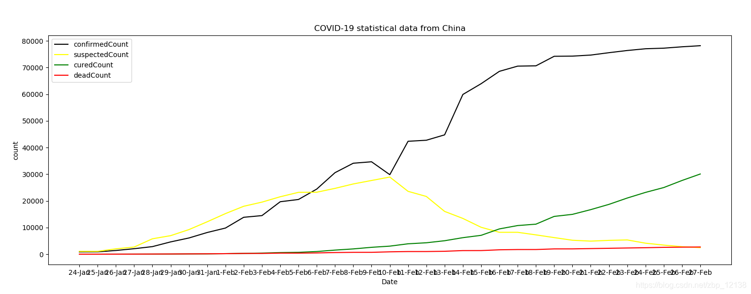
视频中所用的数据截止到2020年2月27日,黄色那条线是疑似感染人数统计,目前已经越来越少了,而绿色那条线是治愈人数,这条线在渐渐上升,于此同时,累计确诊人数和死亡人数在渐渐趋近于某一个数值,这说明我国的疫情在逐渐转好。
下面我们来看看这样的四条曲线要怎么绘制:
- 获取绘图所需数据
- 清洗数据
- 编写程序
数据的获取方式已经放在文章的开头了,大家可以自行下载,得到数据以后,会发现有些数据不是我们想要的:
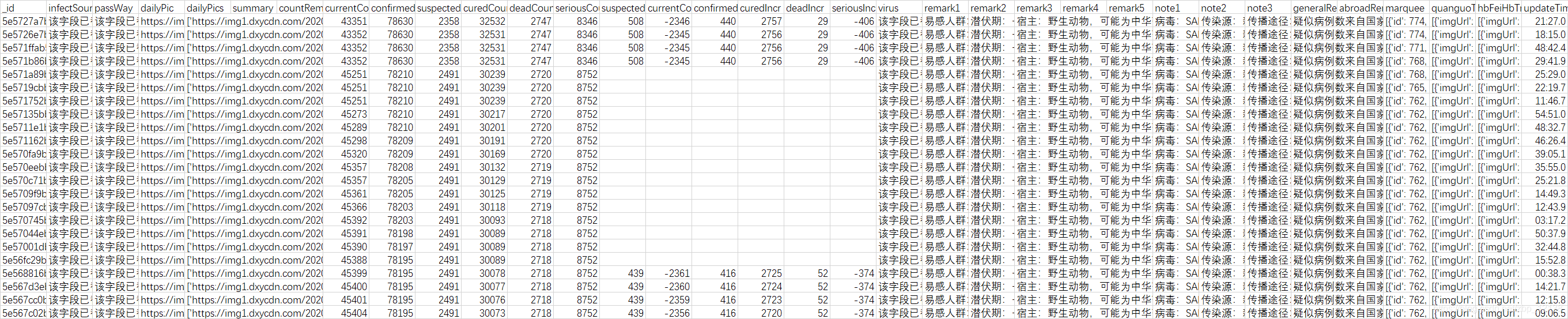
我们根据需要,选几个就好了,这里我选择了:
- confirmedCount 累计感染人数
- suspectedCount 疑似感染人数
- curedCount 治愈人数
- deadCount 死亡人数
- updateTime 更新时间
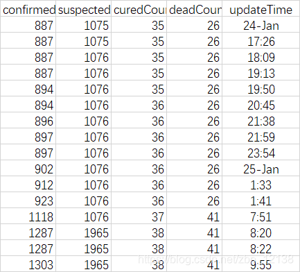
另外,这里我做了倒序处理,时间的格式我也做了调整,到这一步,数据就算是处理好了。
接下来是从这里面提取数据:
confirmedCount = []
suspectedCount = []
curedCount = []
deadCount = []
updateTime = []
在提取之前先定义5个空列表分别存放数据
	with open(r'F:\csdn\新冠病毒动画曲线\data1.csv','r') as csvfile:
        plots = csv.reader(csvfile, delimiter=',')
        next(plots) #从第二行开始读取
        for row in plots:
            confirmedCount.append(int(row[0]))
            suspectedCount.append(int(row[1]))
            curedCount.append(int(row[2]))
            deadCount.append(int(row[3]))
            updateTime.append(row[4])
提取出来之后,我们输出一下:
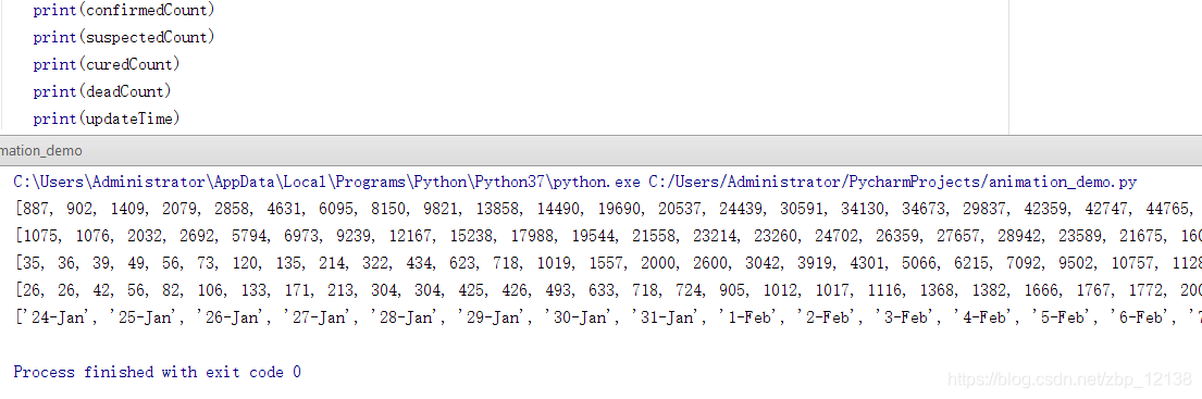
这样看来,数据提取出来的格式都没问题,接下来就是绘图,之前我们讲过了绘制静态图的方法:数据可视化之新型冠状病毒肺炎疫情地图(python+MySQL)
今天我们来学一学怎么绘制动画的折线图,原理非常简单,就是将数据放入数组,然后每次往数组里面增加一个数,清除之前的图,重新画出图像
而python可视化库matplotlib的显示模式默认为阻塞(block)模式,即在plt.show()之后,程序会暂停到那儿,并不会继续执行下去。如果需要继续执行程序,就要关闭图片
因此,我们就要使用plt.ion()这个函数,使matplotlib的显示模式转换为交互(interactive)模式
在交互模式中,如果没有使用ioff()关闭的话,则图像会一闪而过,并不会常留,因此,我们要给他个延迟关闭的效果:
plt.pause(2) #暂停2s
2秒后程序又会进入下一个循环,因此窗口得以保留,但循环结束以后,窗口还是会自动关闭,要想防止这种情况,需要在plt.show()之前加上ioff()命令:
plt.ioff()
plt.show()
下面是初始化:
fig = plt.figure()
ax1 = fig.add_subplot(1,1,1)
add_subplot(1,1,1)中有三个参数,参数1和2分别代表子图的行数和列数,参数3代表子图的个数,这里我们生成一个子图就好了
下面我们设置一下横纵坐标轴的标签,以及标题和图例:
plt.xlabel('Date') #横坐标
plt.ylabel('count') #纵坐标
plt.title('COVID-19 statistical data from China') #标题
ax1.legend() #图例
看一下最终的函数:
def draw():
    with open(r'F:\csdn\新冠病毒动画曲线\data1.csv','r') as csvfile:
        plots = csv.reader(csvfile, delimiter=',')
        next(plots) #从第二行开始读取
        for row in plots:
            confirmedCount.append(int(row[0]))
            suspectedCount.append(int(row[1]))
            curedCount.append(int(row[2]))
            deadCount.append(int(row[3]))
            updateTime.append(row[4])
        # print(confirmedCount)
        # print(suspectedCount)
        # print(curedCount)
        # print(deadCount)
        # print(updateTime)
            ax1.clear()
            ax1.plot(updateTime,confirmedCount, label='confirmedCount',color="black")
            ax1.plot(updateTime,suspectedCount, label='suspectedCount',color="yellow")
            ax1.plot(updateTime,curedCount, label='curedCount',color="green")
            ax1.plot(updateTime,deadCount, label='deadCount',color="red")
            plt.xlabel('Date')
            plt.ylabel('count')
            plt.title('COVID-19 statistical data from China')
            ax1.legend()
            plt.pause(0.1)
        plt.ioff()
        plt.show()

draw()
当然,这样的写法不是最优的,我们稍微改写一下:
import matplotlib.pyplot as plt
import csv

class DRAW_nCoV(object):
    def __init__(self):
        self.confirmedCount = []
        self.suspectedCount = []
        self.curedCount = []
        self.deadCount = []
        self.updateTime = []

    def draw(self):
        fig = plt.figure()
        #creating a subplot
        ax1 = fig.add_subplot(1,1,1)
        plt.ion()
        with open(r'F:\csdn\新冠病毒动画曲线\data1.csv','r') as csvfile:
            plots = csv.reader(csvfile, delimiter=',')
            next(plots) #从第二行开始读取
            for row in plots:
                self.confirmedCount.append(int(row[0]))
                self.suspectedCount.append(int(row[1]))
                self.curedCount.append(int(row[2]))
                self.deadCount.append(int(row[3]))
                self.updateTime.append(row[4])
                ax1.clear()
                ax1.plot(self.updateTime,self.confirmedCount, label='confirmedCount',color="black")
                ax1.plot(self.updateTime,self.suspectedCount, label='suspectedCount',color="yellow")
                ax1.plot(self.updateTime,self.curedCount, label='curedCount',color="green")
                ax1.plot(self.updateTime,self.deadCount, label='deadCount',color="red")
                plt.xlabel('Date')
                plt.ylabel('count')
                plt.title('COVID-19 statistical data from China')
                ax1.legend()
                plt.pause(0.1)
            plt.ioff()
            plt.show()

def main():
    draw_nCoV = DRAW_nCoV()
    draw_nCoV.draw()

if __name__ == '__main__':
    main()
最后,大家对于此次疫情,有什么想说的呢?无论是疫情之后想做的事,还是有什么心里话,都可以告诉我们噢!工作人员会从中抽取优秀回答送上精美礼品!
参与方法:
关注公众号"情感卫生间"后,直接回复内容即可,公众号接有智能对话机器人,欢迎大家跟"小柒"交流哦!