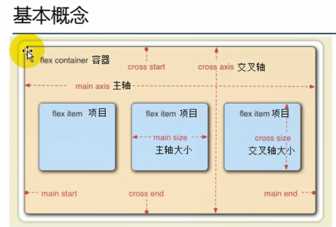
1.容器:如果你给一个元素添加display:flex, 称为这是一个容器
2.项目:容器里面的直接子元素称为项目
3.主轴:在容器当中,项目(多个)按一定的方向进行排列的,默认是按从左到右的方向进行排列,这里的排列方向就是主轴的方向
4.交叉轴:与主轴垂直的轴就是交叉轴,默认是从上到下的方向
伸缩容器的属性
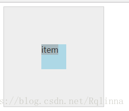
例1:元素自适应水平居中
display: flex | inline-flex
块级伸缩容器 行内级伸缩容器
<!doctype html>
<html lang="en">
<head>
    <meta charset="UTF-8">
    <meta name="viewport"
          content="width=device-width, user-scalable=no, initial-scale=1.0, maximum-scale=1.0, minimum-scale=1.0">
    <meta http-equiv="X-UA-Compatible" content="ie=edge">
    <title>Document</title>
</head>
<style>
    .container{
        width:200px;
        height:200px;
        background-color: #eee;
        border:1px solid  #ccc;
        display: flex;
    }
    .item{
        width:50px;
        height:50px;
        background-color: lightblue;
        margin:auto;
    }
</style>
<body>
<div  class="container">
    <div class="item">item</div>
</div>

</body>
结果如下图所示:
补充:
1.把容器这样设置display:flex 以后,会将直接子元素的display:改为block,对于嵌套的子元素不产生影响
2.把容器这样设置display:flex,解决margin重叠的影响
3.把容器这样设置display:flex,解决浮动的影响,浮动不会起作用
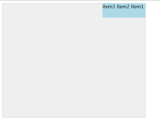
2.flex-direction
指定主轴的方向( 项目的排列方向) flex-direction: row | row-reverse | column | column-reverse 默认为row ,从左往右
例2:
<!doctype html>
<html lang="en">
<head>
    <meta charset="UTF-8">
    <meta name="viewport"
          content="width=device-width, user-scalable=no, initial-scale=1.0, maximum-scale=1.0, minimum-scale=1.0">
    <meta http-equiv="X-UA-Compatible" content="ie=edge">
    <title>Document</title>
</head>
<style>
    .container{
        width:500px;
        height:400px;
        background-color: #eee;
        border:1px solid  #ccc;
        display: flex;
        flex-direction: row-reverse;
    }
    .item{
        width:50px;
        height:50px;
        background-color: lightblue;
    }
</style>
<body>
<div  class="container">
    <div class="item">item1</div>
    <div  class="item">item2</div>
    <div  class="item">item3</div>
</div>

</body>
</html>
结果如下图所示:
3.flex-wrap
伸缩容器在主轴线方向空间不足的情况下,是否换行以及如何换行 默认不换行,会去压缩每个项目的宽度
flex-wrap: nowrap | wrap | wrap-reverse
例:
<!doctype html>
<html lang="en">
<head>
    <meta charset="UTF-8">
    <meta name="viewport"
          content="width=device-width, user-scalable=no, initial-scale=1.0, maximum-scale=1.0, minimum-scale=1.0">
    <meta http-equiv="X-UA-Compatible" content="ie=edge">
    <title>Document</title>
</head>
<style>
    .container{
        padding-top: 20px;
        width:500px;
        height:400px;
        background-color: #eee;
        border:1px solid  #ccc;
        display: flex;
        flex-direction: row;
        flex-wrap:wrap;
    }
    .item{
        width:200px;
        height:50px;
        background-color: lightblue;
    }
</style>
<body>
<div  class="container">
    <div class="item">item1</div>
    <div  class="item">item2</div>
    <div  class="item">item3</div>
    <div  class="item">item4</div>
</div>

</body>
</html>
结果:
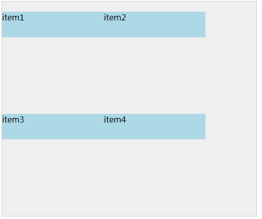
补充:换行及换行的方向是与主轴的方向相关的,必须首先知道主轴的方向是什么方向
4.flex-flow
是flex-direction和flex-wrap的缩写版本,它同时定义了伸缩容器的主轴和侧轴,其默认值为row nowrap
5.justify-content
用来定义伸缩项目在主轴线上的对齐方式,这个属性决定了项目与项目之间的位置关系 ,(在主轴上有富余的空间即项目的总宽度小于容器的宽度,处理富余空间的方法,
)
语法为:
justify-content: flex-start | flex-end | center | space-between | space-around
space-around: 容器很大,项目不足以填充整个容器,所以会有一部分空白空间,让项目之间有相等的空间进行环绕
space-between: 项目与项目之间的宽度是相等的,类似于两端对齐的效果
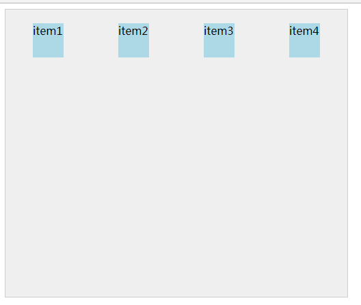
例5:
<!doctype html>
<html lang="en">
<head>
    <meta charset="UTF-8">
    <meta name="viewport"
          content="width=device-width, user-scalable=no, initial-scale=1.0, maximum-scale=1.0, minimum-scale=1.0">
    <meta http-equiv="X-UA-Compatible" content="ie=edge">
    <title>Document</title>
</head>
<style>
    .container{
        padding-top: 20px;
        width:500px;
        height:400px;
        background-color: #eee;
        border:1px solid  #ccc;
        display: flex;
        flex-flow: row wrap;
        justify-content: space-around;
    }
    .item{
        width:45px;
        height:50px;
        background-color: lightblue;
    }
</style>
<body>
<div  class="container">
    <div class="item">item1</div>
    <div  class="item">item2</div>
    <div  class="item">item3</div>
    <div  class="item">item4</div>
</div>

</body>
</html>
结果如下图:
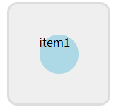
6.align-items
用来定义伸缩项目在交叉轴上的对齐方式,语法为;
align-items: flex-start | flex-end | center | baseline | stretch
例6:
<!doctype html>
<html lang="en">
<head>
    <meta charset="UTF-8">
    <meta name="viewport"
          content="width=device-width, user-scalable=no, initial-scale=1.0, maximum-scale=1.0, minimum-scale=1.0">
    <meta http-equiv="X-UA-Compatible" content="ie=edge">
    <title>Document</title>
</head>
<style>
    .container{
        padding: 10px;
        width:120px;
        height:120px;
        background-color: #eee;
        border:3px solid  #ddd;
        border-radius: 10%;
        margin: 5px;
        display: flex;
        flex-flow: row wrap;
        justify-content: space-around;
    }
    .one{
         /*水平居中*/
        justify-content: center;
         /*垂直居中*/
        align-items: center;
    }
    .item{
        width:55px;
        height:55px;
        background: lightblue;
        border-radius: 50px;
    }
</style>
<body>
<div  class="container one">
    <div class="item">item1</div>
</div>

</body>
</html>
7.align-content
用来调整伸缩项目出现换行后在交叉轴上的对齐方式,语法为:
align-content: flex-start | flex-end | center | space-between | space-around | stretch
伸缩项目的属性
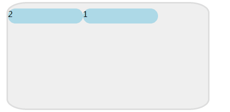
1.order
容器中有多个项目,项目的默认摆放是沿主轴方向,按文档中dom元素的书写排列顺序进行排列的。order属性用于修改排列顺序。数值越小,排列越靠前。默认为0,,可以为负数。
语法为:order: 整数值
<!doctype html>
<html lang="en">
<head>
    <meta charset="UTF-8">
    <meta name="viewport"
          content="width=device-width, user-scalable=no, initial-scale=1.0, maximum-scale=1.0, minimum-scale=1.0">
    <meta http-equiv="X-UA-Compatible" content="ie=edge">
    <title>Document</title>
</head>
<style>
    .container{
        padding-top: 10px;
        width:500px;
        height:400px;
        background-color: #eee;
        border:3px solid  #ddd;
        border-radius: 10%;
        margin: 5px;
        display: flex;
        flex-flow: row wrap;
    }
    .item {
        width: 150px;
        height: 30px;
        background: lightblue;
        border-radius: 50px;
    }
    .item1{
        order:1
    }
    .item2{
        oeder:0
    }
</style>
<body>
<div  class="container ">
    <div class="item item1">1</div>
    <div class="item item2">2</div>


</div>
</body>
</html>
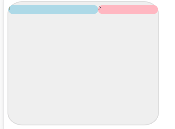
2.flex-grow
定义伸缩项目的放大比例,默认值为零,即表示如果存在剩余空间,也不放大
使用前提:主轴上面有多余的空间可以让项目去伸展
语法为: flex-grow : 整数值
<!doctype html>
<html lang="en">
<head>
    <meta charset="UTF-8">
    <meta name="viewport"
          content="width=device-width, user-scalable=no, initial-scale=1.0, maximum-scale=1.0, minimum-scale=1.0">
    <meta http-equiv="X-UA-Compatible" content="ie=edge">
    <title>Document</title>
</head>
<style>
    .container{
        padding-top: 10px;
        width:500px;
        height:400px;
        background-color: #eee;
        border:3px solid  #ddd;
        border-radius: 10%;
        margin: 5px;
        display: flex;
        flex-flow: row wrap;
    }
    .item {
        width: 150px;
        height: 30px;
        border-radius: 50px;
    }
    .item1{
        width: 100px;
        background-color: lightblue;
        flex-grow: 1;
    }
    .item2{
        width:200px;
        background-color: lightpink;
    }
</style>
<body>
<!--<pre>
    (1)统计多余的空间:M=容器的高度-所有项目宽度之和
    M=500-100-200=200px;
    (2)确定均分的分数:N=项目flex-grow的值之和
    N=1+0=1;
    (3)计算单位空间:P=M/N
     P=200px/1=200px
    (4)项目放大以后的宽度:R=宽度+P*当前flex-growp值
    item1: 100-200*1=300;
    item2: 100+200*0=100;</pre>-->

<div  class="container ">
    <div class="item item1">1</div>
    <div class="item item2">2</div>
</div>
</body>
</html>
3.flex-shrink
定义伸缩项目的伸缩能力,默认值为1(当容器主轴方向上不能容下全部的项目,并且也不允许换行,由于flex-shrink的值为1,所有的项目都会被压缩)
使用前提:主轴方向上的空间不够,项目被压缩
其语法为: flex-shrink : 整数值
4.flex-basis
项目在主轴上占据的大小,用来设定主轴方向上的大小
其语法为:flex-basis: length | auto ,默认值为auto
5.flex
flex是flex-flow flex-shrink flex-basis这三个属性的缩写,其语法为:
flex:none | flex-grow flex-shrink flex-basis ,其中第二个和第三个参数为可选参数,默认值为0 1 auto
6.align-self
用来设置单独伸缩项目在交叉轴上的对齐方式,会覆盖容器的align-item属性,其语法为
align-self : auto | flex-start | flex-end | center | baseline | stretch
伸缩项目在交叉轴方向占满伸缩容器,如果交叉轴为垂直方向的话,只有在不设置高度的情况下才能看到效果
<!doctype html>
<html lang="en">
<head>
    <meta charset="UTF-8">
    <meta name="viewport"
          content="width=device-width, user-scalable=no, initial-scale=1.0, maximum-scale=1.0, minimum-scale=1.0">
    <meta http-equiv="X-UA-Compatible" content="ie=edge">
    <title>Document</title>
</head>
<style>
    .container{
        padding: 10px;
        width:120px;
        height:120px;
        background-color: #eee;
        border:3px solid  #ddd;
        border-radius: 10%;
        margin: 5px;
        display: flex;
        flex-flow: column wrap;
        justify-content: space-around;
    }
    .item {
        width: 30px;
        height: 30px;
        background: lightblue;
        border-radius: 50px;
        align-items: center;
    }
    .three{
        flex-direction: column;
        justify-content: space-around;
        align-items: center;
    }
    .three div:first-child{
        align-self: flex-start;
    }

    .three div:last-child{
        align-self: flex-end;
    }
</style>
<body>
<div  class="container three">
    <div class="item"></div>
    <div class="item"></div>
    <div class="item"></div>

</div>
</body>
</html>
在React Native中使用flexbox
RN目前主要支持flexbox的6个属性
1.flexDirection键
取值可以是row,column, row-reverse,column-reverse,则不支持,View的样式里面没有定义flexDirection,取默认值column
2.flexWrap键
默认值nowrap,表示不会自动换行(或者换列),子组件按照flexDirection键决定的方向一直排列下去
3.justifyContent键
用来定义一个方向上如何排列子组件
4.aliginIterms键
用来定义View组件中所有子组件的对齐
flex-start:顶部对齐 flex-end:底部对齐 center: 中部对齐 stretch:拉长对齐
5.flex键
flex键的类型是数值,取值为0或者1,默认值是0。当它的值为1时,子组件将自动缩放以适应父组件剩下的留白空间。
6.aliginSelf键
alignSelf键有5种可能的字符串类:auto,flex-start,flex-end,center,stretch.其用途是让组件忽略它的父组件样式中alignItems键中的取值,而对该组件使用alignSelf键对应的规则。当它取值为auto时,表示使用父组件的alignIterms值,其他4个值得含义与alignItems相同。