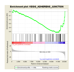
上图大家都不陌生,GSEA分析出来的一个结果图。这里想像大家介绍的不是这个图是什么意思,而是这个图换一种形式展示!
#安装R包
library(plyr)
library(ggplot2)
library(grid)
library(gridExtra)
#设置工作目录
setwd(“C:\Users\lexb4\Desktop\singleGene\21.multipleGSEA”)
#获取目录下的所有xls文件
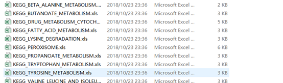
files=grep(".xls",dir(),value=T)
#读取每个文件
data = lapply(files,read.delim)
names(data) = files
该目录下的所有文件
以其中一个文件为例

dataSet = ldply(data, data.frame)
#将文件后缀删掉
dataSet
.id)
gseaCol=c("#58CDD9","#7A142C","#5D90BA","#431A3D","#91612D","#6E568C","#E0367A","#D8D155","#64495D","#7CC767","#223D6C","#D20A13","#FFD121","#088247","#11AA4D")
pGsea=ggplot(dataSet,aes(x=RANK.IN.GENE.LIST,y=RUNNING.ES,colour=pathway,group=pathway))+
geom_line(size = 1.5) + scale_color_manual(values = gseaCol[1:nrow(dataSet)]) +
labs(x = “”, y = “Enrichment Score”, title = “”) + scale_x_continuous(expand = c(0, 0)) +
scale_y_continuous(expand = c(0, 0),limits = c(min(dataSet
RUNNING.ES + 0.02))) +
theme_bw() + theme(panel.grid = element_blank()) + theme(panel.border = element_blank()) + theme(axis.line = element_line(colour = “black”)) + theme(axis.line.x = element_blank(),axis.ticks.x = element_blank(),axis.text.x = element_blank()) +
geom_hline(yintercept = 0) + theme(legend.position = c(0,0),legend.justification = c(0,0)) + #legend注释的位值
guides(colour = guide_legend(title = NULL)) + theme(legend.background = element_blank()) + theme(legend.key = element_blank())+theme(legend.key.size=unit(0.8,‘cm’))
pGene=ggplot(dataSet,aes(RANK.IN.GENE.LIST,pathway,colour=pathway))+geom_tile()+
scale_color_manual(values = gseaCol[1:nrow(dataSet)]) +
labs(x = “high expression<----------->low expression”, y = “”, title = “”) +
scale_x_discrete(expand = c(0, 0)) + scale_y_discrete(expand = c(0, 0)) +
theme_bw() + theme(panel.grid = element_blank()) + theme(panel.border = element_blank()) + theme(axis.line = element_line(colour = “black”))+
theme(axis.line.y = element_blank(),axis.ticks.y = element_blank(),axis.text.y = element_blank())+ guides(color=FALSE)
gGsea = ggplot_gtable(ggplot_build(pGsea))
gGene = ggplot_gtable(ggplot_build(pGene))
maxWidth = grid::unit.pmax(gGsea
widths)
gGsea
widths = as.list(maxWidth)
dev.off()
#将图形可视化,保存在"multipleGSEA.pdf"
pdf(‘multipleGSEA.pdf’, #输出图片的文件
width=7, #设置输出图片高度
height=5.5) #设置输出图片高度
par(mar=c(5,5,2,5))
grid.arrange(arrangeGrob(gGsea,gGene,nrow=2,heights=c(.8,.3)))
dev.off()
如何去解释上图呢?
不同的颜色代表不同的通路,纵轴是每个基因对应的ES,而横轴代表gene。如果该基因在该通路上富集,则在图中出现。如果不在通路上富集则表现为空。这里我不进行详细的解释,如果有不明白的,可以直接留言。

