方法一:使用flex
效果如图所示:
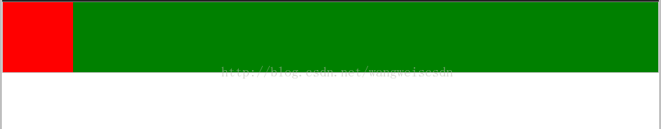
<div class="box">
  <div class="left"></div>
  <div class="right"></div>
</div>
*{
margin:0;
padding:0;
}
.box {
/* width: 400px; */
height: 100px;
display: flex;
flex-direction: row;
align-items: center;
border: 1px solid #c3c3c3;
}
.left {
flex-basis:100px;
-webkit-flex-basis: 100px;
/* Safari 6.1+ */
background-color: red;
height: 100%;
}
.right {
background-color: green;
flex-grow: 1;
height: 100%;
}方法二:浮动布局
效果如图所示:

<div id="left">Left</div>
<div id="right">Right</div>
* {
margin: 0;
padding: 0;
}
#left {
float: left;
width: 100px;
height:100px;
background-color: green;
text-align:center;
line-height:100px;
color:#fff;
}
#right {
background-color: orange;
margin-left: 100px;
text-align:center;
height:100px;
line-height:100px;
}