使用pandas和matplotlib分析kaggle上的 COVID-19数据集粗略分析对各年龄的影响。
数据集地址:https://www.kaggle.com/sudalairajkumar/novel-corona-virus-2019-dataset
COVID-19实时信息统计:https://www.arcgis.com/apps/opsdashboard/index.html#/bda7594740fd40299423467b48e9ecf6
第一步读取数据:
import pandas as pd
import numpy as np
import matplotlib.pyplot as plt
data = pd.read_csv(r'C:/Users/34123/Downloads/novel-corona-virus-2019-dataset-03-15/COVID19_open_line_list.csv')
删除不需要的数据列
data.drop(['Unnamed: '+str(x) for x in range(33,45)],axis=1,inplace=True)
data.head()
查看列名
Index(['ID', 'age', 'sex', 'city', 'province', 'country',
       'wuhan(0)_not_wuhan(1)', 'latitude', 'longitude', 'geo_resolution',
       'date_onset_symptoms', 'date_admission_hospital', 'date_confirmation',
       'symptoms', 'lives_in_Wuhan', 'travel_history_dates',
       'travel_history_location', 'reported_market_exposure',
       'additional_information', 'chronic_disease_binary', 'chronic_disease',
       'source', 'sequence_available', 'outcome', 'date_death_or_discharge',
       'notes_for_discussion', 'location', 'admin3', 'admin2', 'admin1',
       'country_new', 'admin_id', 'data_moderator_initials', 'Unnamed: 33',
       'Unnamed: 34', 'Unnamed: 35', 'Unnamed: 36', 'Unnamed: 37',
       'Unnamed: 38', 'Unnamed: 39', 'Unnamed: 40', 'Unnamed: 41',
       'Unnamed: 42', 'Unnamed: 43', 'Unnamed: 44'],
      dtype='object')
#表中outcome列标记了病人的状态,选出此列进行分析
# 对于一维数组或者列表,unique函数去除其中重复的元素,
# 并按元素由大到小返回一个新的无元素重复的元组或者列表。
# 查看outcome列去重后的数据信息
data['outcome'].unique()
以上操作返回:
array([nan, 'discharged', 'discharge', 'died', 'Discharged', '05.02.2020',
       'death',
       'Symptoms only improved with cough. Currently hospitalized for follow-up.',
       'recovered', 'stable',
       'critical condition, intubated as of 14.02.2020',
       'treated in an intensive care unit (14.02.2020)', 'severe'],
      dtype=object)
清理无关数据,并汇总死亡,出院,恢复这三类数据
def clean(x):
    if x == 'death' or x == 'died' or x == 'Death':
        return 'death'
    elif x == 'discharged' or x=='discharge':
        return 'discharge'
    elif x == 'recovered' or x=='stable':
        return 'recovered'
    else:
        return np.nan
确保年龄age列的数据为整数
def apply_int(x):
    try:
        y = int(x)
        return y
    except:
        # np.nan不是一个“空”对象,用 i is None判断是False
        return np.nan
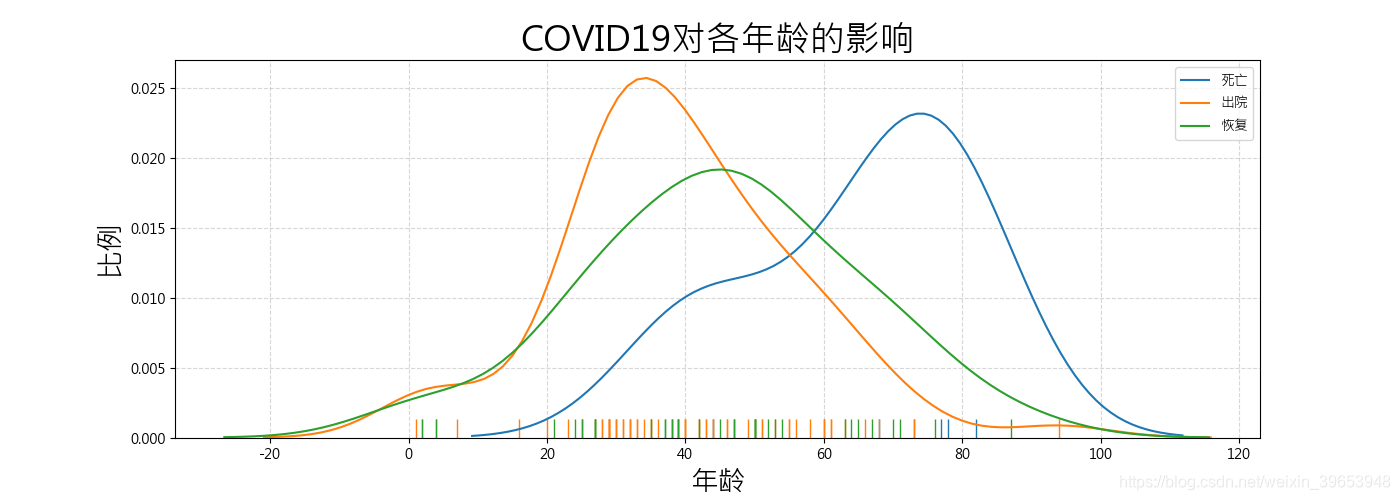
展示对年龄的影响
#设置中文显示
plt.rcParams['font.sans-serif'] = ['Microsoft JhengHei']
plt.rcParams['axes.unicode_minus'] =False

import seaborn as sns
'''
seaborn.distplot()方法说明:
seaborn.distplot(a, bins=None, hist=True, kde=True, rug=False, fit=None, hist_kws=None, kde_kws=None, rug_kws=None, fit_kws=None, color=None, vertical=False, norm_hist=False, axlabel=None, label=None, ax=None)
    hist:布尔值,可选参数。是否绘制(标准化)直方图。
    kde:布尔值,可选参数。是否绘制高斯核密度估计图。
    rug:布尔值,可选参数。是否在横轴上绘制观测值竖线。
    label:字符串,可选参数。图形相关组成部分的图例标签。
其他参数,具体请参考官方文档:https://www.cntofu.com/book/172/docs/24.md
'''
plt.figure(figsize=(14,5), dpi=100)
sns.distplot(data[data['outcome'].apply(clean)=='death']['age'].apply(apply_int),hist=False,rug=True,label='死亡')
sns.distplot(data[data['outcome'].apply(clean)=='discharge']['age'].apply(apply_int),hist=False,rug=True,label='出院')
sns.distplot(data[data['outcome'].apply(clean)=='recovered']['age'].apply(apply_int),hist=False,rug=True,label='恢复')

plt.xlabel('年龄',size=20)
plt.ylabel('比例',size=20)
plt.title('COVID19对各年龄的影响',size=25)
plt.grid(linestyle='--',alpha=0.5)
plt.legend()

plt.savefig('COVID19-01.png')
plt.show()
箱型图:
扫描二维码关注公众号,回复:
10181631 查看本文章

# 箱型图
df1 = pd.DataFrame(data[data['outcome'].apply(clean)=='death']['age'].apply(apply_int)).assign(outcome='death')
df3 = pd.DataFrame(data[data['outcome'].apply(clean)=='discharge']['age'].apply(apply_int)).assign(outcome='discharge')
df2 = pd.DataFrame(data[data['outcome'].apply(clean)=='recovered']['age'].apply(apply_int)).assign(outcome='recovered')
cdf = pd.concat([df1, df2, df3])
plt.figure(figsize=(10,10),dpi=100)
sns.boxplot(x="outcome", y="age", data=cdf)  # RUN PLOT

plt.xlabel('感染者状态',size=20)
plt.ylabel('年龄',size=20)
plt.title('箱型图:COVID19对各年龄的影响',size=25)

plt.grid(linestyle='--',alpha=0.5)

plt.savefig('COVID19-02.png')
plt.show()
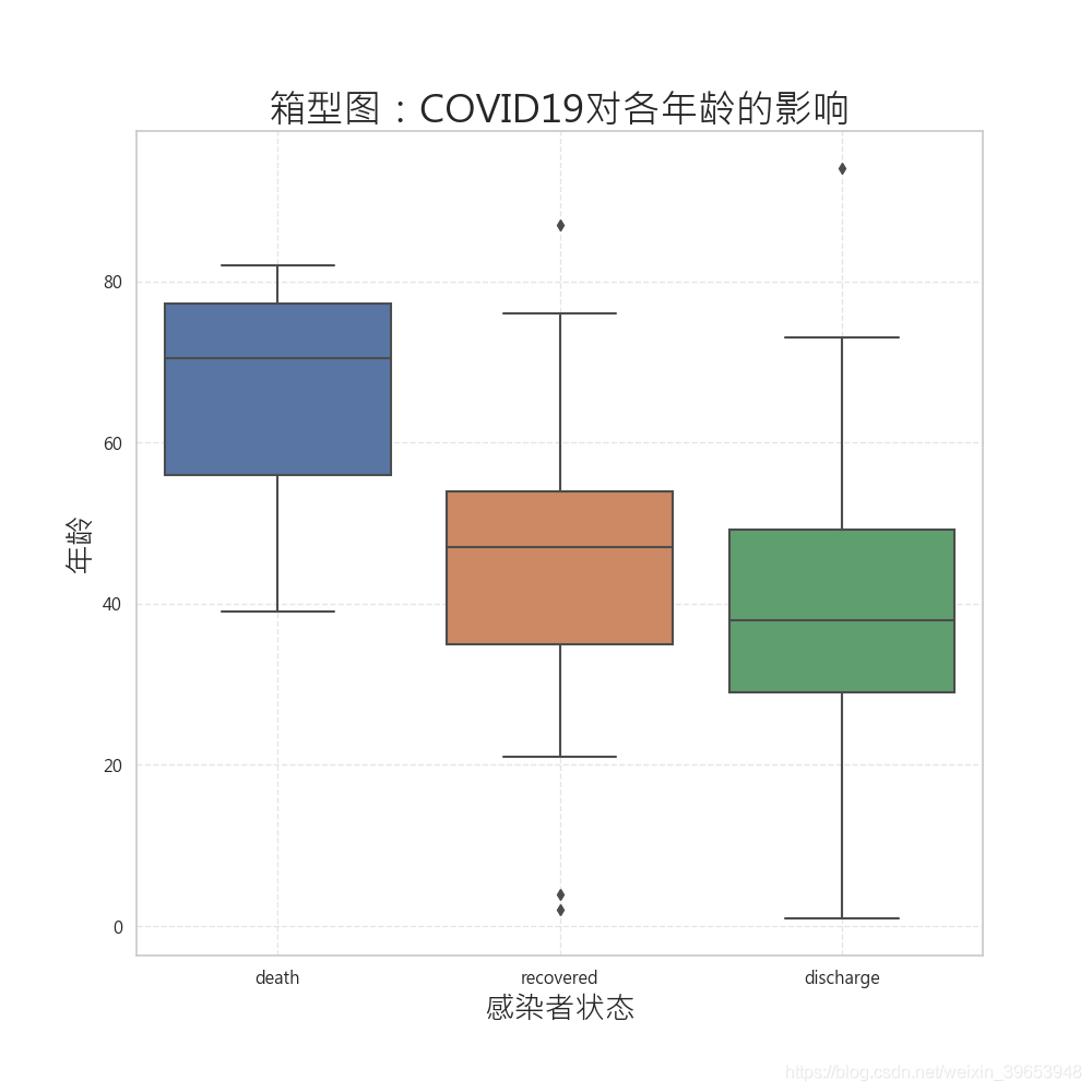
平均出院年龄
data[data['outcome'].apply(clean)=='discharge']['age'].apply(apply_int) .mean()
平均康复年龄
data[data['outcome'].apply(clean)=='recovered']['age'].apply(apply_int) .mean()
平均死亡年龄
data[data['outcome'].apply(clean)=='death']['age'].apply(apply_int) .mean()
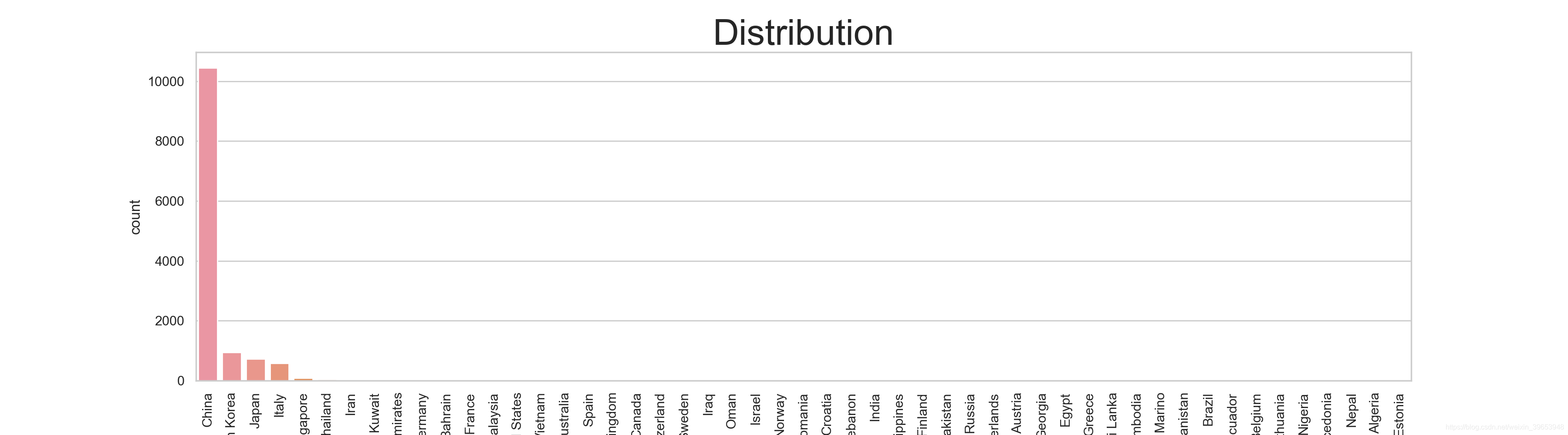
数据集中患者国籍分布
fig = plt.figure(figsize=(18,5),dpi=200)
sns.set_style('whitegrid')
sns.countplot(data['country'],order=data['country'].value_counts().index)
plt.xticks(rotation=90)
plt.title('Distribution',size=30)

plt.savefig('COVID19-03.png')
plt.show()
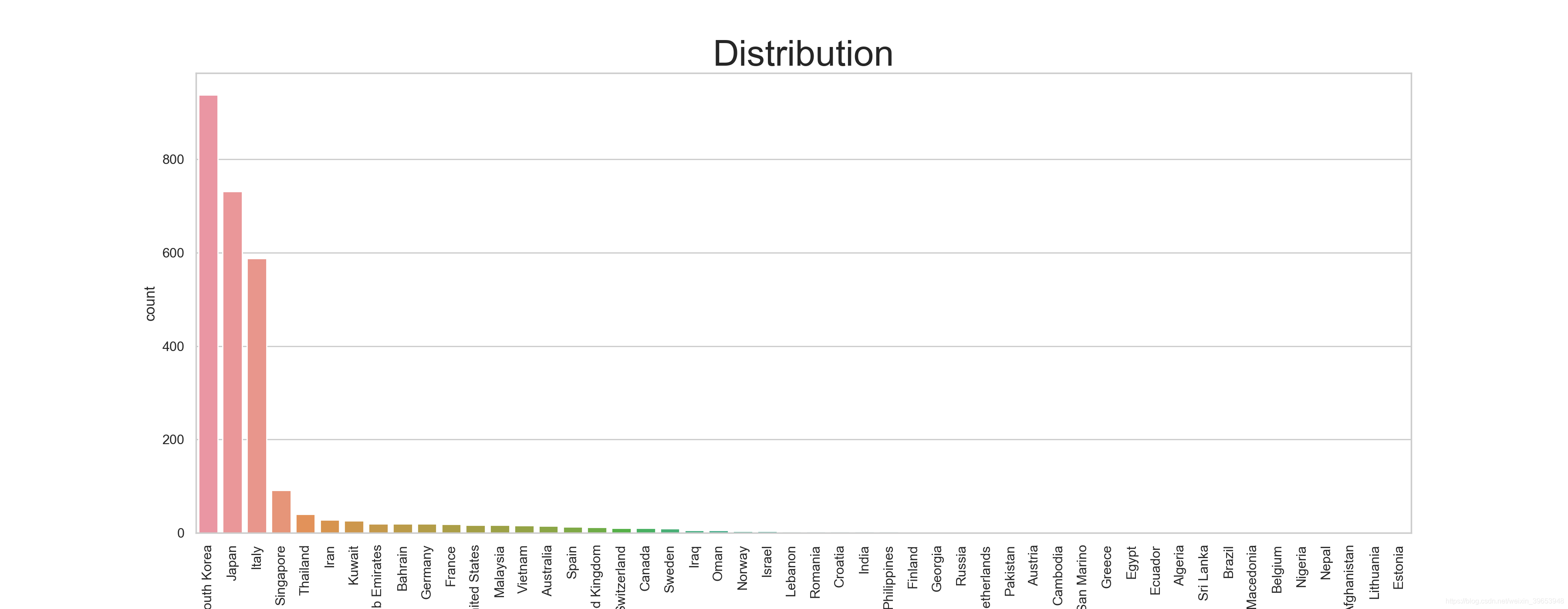
除中国外的患者分布
fig = plt.figure(figsize=(18,7),dpi=200)
sns.set_style('whitegrid')
sns.countplot(data[data['country'] != 'China']['country'],order=data[data['country'] != 'China']['country'].value_counts().index)

plt.title('Distribution',size=30)
plt.xticks(rotation=90)
plt.savefig('COVID19-04.png')

plt.show()
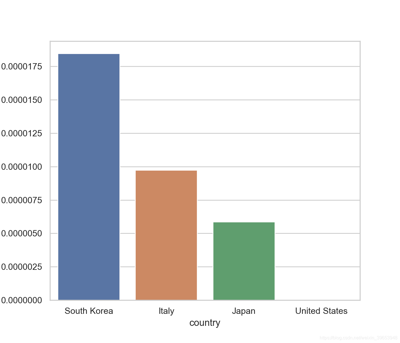
感染人数与国土面积之比
plt.figure(figsize=(7,6),dpi=200)
sns.barplot(x=['South Korea','Italy','Japan','United States'],

y=[938/50_800_000,588/60_430_000,731/124_800_000,17/327_170_000])
plt.ylabel("% of population infected")
plt.xlabel("country")
plt.savefig('COVID19-05.png')
plt.show()
参考:https://towardsdatascience.com/see-the-coronavirus-for-yourself-88ce06b88f5e
