最近因工作原因,使用python的绘图功能,绘制生产的直通率数据,贴上代码,便于以后需要时摘用
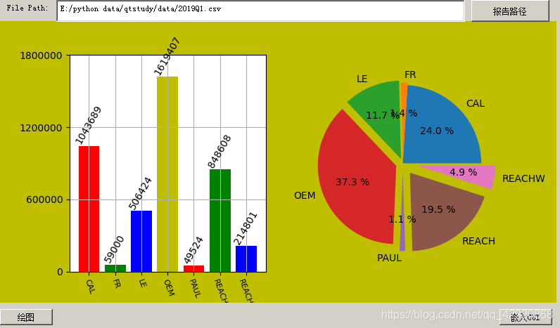
1.选择报表所在路径:
def ReportLocationpushButtonClick(self):
global ReportFileName
ReportFileName, ok = QFileDialog.getOpenFileName(self, “open file”, “./”, “csv file (*.csv .)”) # “/“代表当前目录的根目录
self.ReportLocationtextEdit.setText(str(ReportFileName))
ReportFileName = ReportFileName.replace(”\r”, r"\r").replace(’\n’, r’\n’)#防止转义
2.读取报表中的关键信息并绘制柱形图
def pBar(self):
data = pd.read_excel(ReportFileName, names=[‘model’, ‘PO’,“Retest”])
df1 = data.groupby(‘model’)[‘PO’].sum().to_frame().reset_index()
self.graph.axes.set_ylim(0, 1800000)
self.graph.axes.set_yticks([0,600000,1200000,1800000])
rects = self.graph.axes.bar(range(len(df1.model)), df1.PO, color=‘rgby’)
self.graph.axes.set_xticks(np.arange(len(df1.model)))
self.graph.axes.set_xticklabels(df1.model,rotation=-70,fontsize=8)
self.graph.axes.grid(True)
for rect in rects:
height = rect.get_height()
self.graph.axes.text(rect.get_x() + rect.get_width() / 2, height, str(height), ha=‘center’, va=‘bottom’, fontsize=10,
rotation=60)
3.读取报表信息并绘制饼形图
def pPie(self):
data = pd.read_excel(ReportFileName, names=[‘model’, ‘PO’, “Retest”])
df1 = data.groupby(‘model’)[‘PO’].sum().to_frame().reset_index()
explode = [x * 0.03 for x in range(len(df1.PO))]
self.graph.axes1.pie(df1.PO, explode, df1.model, autopct=’%3.1f %%’, labeldistance=1.1)
4.调用自定义绘制函数并显示在窗体中
def pushButton_MatplotlibClick(self):
self.graph = MyFigure(12,6)
self.pBar()
self.pPie()
self.widget_Matplotlib.addWidget(self.graph, 0, 0)
5.自定义MyFigure类
class MyFigure(FigureCanvas):
def init(self,width=12, height=6):
self.fig = Figure(figsize=(width, height),facecolor= ‘y’)#第一步:创建一个Figure
super(MyFigure,self).init(self.fig) #此句必不可少,否则不能显示图形
#self.axes = self.fig.add_subplot(211)#纵向显示两个图形
#self.axes1=self.fig.add_subplot(212)
self.axes = self.fig.add_subplot(121)#向显示两个图形
self.axes1=self.fig.add_subplot(122)
6.按钮链接
self.pushButton_Matplotlib.clicked.connect(self.pushButton_MatplotlibClick)
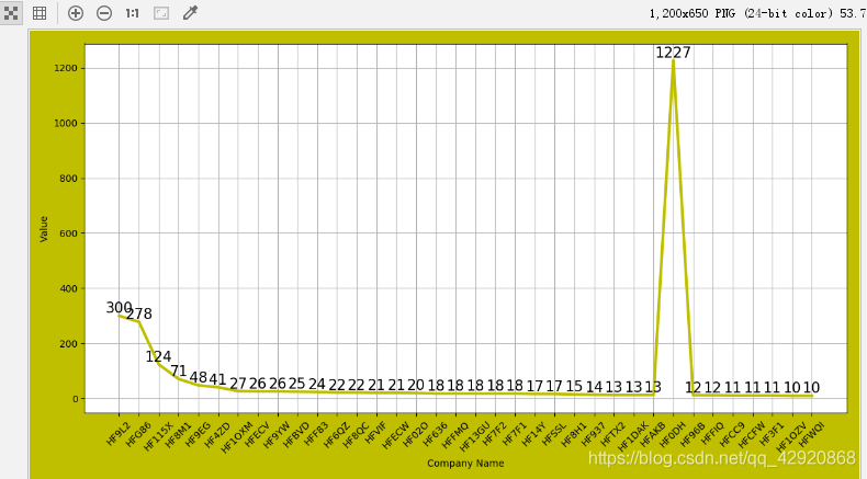
曲线图
import matplotlib.pyplot as plt
import math
import numpy as np
import pandas as pd
da
ta = pd.read_excel(r’./data/fund_data_matplotlib.csv’, names=[‘name’, ‘ID’, ‘Value’])
data.Value1=(data.Value.astype(np.int))
plt.figure(figsize=(12, 6.5),facecolor= ‘y’)#画布大小
plt.xticks(rotation=45)
plt.ylabel(“Value”) #X轴标签
plt.xlabel(“Company Name”) #X轴标签
plt.plot(data.ID, data.Value1, color=‘y’, linewidth=3)
for x, y in zip(data.ID,data.Value1):
plt.text(x, y, str(y), ha=‘center’, va=‘bottom’, fontsize=15 )
plt.savefig(‘aa.png’)
plt.grid()
plt.show()
python中绘制柱形图、饼形图等

猜你喜欢
转载自blog.csdn.net/qq_42920868/article/details/89487982
今日推荐
周排行