[Thinking]
A good-looking interface has supported the principles behind him, people's brains judge beauty of things is automatic, I think because the brain can recognize the essential structure of things, all similar structures will be placed into one category, we will feel the structure similar things have the same attributes. To prove the above conjecture I need to design an experiment to prove and draw a reliable conclusion Home I want to find something in nature vertical structure, compared to two or more things gives the feeling of the properties, and then follow their vertical structure design a login page to see if the corresponding attribute give people the feeling.
【experiment】
The following figure shows the vertical nature of trees and vertical trees, images from the Internet:
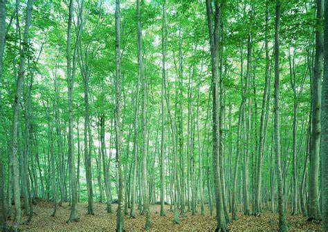
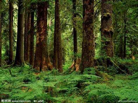
For trees, the narrow vertical structure gives a sloppy, easygoing, feeling vulnerable; for the trees, the deep vertical structure gives consistent and stable, dignified, strong feeling.
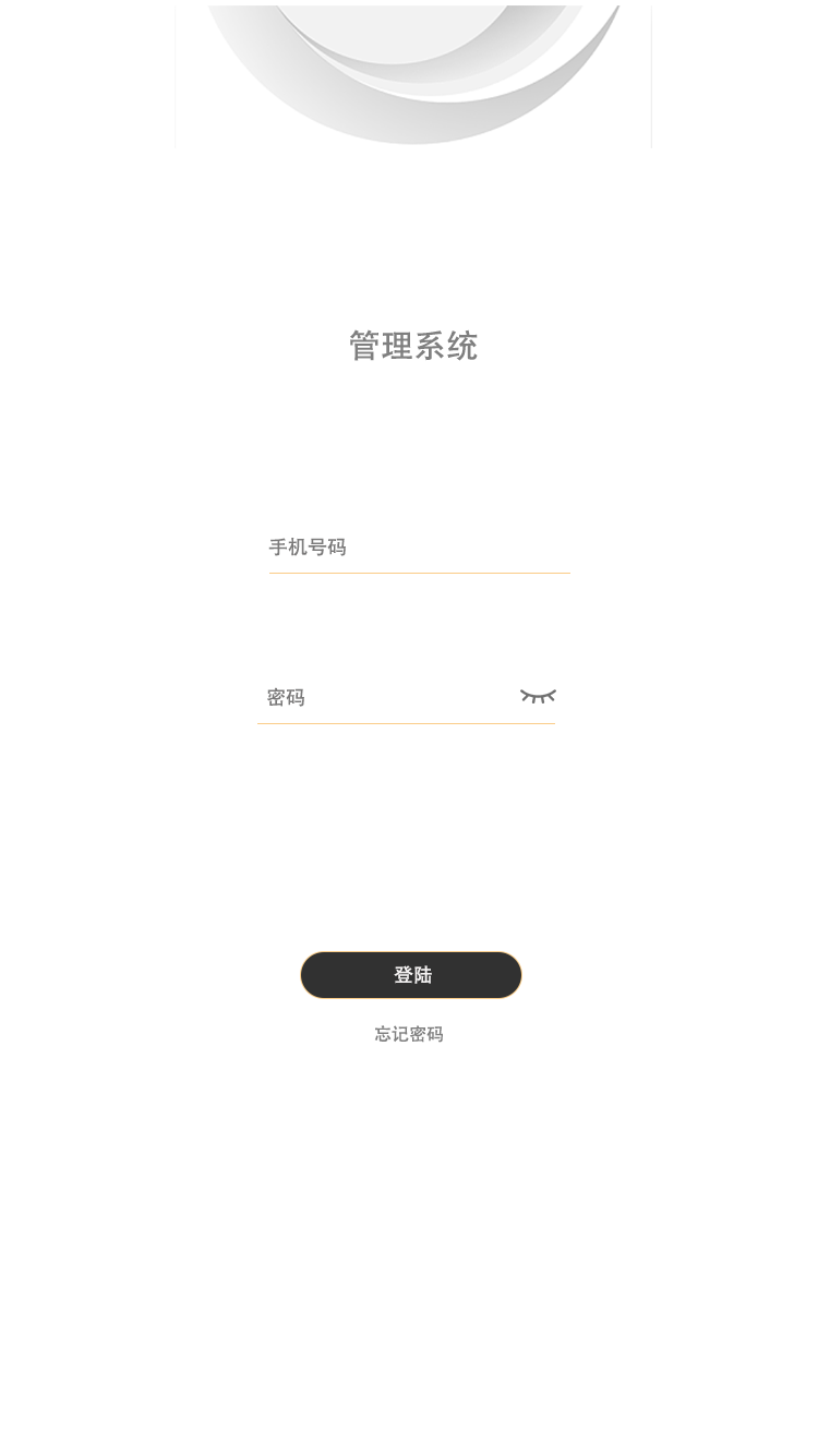
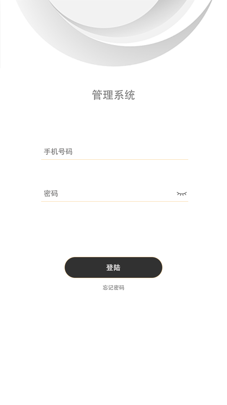
Now look at the log in page design in accordance with the structure of small and big trees to see if feels the same and the above analysis, the following is what I use PS landing page design:
【summary】
1. In the UI design, vertical composition using simple and honest style will make the page more stable and comfortable.
2. When designing a page about leaving a reasonable margin, using the page looks with rich attributes.
【principle】
Nature vigorous upright as trees, cliffs, as well as load-bearing pillars of the building, so deep vertical lines give the mind symbolized as a solemn, strong feeling.