Hello everyone, this article will focus on how to create a python visualization chart. Python visualization legends and application scenarios are something that many people want to understand. To understand how to use python to visualize data charts, you need to understand the following things first. .

Table of contents
1. Implement random scatter plot
1.3 Add titles and coordinate labels to scatter plots
1.2 Display of implementation results
5. Realize the combination of line chart and side-by-side column chart
1. Implement random scatter plot
1.1 Implementation code
import matplotlib.pyplot as plt
import numpy as np
#import seaborn as sns
plt.rcParams['font.sans-serif'] = ['SimHei']
# Matplotlib中设置字体-黑体,解决Matplotlib中文乱码问题
plt.rcParams['axes.unicode_minus'] = False
# 解决Matplotlib坐标轴负号'-'显示为方块的问题
#sns.set(font='SimHei')
# Seaborn中设置字体-黑体,解决Seaborn中文乱码问题
# 随机数生成器的种子
np.random.seed(19680801)


N = 50
x = np.random.rand(N)
y = np.random.rand(N)
colors = np.random.rand(N)
area = (30 * np.random.rand(N))**2  # 0 to 15 point radii

plt.scatter(x, y, s=area, c=colors, alpha=0.5) # 设置颜色及透明度

plt.title("RUNOOB Scatter Test") # 设置标题

plt.show()
1.2 Result display

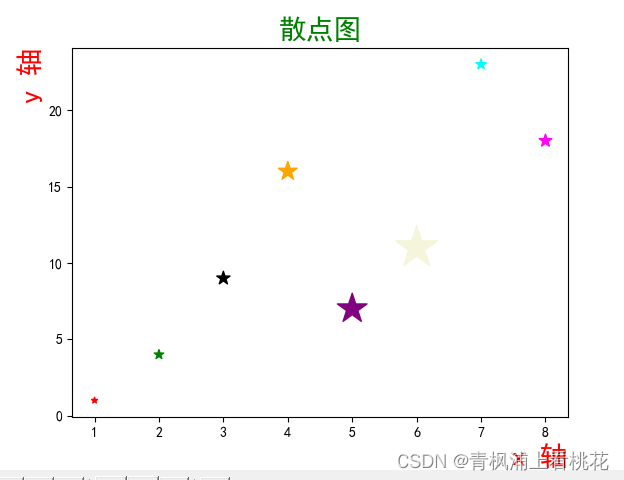
1.3 Add titles and coordinate labels to scatter plots
import matplotlib.pyplot as plt
import numpy as np
#import seaborn as sns
plt.rcParams['font.sans-serif'] = ['SimHei']
# Matplotlib中设置字体-黑体,解决Matplotlib中文乱码问题
plt.rcParams['axes.unicode_minus'] = False
# 解决Matplotlib坐标轴负号'-'显示为方块的问题
#sns.set(font='SimHei')
# Seaborn中设置字体-黑体,解决Seaborn中文乱码问题

x = np.array([1, 2, 3, 4, 5, 6, 7, 8])
y = np.array([1, 4, 9, 16, 7, 11, 23, 18])
sizes = np.array([20,50,100,200,500,1000,60,90])
colors = np.array(["red","green","black","orange","purple","beige","cyan","magenta"])

plt.title("散点图", size=20,c='g')
# fontproperties 设置中文显示,fontsize 设置字体大小
plt.xlabel("x 轴",fontsize=20,c='r',loc="right" )
plt.ylabel("y 轴" ,fontsize=20,c='r',loc="top")
plt.scatter(x, y,s=sizes,c=colors,marker='*')
plt.show()
1.4 Result display
1.5 API
matplotlib.pyplot.scatter(x, y, s=None, c=None, marker=None, cmap=None, norm=None, vmin=None, vmax=None, alpha=None, linewidths=None, *, edgecolors=None, plotnonfinite=False, data=None, **kwargs) Parameter Description: x, y: Arrays of the same length, which are the data points we are about to draw the scatter plot, enter the data. s: The size of the point, the default is 20, it can also be an array. Each parameter of the array is the size of the corresponding point. Python game programming software . c: The color of the point, the default is blue 'b', it can also be an RGB or RGBA two-dimensional row array. marker: point style, default small circle 'o'. cmap: Colormap, default None, scalar or the name of a colormap, only used when c is an array of floating point numbers. If there is no declaration, it is image.cmap. norm: Normalize, default None, data brightness is between 0-1, only used when c is an array of floating point numbers. vmin, vmax:: Brightness setting, ignored when the norm parameter exists. alpha:: Transparency setting, between 0-1, default None, which is opaque. linewidths::The length of the marked point. edgecolors:: Color or color sequence, default is 'face', optional values are 'face', 'none', None. plotnonfinite: Boolean value, sets whether to use non-finite c (inf, -inf or nan) to plot points. **kwargs:: Other parameters.
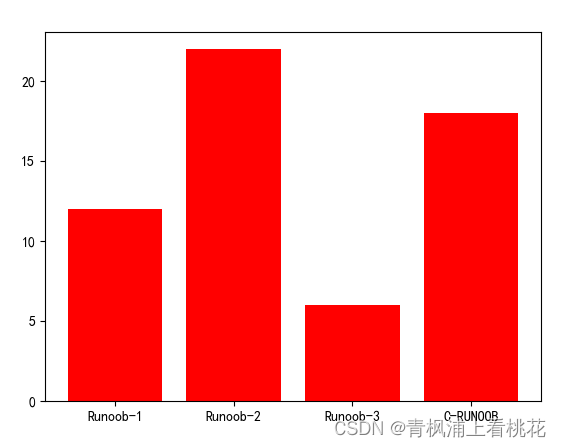
2. Implement histogram
1.1 Implementation code
import matplotlib.pyplot as plt

#import seaborn as sns
plt.rcParams['font.sans-serif'] = ['SimHei']
# Matplotlib中设置字体-黑体,解决Matplotlib中文乱码问题
plt.rcParams['axes.unicode_minus'] = False
# 解决Matplotlib坐标轴负号'-'显示为方块的问题
#sns.set(font='SimHei')
# Seaborn中设置字体-黑体,解决Seaborn中文乱码问题
import matplotlib.pyplot as plt
import numpy as np

x = np.array(["Runoob-1", "Runoob-2", "Runoob-3", "C-RUNOOB"])
y = np.array([12, 22, 6, 18])

plt.bar(x,y,color='r')
plt.show()
1.2 Result display
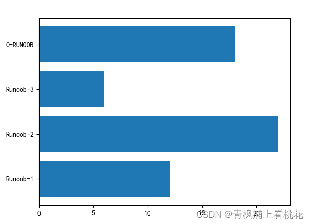
1.3 Implement bar chart code
import matplotlib.pyplot as plt
import numpy as np
#import seaborn as sns
plt.rcParams['font.sans-serif'] = ['SimHei']
# Matplotlib中设置字体-黑体,解决Matplotlib中文乱码问题
plt.rcParams['axes.unicode_minus'] = False
# 解决Matplotlib坐标轴负号'-'显示为方块的问题
#sns.set(font='SimHei')
# Seaborn中设置字体-黑体,解决Seaborn中文乱码问题

x = np.array(["Runoob-1", "Runoob-2", "Runoob-3", "C-RUNOOB"])
y = np.array([12, 22, 6, 18])

plt.barh(x,y)
plt.show()
1.4 Result display
3. Implement histogram
1.1 Implemented code
import matplotlib.pyplot as plt
import numpy as np

# 生成一组随机数据
data = np.random.randn(1000)

# 绘制直方图
plt.hist(data, bins=30, color='skyblue', alpha=0.8)

# 设置图表属性
plt.title('RUNOOB hist() Test')
plt.xlabel('Value')
plt.ylabel('Frequency')

# 显示图表
plt.show()
1.2 Display of implementation results

4. Implement pie chart
1.1 Implementation code
import matplotlib.pyplot as plt

# 数据
sizes = [15, 30, 45, 10]

# 饼图的标签
labels = ['A', 'B', 'C', 'D']

# 饼图的颜色
colors = ['yellowgreen', 'gold', 'lightskyblue', 'lightcoral']

# 突出显示第二个扇形
explode = (0, 0.1, 0, 0)

# 绘制饼图
plt.pie(sizes, explode=explode, labels=labels, colors=colors,
        autopct='%1.1f%%', shadow=True, startangle=90)

# 标题
plt.title("RUNOOB Pie Test")

# 显示图形
plt.show()
1.2 Implementation results

1.3 Implement API reference
matplotlib.pyplot.pie(x, explode=None, labels=None, colors=None, autopct=None, pctdistance=0.6, shadow=False, labeldistance=1.1, startangle=0, radius=1, counterclock=True, wedgeprops=None, textprops=None, center=0, 0, frame=False, rotatelabels=False, *, normalize=None, data=None)[source]
Parameter Description:
x: Floating point array or list, used to draw pie chart data, representing the area of each sector.
explode: Array, indicating the interval between each sector, the default value is 0.
labels: list, labels of each sector, default value is None.
colors: array, representing the color of each sector, the default value is None.
autopct: Set the display format of each sector percentage in the pie chart, %d%% is an integer percentage, %0.1f is a decimal point, %0.1f%% is a one-decimal percentage, %0.2f%% is a two-decimal percentage.
labeldistance: The drawing position of the label mark, in proportion to the radius, the default value is 1.1, if <1, it is drawn inside the pie chart.
pctdistance:: Similar to labeldistance, specifies the position scale of autopct. The default value is 0.6.
shadow:: Boolean value True or False, set the shadow of the pie chart, the default is False, no shadow is set.
radius:: Set the radius of the pie chart, the default is 1.
startangle:: Used to specify the starting angle of the pie chart. The default is to draw counterclockwise from the positive direction of the x-axis. If set =90, it will be drawn from the positive direction of the y-axis.
counterclock: Boolean value, used to specify whether to draw the sector counterclockwise. The default is True, which means drawing counterclockwise, and False, which means clockwise.
wedgeprops: Dictionary type, default value None. Used to specify the properties of the sector, such as border line color, border line width, etc. For example: wedgeprops={'linewidth':5} sets the wedge line width to 5.
textprops: Dictionary type, used to specify the properties of text labels, such as font size, font color, etc. The default value is None.
center: A list of floating point types, used to specify the center position of the pie chart, default value: (0,0).
frame: Boolean type, used to specify whether to draw the frame of the pie chart, default value: False. If True, draw the axis frame with the table.
rotatelabels: Boolean type, used to specify whether to rotate text labels, the default is False. If True, rotate each label to the specified angle.
data: used to specify data. If the data parameter is set, you can directly use the columns in the data frame as the values of x, labels and other parameters without passing them again.
In addition, the pie() function can also return three parameters:
wedges: a list containing sector objects.
texts: A list containing text label objects.
autotexts: A list containing automatically generated text label objects.
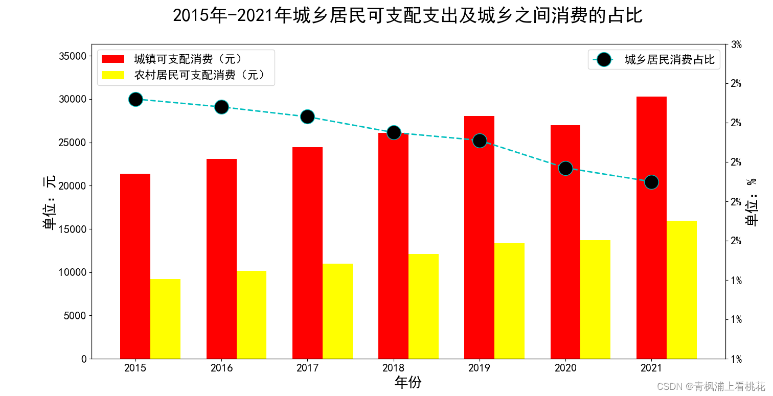
5. Realize the combination of line chart and side-by-side column chart
1.1 Implementation code
import pandas as pd
import matplotlib.pyplot as plt


def plot_combination1():
    sale = pd.read_excel('./数据/城乡收支情况.xlsx', header=0, index_col=0)
    # 设置正常显示中文标签
    plt.rcParams['font.sans-serif'] = ['SimHei']
    # 正常显示负号
    plt.rcParams['axes.unicode_minus'] = False
    # 设置字体大小
    plt.rcParams.update({'font.size': 16})

    # 提取数据
    x = sale['年份']
    y4 = sale['城镇可支配支出(元)']
    y5 = sale['农村居民可支配支出(元)']
    y6= sale['城乡居民的消费支出之比/%']


    plt.figure(figsize=(16, 8))
    plt.subplot(111)

    # 柱形宽度
    bar_width = 0.35

    # 在主坐标轴绘制柱形图
    plt.bar(x, y4, bar_width,color='r', label='城镇可支配消费(元)')
    plt.bar(x + bar_width, y5, bar_width,color='#FFFF00', label='农村居民可支配消费(元)')

    # 设置坐标轴的取值范围,避免柱子过高而与图例重叠
    plt.ylim(0, max(y4.max(), y5.max()) * 1.2)

    # 设置图例
    plt.legend(loc='upper left')
    plt.ylabel("单位:元",fontsize=20, loc="center")

    # 设置横坐标的标签
    plt.xticks(x)
    #plt.set_xticklabels(sale.index)
    plt.xlabel("年份",fontsize=20, loc="center")

    # 在次坐标轴上绘制折线图
    plt.twinx()
    # ls:线的类型,lw:宽度,o:在顶点处实心圈
    plt.plot(x, y6, ls='--', lw=2, color='c', marker='o',ms = 20, mfc = 'k', label='城乡居民消费占比')

    # 设置次坐标轴的取值范围,避免折线图波动过大
    plt.ylim(1, 2.6)

    # 设置图例
    plt.legend(loc='best')

    # 定义显示百分号的函数
    def to_percent(number, position=0):
        return '%.f' % (number) + '%'

    # 次坐标轴的标签显示百分号 FuncFormatter:自定义格式函数包
    from matplotlib.ticker import FuncFormatter
    plt.gca().yaxis.set_major_formatter(FuncFormatter(to_percent))

    # 设置标题
    plt.title('\n2015年-2021年城乡居民可支配支出及城乡之间消费的占比\n', fontsize=26, loc='center', color='k')

    plt.ylabel("单位:%",fontsize=20, loc="center")
    plt.savefig('./figure1.jpg', bbox_inches='tight')

    plt.show()

if __name__ == '__main__':

    plot_combination1()
1.2 Implementation results
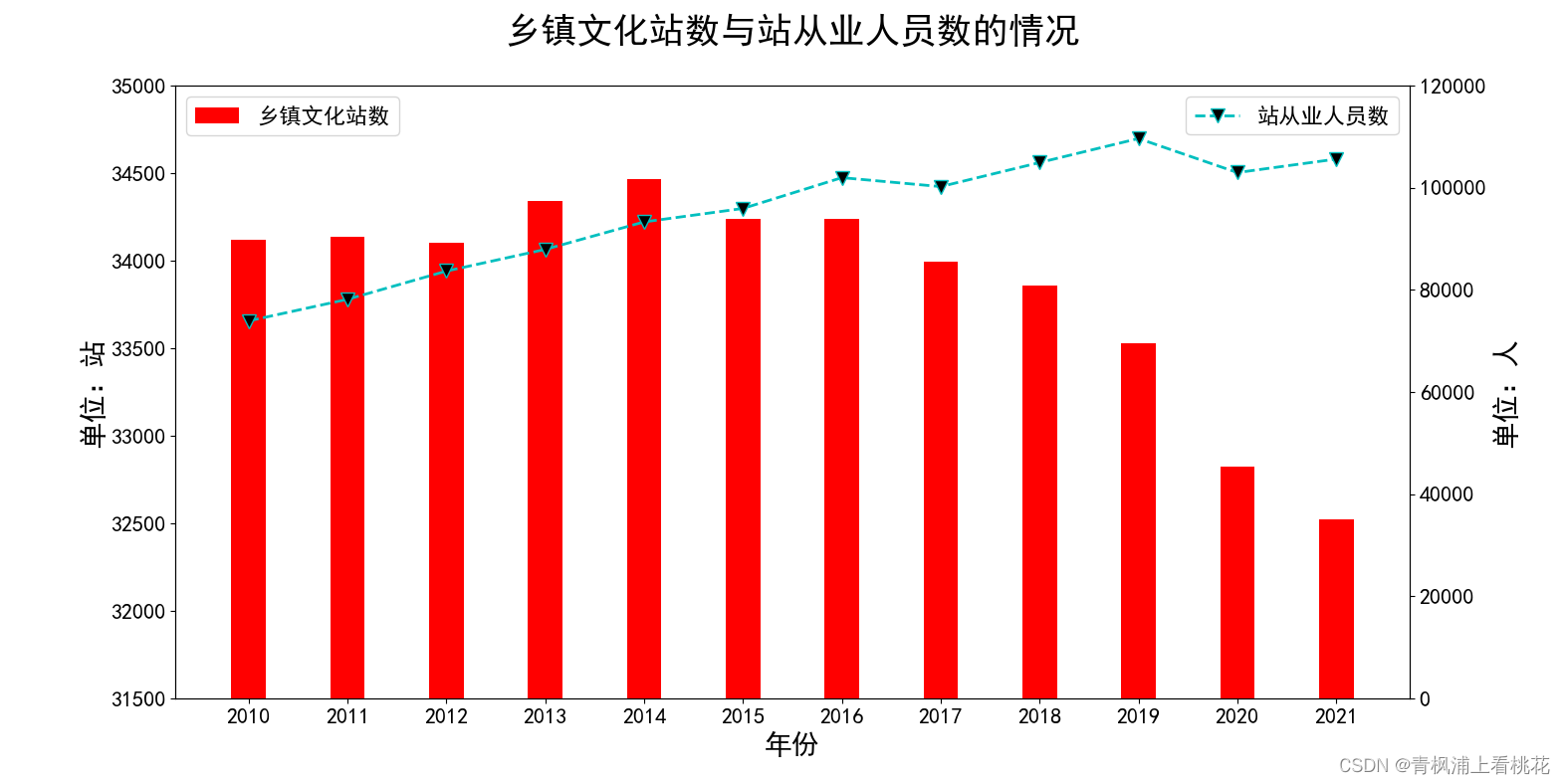
6. Combination of bar chart and line chart
1.1 Code implementation
#导入库
import pandas as pd
import matplotlib.pyplot as plt

def plot_combination():
    # 读取Excel文件
    data = pd.read_excel('./乡镇文化站数与从业人数.xlsx', header=0, index_col=0)
    # 提取数据
    x = data['年份']
    y1 = data['乡镇文化站数']
    y2 = data['乡镇文化站从业人员数']
    # 设置正常显示中文标签
    plt.rcParams['font.sans-serif'] = ['SimHei']
    # 正常显示负号
    plt.rcParams['axes.unicode_minus'] = False
    # 设置字体大小
    plt.rcParams.update({'font.size': 16})


    plt.figure(figsize=(16, 8))
    plt.subplot(111)

    # 柱形宽度
    bar_width = 0.35

    # 在主坐标轴绘制柱形图
    plt.bar(x, y1, bar_width,color='r', label='乡镇文化站数')
    plt.ylim(31500,35000)


    # 设置图例
    plt.legend(loc='upper left')
    plt.ylabel("单位:站",fontsize=20, loc="center")

    # 设置横坐标的标签
    plt.xticks(x)
    #plt.set_xticklabels(sale.index)
    plt.xlabel("年份",fontsize=20, loc="center")

    # 在次坐标轴上绘制折线图
    plt.twinx()
    plt.plot(x, y2, ls='--', lw=2, color='c', marker='v',ms = 10, mfc = 'k', label='站从业人员数')

    # 设置次坐标轴的取值范围,避免折线图波动过大
    plt.ylim(0,120000)

    # 设置图例
    plt.legend(loc='upper right')
    # 设置标题
    plt.title('\n乡镇文化站数与站从业人员数的情况\n', fontsize=26, loc='center', color='k')
    plt.ylabel("单位:人",fontsize=20, loc="center")

    plt.savefig('./figure1.jpg', bbox_inches='tight')

    plt.show()

if __name__ == '__main__':

    plot_combination()
1.2 Result display