Related links: Add vertical vertical lines in excel
How to add horizontal and vertical lines in Excel?
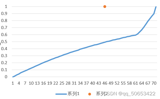
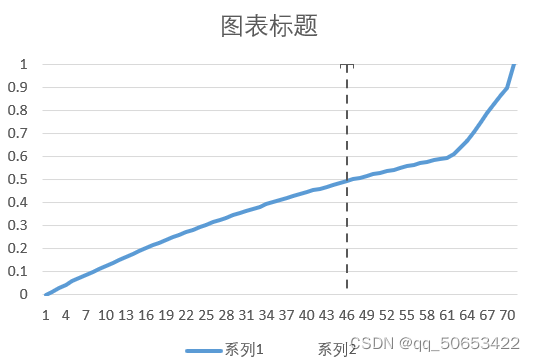
Because I am not used to adding auxiliary columns, and there is already a quantile abscissa, I thought I would try using the error lines of a scatter plot
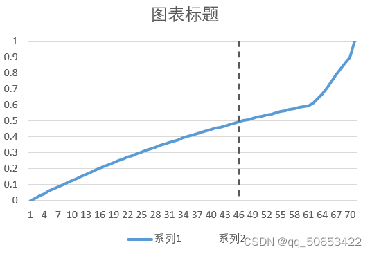
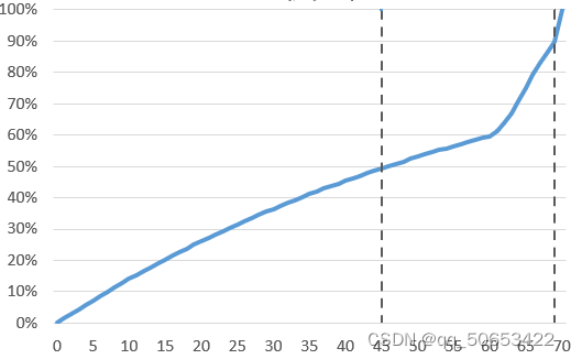
Rendering:
step:
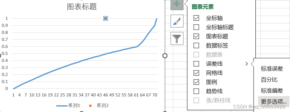
s1: Select two columns of data at random –>Insert (–>Chart)–>Create a custom combination chart, select line chart and scatter chart as the chart type


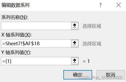
s2: Click on the chart ->Edit "Series 2" as shown in the figure ("X-axis series value" is the 0.5 quantile value) ->Edit "Series 1" (line) as the desired data
s3: Click on the scatter point –> plus sign in the upper right corner –> error bars (don’t check it yet) –> more options
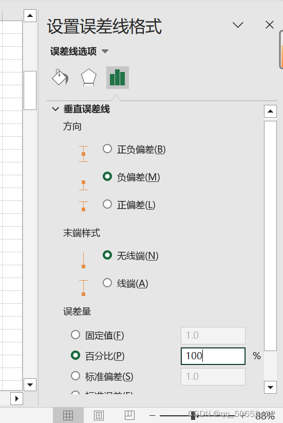
s4: Select "Negative Deviation"->"Wireless End"->"Percent"-fill in 100%
ps: See clearly that it is a vertical error bar rather than a horizontal error bar.
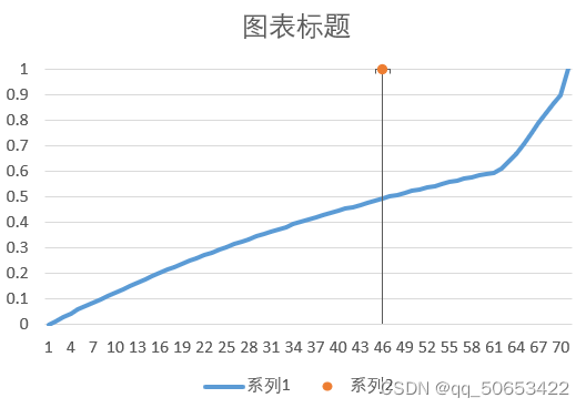
s5: Click "Oil Barrel" –>Width 1.25 –>Dash Type –>Select dotted line (or other)
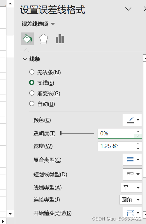
s6: Click Scatter –>“Mark”–>“Mark Options”–>“None”
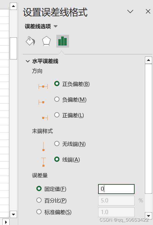
s7: There is a horizontal bar on the last scatter point. You can click the scatter point repeatedly until "Set Error Bar Format" and "Horizontal Error Bar" appear in the right window, and change the fixed value to 0