foreword
Recently, I am completing a thesis on weather forecasting, which involves deep learning and weather mapping. I think it is still necessary to write some summaries of my experience in this process, and take this opportunity to communicate with colleagues.
1. Basic commands
When we use deep learning, we will definitely use drawing commands, drawing loss and val_loss, etc., to see the effect of the model.
plt.plot(x,y,lw=,ls=,c=, alpha=, label=)x: the data of the x coordinate
y: the data of the y coordinate
lw: specifies the line width
ls: Specifies the line style, ls='-' is a solid line, ls='--' is a dashed line, ls='-.' is a dotted line, ls=':' is a dashed line
c: Specifies the line color, c='r' is red, c='k' is black, c='y' is yellow
alpha: Specifies the transparency of the line, the smaller the value, the more transparent
label: specifies the meaning of the line
Code example:
#导入库
import matplotlib.pyplot as plt
import numpy as np
#设定画布。dpi越大图越清晰,绘图时间越久
fig=plt.figure(figsize=(4, 4), dpi=300)
#导入数据
x=list(np.arange(1, 21))
y=np.random.randn(20)
#绘图命令
plt.plot(x, y, lw=4, ls='-', c='b', alpha=0.1)
plt.plot()
#show出图形
plt.show()
#保存图片
fig.savefig("画布")
Drawing result:

2. Drawing based on Excel data
In python, there is a library package for data processing called pandas
# 导包
import pandas as pd
# 读取excel文件
pd.read_excel('文件所在路径')
Extract a column of data in excel: filename['column name'], the return value is a list.
After getting the data we want in excel, the next step is to draw:
...
# 第一步绘制画布
fig=plt.figure(figsize=(7, 4), dpi=200)
# 第二步添加绘图区.
# subplot命令是在画布上添加一个绘图区,括号里的内容转述为汉字为:“创建一个一行一列的绘图区(一行一列就只有一个绘图区),ax1是第一个绘图区,facecolor用来设置画布背景颜色,默认为白色
ax1 = fig.add_subplot(111, facecolor='green')
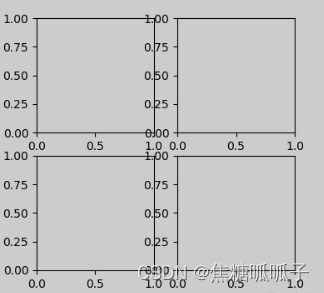
If you want to create a sub-graph area with two rows and two columns (or other dimensions), respectively ax1, ax2, ax3, ax4:
ax1=fig.add_subplot(221)
ax2=fig.add_subplot(222)
ax3=fig.add_subplot(223)
ax4=fig.add_subplot(224)
The effect is as follows:
3. Merge the x (or y) coordinate axes of a graph and add a legend legend()
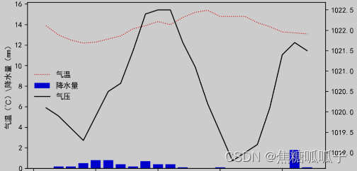
To achieve the effect of the above picture, the focus is on ax2=ax1.twinx(), ax2 and ax1 share the x-axis, but ax1 uses the left y-axis, and ax2 uses the right y-axis:
fig=plt.figure(figsize=(7,4),dpi=200)        # 新建画布
ax1=fig.add_subplot(111)                     # 设置绘图区
line1,=ax1.plot(times,temps,'r:',lw=1,label='气温')    # 创建折线
bar1 =ax1.bar(times,rains,color='b',label='降水量')    # 创建条状
ax2=ax1.twinx()                            # 设置共用x轴
line2,=ax2.plot(times,pressures,'k-',lw=1.2,label='气压')

# legend用来设置图例,还可以添加参数ncol='',该参数用来设置图例的列数,用于对齐
plt.legend((line1,bar1,line2),('气温','降水量','气压'),loc='center left',frameon=False,framealpha=0.5)
ax1.set_xlabel('时间 \ h')                # 设置x轴
ax1.set_ylabel('气温(℃)\降水量(mm)')  # 设置左侧y轴
ax2.set_ylabel('气压(hPa)')             # 设置右侧y轴
plt.title("----")                         # 设置图的名称
plt.show()
4. Adjust the font style
Adjust by means of a dictionary, store the parameter name and specified value size that need to be modified in the dictionary, and store more parameters:
font={'size':30,'color':'red'}
ax.set_xlabel('--',fontdict=font)
ax.set_ylabel('--',fontdict=font)
5. Draw grid lines
ax.grid()  # 开启x和y轴的网格
ax.grid(ls='--')   # 开启x和y轴的虚线网格
ax.grid(True,axis='x')   # 开启x轴的网格
ax.grid(True,axis='y')   # 开启y轴的网格
6. Combine the coordinate axes of the two graphs
Set up the canvas as follows:
fig,((ax1),(ax2))=plt.subplots(2,1,figsize=(5,5),dpi=200,sharex='all')
fig.subplots_adjust(hspace=0)
Seven, not commonly used functions
1.ax.set_ylim()、ax.set_xlim()
When sharing the x(y) axis, the zero scale of the y(x) axis on both sides is inconsistent, and xlim and ylim are used to set the range of the coordinate axis.
2.set_minor_locator()、set_major_locator()
set_minor_locator is used to set or modify the size of the minor scale on the basis of the main scale, and set_major_locator is used to modify the unit display of the main scale. Before use, the library package must be imported:
import matplotlib.ticker as tickerfor example:
(1) Here, set the secondary scale as 0.1 unit.
ax1.yaxis.set_minor_locator(ticker.MultipleLocator(0.1))(2) Set the main scale on the right to display every 10 units.
ax2.yaxis.set_major_locator(ticker.MultipleLocator(10))