With the development of technology, the complexity of development is getting higher and higher. The traditional development method makes a system into a whole application. It often happens that a small change or the addition of a small function may cause the overall logic to change. The modification affects the whole body. Through component development, individual development and maintenance can be effectively achieved, and they can be combined at will. Greatly improve low development efficiency and reduce maintenance costs.
Componentization is the only way for any front-end application with complex business scenarios and products after multiple iterations. Componentization requires more than just the module splitting and decoupling seen on the surface. There is also a lot of work behind it to support componentization, such as module splitting strategies based on business characteristics, interaction methods between modules, and building systems. etc.
The components introduced in this article are:
To quickly implement front-end vue uni-app custom pop-up components and pop-up components, please visit the uni-app plug-in market address: https://ext.dcloud.net.cn/plugin?id=12491
For more information on front-end components, please follow the WeChat public account: Front-end component development

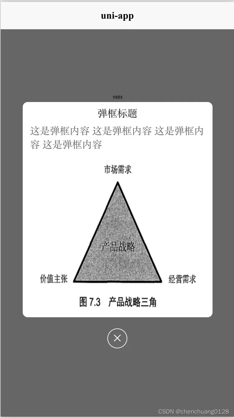
The renderings are as follows:
# How to use custom pop-up boxes
#### HTML code part
```html
<template>
<view class="content">
<image class="logo" src="/static/logo.png"></image>
<view class="logo" style="background-color: aquamarine;line-height: 100px;text-align: center;" @click="popupClick">点击弹框</view>
<!-- Using components -->
<ccPopup :ishide='isshow' width="calc(100vw - 70px)" height="346px" radius="16rpx">
<!-- Customized display content -->
<view class="modelContent">
<view style="margin-top: 6px;">
Pop-up title
</view>
<view style="margin-top: 20px; color: #666666; margin: 6px 12px;">
This is the content of the pop-up box. This is the content of the pop-up box. This is the content of the pop-up box. This is the content of the pop-up box.
</view>
<image class="imageV" :src="mySrc" ></image>
</view>
<!-- Customize the close button -->
<view class="close" @click="isshow=false">✕</view>
</ccPopup>
</view>
</template>
```
#### JS code (introducing components to fill in data)
```javascript
<script>
import ccPopup from '@/components/cc-popup.vue';
export default {
components: {
ccPopup
},
data() {
return {
title: 'Hello',
companyList:[{},{},{}],
isshow:false,
mySrc:'../../static/logo.png'
}
},
onLoad() {
},
methods: {
popupClick(){
this.isshow = !this.isshow;
}
}
}
</script>
```
#### CSS
```CSS
<style>
.content {
display: flex;
flex-direction: column;
}
.logo {
height: 200rpx;
width: 200rpx;
margin-top: 200rpx;
margin-left: auto;
margin-right: auto;
margin-bottom: 50rpx;
}
.text-area {
display: flex;
justify-content: center;
}
.title {
font-size: 36rpx;
color: #8f8f94;
}
.modelContent {
width: 100%;
height: 100%;
display: flex;
align-items: center;
flex-direction: column;
justify-content: center;
}
.imageV {
margin-top: 0px;
width: calc(100vw - 100px);
height: calc((100vw - 100px) * 1.027) ;
}
.close {
width: 60rpx;
height: 60rpx;
color: #FFFFFF;
line-height: 60rpx;
text-align: center;
border-radius: 50%;
border: 1px solid #FFFFFF;
position: relative;
bottom: -10%;
left: 50%;
transform: translate(-50%, -50%);
}
</style>
```