1. Realize the bottom selection through uni.showActionSheet
Effect

the code
<template>
  <view>
    <button @click="showActionsheet">点击打开弹窗</button>
  </view>
</template>

<script>
export default {
  methods: {
    showActionsheet() {
      uni.showActionSheet({
        itemList: ['选项1', '选项2', '选项3'],
        success: (res) => {
          console.log('选择了第' + (res.tapIndex + 1) + '个选项');
        },
        fail: (err) => {
          console.log('弹窗取消');
        }
      });
    }
  }
};
</script>
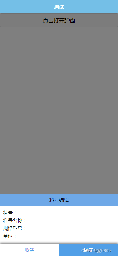
2. Customize the bottom pop-up window
Effect
the code
<template>
	<view>
		<button @click="togglePopup">点击打开弹窗</button>
		<view v-if="showPopup" class="popup">
			<view class="content">
				<view class="line1">
					<view>料号编辑</view>
				</view>
				<view class="line2">
					<view>料号:</view>
					<view>料号名称:</view>
					<view>规格型号:</view>
					<view>单位:</view>
				</view>
			</view>
			<view class="btn-group">
				<view class="btn_position">
					<view class="cancel" @click="cancel">取消</view>
					<view class="submit" @click="submit">提交</view>
				</view>
			</view>
		</view>
		<view v-if="showPopup" class="mask" @click="togglePopup"></view>
	</view>
</template>

<script>
	export default {
		data() {
			return {
				showPopup: false,
			};
		},
		methods: {
			togglePopup() {
				this.showPopup = !this.showPopup;
			},
			submit() {
				this.showPopup = false;
			},
			cancel() {
				this.showPopup = false;
			}
		}
	};
</script>

<style lang="scss">
	// 弹窗效果
	.popup {
		position: fixed;
		bottom: 0;
		left: 0;
		width: 100%;
		background-color: #fff;
		// padding: 20rpx;
		box-sizing: border-box;
		z-index: 999;
	}

	// 遮罩层
	.mask {
		position: fixed;
		top: 0;
		left: 0;
		width: 100%;
		height: 100%;
		background-color: rgba(0, 0, 0, 0.5);
		z-index: 888;
	}

	// 弹窗内容
	.content {
		.line1 {
			background-color:#6ea8e7;
			text-align: center;
			padding: 20rpx;
		}

		.line2 {
			padding: 20rpx;
			// border-bottom: 1px solid black;

			view {
				margin-bottom: 10rpx;
			}
		}
	}

	// 按钮样式
	.btn-group {
		box-shadow: 0px -2px 6px rgba(0, 0, 0, 0.5); /* 示例阴影参数,根据需要进行调整 */
		.btn_position {
			display: flex;
			width: 100%;
			.cancel {
				width: 50%;
				text-align: center;
				padding: 20rpx 0;
				color: #519fe7;
			}

			.submit {
				width: 50%;
				background-color: #519fe7;
				text-align: center;
				padding: 20rpx 0;
				color: #fff;
			}
		}

	}
</style>