Briefly
When writing a page recently, there needs to be a prompt box that pops up from bottom to top.
After meditating for a while, it came true.
Record the implementation ideas.
Implementation ideas
The implementation steps are as follows:
- Write styles.
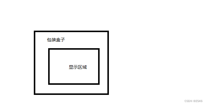
The home page must have a container (box) for carrying content. The outer layer is covered with a packing box (for positioning and style definition).
- Trigger the popup effect logic.
Here I move the mouse up, display the content, and trigger the pop-up effect. In actual application, other triggering methods may be used. - Realization of pop-up effect.
Use CSS transition and transform to achieve - Packaged into components.
Relevant attributes or key operations can be proposed and encapsulated into configurable components.
Write styles and trigger logic
<!DOCTYPE html>
<html lang="en">
<head>
<meta charset="UTF-8">
<meta http-equiv="X-UA-Compatible" content="IE=edge">
<meta name="viewport" content="width=device-width, initial-scale=1.0">
<title>Document</title>
<style>
.wrapper {
position: relative;
min-width: 10px;
min-height: 10px;
width: 400px;
height: 200px;
min-height: 10px;
margin-left: calc(50% - 100px);
margin-top: 100px;
border-radius: 50px 20px 50px 20px;
background-color: skyblue;
}
.box {
position: absolute;
top: 0;
left: 0;
display: block;
width: 100%;
height: 100%;
cursor: pointer;
border-radius: inherit;
background-color: #666;
}
.wrapper:hover .box {
transform: translate(0, 0);
}
</style>
</head>
<body>
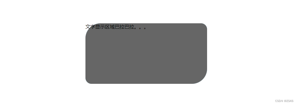
<div class="wrapper">
<div class="box">文字显示区域巴拉巴拉。。。</div>
</div>
</body>
</html>
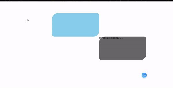
Move the mouse up to trigger the pop-up effect.
Design pop-up effect
The pop-up effect is realized by transition and transform of css.
transform transforms the display content box (box).
transition Animates the transition.
For example:
by default, let the box move down by 100% and move to the right by 100%;
when the mouse moves in, it will return to the original position.
.box{


transform: translate(100%, 100%);
transition: 0.5s ease all;
}
.wrapper:hover .box {


      transform: translate(0, 0);
    }
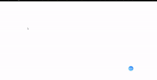
The effect is to display the pop-up effect of the content area from the bottom right to the top right :
The wrapper removes the background color and adds overflow: hidden ; the effect:
Packaged into components
Key attributes such as trigger mode, transform pop-up effect, transition animation style, duration, etc. can be proposed and packaged into configurable components.
Hurry up and try it.
epilogue
full code.
<!DOCTYPE html>
<html lang="en">

<head>
  <meta charset="UTF-8">
  <meta http-equiv="X-UA-Compatible" content="IE=edge">
  <meta name="viewport" content="width=device-width, initial-scale=1.0">
  <title>Document</title>
  <style>
    .wrapper {


      position: relative;
      min-width: 10px;
      min-height: 10px;
      width: 400px;
      height: 200px;
      min-height: 10px;
      margin-left: calc(50% - 100px);
      margin-top: 100px;
      border-radius: 50px 20px 50px 20px;
      /* background-color: skyblue; */
      overflow: hidden;
    }

    .box {


      position: absolute;
      top: 0;
      left: 0;
      display: block;
      width: 100%;
      height: 100%;
      transform: translate(100%, 100%);
      transition: 0.5s ease all;
      cursor: pointer;
      border-radius: inherit;
      background-color: #666;
    }

    .wrapper:hover .box {


      transform: translate(0, 0);
    }
  </style>
</head>

<body>
  <div class="wrapper">
    <div class="box">文字显示区域巴拉巴拉。。。</div>
  </div>
</body>

</html>