Table of contents
Introduction
toastr.js is a very concise pop-up message plugin, the main reason is that its script and style files are small.
And you can modify the style file according to your own needs, which can be applied in many different scenarios.
https://codeseven.github.io/toastr/
https://github.com/CodeSeven/toastr
1. Preparation
Three files need to be introduced before calling the toastr plugin:
jquery.js、toastr.js、toastr.css。
For example, it is possible to import via a CDN:
<script src="https://cdn.staticfile.org/jquery/1.10.2/jquery.min.js"></script>
<script src="https://cdn.bootcss.com/toastr.js/latest/js/toastr.min.js"></script>
<link rel="stylesheet" type="text/css" href="https://cdn.bootcss.com/toastr.js/latest/css/toastr.min.css">
2. Easy to use
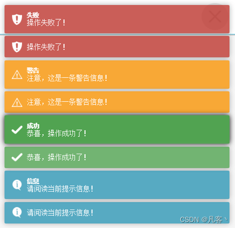
After the introduction, you can simply call directly through toastr.xxx, and select the corresponding pop-up box according to the prompt type. For example:
Note: The second parameter is the title, and the style can be modified, which will be introduced below.
toastr.info("请阅读当前提示信息!")
toastr.info("请阅读当前提示信息!","信息")
toastr.success("恭喜,操作成功了!")
toastr.success("恭喜,操作成功了!", "成功")
toastr.warning("注意,这是一条警告信息!")
toastr.warning("注意,这是一条警告信息!", "警告")
toastr.error("操作失败了!");
toastr.error("操作失败了!", "失败");

// toastr.clear();// 移除所有,有动画效果
// toastr.remove();// 移除所有,没有动画效果
The pop-up window looks like:
Note: When the mouse locks the focus, the color will be accentuated, as shown in the success bullet box with title below.
3. Advanced use
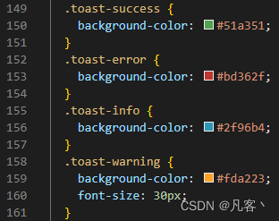
You can customize the style of the bullet box by modifying the style file toastr.css.
Example 1: Modify the color of the popup window and the style of the title
As shown in the figure below, you can modify the background color value of the corresponding background-color bullet box, and add the font-size style.
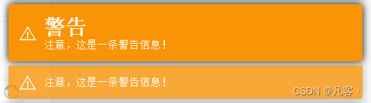
Effect:
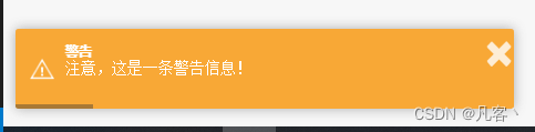
Example 2: Customize pop-up actions by modifying configuration items
var messageOpts = {


    "closeButton": true,// 是否显示关闭按钮
    "progressBar":true,// 是否显示进度条
    "positionClass": "toast-bottom-left",// 弹出窗的位置
    "showDuration": "1000",// 显示的动画时间
    "hideDuration": "1000",// 消失的动画时间
    "timeOut": "6000",// 弹窗展现时间
    "showEasing": "swing",//显示时的动画缓冲方式
    "hideEasing": "linear",//消失时的动画缓冲方式
    "showMethod": "fadeIn",//显示时的动画方式
    "hideMethod": "fadeOut", //消失时的动画方式
    "allowHtml":true,// 允许弹窗内容包含 HTML 语言
};
toastr.options = messageOpts;

toastr.warning("注意,这是一条警告信息!", "警告")
Popup style:
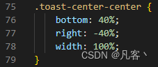
Example 3: Customize the display position of the pop-up box
Customize a pop-up window style displayed in the middle of the page as follows: (the displayed position can be flexibly adjusted)
"positionClass": "toast-center-center",// 弹出窗的位置配置
4. Detailed explanation of options configuration items
The following are examples of commonly used configuration items:
| 1 | 2 | 3 |
|---|---|---|
| closeButton | Whether to display the close button | [default false] true: display; false: not display |
| progressBar | whether to show progress bar | [default false] true: display; false: not display |
| positionClass | The display position of the popup box | [default toast-top-right top right] toast-top-left: top left toast-top-right: top right toast-top-center: top middle toast-top-full-width: top middle (full width) toast-bottom-right: bottom right toast-bottom-left: bottom left toast-bottom-center: bottom middle toast-bottom-full-width: bottom middle (full width) |
| showDuration | Show animation duration | 【Default 300ms】unit: millisecond |
| hideDuration | Disappear animation duration | [Default 1000ms] Unit: millisecond |
| timeOut | popup display time | 【Default 5000ms】unit: millisecond |
| extendedTimeOut | After losing the mouse focus, re-display the time | [Default 1000ms] Unit: millisecond |
| onShown | The action triggered when the popup is displayed | toastr.options.onShown = function() { console.log(‘hello’); } |
| onHidden | The action triggered when the popup automatically disappears | toastr.options.onHidden = function() { console.log(‘goodbye’); } |
| onclick | The action triggered when the popup is clicked | toastr.options.onclick = function() { console.log(‘clicked’); } |
| onCloseClick | The action triggered when the popup is manually closed | toastr.options.onCloseClick = function() { console.log(‘close button clicked’); } |
| killToDismiss | Click whether the pop-up box disappears immediately | [Default true] true: disappear immediately; false: do not disappear |
In addition, the maxOpened test is invalid and will not be listed for now.