Table of contents
1. Create a jsp file named login.jsp
2. Create a css file and name it style.css
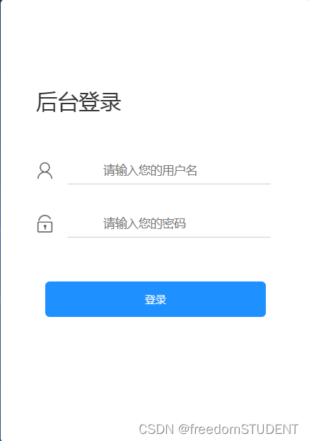
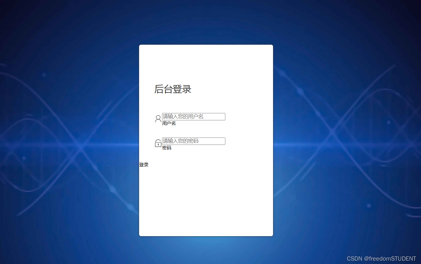
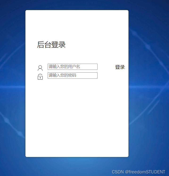
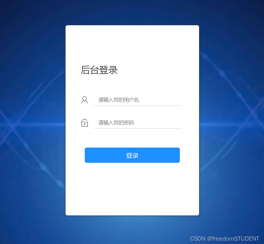
The editing effect is as follows:
renderings
1. Create a jsp file named login.jsp
Make the following sample
code:
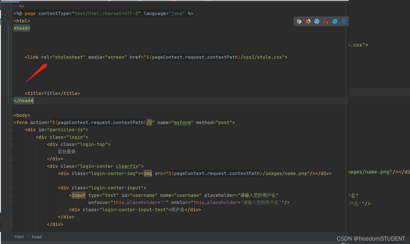
<%@ page contentType="text/html;charset=UTF-8" language="java" %>
<html>
<head>
<title>Title</title>
</head>
<body>
<body>
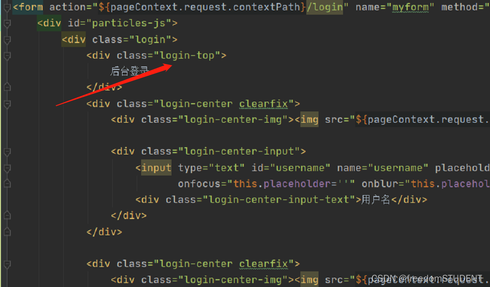
<form action="${pageContext.request.contextPath}/login" name="myform" method="post">
<div id="particles-js">
<div class="login">
<div class="login-top">
后台登录
</div>
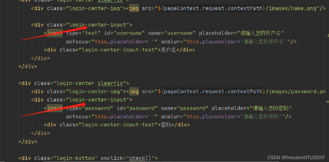
<div class="login-center clearfix">
<div class="login-center-img"><img src="${pageContext.request.contextPath}/images/name.png"/></div>
<div class="login-center-input">
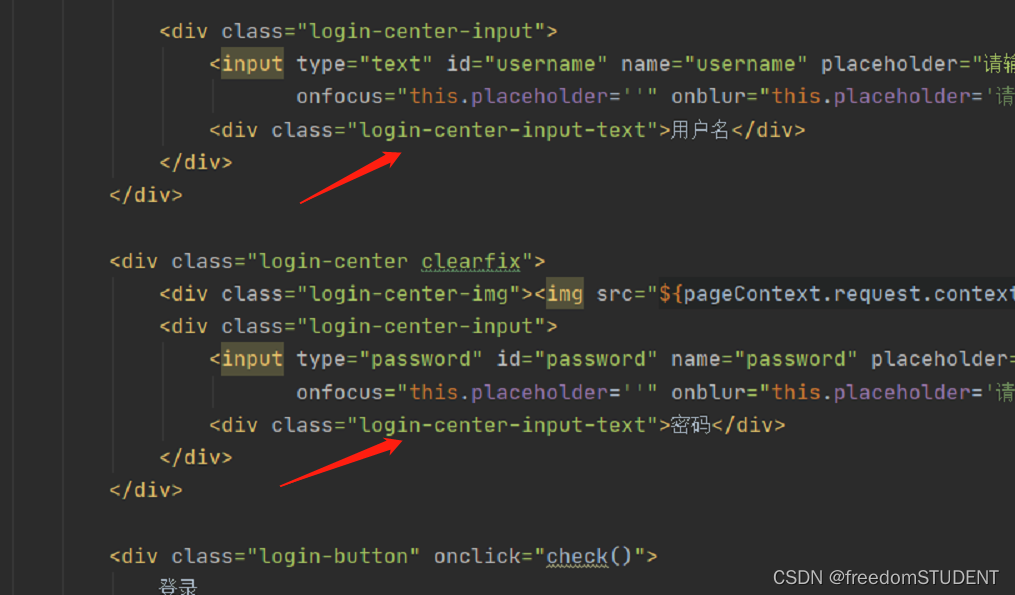
<input type="text" id="username" name="username" placeholder="请输入您的用户名" onfocus="this.placeholder=''" onblur="this.placeholder='请输入您的用户名'"/>
<div class="login-center-input-text">用户名</div>
</div>
</div>
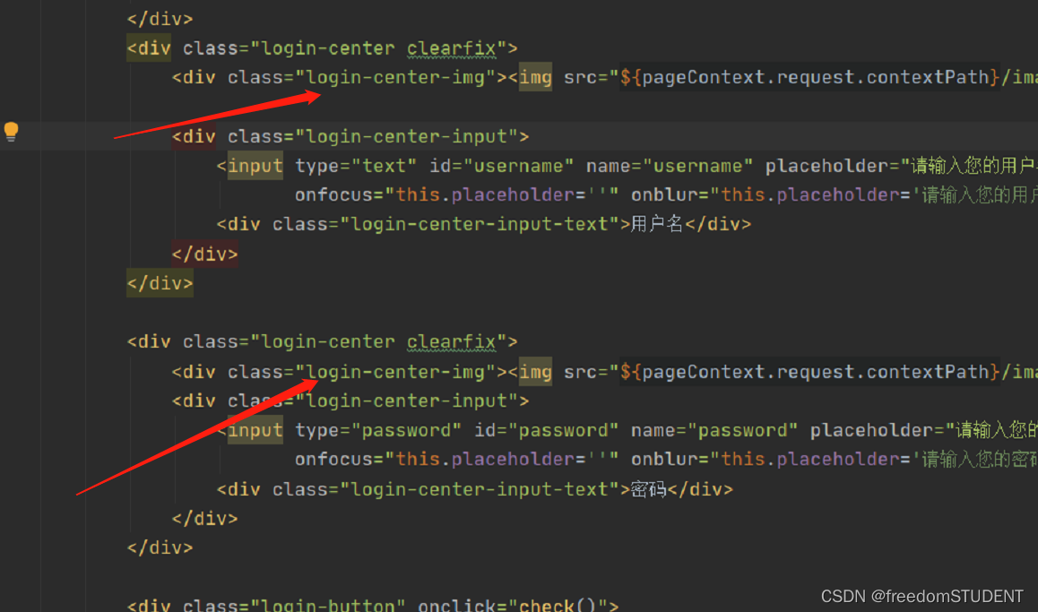
<div class="login-center clearfix">
<div class="login-center-img"><img src="${pageContext.request.contextPath}/images/password.png"/></div>
<div class="login-center-input">
<input type="password" id="password" name="password" placeholder="请输入您的密码" onfocus="this.placeholder=''" onblur="this.placeholder='请输入您的密码'"/>
<div class="login-center-input-text">密码</div>
</div>
</div>
<div class="login-button" onclick="check()">
登录
</div>
<span style="text-align: center;color: red;"><br>       ${msg}</span>
</div>
<div class="sk-rotating-plane"></div>
</div>
</form>
</body>
This piece of code only completes the task of front-end page display
1.
<form action="${pageContext.request.contextPath}/login" name="myform" method="post">
    <div id="particles-js">
        <div class="login">
            <div class="login-top">
                后台登录
            </div>


        </div>

    </div>
The effect is as follows:
2.
<form action="${pageContext.request.contextPath}/login" name="myform" method="post">
    <div id="particles-js">
        <div class="login">
            <div class="login-top">
                后台登录
            </div>
            <div class="login-center clearfix">
                <div class="login-center-img"><img src="${pageContext.request.contextPath}/images/name.png"/></div>

                </div>


        </div>

    </div>
The effect is as follows:

<div class="login-center-img"><img src="${pageContext.request.contextPath}/images/name.png"/></div>
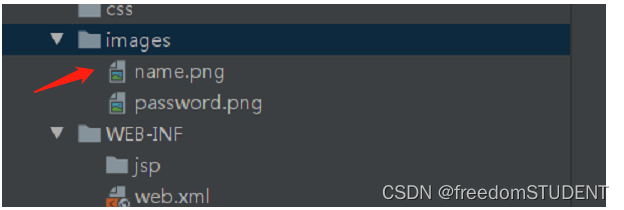
This line of code calls the name.png image in the images file
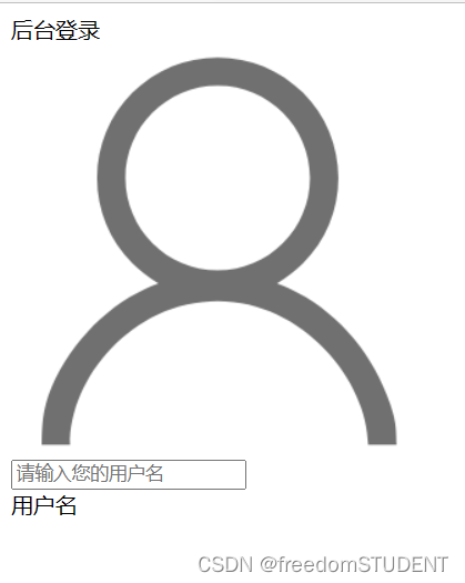
3.
<div id="particles-js">
    <div class="login">
        <div class="login-top">
            后台登录
        </div>
        <div class="login-center clearfix">
            <div class="login-center-img"><img src="${pageContext.request.contextPath}/images/name.png"/></div>

            <div class="login-center-input">
                <input type="text" id="username" name="username" placeholder="请输入您的用户名" onfocus="this.placeholder=''" onblur="this.placeholder='请输入您的用户名'"/>
                <div class="login-center-input-text">用户名</div>
            </div>

        </div>


    </div>

</div>
<div class="login-center-input">
<input type="text" id="username" name="username" placeholder="Please enter your username" onfοcus="this.placeholder=''" onblur ="this.placeholder='Please enter your username'"/>
<div class="login-center-input-text">Username</div>
</div>
type="text" : Indicates that the input box is a text box.
id="username" : A unique identifier is assigned to the input box, through which the input box can be accessed and operated.
name="username" : Specifies the name of the input box, and the value of the input box can be submitted to the server together with the name when the form is submitted.
placeholder="Please enter your username" : This attribute provides a prompt text for the input box, which will be displayed in the input box when the user does not enter anything. In this case it will say "Please enter your username".
οnfοcus="this.placeholder=''" : When the user places focus in the input box, this code will clear the hint text so that the user can type directly.
οnblur="this.placeholder='Please enter your username'" : When the user moves focus out of the input box, if nothing is entered in the input box, the code will redisplay "Please enter your username" Prompt text.
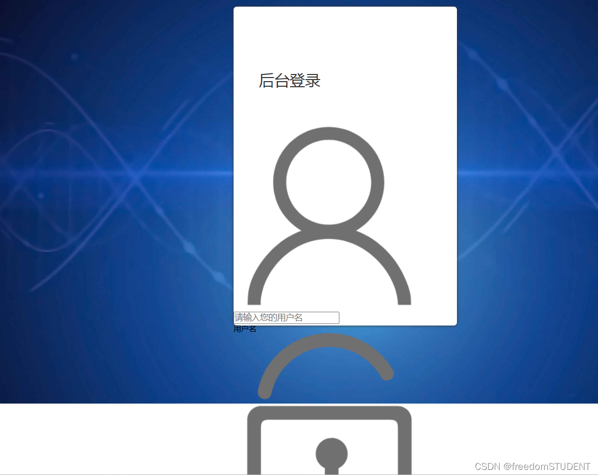
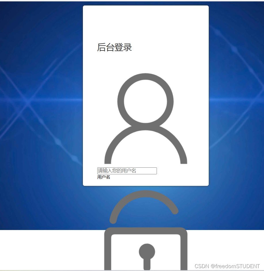
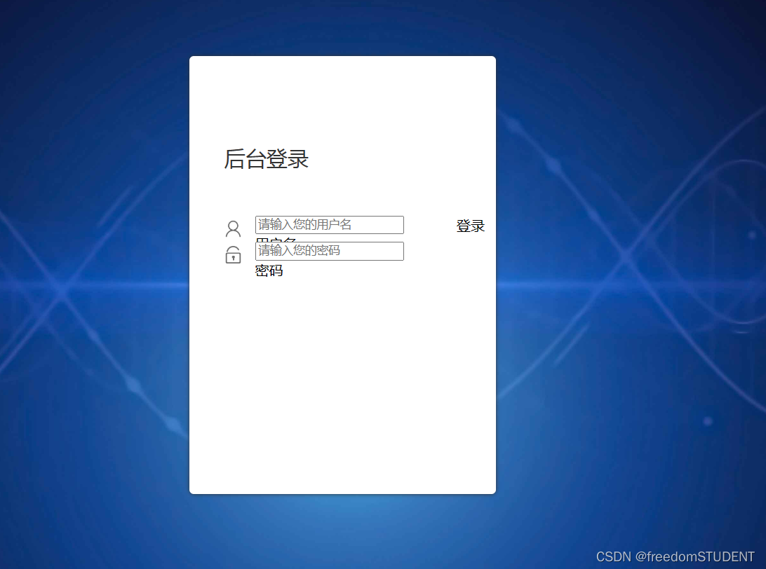
The effect is as follows:
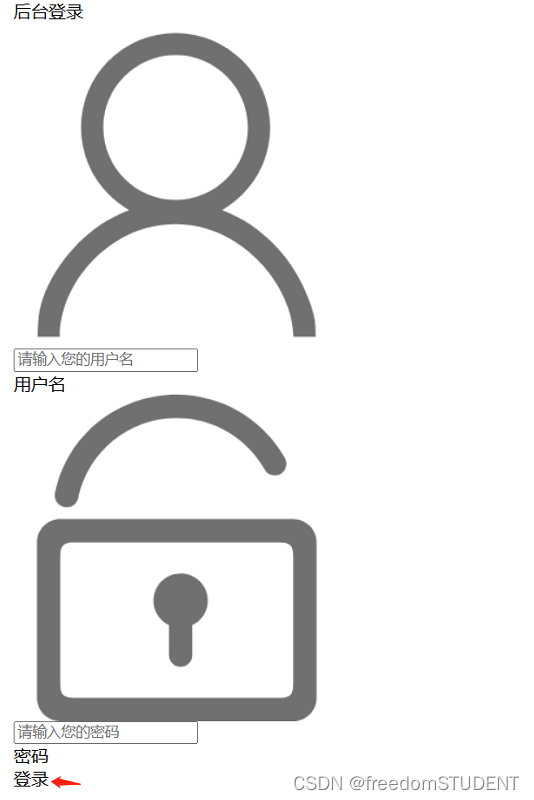
4.
<body>
<form action="${pageContext.request.contextPath}/login" name="myform" method="post">
    <div id="particles-js">
        <div class="login">
            <div class="login-top">
                后台登录
            </div>
            <div class="login-center clearfix">
                <div class="login-center-img"><img src="${pageContext.request.contextPath}/images/name.png"/></div>

                <div class="login-center-input">
                    <input type="text" id="username" name="username" placeholder="请输入您的用户名"
                           onfocus="this.placeholder=''" onblur="this.placeholder='请输入您的用户名'"/>
                    <div class="login-center-input-text">用户名</div>
                </div>
            </div>

            <div class="login-center clearfix">
                <div class="login-center-img"><img src="${pageContext.request.contextPath}/images/password.png"/></div>
                <div class="login-center-input">
                    <input type="password" id="password" name="password" placeholder="请输入您的密码"
                           onfocus="this.placeholder=''" onblur="this.placeholder='请输入您的密码'"/>
                    <div class="login-center-input-text">密码</div>
                </div>
            </div>


        </div>

    </div>
</form>
<div class="login-center clearfix">
    <div class="login-center-img"><img src="${pageContext.request.contextPath}/images/password.png"/></div>
    <div class="login-center-input">
        < input type="password" id="password" name="password" placeholder="Please enter your password"
               οnfοcus="this.placeholder=''" οnblur="this.placeholder='Please enter your password'"/>
        <div class="login-center-input-text">密码</div>
    </div>
</div>
The effect is as follows:

5.
<form action="${pageContext.request.contextPath}/login" name="myform" method="post">
    <div id="particles-js">
        <div class="login">
            <div class="login-top">
                后台登录
            </div>
            <div class="login-center clearfix">
                <div class="login-center-img"><img src="${pageContext.request.contextPath}/images/name.png"/></div>

                <div class="login-center-input">
                    <input type="text" id="username" name="username" placeholder="请输入您的用户名"
                           onfocus="this.placeholder=''" onblur="this.placeholder='请输入您的用户名'"/>
                    <div class="login-center-input-text">用户名</div>
                </div>
            </div>

            <div class="login-center clearfix">
                <div class="login-center-img"><img src="${pageContext.request.contextPath}/images/password.png"/></div>
                <div class="login-center-input">
                    <input type="password" id="password" name="password" placeholder="请输入您的密码"
                           onfocus="this.placeholder=''" onblur="this.placeholder='请输入您的密码'"/>
                    <div class="login-center-input-text">密码</div>
                </div>
            </div>

            <div class="login-button" onclick="check()">
                登录
            </div>


        </div>

    </div>
</form>
<div class="login-button" οnclick="check()">
登录
</div>
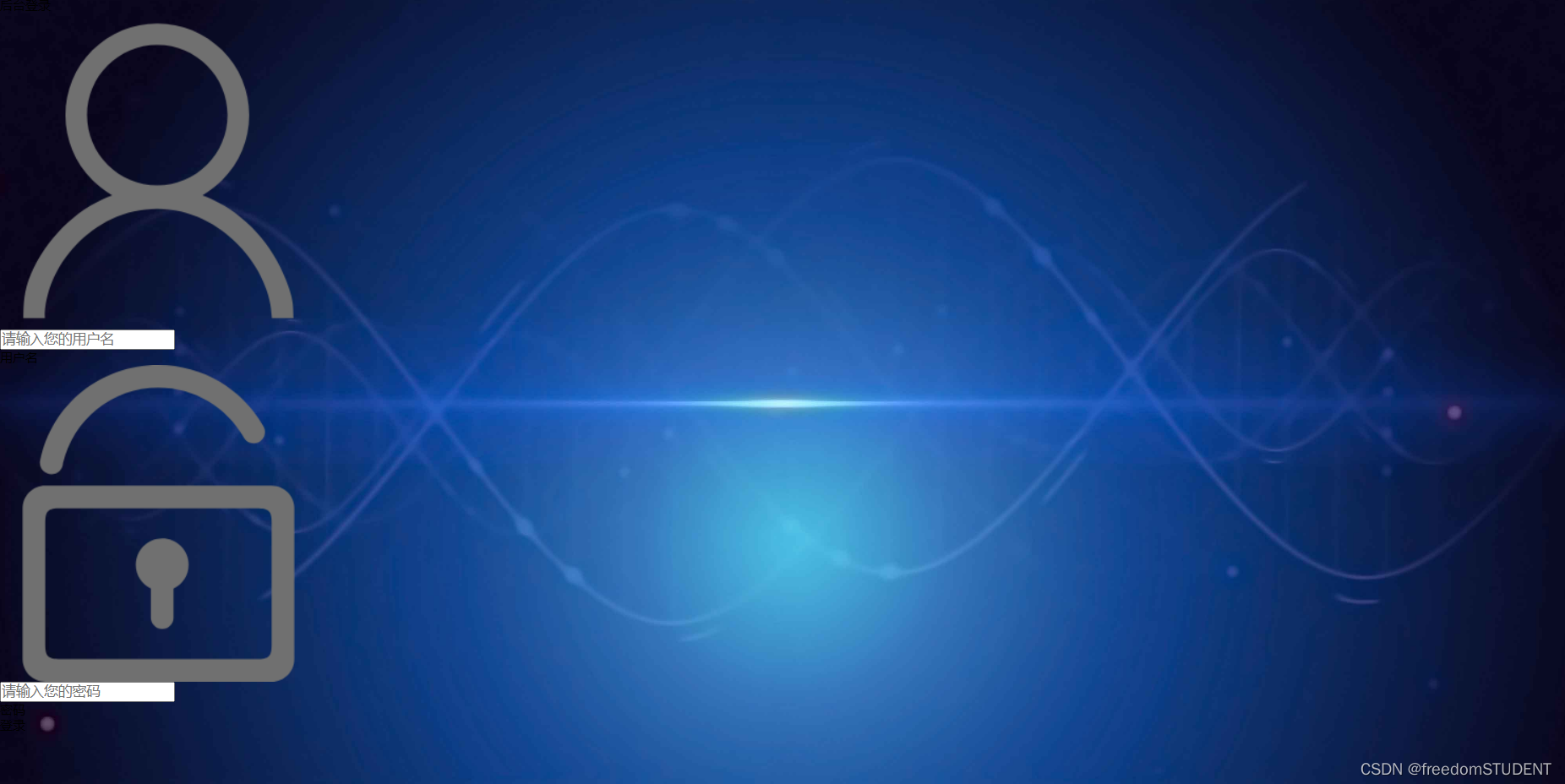
The effect is as follows:
6.

<span style="text-align: center;color: red;"><br>       ${msg}</span>
This code is used in HTML or other web page markup languages, it will display a message in red text (the text color is red) on the page, where ${msg} is a placeholder, indicating that the actual displayed message will be displayed by Programs or codes are dynamically generated and populated here. By using the center alignment style ( text-align: center ), the text will be placed in the center of the page. If you are using a certain web framework or library, this code may already be pre-defined in it and can be used in your project very conveniently.
2. Create a css file and name it style.css
To use the style in style.css, you must add it in login
<link rel="stylesheet" media="screen" href="${pageContext.request.contextPath}/css1/style.css">
1.
html,body{
	width:100%;
	height:100%;
}

#particles-js{
	width: 100%;
	height: 100%;
	position: relative;
	background-image: url(../images/bg.jpg);
	background-position: 50% 50%;
	background-size: cover;
	background-repeat: no-repeat;
	margin-left: auto;
	margin-right: auto;
}
This code is about styling the background image
Corresponding to the following figure
 The effect is as follows:
 Code analysis:
`width: 100%;`: Set the width of the element to 100%.
- `height: 100%;`: Set the height of the element to 100%.
- `position: relative;`: Set the position of the element in the document flow as relative positioning.
- `background-image: url(../images/bg.jpg);`: Set the background image of the element to `../images/bg.jpg`.
- `background-position: 50% 50%;`: Set the position of the background image in the element in the horizontal and vertical direction to 50%.
- `background-size: cover;`: Set the background image to scale proportionally to completely cover the entire element.
- `background-repeat: no-repeat;`: prevents the background image from being repeated in the element.
- `margin-left: auto;`: Set the left margin of the element to auto.
- `margin-right: auto;`: Set the right margin of the element to auto.
2.
html,body{
	width:100%;
	height:100%;
}

#particles-js{
	width: 100%;
	height: 100%;
	position: relative;
	background-image: url(../images/bg.jpg);
	background-position: 50% 50%;
	background-size: cover;
	background-repeat: no-repeat;
	margin-left: auto;
	margin-right: auto;
}


.login{z-index: 2;position:absolute;width: 350px;border-radius: 5px;height: 500px;background: white;box-shadow: 0px 0px 5px #333333;top: 50%;left: 50%;margin-top: -250px;margin-left: -175px;transition: all 1s;-moz-transition: all 1s;	/* Firefox 4 */-webkit-transition: all 1s;	/* Safari 和 Chrome */-o-transition: all 1s;	/* Opera */}
.login{z-index: 2;
       position:absolute;
       width: 350px;
       border-radius: 5px;
       height: 500px;
       background: white;
       box-shadow: 0px 0px 5px #333333;
       top: 50%;
       left: 50%;
       margin-top: -250px;
       margin-left: -175px;
       transition: all 1s;
       -moz-transition: all 1s;
       transition: all 1s;
       -o-transition: all 1s;   }
This line of code corresponds to

The effect is as follows:

Code analysis:
- z-index: 2; Control the level of the element, the larger the value, the higher the front display.
- position: absolute; The positioning method of the element, here is absolute positioning, which is positioned relative to the parent element.
- width: 350px; width is set to 350px- height: 500px; the height is set to 500px
- border-radius: 5px; the roundness of the element. (The degrees of the four rounded corners of the white box in the rendering)
- background: white; The background color of the element.
- box-shadow: 0px 0px 5px #333333; The shadow style of the element.-top: 50%;
- left: 50%;
- top and left: The top and left positions of the element relative to the parent element.- margin-top: -250px;
- margin-left: -175px;
- margin-top and margin-left: the distance between the top and left of the element relative to its own position, generally used to center the element.transition: all 1s;
-moz-transition: all 1s;
transition: all 1s;
-o-transition: all 1s;
-transition and -moz-transition and -o-transition: control the animation duration and effect of the element change process.
3.
html,body{
	width:100%;
	height:100%;
}

#particles-js{
	width: 100%;
	height: 100%;
	position: relative;
	background-image: url(../images/bg.jpg);
	background-position: 50% 50%;
	background-size: cover;
	background-repeat: no-repeat;
	margin-left: auto;
	margin-right: auto;
}


.login{z-index: 2;position:absolute;width: 350px;border-radius: 5px;height: 500px;background: white;box-shadow: 0px 0px 5px #333333;top: 50%;left: 50%;margin-top: -250px;margin-left: -175px;transition: all 1s;-moz-transition: all 1s;	/* Firefox 4 */-webkit-transition: all 1s;	/* Safari 和 Chrome */-o-transition: all 1s;	/* Opera */}
.login-top{font-size: 24px;margin-top: 100px;padding-left: 40px;box-sizing: border-box;color: #333333;margin-bottom: 50px;}
.login-top{font-size: 24px;
           margin-top: 100px;
           padding-left: 40px;
           box-sizing: border-box;
           color: #333333;
           margin-bottom: 50px;}
This line of code corresponds to
This line of code is mainly used for the four characters of background login
The effect is as follows:
Code analysis:
font-size: 24px; Set the font size to 24 pixels.
- margin-top: 100px; Sets the element's top edge to be 100 pixels from the top edge of its container.
- padding-left: 40px; Set the left padding of the element to 40px.
- box-sizing: border-box; The box model of the specified element is border-box, that is, the width and height of the specified element include border and padding.
- color: #333333; Set the text color to #333333, which is one of the hexadecimal color codes.
- margin-bottom: 50px; Sets the element's bottom edge to be 50 pixels from the bottom edge of its container.
4.
html,body{
	width:100%;
	height:100%;
}

#particles-js{
	width: 100%;
	height: 100%;
	position: relative;
	background-image: url(../images/bg.jpg);
	background-position: 50% 50%;
	background-size: cover;
	background-repeat: no-repeat;
	margin-left: auto;
	margin-right: auto;
}


.login{z-index: 2;position:absolute;width: 350px;border-radius: 5px;height: 500px;background: white;box-shadow: 0px 0px 5px #333333;top: 50%;left: 50%;margin-top: -250px;margin-left: -175px;transition: all 1s;-moz-transition: all 1s;	/* Firefox 4 */-webkit-transition: all 1s;	/* Safari 和 Chrome */-o-transition: all 1s;	/* Opera */}
.login-top{font-size: 24px;margin-top: 100px;padding-left: 40px;box-sizing: border-box;color: #333333;margin-bottom: 50px;}
.login-center{width: 100%;box-sizing: border-box;padding: 0 40px;margin-bottom: 30px;}
.login-center{width: 100%;
              box-sizing: border-box;
              padding: 0 40px;
              margin-bottom: 30px;}
The role of this code is to play a central role
This piece of code is as follows:

The effect is as follows:
Code analysis:
.login-center { width: 100%; // Set the width of the element to 100%
box-sizing: border-box; // Define the box model of the element as border-box, that is, the border and padding values of the element will not increase the width and height of the element
padding: 0 40px; // Set the inner margin of the element to 0, and the left and right spacing to 40px
margin-bottom: 30px; // Set the margin below the element to 30px }
5.
html,body{
	width:100%;
	height:100%;
}

#particles-js{
	width: 100%;
	height: 100%;
	position: relative;
	background-image: url(../images/bg.jpg);
	background-position: 50% 50%;
	background-size: cover;
	background-repeat: no-repeat;
	margin-left: auto;
	margin-right: auto;
}


.login{z-index: 2;position:absolute;width: 350px;border-radius: 5px;height: 500px;background: white;box-shadow: 0px 0px 5px #333333;top: 50%;left: 50%;margin-top: -250px;margin-left: -175px;transition: all 1s;-moz-transition: all 1s;	/* Firefox 4 */-webkit-transition: all 1s;	/* Safari 和 Chrome */-o-transition: all 1s;	/* Opera */}
.login-top{font-size: 24px;margin-top: 100px;padding-left: 40px;box-sizing: border-box;color: #333333;margin-bottom: 50px;}
.login-center{width: 100%;box-sizing: border-box;padding: 0 40px;margin-bottom: 30px;}
.login-center-img{width: 20px;height: 20px;float: left;margin-top: 5px;}
.login-center-img>img{width: 100%;}
.login-center-img{width: 20px;
height: 20px;
float: left;
margin-top: 5px;}
.login-center-img>img{width: 100%;}
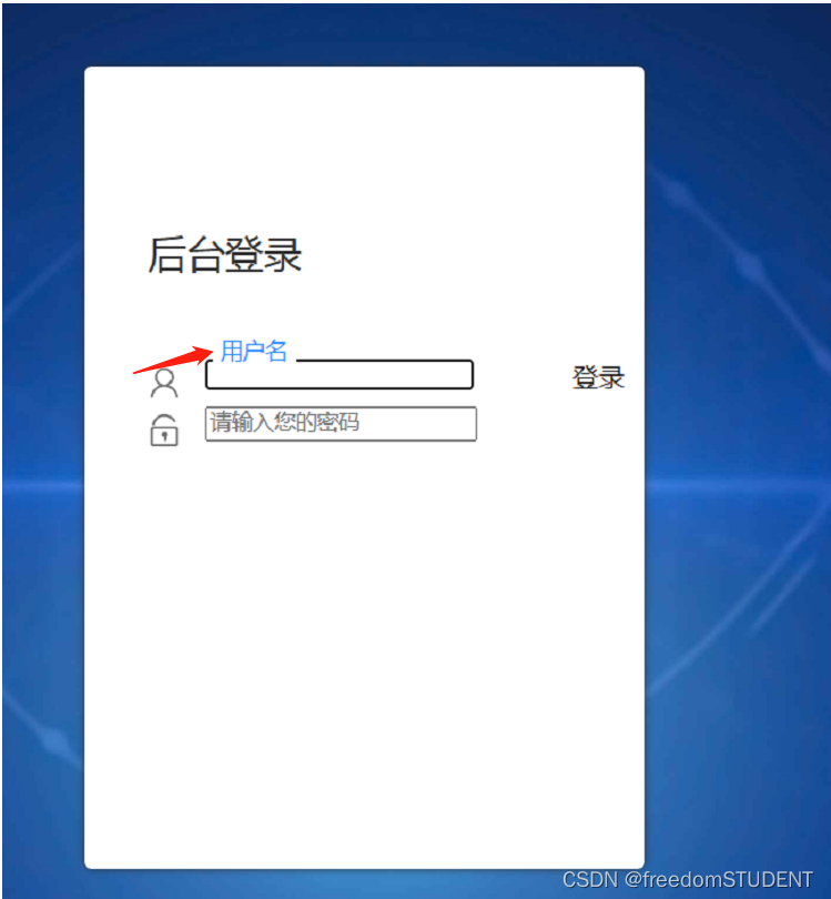
This line of code corresponds to:
The effect is as follows:
Code analysis:
.login-center-img represents the class name of the element;
width: 20px; indicates that the width of the element is 20 pixels;
height: 20px; indicates that the height of the element is 20 pixels;
float: left; indicates that the element floats to the left;
margin-top: 5px; indicates that there is a 5-pixel gap between the top of the element and the element above it.
.login-center-img>img{width: 100%;}The effect is to set the width of the <img> tag to 100%. That is, the <img> tag will fill the width of its parent element instead of maintaining its original width. This is often used to ensure that images maintain the proper proportions and sizes for display on different devices.
6.
html,body{
	width:100%;
	height:100%;
}

#particles-js{
	width: 100%;
	height: 100%;
	position: relative;
	background-image: url(../images/bg.jpg);
	background-position: 50% 50%;
	background-size: cover;
	background-repeat: no-repeat;
	margin-left: auto;
	margin-right: auto;
}


.login{z-index: 2;position:absolute;width: 350px;border-radius: 5px;height: 500px;background: white;box-shadow: 0px 0px 5px #333333;top: 50%;left: 50%;margin-top: -250px;margin-left: -175px;transition: all 1s;-moz-transition: all 1s;	/* Firefox 4 */-webkit-transition: all 1s;	/* Safari 和 Chrome */-o-transition: all 1s;	/* Opera */}
.login-top{font-size: 24px;margin-top: 100px;padding-left: 40px;box-sizing: border-box;color: #333333;margin-bottom: 50px;}
.login-center{width: 100%;box-sizing: border-box;padding: 0 40px;margin-bottom: 30px;}
.login-center-img{width: 20px;height: 20px;float: left;margin-top: 5px;}
.login-center-img>img{width: 100%;}
.login-center-input{float: left;width: 230px;margin-left: 15px;height: 30px;position: relative;}
login-center-input input{z-index: 2;transition: all 0.5s;padding-left: 10px;color: #333333;width: 100%;height: 30px;border: 0;border-bottom: 1px solid #cccccc;border-top: 1px solid #ffffff;border-left: 1px solid #ffffff;border-right: 1px solid #ffffff;box-sizing: border-box;outline: none;position: relative;}
.login-center-input input:focus{border: 1px solid dodgerblue;}
.login-center-input{
float: left;
width: 230px;
margin-left: 15px;
height: 30px;
position: relative;}
login-center-input input{
z-index: 2;
transition: all 0.5s;
padding-left: 10px;
color: #333333;
width: 100%;
height: 30px;
border: 0;
border-bottom: 1px solid #cccccc;
border-top: 1px solid #ffffff;
border-left: 1px solid #ffffff;
border-right: 1px solid #ffffff;
box-sizing: border-box;
outline: none;position: relative;}
.login-center-input input:focus{border: 1px solid dodgerblue;}
This code corresponds to
The effect is as follows:
Code analysis:
float: left means that the element should float to the left, allowing other elements to line up to its right.
width: 230px specifies that the element has a width of 230 pixels.
margin-left: 15px sets the left margin of the element to 15px, leaving some space to the left of it.
height: 30px specifies that the height of the element is 30 pixels.
position: relative sets the element's positioning type to relative positioning, which means it will be positioned relative to its normal position, rather than relative to the parent element.
z-index: 2 - It determines the stacking order of this element (in the context of other overlapping elements), elements with higher z-index values will be placed on top of elements with lower values.
transition: all 0.5s - This animates all style property changes, making them smoother.
padding-left: 10px - it sets the left padding of the element.
color: #333333 - It sets the text color of the element.
width: 100% - It sets the width of the element to the width of the parent element.
height: 30px - it sets the height of the element.
border: 0 - it removes the element's default border.
border-bottom: 1px solid #cccccc - This sets the bottom border of the element to be 1px wide and colored #cccccc.
border-top: 1px solid #ffffff - This sets the top border of the element to be 1px wide and colored #ffffff.
border-left: 1px solid #ffffff - This sets the left border of the element to be 1px wide and colored #ffffff.
border-right: 1px solid #ffffff - This sets the right border of the element to be 1px wide and colored #ffffff.
box-sizing: border-box - It sets the element box size including border and padding, but excluding margins. This means that the element's width and height will be the specified content size plus border and padding sizes.
outline: none - It removes the default outline of the element when it gets focus.
position: relative - it sets the position of the element to be relative.
.login-center-input input:focus{border: 1px solid dodgerblue;}
Its function is to add a blue border to the input box when the user clicks on it.
7.
html,body{
	width:100%;
	height:100%;
}

#particles-js{
	width: 100%;
	height: 100%;
	position: relative;
	background-image: url(../images/bg.jpg);
	background-position: 50% 50%;
	background-size: cover;
	background-repeat: no-repeat;
	margin-left: auto;
	margin-right: auto;
}


.login{z-index: 2;position:absolute;width: 350px;border-radius: 5px;height: 500px;background: white;box-shadow: 0px 0px 5px #333333;top: 50%;left: 50%;margin-top: -250px;margin-left: -175px;transition: all 1s;-moz-transition: all 1s;	/* Firefox 4 */-webkit-transition: all 1s;	/* Safari 和 Chrome */-o-transition: all 1s;	/* Opera */}
.login-top{font-size: 24px;margin-top: 100px;padding-left: 40px;box-sizing: border-box;color: #333333;margin-bottom: 50px;}
.login-center{width: 100%;box-sizing: border-box;padding: 0 40px;margin-bottom: 30px;}
.login-center-img{width: 20px;height: 20px;float: left;margin-top: 5px;}
.login-center-img>img{width: 100%;}
.login-center-input{float: left;width: 230px;margin-left: 15px;height: 30px;position: relative;}
login-center-input input{z-index: 2;transition: all 0.5s;padding-left: 10px;color: #333333;width: 100%;height: 30px;border: 0;border-bottom: 1px solid #cccccc;border-top: 1px solid #ffffff;border-left: 1px solid #ffffff;border-right: 1px solid #ffffff;box-sizing: border-box;outline: none;position: relative;}
.login-center-input input:focus{border: 1px solid dodgerblue;}
.login-center-input-text{background: white;padding: 0 5px;position: absolute;z-index: 0;opacity: 0;height: 20px;top: 50%;margin-top: -10px;font-size: 14px;left: 5px;color: dodgerblue;line-height: 20px;transition: all 0.5s;-moz-transition: all 0.5s;	/* Firefox 4 */-webkit-transition: all 0.5s;	/* Safari 和 Chrome */-o-transition: all 0.5s;	/* Opera */}
.login-center-input-text{background: white;
                        padding: 0 5px;
                        position: absolute;
                        z-index: 0;
                        opacity: 0;
                        height: 20px;
                        top: 50%;
                        margin-top: -10px;
                        font-size: 14px;
                       left: 5px;
                       color: dodgerblue;
                      line-height: 20px;
                      transition: all 0.5s;
                    -moz-transition: all 0.5s;
                  -webkit-transition: all 0.5s;
                   -o-transition: all 0.5s;}
This piece of code works as follows
The effect is as follows:
Code analysis:
background: The background color is white.
padding: The left and right padding of the input box is 5 pixels, and the top and bottom paddings are defaulted.
position: The positioning method of the input box is absolute positioning.
z-index: The level of the layer is 0, that is, it is displayed at the default level.
opacity: The opacity of the input box is 0, that is, it is invisible.
height: The height of the input box is 20 pixels.
top: The input box is vertically centered relative to the parent element (login center).
margin-top: Make the input box vertically offset by half of its own height to achieve complete vertical centering.
font-size: The font size of the text in the input box is 14 pixels.
left: The distance between the input box and the left side is 5 pixels.
color: The color of the text in the input box is dodgerblue.
line-height: The line height of the text in the input box is 20 pixels, which is the same as the height of the input box.
transition: All attribute changes will have a transition animation effect of 0.5 seconds.
-moz-transition: Specifies that all property changes in the Firefox browser will have a transition animation effect of 0.5 seconds.
-webkit-transition: Specifies that all property changes in Google Chrome will have a transition animation effect of 0.5 seconds.
-o-transition: Specifies that all property changes in Openg browser will have a transition animation effect of 0.5 seconds.
8.
html,body{
	width:100%;
	height:100%;
}

#particles-js{
	width: 100%;
	height: 100%;
	position: relative;
	background-image: url(../images/bg.jpg);
	background-position: 50% 50%;
	background-size: cover;
	background-repeat: no-repeat;
	margin-left: auto;
	margin-right: auto;
}


.login{z-index: 2;position:absolute;width: 350px;border-radius: 5px;height: 500px;background: white;box-shadow: 0px 0px 5px #333333;top: 50%;left: 50%;margin-top: -250px;margin-left: -175px;transition: all 1s;-moz-transition: all 1s;	/* Firefox 4 */-webkit-transition: all 1s;	/* Safari 和 Chrome */-o-transition: all 1s;	/* Opera */}
.login-top{font-size: 24px;margin-top: 100px;padding-left: 40px;box-sizing: border-box;color: #333333;margin-bottom: 50px;}
.login-center{width: 100%;box-sizing: border-box;padding: 0 40px;margin-bottom: 30px;}
.login-center-img{width: 20px;height: 20px;float: left;margin-top: 5px;}
.login-center-img>img{width: 100%;}
.login-center-input{float: left;width: 230px;margin-left: 15px;height: 30px;position: relative;}
login-center-input input{z-index: 2;transition: all 0.5s;padding-left: 10px;color: #333333;width: 100%;height: 30px;border: 0;border-bottom: 1px solid #cccccc;border-top: 1px solid #ffffff;border-left: 1px solid #ffffff;border-right: 1px solid #ffffff;box-sizing: border-box;outline: none;position: relative;}
.login-center-input input:focus{border: 1px solid dodgerblue;}
.login-center-input-text{background: white;padding: 0 5px;position: absolute;z-index: 0;opacity: 0;height: 20px;top: 50%;margin-top: -10px;font-size: 14px;left: 5px;color: dodgerblue;line-height: 20px;transition: all 0.5s;-moz-transition: all 0.5s;	/* Firefox 4 */-webkit-transition: all 0.5s;	/* Safari 和 Chrome */-o-transition: all 0.5s;	/* Opera */}
.login-center-input input:focus~.login-center-input-text{top: 0;z-index: 3;opacity: 1;margin-top: -15px;}
.login-center-input input:focus~.login-center-input-text{top: 0;
z-index: 3;
opacity: 1;
margin-top: -15px;}
The effect is as follows:
Code analysis:
.login-center-input input:focus~.login-center-input-text{top: 0; z-index: 3; opacity: 1; margin-top: -15px;}When an input form gains focus (for example, the user clicks or presses the Tab key to enter the form), do the following for its adjacent element with the class name .login-center-input-text:
Position the element at the top of the input box (top: 0).
Make it visible (z-index: 3) above other elements.
Set its opacity to 1 (opacity: 1) so that the user can see its content.
Set the padding above it to -15px ( margin-top: -15px ) to counteract the space created by the text movement.
9.
html,body{
	width:100%;
	height:100%;
}


#particles-js{
	width: 100%;
	height: 100%;
	position: relative;
	background-image: url(../images/bg.jpg);
	background-position: 50% 50%;
	background-size: cover;
	background-repeat: no-repeat;
	margin-left: auto;
	margin-right: auto;
}


.login{z-index: 2;position:absolute;width: 350px;border-radius: 5px;height: 500px;background: white;box-shadow: 0px 0px 5px #333333;top: 50%;left: 50%;margin-top: -250px;margin-left: -175px;transition: all 1s;-moz-transition: all 1s;	/* Firefox 4 */-webkit-transition: all 1s;	/* Safari 和 Chrome */-o-transition: all 1s;	/* Opera */}
.login-top{font-size: 24px;margin-top: 100px;padding-left: 40px;box-sizing: border-box;color: #333333;margin-bottom: 50px;}
.login-center{width: 100%;box-sizing: border-box;padding: 0 40px;margin-bottom: 30px;}
.login-center-img{width: 20px;height: 20px;float: left;margin-top: 5px;}
.login-center-img>img{width: 100%;}
.login-center-input{float: left;width: 230px;margin-left: 15px;height: 30px;position: relative;}
.login-center-input input{z-index: 2;transition: all 0.5s;padding-left: 10px;color: #333333;width: 100%;height: 30px;border: 0;border-bottom: 1px solid #cccccc;border-top: 1px solid #ffffff;border-left: 1px solid #ffffff;border-right: 1px solid #ffffff;box-sizing: border-box;outline: none;position: relative;}
.login-center-input input:focus{border: 1px solid dodgerblue;}
.login-center-input-text{background: white;padding: 0 5px;position: absolute;z-index: 0;opacity: 0;height: 20px;top: 50%;margin-top: -10px;font-size: 14px;left: 5px;color: dodgerblue;line-height: 20px;transition: all 0.5s;-moz-transition: all 0.5s;	/* Firefox 4 */-webkit-transition: all 0.5s;	/* Safari 和 Chrome */-o-transition: all 0.5s;	/* Opera */}
.login-center-input input:focus~.login-center-input-text{top: 0;z-index: 3;opacity: 1;margin-top: -15px;}
.login-button{cursor: pointer;width: 250px;text-align: center;height: 40px;line-height: 40px;background-color: dodgerblue;border-radius: 5px;margin: 0 auto;margin-top: 50px;color: white;}
.login-button{cursor: pointer;width: 250px;
              text-align: center;
              height: 40px;
              line-height: 40px;
              background-color: dodgerblue;border-radius: 5px;margin: 0 auto;margin-top: 50px;color: white;}
Used to style the login button. Among them, the button's width, height, line height, background color, rounded corners and other attributes are set, and the button is centered on the top of the page. The "cursor: pointer" attribute is used, so that when the mouse hovers over the upper button, it will become a hand shape, which enhances the user experience. At the same time, the color of the text button is set to white.

10.
html,body{
	width:100%;
	height:100%;
}


.js-count-particles{
  font-size: 1.1em;
}

#stats,
.count-particles{
  -webkit-user-select: none;
  margin-top: 5px;
  margin-left: 5px;
}

#stats{
  border-radius: 3px 3px 0 0;
  overflow: hidden;
}

.count-particles{
  border-radius: 0 0 3px 3px;
}


#particles-js{
	width: 100%;
	height: 100%;
	position: relative;
	background-image: url(../images/bg.jpg);
	background-position: 50% 50%;
	background-size: cover;
	background-repeat: no-repeat;
	margin-left: auto;
	margin-right: auto;
}

body{margin:0;padding:0;}

.login{z-index: 2;position:absolute;width: 350px;border-radius: 5px;height: 500px;background: white;box-shadow: 0px 0px 5px #333333;top: 50%;left: 50%;margin-top: -250px;margin-left: -175px;transition: all 1s;-moz-transition: all 1s;	/* Firefox 4 */-webkit-transition: all 1s;	/* Safari 和 Chrome */-o-transition: all 1s;	/* Opera */}
.login-top{font-size: 24px;margin-top: 100px;padding-left: 40px;box-sizing: border-box;color: #333333;margin-bottom: 50px;}
.login-center{width: 100%;box-sizing: border-box;padding: 0 40px;margin-bottom: 30px;}
.login-center-img{width: 20px;height: 20px;float: left;margin-top: 5px;}
.login-center-img>img{width: 100%;}
.login-center-input{float: left;width: 230px;margin-left: 15px;height: 30px;position: relative;}
.login-center-input input{z-index: 2;transition: all 0.5s;padding-left: 10px;color: #333333;width: 100%;height: 30px;border: 0;border-bottom: 1px solid #cccccc;border-top: 1px solid #ffffff;border-left: 1px solid #ffffff;border-right: 1px solid #ffffff;box-sizing: border-box;outline: none;position: relative;}
.login-center-input input:focus{border: 1px solid dodgerblue;}
.login-center-input-text{background: white;padding: 0 5px;position: absolute;z-index: 0;opacity: 0;height: 20px;top: 50%;margin-top: -10px;font-size: 14px;left: 5px;color: dodgerblue;line-height: 20px;transition: all 0.5s;-moz-transition: all 0.5s;	/* Firefox 4 */-webkit-transition: all 0.5s;	/* Safari 和 Chrome */-o-transition: all 0.5s;	/* Opera */}
.login-center-input input:focus~.login-center-input-text{top: 0;z-index: 3;opacity: 1;margin-top: -15px;}
.login-button{cursor: pointer;width: 250px;text-align: center;height: 40px;line-height: 40px;background-color: dodgerblue;border-radius: 5px;margin: 0 auto;margin-top: 50px;color: white;}
body{margin:0;padding:0;}
The margin and padding of the elements in the body are 0. This allows the content of the entire page to be displayed close to the browser window without additional blank space
The effect is as follows:
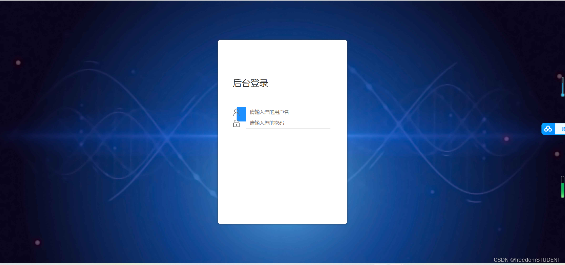
The background image completely covers the web page
11.
html,body{
	width:100%;
	height:100%;
}


.js-count-particles{
  font-size: 1.1em;
}

#stats,
.count-particles{
  -webkit-user-select: none;
  margin-top: 5px;
  margin-left: 5px;
}

#stats{
  border-radius: 3px 3px 0 0;
  overflow: hidden;
}

.count-particles{
  border-radius: 0 0 3px 3px;
}


#particles-js{
	width: 100%;
	height: 100%;
	position: relative;
	background-image: url(../images/bg.jpg);
	background-position: 50% 50%;
	background-size: cover;
	background-repeat: no-repeat;
	margin-left: auto;
	margin-right: auto;
}

body{margin:0;padding:0;}
.clearfix:after{visibility:hidden;display: block;font-size:0;content:" ";clear:both;height:0;}

.login{z-index: 2;position:absolute;width: 350px;border-radius: 5px;height: 500px;background: white;box-shadow: 0px 0px 5px #333333;top: 50%;left: 50%;margin-top: -250px;margin-left: -175px;transition: all 1s;-moz-transition: all 1s;	/* Firefox 4 */-webkit-transition: all 1s;	/* Safari 和 Chrome */-o-transition: all 1s;	/* Opera */}
.login-top{font-size: 24px;margin-top: 100px;padding-left: 40px;box-sizing: border-box;color: #333333;margin-bottom: 50px;}
.login-center{width: 100%;box-sizing: border-box;padding: 0 40px;margin-bottom: 30px;}
.login-center-img{width: 20px;height: 20px;float: left;margin-top: 5px;}
.login-center-img>img{width: 100%;}
.login-center-input{float: left;width: 230px;margin-left: 15px;height: 30px;position: relative;}
.login-center-input input{z-index: 2;transition: all 0.5s;padding-left: 10px;color: #333333;width: 100%;height: 30px;border: 0;border-bottom: 1px solid #cccccc;border-top: 1px solid #ffffff;border-left: 1px solid #ffffff;border-right: 1px solid #ffffff;box-sizing: border-box;outline: none;position: relative;}
.login-center-input input:focus{border: 1px solid dodgerblue;}
.login-center-input-text{background: white;padding: 0 5px;position: absolute;z-index: 0;opacity: 0;height: 20px;top: 50%;margin-top: -10px;font-size: 14px;left: 5px;color: dodgerblue;line-height: 20px;transition: all 0.5s;-moz-transition: all 0.5s;	/* Firefox 4 */-webkit-transition: all 0.5s;	/* Safari 和 Chrome */-o-transition: all 0.5s;	/* Opera */}
.login-center-input input:focus~.login-center-input-text{top: 0;z-index: 3;opacity: 1;margin-top: -15px;}
.login.active{-webkit-animation: login-small 0.8s ; animation: login-small 0.8s ;animation-fill-mode:forwards;-webkit-animation-fill-mode:forwards}
.login-button{cursor: pointer;width: 250px;text-align: center;height: 40px;line-height: 40px;background-color: dodgerblue;border-radius: 5px;margin: 0 auto;margin-top: 50px;color: white;}
.clearfix:after{visibility:hidden;
                 display: block;
                 font-size:0;
                  content:" ";
                  clear:both;
                  height:0;}
For a class that creates clear floats. By adding this class to the element, the mid-floating of the element can be cleared to prevent it from affecting subsequent elements. Among them, the pseudo-element ":after" is used to insert a space to achieve the effect of clearing the float.
The effect is as follows:
3. Code
Related files, image downloads:
https://download.csdn.net/download/m0_67930426/87902949?spm=1001.2014.3001.5503
login.jsp
<%--
Created by IntelliJ IDEA.
User: 23502
Date: 2023/6/3
Time: 18:18
To change this template use File | Settings | File Templates.
--%>
<%@ page contentType="text/html;charset=UTF-8" language="java" %>
<html>
<head>
<link rel="stylesheet" media="screen" href="${pageContext.request.contextPath}/css1/style.css">
<title>Title</title>
</head>
<body>
<form action="${pageContext.request.contextPath}/2" name="myform" method="post">
<div id="particles-js">
<div class="login">
<div class="login-top">
后台登录
</div>
<div class="login-center clearfix">
<div class="login-center-img"><img src="${pageContext.request.contextPath}/images/name.png"/></div>
<div class="login-center-input">
<input type="text" id="username" name="username" placeholder="请输入您的用户名"
onfocus="this.placeholder=''" onblur="this.placeholder='请输入您的用户名'"/>
<div class="login-center-input-text">用户名</div>
</div>
</div>
<div class="login-center clearfix">
<div class="login-center-img"><img src="${pageContext.request.contextPath}/images/password.png"/></div>
<div class="login-center-input">
<input type="password" id="password" name="password" placeholder="请输入您的密码"
onfocus="this.placeholder=''" onblur="this.placeholder='请输入您的密码'"/>
<div class="login-center-input-text">密码</div>
</div>
</div>
<div class="login-button" onclick="check()">
登录
</div>
<span style="text-align: center;color: red;"><br>       ${msg}</span>
</div>
<div class="sk-rotating-plane"></div>
</div>
</form>
</body>
</html>style.css
html,body{
	width:100%;
	height:100%;
}


.js-count-particles{
  font-size: 1.1em;
}

#stats,
.count-particles{
  -webkit-user-select: none;
  margin-top: 5px;
  margin-left: 5px;
}

#stats{
  border-radius: 3px 3px 0 0;
  overflow: hidden;
}

.count-particles{
  border-radius: 0 0 3px 3px;
}


#particles-js{
	width: 100%;
	height: 100%;
	position: relative;
	background-image: url(../images/bg.jpg);
	background-position: 50% 50%;
	background-size: cover;
	background-repeat: no-repeat;
	margin-left: auto;
	margin-right: auto;
}

body{margin:0;padding:0;}
.clearfix:after{visibility:hidden;display: block;font-size:0;content:" ";clear:both;height:0;}

.login{z-index: 2;position:absolute;width: 350px;border-radius: 5px;height: 500px;background: white;box-shadow: 0px 0px 5px #333333;top: 50%;left: 50%;margin-top: -250px;margin-left: -175px;transition: all 1s;-moz-transition: all 1s;	/* Firefox 4 */-webkit-transition: all 1s;	/* Safari 和 Chrome */-o-transition: all 1s;	/* Opera */}
.login-top{font-size: 24px;margin-top: 100px;padding-left: 40px;box-sizing: border-box;color: #333333;margin-bottom: 50px;}
.login-center{width: 100%;box-sizing: border-box;padding: 0 40px;margin-bottom: 30px;}
.login-center-img{width: 20px;height: 20px;float: left;margin-top: 5px;}
.login-center-img>img{width: 100%;}
.login-center-input{float: left;width: 230px;margin-left: 15px;height: 30px;position: relative;}
.login-center-input input{z-index: 2;transition: all 0.5s;padding-left: 10px;color: #333333;width: 100%;height: 30px;border: 0;border-bottom: 1px solid #cccccc;border-top: 1px solid #ffffff;border-left: 1px solid #ffffff;border-right: 1px solid #ffffff;box-sizing: border-box;outline: none;position: relative;}
.login-center-input input:focus{border: 1px solid dodgerblue;}
.login-center-input-text{background: white;padding: 0 5px;position: absolute;z-index: 0;opacity: 0;height: 20px;top: 50%;margin-top: -10px;font-size: 14px;left: 5px;color: dodgerblue;line-height: 20px;transition: all 0.5s;-moz-transition: all 0.5s;	/* Firefox 4 */-webkit-transition: all 0.5s;	/* Safari 和 Chrome */-o-transition: all 0.5s;	/* Opera */}
.login-center-input input:focus~.login-center-input-text{top: 0;z-index: 3;opacity: 1;margin-top: -15px;}
.login.active{-webkit-animation: login-small 0.8s ; animation: login-small 0.8s ;animation-fill-mode:forwards;-webkit-animation-fill-mode:forwards}
.login-button{cursor: pointer;width: 250px;text-align: center;height: 40px;line-height: 40px;background-color: dodgerblue;border-radius: 5px;margin: 0 auto;margin-top: 50px;color: white;}