
Definition of an area chart:
The area chart is based on the line chart, and the area below the line is filled with color (that is, the area color). It is used to display values on continuous intervals or time spans. It is generally used to display trends and comparative relationships (between multiple area blocks). contrast between), different color fills can better highlight the trend information. Area charts are most commonly used to show trends and relationships, rather than to communicate specific values.
Types of area charts:
(1) According to the form of presentation, we can divide the area chart into two-dimensional area chart and three-dimensional area chart. The two-dimensional area chart is mainly presented in the form of a plane, while the three-dimensional area chart is presented in a three-dimensional form.
(2) According to the content of emphasis, area charts can be divided into three categories:
① Ordinary area chart: Displays the trend line of various values over time or category.
②Stacked area chart: Displays the trend line of the size of each value over time or category, mainly emphasizing the trend line of the value of a certain category intersecting on the series axis.
③Percent stacked area chart: Displays the trend line of the percentage of each value over time or category, mainly emphasizing the proportional trend line of each series.
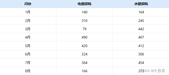
Next, I use the following data as an example data to make an area chart using the Shanhaijing visualization software:
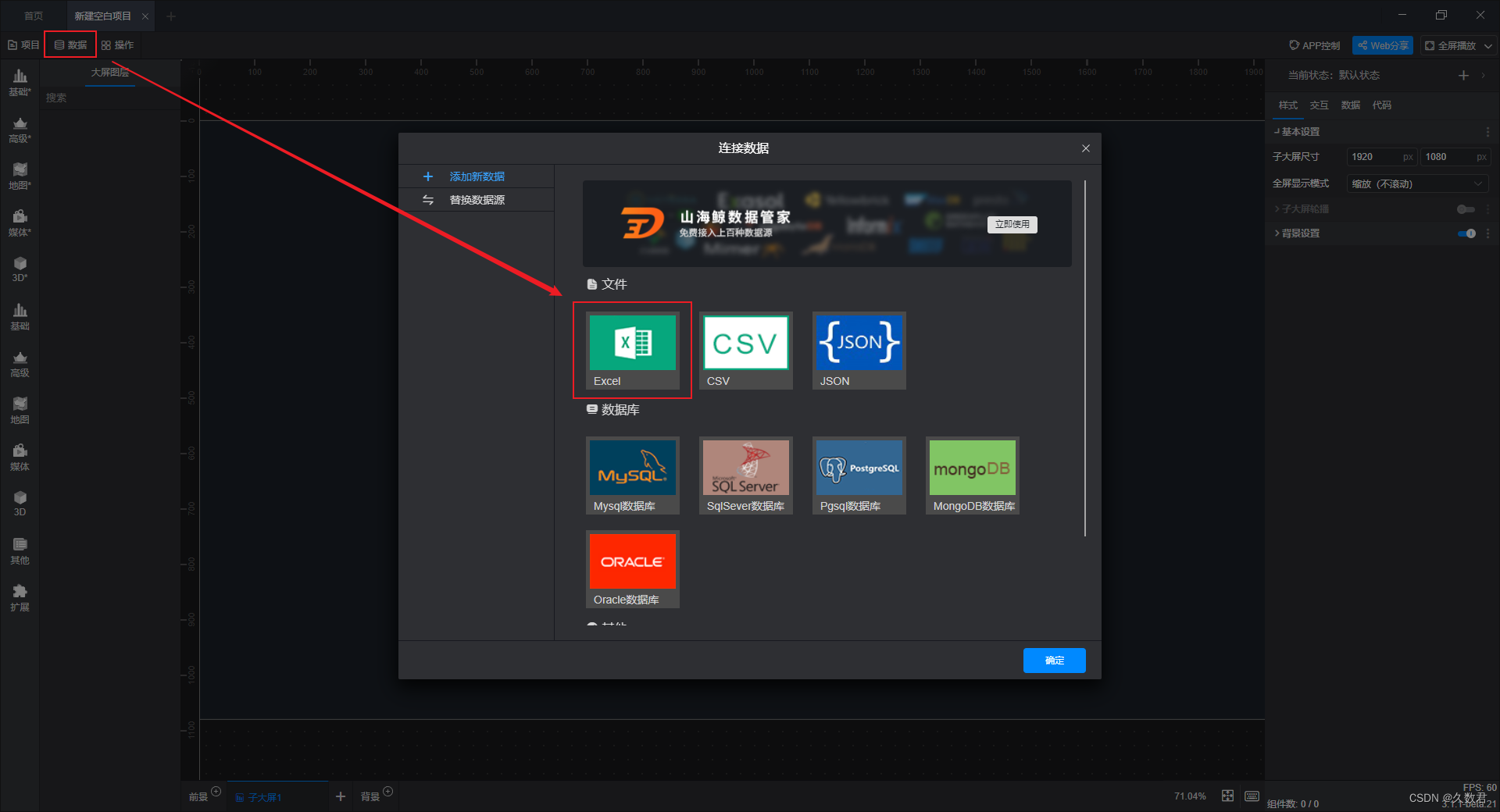
① Import the sample data we prepared in advance into the software:
② Directly select the built-in basic component of the software - area chart:
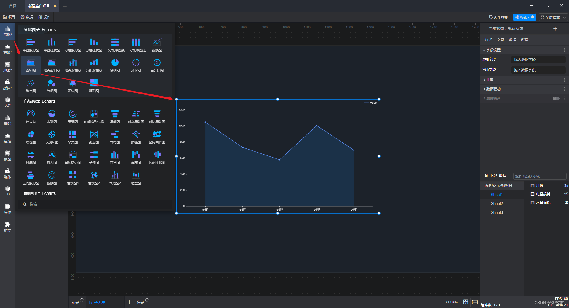
③Connect the imported data with the added components, that is, check and add fields:

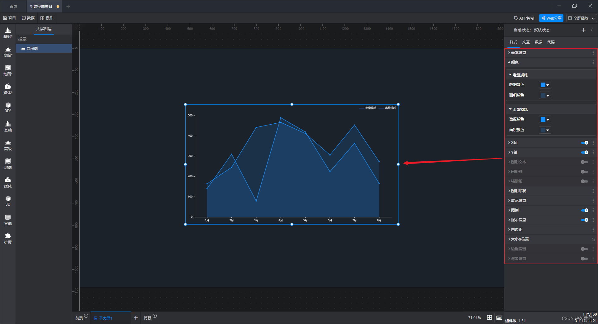
④ After the data is added, a complete area map has been made, and finally you only need to change the style according to your own aesthetics or needs:
In the above steps, it should not be difficult to find that we don't need to write any code, we just need to directly connect the data with the built-in components. The zero-code drag-and-drop operation can save a lot of time, and is very suitable for data analysts who do not know how to code but have the need to make visual charts or large-screen visualizations~
The role of the area chart:
When using an area chart, it is often necessary to mention the line chart, but the area chart looks more beautiful than the line chart, and it can better highlight the area occupied by each series and grasp the overall trend more intuitively. The most important point is that the area chart can be compared vertically with other departments, which can intuitively reflect the differences.