Table of contents
- Chapter 1: Introduction to ECharts
- Chapter 2: Building a Development Environment
- Chapter 3: Component Details
Chapter 1: Introduction to ECharts
1.1. Overview of ECharts
- ECharts is a JavaScript-based data visualization chart library that provides intuitive, vivid, interactive, and customizable data visualization charts.
- ECharts was originally open-sourced by the Baidu team, and was donated to the Apache Foundation in early 2018, becoming an ASF incubation-level project.
- ECharts, the full name of Enterprise Charts, commercial-grade data charts, a pure Javascript chart library , can run smoothly on PCs and mobile devices , and is compatible with most current browsers.
- Provide many of us with intuitive, vivid, interactive, and highly customizable data visualization charts .
- It can support 12 types of charts such as line charts, histograms, scatter charts, candlestick charts, pie charts, radar charts, chord charts, force-directed layout charts, maps, dashboards, funnel charts, and event river charts .
- At the same time , it provides 7 interactive components such as title, detail bubble, legend, value field, data area, time axis, toolbox, etc.
- Support linkage and mash-up display of multiple diagrams and components.
1.2. Features of ECharts
(1) Rich types of visualization
ECharts provides many ways to implement graphs, including line graphs, histograms, scatter graphs, pie charts, K-line graphs, box-and-whisker graphs, maps, relationship graphs, rectangular tree graphs, sunburst graphs, and funnels Charts, dashboards, etc.
In addition, ECharts also provides custom series, which can expand different charts
(2) Support multiple data formats
In ECharts 4.0 and above, the dataset attribute of ECharts supports the incoming data format except Two-dimensional tables, as well as key-value pairs.
(3) Tens of millions of data are displayed smoothly on the front end.
The enhanced rendering technology of ECharts version 4.0 and above enables smooth interaction when displaying tens of millions of data, such as zooming and panning. The support for streaming loading enables data to be loaded and rendered in chunks for a better user experience.
(4) Animation display of dynamic data
When the data changes, ECharts displays the visualization of new data through appropriate internal animation changes, often in conjunction with time series data display
(5) More and more powerful three-dimensional visualization
ECharts provides ECharts GL, It can realize visualization effects such as three-dimensional earth and buildings, and can be applied in VR and large-screen scenes, and the effect is even more cool.
(6) Cross-platform application
ECharts has different rendering schemes, which can be well adapted to different platforms. For example, the SVG rendering of ECharts 4.0 and above makes the mobile terminal no need to worry about memory, and the Canvas rendering enables the PC terminal to display special effects with a large amount of data, and ECharts 4.0 starts to adapt to the WeChat applet (7) Data depth exploration ECharts supports user interaction to
mine
data information, and provide convenient interactive components such as legends, visual maps, and data area zooming, so that users can dig into the details of data display from the overview
(8) Barrier-free access
ECharts 4.0 complies with the barrier-free rich Internet application specification set specified by W3C, and supports the generation of descriptions for visualization, so that blind people can understand the content of the chart through voice.
In addition to the ECharts features mentioned above, there are more surprises in ECharts, which you can slowly discover in your future studies.
1.3. ECharts vs. Highcharts
Highcharts is a charting library written in JavaScript that supports a variety of commonly used visualizations. As similar visualization products, the comparison between ECharts and Highcharts is as follows
1. Chart Type Angle
At present, the shared visual diagrams displayed on the official websites of ECharts and Highcharts are roughly the same. The difference is that ECharts official website also displays tree diagrams, path diagrams, sunburst diagrams, pictograms, calendar coordinate systems, etc. Highcharts official website also displays bullet diagrams and honeycomb diagrams. wait.
2. Is it free?
ECharts is free. Highcharts is free to learn and paid for commercial use
3. Visualization technology perspective
The latest ECharts supports Canvas and SVG rendering methods, and Highcharts supports SVG rendering methods
Canvas (canvas) accommodates all UI elements. Canvas is a Game Object mounted with Canvas Component, all UI elements must be its child nodes, and event handling is not supported.
SVG is a graphics file format. Its full English name is Scalable Vector Graphics, which means scalable vector graphics. It is based on XML (Extensible Markup Language), developed by the World Wide Web Consortium (W3C) alliance. Strictly speaking, it should be an open standard vector graphics language that allows you to design exciting, high-resolution web graphics pages. Users can directly use codes to draw images, open SVG images with any word processing tool, make images interactive by changing some codes, and insert them into HTML at any time to view them through a browser. Not suitable for gaming applications.
Chapter 2: Building a Development Environment
2.1. Install ECharts
The official website seems to be unable to enter even after clicking this link. There are
four ways to download: direct download, npm, github, and CDN import
Direct download :
We can directly download echarts.min.js and import it with the <script> tag.
https://cdn.staticfile.org/echarts/4.7.0/echarts.min.js
In addition, the source code version echarts.js can be used in the development environment and imported with the <script> tag. The source code version contains common error messages and warn.
https://cdn.staticfile.org/echarts/4.7.0/echarts.js
We can also directly download more rich versions from the official website of ECharts, including different themes and languages,
download address: https://echarts.apache.org/zh/download.html . (Temporarily inaccessible)
These built echarts provide the following customizations:
- Full version: echarts/dist/echarts.js , the largest volume, including all charts and components, see: echarts/echarts.all.js for the included content .
- Commonly used version: echarts/dist/echarts.common.js , moderate in size, contains common charts and components, see: echarts/echarts.common.js for the included content .
- Lite version: echarts/dist/echarts.simple.js , smaller in size, only contains the most commonly used charts and components, see: echarts/echarts.simple.js for the included content .
CDN:
-
Staticfile CDN (domestic) : https://cdn.staticfile.org/echarts/4.3.0/echarts.min.js
-
jsDelivr:https://cdn.jsdelivr.net/npm/[email protected]/dist/echarts.min.js
-
cdnjs :https://cdnjs.cloudflare.com/ajax/libs/echarts/4.3.0/echarts.min.js
NPM method
Due to the slow installation speed of npm, this tutorial uses the image of Taobao and its command cnpm. For the introduction of installation and use, refer to: Use Taobao NPM image.
The npm version needs to be greater than 3.0, if it is lower than this version it needs to be upgraded:
Check version
npm -v
2.3.0
upgrade npm
cnpm install npm -g
upgrade or install cnpm
npm install cnpm -g
最新稳定版
$ cnpm install echarts --save
Example:
var echarts = require('echarts');

// 基于准备好的dom,初始化echarts实例
var myChart = echarts.init(document.getElementById('main'));

// 绘制图表
myChart.setOption({


    title: {


        text: 'ECharts 入门示例'
    },
    tooltip: {

    },
    xAxis: {


        data: ['衬衫', '羊毛衫', '雪纺衫', '裤子', '高跟鞋', '袜子']
    },
    yAxis: {

    },
    series: [{


        name: '销量',
        type: 'bar',
        data: [5, 20, 36, 10, 10, 20]
    }]
});
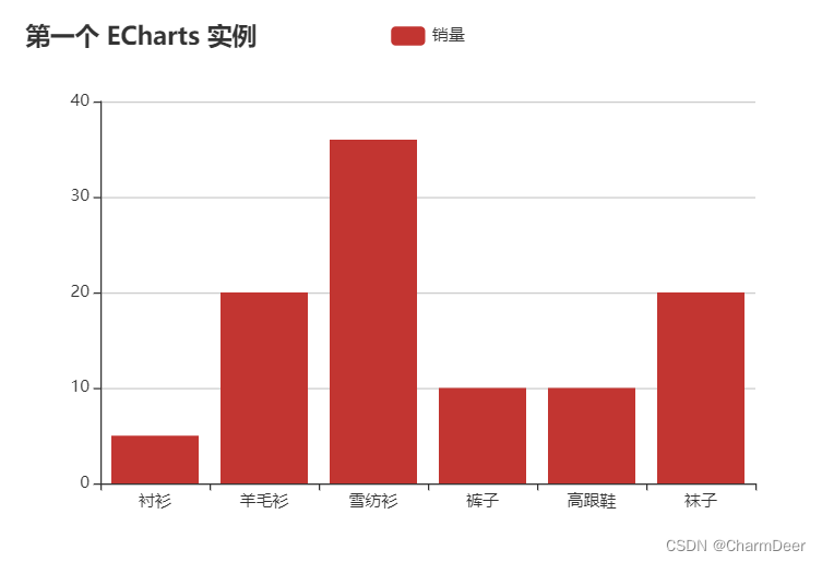
2.2. Simple use of ECharts
Here use CDN to introduce test, please download for actual development
<!DOCTYPE html>
<html>
<head>
    <meta charset="utf-8">
    <title>第一个 ECharts 实例</title>
    <!-- 引入 echarts.js -->
    <script src="https://cdn.staticfile.org/echarts/4.3.0/echarts.min.js"></script>
</head>
<body>
    <!-- 为ECharts准备一个具备大小(宽高)的Dom -->
    <div id="main" style="width: 600px;height:400px;"></div>
    <script type="text/javascript">
        // 基于准备好的dom,初始化echarts实例
        var myChart = echarts.init(document.getElementById('main'));

        // 指定图表的配置项和数据
        var option = {


            title: {


                text: '第一个 ECharts 实例'
            },
            tooltip: {

      },
            legend: {


                data:['销量']
            },
            xAxis: {


                data: ["衬衫","羊毛衫","雪纺衫","裤子","高跟鞋","袜子"]
            },
            yAxis: {

      },
            series: [{


                name: '销量',
                type: 'bar',
                data: [5, 20, 36, 10, 10, 20]
            }]
        };

        // 使用刚指定的配置项和数据显示图表。
        myChart.setOption(option);
    </script>
</body>
</html>
running result:
Chapter 3: Component Details
3.1. Configuration syntax
Step 1: Create an HTML page
Create an HTML page and import echarts.min.js:
<!DOCTYPE html>
<html>
<head>
    <meta charset="utf-8">
    <!-- 引入 ECharts 文件 -->
    <script src="echarts.min.js"></script>
</head>
</html>
Step 2: Prepare a DOM container with height and width for ECharts.
The div whose id is main in the instance is used to contain the chart drawn by ECharts:
<body>
    <!-- 为 ECharts 准备一个具备大小(宽高)的 DOM -->
    <div id="main" style="width: 600px;height:400px;"></div>
</body>
Step 3: Set configuration information
ECharts library uses json format to configure
echarts.init(document.getElementById('main')).setOption(option);
Here option means to use the configuration of json data format to draw the chart. Proceed as follows:
title
Configure a title for the chart:
title: {


    text: '第一个 ECharts 实例'
}
prompt information
Configuration prompt information:
tooltip: {},
legend component
The legend component presents the different series of symbols, colors and names. Which series are not displayed can be controlled by clicking on the legend.
legend: {


    data: [{


        name: '系列1',
        // 强制设置图形为圆。
        icon: 'circle',
        // 设置文本为红色
        textStyle: {


            color: 'red'
        }
    }]
}
X-axis
Configure the items to display on the x-axis:
xAxis: {


    data: ["衬衫","羊毛衫","雪纺衫","裤子","高跟鞋","袜子"]
}
Y axis
Configure the items to display on the Y axis.
yAxis: {}
series list
Each series determines its own chart type by type:
series: [{


    name: '销量',  // 系列名称
    type: 'bar',  // 系列图表类型
    data: [5, 20, 36, 10, 10, 20]  // 系列中的数据内容
}]
Each series determines its own chart type by type:
- type: 'bar': histogram/bar chart
- type: 'line': line/area chart
- type: 'pie': pie
- type: 'scatter': scatter (bubble) chart
- type: 'effectScatter': Scatter (bubbles) with ripple effect animation
- type: 'radar': Radar chart
- type: 'tree': tree diagram
- type: 'treemap': tree map
- type: 'sunburst': sunburst chart
- type: 'boxplot': box plot
- type: 'candlestick': candlestick chart
- type: 'heatmap': heat map
- type: 'map': map
- type: 'parallel': series of parallel coordinate systems
- type: 'lines': line graph
- type: 'graph': relationship graph
- type: 'sankey': Sankey diagram
- type: 'funnel': funnel chart
- type: 'gauge': Dashboard
- type: 'pictorialBar': pictorial bar chart
- type: 'themeRiver': theme river
- type: 'custom': custom series
Example
The following is a complete example:
<!DOCTYPE html>
<html>
<head>
    <meta charset="utf-8">
    <title>第一个 ECharts 实例</title>
    <!-- 引入 echarts.js -->
    <script src="https://cdn.staticfile.org/echarts/4.3.0/echarts.min.js"></script>
</head>
<body>
    <!-- 为ECharts准备一个具备大小(宽高)的Dom -->
    <div id="main" style="width: 600px;height:400px;"></div>
    <script type="text/javascript">
        // 基于准备好的dom,初始化echarts实例
        var myChart = echarts.init(document.getElementById('main'));

        // 指定图表的配置项和数据
        var option = {


            title: {


                text: '第一个 ECharts 实例'
            },
            tooltip: {

      },
            legend: {


                data:['销量']
            },
            xAxis: {


                data: ["衬衫","羊毛衫","雪纺衫","裤子","高跟鞋","袜子"]
            },
            yAxis: {

      },
            series: [{


                name: '销量',
                type: 'bar',
                data: [5, 20, 36, 10, 10, 20]
            }]
        };

        // 使用刚指定的配置项和数据显示图表。
        myChart.setOption(option);
    </script>
</body>
</html>
You can try changing the type, some types do not support this format, and it is normal
3.2, detailed parsing grammar
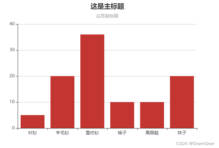
3.2.1 Title
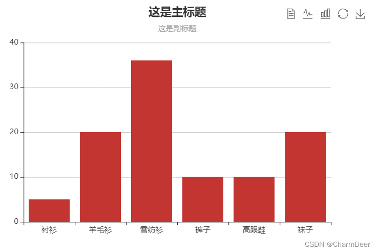
In ECharts, the title generally includes the main title and subtitle, and the relevant parameter configuration of the title can be configured in the title in the option. Here are some common parameters
- text: main title text, support line break with \n
- subtext: subtitle text, support line break with \n
- left: the distance from the left side of the container, its value can be a specific pixel value, for example: 10; it can also be a percentage value relative to the container, for example: 10%; it can also be the more commonly used left, center, right, you can It is understood as left alignment, center alignment, and right alignment.
- show: Whether to display the title component, the value is Boolean data type data, the default is true
title{


	text:"这是主标题",
	subtext:"这是副标题",
	left:"center" //居中显示
}
Full code:
<!DOCTYPE html>
<html lang="en">

<head>
    <meta charset="UTF-8">
    <meta http-equiv="X-UA-Compatible" content="IE=edge">
    <meta name="viewport" content="width=device-width, initial-scale=1.0">
    <title>ECharts图表</title>
    <!-- 引入 echarts.js -->
    <script src="https://cdn.staticfile.org/echarts/4.3.0/echarts.min.js"></script>
</head>

<body>
    <!-- 为ECharts准备一个具备大小(宽高)的Dom -->
    <div id="main" style="width: 600px;height:400px;"></div>
    <script type="text/javascript">
        // 基于准备好的dom,初始化echarts实例
        var myChart = echarts.init(document.getElementById('main'));

        // 指定图表的配置项和数据
        var option = {


            title: {


                text: '这是主标题',
                subtext: '这是副标题',
                left: 'center'
            },
            tooltip: {

      },
            // legend: {


            //     data: ['销量']
            // },
            xAxis: {


                data: ["衬衫", "羊毛衫", "雪纺衫", "裤子", "高跟鞋", "袜子"]
            },
            yAxis: {

      },
            series: [{


                name: '销量',
                type: 'bar',
                data: [5, 20, 36, 10, 10, 20]
            }]
        };

        // 使用刚指定的配置项和数据显示图表。
        myChart.setOption(option);
    </script>
</body>

</html>
operation result:
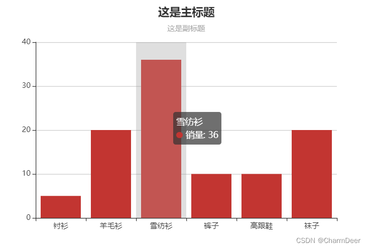
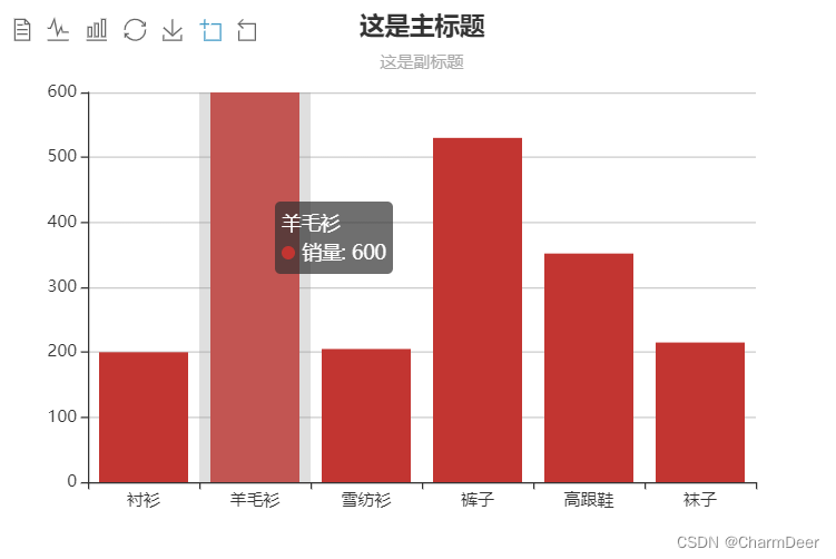
3.2.2 Prompt box
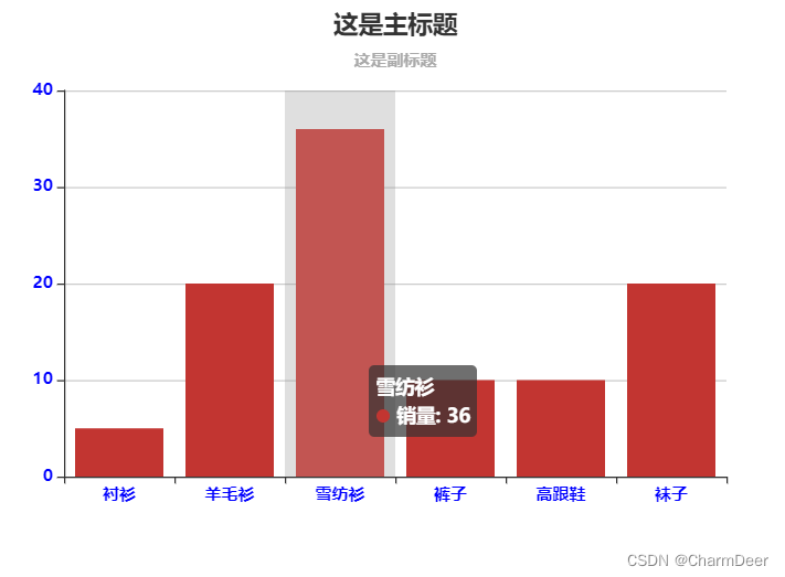
In ECharts, the prompt box component becomes tooltip, and its function is to provide users with relevant information at the right time.
-
trigger: trigger type, optional parameters are item (graphic trigger), axis (coordinate axis trigger), none (no trigger).
-
formatter: the content formatter of the floating layer of the prompt box, generally uses a string template, and the template variables include {a}, {b}, {c}, {d}, {e}, respectively representing the series name, data name, data value, etc. . The data meanings represented by variables {a},{b},{c},{d} under different chart types are as follows
- Line (area) chart, columnar (bar) chart, candlestick chart: {a} (series name), {b} (type value), {c} (value), {d} (none)
- Scatter (bubble) plots: {a} (series name), {b} (data name), {c} (numeric array), {d} (none)
- Maps: {a} (series name), {b} (area name), {c} (merged values), {d} (none).
- Pie charts, dashboards, vulnerability graphs: {a} (series name), {b} (data item name), {c} (value), {d} (percentage)
-
axisPointer: Coordinate axis indicator configuration item, type is a sub-parameter of this parameter, used to set the indicator type, the value can be line (straight line indicator), shadow (shadow indicator), cross (crosshair indicator), none (no indicator)
-
show: Whether to display the prompt box component, the value is Boolean data, and the default is true.
tooltip:{


	trigger:'axis',
	axisPointer:{


		type:'shadow'
	}
}
Full code:
<!DOCTYPE html>
<html lang="en">

<head>
    <meta charset="UTF-8">
    <meta http-equiv="X-UA-Compatible" content="IE=edge">
    <meta name="viewport" content="width=device-width, initial-scale=1.0">
    <title>ECharts图表</title>
    <!-- 引入 echarts.js -->
    <script src="https://cdn.staticfile.org/echarts/4.3.0/echarts.min.js"></script>
</head>

<body>
    <!-- 为ECharts准备一个具备大小(宽高)的Dom -->
    <div id="main" style="width: 600px;height:400px;"></div>
    <script type="text/javascript">
        // 基于准备好的dom,初始化echarts实例
        var myChart = echarts.init(document.getElementById('main'));

        // 指定图表的配置项和数据
        var option = {


            title: {


                text: '这是主标题',
                subtext: '这是副标题',
                left: 'center'
            },
            tooltip: {


                trigger: 'axis',
                axisPointer: {


                    type: 'shadow'
                }
            },
            // legend: {


            //     data: ['销量']
            // },
            xAxis: {


                data: ["衬衫", "羊毛衫", "雪纺衫", "裤子", "高跟鞋", "袜子"]
            },
            yAxis: {

      },
            series: [{


                name: '销量',
                type: 'bar',
                data: [5, 20, 36, 10, 10, 20]
            }]
        };

        // 使用刚指定的配置项和数据显示图表。
        myChart.setOption(option);
    </script>
</body>

</html>
3.2.3 Toolbar
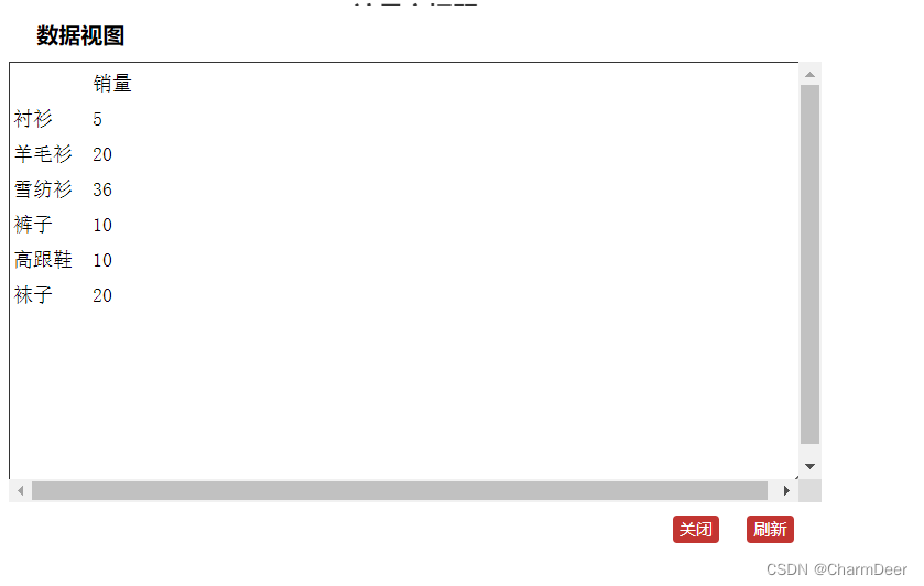
In ECharts, the toolbar component is called toolbox. By setting the toolbar, we can download the visualization to the local, or view the underlying data of the visualization.
- show: Whether to display the toolbar component, the value is Boolean data, the default is: true.
- featrue: Each tool configuration item, which contains many commonly used sub-parameters, such as saveAsImage, restore, dataView, magicType, etc. Among them, saveAsImage is to save the visualization result locally, restore is to restore the visualization to the initial setting, dataView can see the underlying data view of the visualization, and magicType can convert one visualization to another.
		toolbox: {


                show: true,
                feature: {


                    mark: {


                        show: true
                    },
                    dataView: {


                        show: true,
                        readOnly: false
                    },
                    magicType: {


                        show: true,
                        type: ['line', 'bar']
                    },
                    restore: {


                        show: true
                    },
                    saveAsImage: {


                        show: true
                    }

                }
            },
Full code:
<!DOCTYPE html>
<html lang="en">

<head>
    <meta charset="UTF-8">
    <meta http-equiv="X-UA-Compatible" content="IE=edge">
    <meta name="viewport" content="width=device-width, initial-scale=1.0">
    <title>ECharts图表</title>
    <!-- 引入 echarts.js -->
    <script src="https://cdn.staticfile.org/echarts/4.3.0/echarts.min.js"></script>
</head>

<body>
    <!-- 为ECharts准备一个具备大小(宽高)的Dom -->
    <div id="main" style="width: 600px;height:400px;"></div>
    <script type="text/javascript">
        // 基于准备好的dom,初始化echarts实例
        var myChart = echarts.init(document.getElementById('main'));

        // 指定图表的配置项和数据
        var option = {


            title: {


                text: '这是主标题',
                subtext: '这是副标题',
                left: 'center'
            },
            tooltip: {


                trigger: 'axis',
                axisPointer: {


                    type: 'shadow'
                }
            },
            toolbox: {


                show: true,
                feature: {


                    mark: {


                        show: true
                    },
                    dataView: {


                        show: true,
                        readOnly: false
                    },
                    magicType: {


                        show: true,
                        type: ['line', 'bar']
                    },
                    restore: {


                        show: true
                    },
                    saveAsImage: {


                        show: true
                    }

                }
            },
            // legend: {


            //     data: ['销量']
            // },
            xAxis: {


                data: ["衬衫", "羊毛衫", "雪纺衫", "裤子", "高跟鞋", "袜子"]
            },
            yAxis: {

      },
            series: [{


                name: '销量',
                type: 'bar',
                data: [5, 20, 36, 10, 10, 20]
            }]
        };

        // 使用刚指定的配置项和数据显示图表。
        myChart.setOption(option);
    </script>
</body>

</html>
Running results:
Demo 1: Convert to a data view
Demo 2: Convert to a line chart
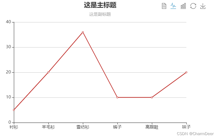
The download is in the form of a picture, you can try it
3.2.4 Legend
In ECharts, the legend component is called legend, and its function is to distinguish different data displays. Here are some common parameters
- show: Whether to display the legend component, the value is Boolean data, the default is true.
- left: the distance from the left side of the container, its value can be a specific pixel value, for example: 10; it can also be a percentage value relative to the container, for example: 10%; it can also be the more commonly used left, center, right, you can It is understood as left alignment, center alignment, and right alignment.
- top: the distance from the top of the container, its value can be a specific pixel value, such as 10; it can also be a percentage value relative to the container, such as 10%; it can also be the more commonly used top, middle, bottom, which can be understood as at the top, at the middle, at the bottom
- orient: The layout orientation of the legend list, the default is horizontal (horizontal), and it can also be vertical (vertical).
- data: The data array in the legend, usually one-to-one correspondence with the series of data display, the specific usage can be found in the following example
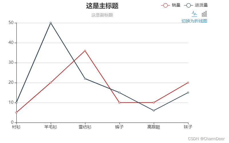
Here, columns of different colors are used to represent the sales volume and purchase volume respectively. In order to distinguish and correspond to the name, a legend is needed
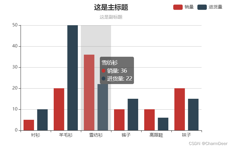
Full code:
<!DOCTYPE html>
<html lang="en">

<head>
    <meta charset="UTF-8">
    <meta http-equiv="X-UA-Compatible" content="IE=edge">
    <meta name="viewport" content="width=device-width, initial-scale=1.0">
    <title>ECharts图表</title>
    <!-- 引入 echarts.js -->
    <script src="https://cdn.staticfile.org/echarts/4.3.0/echarts.min.js"></script>
</head>

<body>
    <!-- 为ECharts准备一个具备大小(宽高)的Dom -->
    <div id="main" style="width: 600px;height:400px;"></div>
    <script type="text/javascript">
        // 基于准备好的dom,初始化echarts实例
        var myChart = echarts.init(document.getElementById('main'));

        // 指定图表的配置项和数据
        var option = {


            title: {


                text: '这是主标题',
                subtext: '这是副标题',
                left: 'center'
            },
            tooltip: {


                trigger: 'axis',
                axisPointer: {


                    type: 'shadow'
                }
            },
            legend: {


                data: ['销量', '进货量'],
                left: 'right',
            },
            xAxis: {


                data: ["衬衫", "羊毛衫", "雪纺衫", "裤子", "高跟鞋", "袜子"]
            },
            yAxis: {

      },
            series: [{


                name: '销量',
                type: 'bar',
                data: [5, 20, 36, 10, 10, 20]
            }, {


                name: '进货量',
                type: 'bar',
                data: [10, 50, 22, 15, 6, 15]

            }]
        };

        // 使用刚指定的配置项和数据显示图表。
        myChart.setOption(option);
    </script>
</body>

</html>
Combined with the previous learning knowledge, the line chart can also (or other charts)
complete code:
<!DOCTYPE html>
<html lang="en">

<head>
    <meta charset="UTF-8">
    <meta http-equiv="X-UA-Compatible" content="IE=edge">
    <meta name="viewport" content="width=device-width, initial-scale=1.0">
    <title>ECharts图表</title>
    <!-- 引入 echarts.js -->
    <script src="https://cdn.staticfile.org/echarts/4.3.0/echarts.min.js"></script>
</head>

<body>
    <!-- 为ECharts准备一个具备大小(宽高)的Dom -->
    <div id="main" style="width: 600px;height:400px;"></div>
    <script type="text/javascript">
        // 基于准备好的dom,初始化echarts实例
        var myChart = echarts.init(document.getElementById('main'));

        // 指定图表的配置项和数据
        var option = {


            title: {


                text: '这是主标题',
                subtext: '这是副标题',
                left: 'center'
            },
            tooltip: {


                trigger: 'axis',
                axisPointer: {


                    type: 'shadow'
                }
            },
            toolbox: {


                show: true,
                feature: {


                    magicType: {


                        show: true,
                        type: ['line', 'bar']
                    },
                },
                top: '20'
            },
            legend: {


                data: ['销量', '进货量'],
                left: 'right',
            },
            xAxis: {


                data: ["衬衫", "羊毛衫", "雪纺衫", "裤子", "高跟鞋", "袜子"]
            },
            yAxis: {

      },
            series: [{


                name: '销量',
                type: 'bar',
                data: [5, 20, 36, 10, 10, 20]
            }, {


                name: '进货量',
                type: 'bar',
                data: [10, 50, 22, 15, 6, 15]

            }]
        };

        // 使用刚指定的配置项和数据显示图表。
        myChart.setOption(option);
    </script>
</body>
</html>
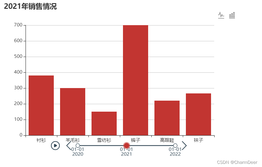
3.2.5 Time axis
In terms of usage, timeline is slightly different from the components introduced before. There will be multiple options when using it. The traditional options of ECharts can be called atomic options, and the options used when using timeline can be called options that contain multiple atomic options. Composite options. The format when using timeline can be represented by the following code:
in the following code (behind the legend) baseOption is an "atomic option", and each item in the options array is also an "atomic option". Each "atomic option" contains various configuration items described in this document

Complete code
<!DOCTYPE html>
<html lang="en">

<head>
    <meta charset="UTF-8">
    <meta http-equiv="X-UA-Compatible" content="IE=edge">
    <meta name="viewport" content="width=device-width, initial-scale=1.0">
    <title>ECharts图表</title>
    <!-- 引入 echarts.js -->
    <script src="https://cdn.staticfile.org/echarts/4.3.0/echarts.min.js"></script>
</head>

<body>
    <!-- 为ECharts准备一个具备大小(宽高)的Dom -->
    <div id="main" style="width: 600px;height:400px;"></div>
    <script type="text/javascript">
        // 基于准备好的dom,初始化echarts实例
        var myChart = echarts.init(document.getElementById('main'));

        // 指定图表的配置项和数据
        var allOptions = {


            baseOption: {


                timeline: {


                    data: ['2020', '2021', '2022']
                },
                tooltip: {


                    trigger: 'axis',
                    axisPointer: {


                        type: 'shadow'
                    }
                },
                toolbox: {


                    show: true,
                    feature: {


                        magicType: {


                            show: true,
                            type: ['line', 'bar']
                        },
                    },
                    top: '20'
                },
                legend: {


                    data: ['销量', '进货量'],
                    left: 'right',
                },
                xAxis: [{


                    type: 'category',
                    data: ["衬衫", "羊毛衫", "雪纺衫", "裤子", "高跟鞋", "袜子"]
                }],
                yAxis: [{


                    type: 'value'
                }],
                series: [{


                    type: 'bar',
                }]
            },
            options: [{

       //这是'2020'对应的option
                title: {


                    text: '2020年销售情况'
                },
                series: [{


                    data: [300, 500, 450, 500, 320, 623]
                }]
            }, {

       //这是'2020'对应的option
                title: {


                    text: '2021年销售情况'
                },
                series: [{


                    data: [380, 300, 150, 700, 220, 266]
                }]
            }, {

       //这是'2020'对应的option
                title: {


                    text: '2022年销售情况'
                },
                series: [{


                    data: [450, 400, 350, 500, 320, 423]
                }]
            }]
        };

        // 使用刚指定的配置项和数据显示图表。
        myChart.setOption(allOptions);
    </script>
</body>

</html>
Most of the commonly used parameters are related to playback settings, such as the loop parameter of whether to play in a loop, the rewind parameter of whether to play in reverse, the playback speed playInterval parameter, the position controlPosition parameter of the playback button, etc.
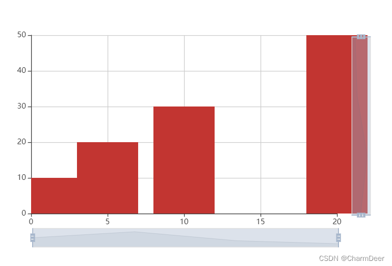
3.2.6 Data area scaling
In ECharts, the data area zoom component is called dataZoom. Its function is to provide users with the function of area zoom, so that users can overview the overall situation of the data through area zoom, and can also pay attention to the details of the data. Currently, the area zoom components supported by ECharts are
: The following types:
- Slider type data area zoom component (dataZoomSlider)
- Built-in data area zoom component (dataZoomInside)
- Box selection data area zoom component (dataZoomSelect)
1. Sliding bar type data area zoom component
The parameters commonly used in the sliding bar type data area zooming component are as follows.
1) xAxisIndex: Specifies the x-axis of the control. If there are multiple charts in a visualization, which axis does our region zoom component control? At this point, you need to specify the value of this parameter: if the value is a number, then one axis is controlled; if the value is an array, then multiple axes are controlled. Let's take a look at the sample code below;
option:{


	xAxis:[{


		{

    ...},//第一个xAxis
		{

    ...},//第二个xAxis
		{

    ...},//第三个xAxis
		{

    ...} //第四个xAxis
	}],
	dataZoom:[
		{

     //第一个dataZoom组件
			xAxisIndex:[0,3] //表示这个dataZoom组件控制第一个和第四个xAxis
		},
		{


			xAxisIndex: 2 //表示这个dataZoom组件控制第三个xAxis
		}
	]
}
At this time, the first dataZoom component controls the first and fourth xAxis, while the second dataZoom component controls the third xAxis.
In addition to xAxisIndex, there is also yAxisIndex. The usage is similar, so I won’t go into details here.
2) filterMode: filter mode, the essence of dataZoom data window zooming is data filtering, that is, to filter out the content outside the window.
There are many filtering modes, and the commonly used optional values are as follows
- filter: Filter the data outside the window. When the visualization has multiple axes, it will affect the data range of other axes. For data, as long as one dimension is outside the window, it will be filtered out
- weakFilter: Filter data outside the window. When the visualization has multiple axes, it will affect the data range of other axes. For data, only when all its dimensions are outside the same side of the window will it be filtered out
- empty: does not affect the data range of other axes
- none: Do not filter the data, only change the range of the number axis
Let's look at a specific example, where only option is set
Full code:
<!DOCTYPE html>
<html lang="en">

<head>
    <meta charset="UTF-8">
    <meta http-equiv="X-UA-Compatible" content="IE=edge">
    <meta name="viewport" content="width=device-width, initial-scale=1.0">
    <title>数据区域缩放</title>
    <script src="https://cdn.staticfile.org/echarts/4.3.0/echarts.min.js"></script>
</head>

<body>
    <!-- 为ECharts准备一个具备大小(宽高)的Dom -->
    <div id="main" style="width: 600px;height:400px;"></div>
    <script type="text/javascript">
        // 基于准备好的dom,初始化echarts实例
        var myChart = echarts.init(document.getElementById('main'));

        // 指定图表的配置项和数据
        var option = {


            dataZoom: [{


                id: 'dataZoomX',
                type: 'slider',
                xAxisIndex: [0],
                filterMode: 'filter'
            }, {


                id: 'dataZoomY',
                type: 'slider',
                yAxisIndex: [0],
                filterMode: 'empty'
            }],
            xAxis: {


                type: 'value'
            },
            yAxis: {


                type: 'value'
            },
            series: {


                type: 'bar',
                data: [
                    //第一列对应x轴,第二列对应y轴
                    [10, 30],
                    [20, 50],
                    [5, 20],
                    [2, 10]
                ]
            }
        };
        // 使用刚指定的配置项和数据显示图表。
        myChart.setOption(option);
    </script>
</body>

</html>
As can be seen from the code, the scaling mode of controlling the x-axis is filter, and the scaling mode of controlling the y-axis is empty, then the x-axis is used as the main axis, and the scaling of x will affect the data of the y-axis, and the y-axis is used as the auxiliary axis. Zooming does not affect the data on the x-axis. You can drag the two ends of the x-axis or y-axis slider at will, or drag the slider to achieve window data scaling
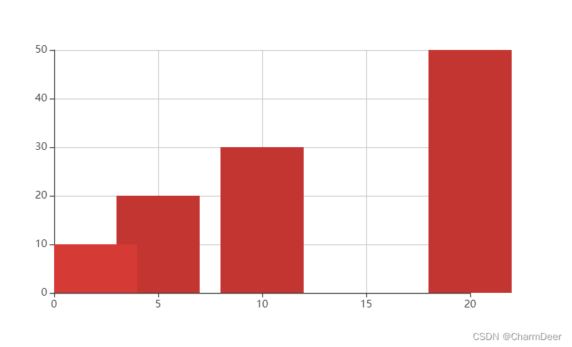
2. The built-in data area zoom component
is so-called built-in, which means that the area zoom component is built in the coordinate system, and its parameters are basically the same as those of the slider type data area zoom component mentioned above. The slider type is changed to the inside type, and the code is as follows:
Complete code:
<!DOCTYPE html>
<html lang="en">

<head>
    <meta charset="UTF-8">
    <meta http-equiv="X-UA-Compatible" content="IE=edge">
    <meta name="viewport" content="width=device-width, initial-scale=1.0">
    <title>数据区域缩放</title>
    <script src="https://cdn.staticfile.org/echarts/4.3.0/echarts.min.js"></script>
</head>

<body>
    <!-- 为ECharts准备一个具备大小(宽高)的Dom -->
    <div id="main" style="width: 600px;height:400px;"></div>
    <script type="text/javascript">
        // 基于准备好的dom,初始化echarts实例
        var myChart = echarts.init(document.getElementById('main'));

        // 指定图表的配置项和数据
        var option = {


            dataZoom: [{


                id: 'dataZoomX',
                type: 'inside',
                xAxisIndex: [0],
                filterMode: 'inside'
            }, {


                id: 'dataZoomY',
                type: 'inside',
                yAxisIndex: [0],
                filterMode: 'empty'
            }],
            xAxis: {


                type: 'value'
            },
            yAxis: {


                type: 'value'
            },
            series: {


                type: 'bar',
                data: [
                    //第一列对应x轴,第二列对应y轴
                    [10, 30],
                    [20, 50],
                    [5, 20],
                    [2, 10]
                ]
            }
        };
        // 使用刚指定的配置项和数据显示图表。
        myChart.setOption(option);
    </script>
</body>

</html>
Hover the mouse over the visualization area and scroll the mouse wheel to find that the visualization data window is changing. The so-called built-in actually means that the zoom is built into the graph and appears in our field of vision without display.
3. Box selection data area zoom component
The frame selection type, as the name suggests, is to scale the data area through the selection box, and this component is in the toolbox mentioned earlier. Let's look at an example.
Add dataZoom: {show: true} under the toolbox.feature in the code when explaining the toolbox. In order to see the toolbox clearly, set left: 'left' under the toolbox to get the following option code :
<!DOCTYPE html>
<html lang="en">

<head>
    <meta charset="UTF-8">
    <meta http-equiv="X-UA-Compatible" content="IE=edge">
    <meta name="viewport" content="width=device-width, initial-scale=1.0">
    <title>数据区域缩放</title>
    <script src="https://cdn.staticfile.org/echarts/4.3.0/echarts.min.js"></script>
</head>

<body>
    <!-- 为ECharts准备一个具备大小(宽高)的Dom -->
    <div id="main" style="width: 600px;height:400px;"></div>
    <script type="text/javascript">
        // 基于准备好的dom,初始化echarts实例
        var myChart = echarts.init(document.getElementById('main'));

        // 指定图表的配置项和数据
        var option = {


            title: {


                text: '这是主标题',
                subtext: '这是副标题',
                left: 'center', //居中显示
            },
            tooltip: {


                trigger: 'axis',
                axisPointer: {


                    type: 'shadow'
                }
            },
            toolbox: {


                show: true,
                left: 'left',
                feature: {


                    mark: {


                        show: true
                    },
                    dataView: {


                        show: true,
                        readOnly: false
                    },
                    magicType: {


                        show: true,
                        type: ['line', 'bar']
                    },
                    restore: {


                        show: true
                    },
                    saveAsImage: {


                        show: true
                    },
                    dataZoom: {


                        show: true
                    }
                }
            },
            legend: {


                data: ['各产品销售情况']
            },
            xAxis: {


                data: ["衬衫", "羊毛衫", "雪纺衫", "裤子", "高跟鞋", "袜子"]
            },
            yAxis: {

      },
            series: [{


                name: '销量',
                type: 'bar',
                data: [200, 600, 205, 530, 352, 215]
            }]
        };
        // 使用刚指定的配置项和数据显示图表。
        myChart.setOption(option);
    </script>
</body>

</html>
In the toolbox toolbox in the upper left corner, there are two more buttons, namely "Zoom Area" and "Zoom Area Restore". Click the "Zoom Area Button" to draw an area in the visualization to zoom the data , click "Area Zoom Restore" to clear the zoom and restore to the original visual state
3.2.7 Grid
The grid size of the visual display can be controlled in the visual coordinate system through the grid. In addition to the previously mentioned position parameters, such as left, top, right, bottom, etc., commonly used parameters also include width (the width of the grid component), height ( The height of the component), the default parameters of both are auto, that is, adaptive, of course, specific values can also be specified.
Example picture:
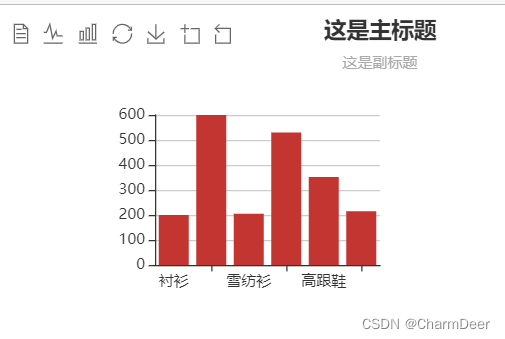
complete code:
<!DOCTYPE html>
<html lang="en">

<head>
    <meta charset="UTF-8">
    <meta http-equiv="X-UA-Compatible" content="IE=edge">
    <meta name="viewport" content="width=device-width, initial-scale=1.0">
    <title>网格</title>
    <script src="https://cdn.staticfile.org/echarts/4.3.0/echarts.min.js"></script>
</head>

<body>
    <!-- 为ECharts准备一个具备大小(宽高)的Dom -->
    <div id="main" style="width: 600px;height:400px;"></div>
    <script type="text/javascript">
        // 基于准备好的dom,初始化echarts实例
        var myChart = echarts.init(document.getElementById('main'));

        // 指定图表的配置项和数据
        var option = {


            //网格布局
            grid: [{


                x: '20%',
                y: '20%',
                width: '30%',
                height: '30%'
            }],
            title: {


                text: '这是主标题',
                subtext: '这是副标题',
                left: 'center', //居中显示
            },
            tooltip: {


                trigger: 'axis',
                axisPointer: {


                    type: 'shadow'
                }
            },
            toolbox: {


                show: true,
                left: 'left',
                feature: {


                    mark: {


                        show: true
                    },
                    dataView: {


                        show: true,
                        readOnly: false
                    },
                    magicType: {


                        show: true,
                        type: ['line', 'bar']
                    },
                    restore: {


                        show: true
                    },
                    saveAsImage: {


                        show: true
                    },
                    dataZoom: {


                        show: true
                    }
                }
            },
            legend: {


                data: ['各产品销售情况']
            },
            xAxis: {


                data: ["衬衫", "羊毛衫", "雪纺衫", "裤子", "高跟鞋", "袜子"]
            },
            yAxis: {

      },
            series: [{


                name: '销量',
                type: 'bar',
                data: [200, 600, 205, 530, 352, 215]
            }]
        };
        // 使用刚指定的配置项和数据显示图表。
        myChart.setOption(option);
    </script>
</body>

</html>
Use grid properties to control the size of the entire visual view
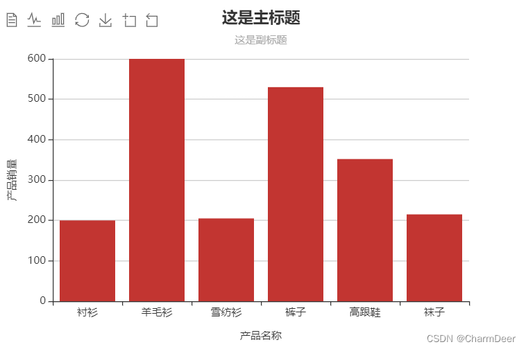
3.2.8 Coordinate axes
Generally speaking, our most commonly used coordinate axis is the rectangular coordinate system, especially the two-dimensional rectangular coordinate system, so the horizontal axis (xAxis) and vertical axis (yAxis) are most commonly used. Common parameters about xAxis and yAxis are as follows:
- position: Specify the position of the x-axis, optional parameters are top (top) and bottom (bottom)
- type: specifies the type of the coordinate axis. There are four optional parameters: "value", indicating the axis of numeric type, suitable for continuous data; "category", indicating the axis of category type, suitable for discrete category data; "time", indicating the axis of time type , for continuous time series data; "log", for logarithmic data; type of axis, for logarithmic data
- name: the name of the axis
- nameLocation: The name display location of the coordinate axis. There are three optional parameters: "start", the starting position; "middle" or "center", the middle position; "end", the end position;
Modify the previous code, add some parameters to xAxis and yAxis in the option, add the names of the coordinate axes as "product name" on the horizontal axis and "product sales" on the vertical axis, and set the coordinate axis names to be displayed in the center ( center). The reason for adding a certain distance to the text display is to avoid overlapping the text on the axis name and the scale on the x-axis and y-axis. The specific generation is as follows:
<!DOCTYPE html>
<html lang="en">

<head>
    <meta charset="UTF-8">
    <meta http-equiv="X-UA-Compatible" content="IE=edge">
    <meta name="viewport" content="width=device-width, initial-scale=1.0">
    <title>网格</title>
    <script src="https://cdn.staticfile.org/echarts/4.3.0/echarts.min.js"></script>
</head>

<body>
    <!-- 为ECharts准备一个具备大小(宽高)的Dom -->
    <div id="main" style="width: 600px;height:400px;"></div>
    <script type="text/javascript">
        // 基于准备好的dom,初始化echarts实例
        var myChart = echarts.init(document.getElementById('main'));

        // 指定图表的配置项和数据
        var option = {


            title: {


                text: '这是主标题',
                subtext: '这是副标题',
                left: 'center', //居中显示
            },
            tooltip: {


                trigger: 'axis',
                axisPointer: {


                    type: 'shadow'
                }
            },
            toolbox: {


                show: true,
                left: 'left',
                feature: {


                    mark: {


                        show: true
                    },
                    dataView: {


                        show: true,
                        readOnly: false
                    },
                    magicType: {


                        show: true,
                        type: ['line', 'bar']
                    },
                    restore: {


                        show: true
                    },
                    saveAsImage: {


                        show: true
                    },
                    dataZoom: {


                        show: true
                    }
                }
            },
            legend: {


                data: ['各产品销售情况']
            },
            xAxis: {


                data: ["衬衫", "羊毛衫", "雪纺衫", "裤子", "高跟鞋", "袜子"],
                name: '产品名称',
                nameLocation: 'center',
                nameGap: 35
            },
            yAxis: {


                name: '产品销量',
                nameLocation: 'center',
                nameGap: 40
            },
            series: [{


                name: '销量',
                type: 'bar',
                data: [200, 600, 205, 530, 352, 215]
            }]
        };
        // 使用刚指定的配置项和数据显示图表。
        myChart.setOption(option);
    </script>
</body>

</html>
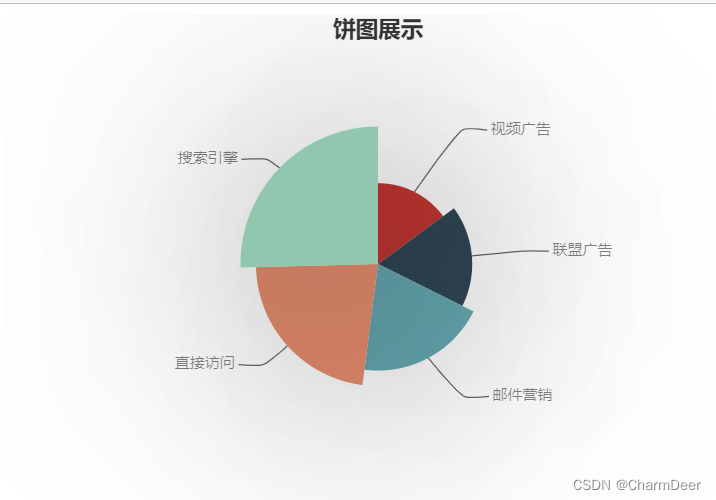
3.2.9 Data Series
A chart may contain multiple series, and each series may contain multiple data, so the data series (series) are mainly used as data containers.
For each visual icon, the form of the series is not exactly the same. Let's look at the series structure of a pie chart.
series is an array structure, using square brackets, each part in the square brackets is enclosed in curly brackets, each curly bracket is similar to a dictionary structure, including key (key) and value (value) For example, the name in the code is the key,
" "Access source" is the value; type specifies that the graph is a pie (pie chart); radius specifies the radius of the pie chart, and the size is represented by the proportion of the graph in the frame; data contains the data of each pie in the pie chart content. In addition, there are some style-related settings, the code is as follows:
Complete code:
<!DOCTYPE html>
<html lang="en">

<head>
    <meta charset="UTF-8">
    <meta http-equiv="X-UA-Compatible" content="IE=edge">
    <meta name="viewport" content="width=device-width, initial-scale=1.0">
    <title>网格</title>
    <script src="https://cdn.staticfile.org/echarts/4.3.0/echarts.min.js"></script>
</head>

<body>
    <!-- 为ECharts准备一个具备大小(宽高)的Dom -->
    <div id="main" style="width: 600px;height:400px;"></div>
    <script type="text/javascript">
        // 基于准备好的dom,初始化echarts实例
        var myChart = echarts.init(document.getElementById('main'));

        // 指定图表的配置项和数据
        var option = {


            title: {


                text: '饼图展示',
                left: 'center'
            },
            series: [{


                name: '访问来源',
                type: 'pie',
                radius: '55%',
                center: ['50%', '50%'],
                data: [{


                    value: 355,
                    name: '直接访问'
                }, {


                    value: 310,
                    name: '邮件营销'
                }, {


                    value: 274,
                    name: '联盟广告'
                }, {


                    value: 235,
                    name: '视频广告'
                }, {


                    value: 400,
                    name: '搜索引擎'
                }, ].sort(function(a, b) {


                    return a.value - b.value;
                }),
                roseType: 'radius',
                label: {


                    color: 'rgba(0,0,0,0.5)' //显示字体颜色
                },
                labelLine: {


                    lineStyle: {


                        color: 'rgba(0,0,0,0.6)' //连接字体线颜色
                    },
                    smooth: 0.2,
                    length: 10,
                    length2: 20
                },
                itemStyle: {

       //饼图颜色
                    // color: '#c23531',
                    shadowBlur: 200,
                    shadowColor: 'rgba(0,0,0,0.5)'
                },
                anumationType: 'scale',
                animationEasing: 'elasticOut',
                animationDelay: function(idx) {


                    return Math.random() * 200;
                }
            }]
        };
        // 使用刚指定的配置项和数据显示图表。
        myChart.setOption(option);
    </script>
</body>

</html>
3.2.10 Global Font Style
When making visualizations, text display is often used. At this time, it is particularly important to choose a suitable font style to match with the visualization.
In the global font style (textStyle), we can define the global font style display. The commonly used parameters and their descriptions are as follows.
- color: the color of the text, for example textStyle="#fff".
- fontStyle: The style of the text font, the optional values are normal, italic, oblique.
- fontWeigh: The font family of the text, the optional values are sans-serif, serif, monospace, Arial, Courier New, Microsoft Yahei, etc.
- fontSize: the font size of the text, the value is a value
For example, the following code, add styleStyle, set the font color to blue (blue), font bold display (bolder), font style to Microsoft Yahei (Microsoft Yahei), the visual result is shown in the figure: complete code
:
<!DOCTYPE html>
<html lang="en">

<head>
    <meta charset="UTF-8">
    <meta http-equiv="X-UA-Compatible" content="IE=edge">
    <meta name="viewport" content="width=device-width, initial-scale=1.0">
    <title>ECharts图表</title>
    <!-- 引入 echarts.js -->
    <script src="https://cdn.staticfile.org/echarts/4.3.0/echarts.min.js"></script>
</head>

<body>
    <!-- 为ECharts准备一个具备大小(宽高)的Dom -->
    <div id="main" style="width: 600px;height:400px;"></div>
    <script type="text/javascript">
        // 基于准备好的dom,初始化echarts实例
        var myChart = echarts.init(document.getElementById('main'));

        // 指定图表的配置项和数据
        var option = {


            title: {


                text: '这是主标题',
                subtext: '这是副标题',
                left: 'center'
            },
            tooltip: {


                trigger: 'axis',
                axisPointer: {


                    type: 'shadow'
                }
            },
            legend: {


                data: ['各产品销量情况']
            },
            xAxis: {


                data: ["衬衫", "羊毛衫", "雪纺衫", "裤子", "高跟鞋", "袜子"]
            },
            yAxis: {

      },
            series: [{


                name: '销量',
                type: 'bar',
                data: [5, 20, 36, 10, 10, 20]
            }],
            textStyle: {


                color: 'blue',
                fontWeight: 'bolder',
                fontFamily: 'Microsoft Yahei'
            }
        };

        // 使用刚指定的配置项和数据显示图表。
        myChart.setOption(option);
    </script>
</body>

</html>
summary
I have learned the basics of ECharts, and some simple uses. Next, I will explain more advanced usage methods and more cool data display, such as the cool usage below. Please look forward to the second issue of the

article