Table of contents
1. Draw a boxplot
import seaborn as sns
import matplotlib.pyplot as plt
# 加载示例数据(例如,使用seaborn自带的数据集)
tips = sns.load_dataset("tips")

# 使用boxplot绘制箱线图
sns.boxplot(x='day', y='total_bill', data=tips)

# 展示图形
plt.show()
Result graph:

2. Draw a violin diagram
import seaborn as sns
import matplotlib.pyplot as plt

# 加载iris数据集
iris = sns.load_dataset('iris')

# 使用violinplot绘制小提琴图
sns.violinplot(x='species', y='sepal_length', data=iris)

# 设置图形标题
plt.title('Violin Plot of Sepal Length')

# 设置x轴标签
plt.xlabel('Species')

# 设置y轴标签
plt.ylabel('Sepal Length')

# 展示图形
plt.show()
Result graph:

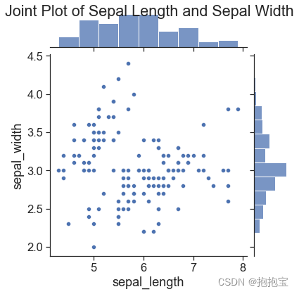
3. Draw a multi-panel graph
import seaborn as sns
import matplotlib.pyplot as plt

# 加载iris数据集
iris = sns.load_dataset('iris')

# 使用jointplot绘制多面板图
sns.jointplot(x='sepal_length', y='sepal_width', data=iris, kind='scatter')

# 设置图形标题
plt.suptitle('Joint Plot of Sepal Length and Sepal Width')

# 展示图形
plt.show()
Result graph:
4. Draw a contour map
import seaborn as sns
import matplotlib.pyplot as plt

# 加载iris数据集
iris = sns.load_dataset('iris')

# 使用kdeplot绘制两个变量的等高线图
sns.kdeplot(data=iris, x='sepal_length', y='sepal_width', cmap='viridis', shade=True)

# 设置图形标题
plt.title('Contour Plot of Sepal Length and Sepal Width')

# 展示图形
plt.show()
Result graph:

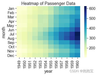
5. Draw a heat map
import seaborn as sns
import matplotlib.pyplot as plt

# 加载flights数据集
flights = sns.load_dataset('flights')

# 使用pivot_table函数从原始数据中生成矩阵
matrix = flights.pivot_table(index='month', columns='year', values='passengers')

# 使用heatmap函数绘制热力图
sns.heatmap(data=matrix, cmap='YlGnBu')

# 设置图形标题
plt.title('Heatmap of Passenger Data')

# 展示图形
plt.show()
Result graph: