Article structure
foreword
Although I am now working hard to learn the front-end and aspire to become a front-end engineer, my hobbies are design and the like, including graphic design and painting, so I often pursue beautiful things and designs. So while I am learning these, I also like to adjust these styles and interactive animations. I think some appropriate and interesting interaction designs can enrich the visual experience and satisfy some psychological needs.
renderings
Today I’m going to talk about a very common interaction design in the form. I believe everyone should have seen it on many websites. At first I saw it on openAI. I think it's very interesting, so I'll do it myself.

Dismantling animation
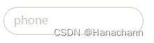
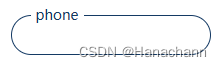
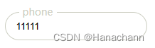
There are a total of 3 states, and only the border color and the text position and color in the input box change .
- When out of focus and no fields are filled in: the border color is gray, and the text is in the input box.
- When focused and no fields are filled: the border color is blue, and the text is on the input box
- When out of focus and there are fields in the frame: the border color is gray, and the text is on the input frame.
attention to detail
The html part: we have two elements in the layout, an input box and a label tag text, they are sibling elements.
Notice! ! The attribute in the input box requiredmust be added, it is to ensure that the box is only valid when there is a field (because we will use this pseudo-class in css :valid).
css part:
For the text in the box pointer-events:none;, attributes need to be set to block mouse events .
Because this is not set, when we click on the input box because the text is in the box, we cannot focus the input box when we click on the text.

Code
html:
 <div class="form-item">
	<input type="text" class="text" name="username" required="">
	<label class="move" for="username">phone</label>
</div>
css:
<style>
:root {


        --input-width: 200px;
        --input-height: 40px;
        --input-border-radius: 30px;
        --input-color: #cccec1;
        --theme-color: #143a64;
    }
 .form-item .move {


        padding: 0 5px;
        position: absolute;
        top: 50%;
        left: 10px;
        color: var(--input-color);
        /* 屏蔽鼠标事件 */
        pointer-events: none;
        background-color: #fff;
        transform: translateY(-55%);
        transition: 0.3s ease;
    }

    .form-item .text {


        outline: none;
        width: var(--input-width);
        height: var(--input-height);
        border-radius: var(--input-border-radius);
        padding: 5px 15px ;
        border: 1px solid var(--input-color);
        transition: 0.3s ease;
    }
    .form-item .text:focus {


        border: 1px solid var(--theme-color);
    }
    .form-item .text:focus +.move,
    .form-item .text:focus:valid +.move {


        top: 0px;
        left: 20px;
        font-size: 14px;
        color: var(--theme-color);
        background-color: #fff;
    }
    .form-item .text:valid +.move {


        top: 0px;
        left: 20px;
        font-size: 14px;
        background-color: #fff;
    }
</style>
What is released in the article is part of the code, and there are some other animations on the complete page, which are not mentioned in the article. If you have any questions, please leave a message for me~
For complete code reference, please click on the complete page code to edit the address online