The cube animation written by pure css3 animation is quite simple, and the complete effect is as follows:
First, make 6 faces in html
<div id="wrapper">
<ul>
<li><img src="./img/1.png" alt=""></li>
<li><img src="./img/2.png" alt=""></li>
<li><img src="./img/3.png" alt=""></li>
<li><img src="./img/4.png" alt=""></li>
<li><img src="./img/5.png" alt=""></li>
<li><img src="./img/6.png" alt=""></li>
</ul>
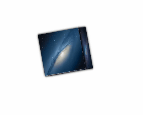
</div>The effect is to arrange them one by one:

Then, push the 6 faces together, set position: absolute, so that the 6 faces are separated from the document and stacked together
   * {
            margin: 0px;
            padding: 0px;

        }

        ul,
        ol {
            list-style: none;
        }
       #wrapper {
            width: 500px;
            height: 500px;
            margin: 300px auto;
        }
        ul {
            width: 200px;
            height: 200px;
            position: relative;

        }
        ul>li {
            width: 200px;
            height: 200px;
            position: absolute;
            opacity: 0.6;
        }

        img {
            width: 100%;
            height: 100%;
            display: block;

        }
The effect is stacked into one like this:

Then write the style of the rotated plane
transform: rotate to do the rotation so that it looks like a cube.
 ul>li:nth-child(1) {
            transform: translateY(-100px) rotateX(90deg);
        }

        ul>li:nth-child(2) {

            transform: translateY(100px) rotateX(-90deg);
        }

        ul>li:nth-child(3) {

            transform: translateX(-100px) rotateY(-90deg);
        }

        ul>li:nth-child(4) {

            transform: translateX(100px) rotateY(90deg);
        }

        ul>li:nth-child(5) {

            transform: translatez(100px);
        }

        ul>li:nth-child(6) {

            transform: translatez(-100px) rotateY(-180deg);
        }
After writing, it is already a cube, but because we only look at one side, it still looks like a planar view
Also need to add transform-style: preserve-3d; /* open 3d view*/
        ul {
            width: 200px;
            height: 200px;
            position: relative;
            transform-style: preserve-3d;

/*注释的可不加*/
            /* perspective: 800px;  这个是设置人眼到物看的距离*/
            /* transform: rotateY(30deg); 旋转立体效果看更好 */

        }
Adding rotation animation to achieve a three-dimensional effect
transform: rotate3d(0, 0, 0, 0deg); y ,x ,z轴
ul {
width: 200px;
height: 200px;
position: relative;
transform-style: preserve-3d;
/* 开启3d视图 */
animation: hhl 5s linear infinite;
}
@keyframes hhl {
from {
transform: rotate3d(0, 0, 0, 0deg);
/* 0,0,0 360deg y,x,z轴方向转*/
}
to {
transform: rotate3d(1, 1, 0, 360deg);
/*转哪个方向都可调*/
}
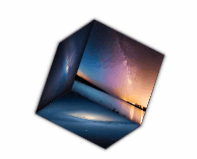
}The effect is as follows:
I want to split the effect and add the mouse:hover event to complete
        ul:hover>li:nth-child(1) {
            transform: translateY(-200px) rotateX(90deg);
        }

        ul:hover>li:nth-child(2) {

            transform: translateY(200px) rotateX(-90deg);
        }

        ul:hover>li:nth-child(3) {

            transform: translateX(-200px) rotateY(-90deg);
        }

        ul:hover>li:nth-child(4) {

            transform: translateX(200px) rotateY(90deg);
        }

        ul:hover>li:nth-child(5) {

            transform: translatez(200px);
        }

        ul:hover>li:nth-child(6) {

            transform: translatez(-200px) rotateY(-180deg);
        }
The effect is as follows:

All complete code:
<!DOCTYPE html>
<html lang="en">

<head>
    <meta charset="UTF-8">
    <meta http-equiv="X-UA-Compatible" content="IE=edge">
    <meta name="viewport" content="width=device-width, initial-scale=1.0">
    <title>Document</title>
    <style>
        * {
            margin: 0px;
            padding: 0px;
        }

        ul,
        ol {
            list-style: none;
        }

        #wrapper {
            width: 500px;
            height: 500px;
            margin: 200px auto;
            background: #ccc;
        }

        #wrapper ul {
            width: 200px;
            height: 200px;

            transform-origin: center;
            transform: rotateX(0deg);

            transform-style: preserve-3d;
            /* perspective: 0px; */
            position: relative;
            left: 150px;
            top: 150px;
            animation: hhl 5s linear infinite;

        }

        @keyframes hhl {
            from {
                transform: rotate3d(1, 0, 1, 0deg);
            }

            to {
                transform: rotate3d(1, 0, 1, -360deg);

            }
        }

        ul>li {
            width: 200px;
            line-height: 200px;
            background: rgba(255, 0, 0, 0.4);
            transform-origin: center;
            position: absolute;
            left: 0px;
            top: 0px;
            color: white;
            text-align: center;
            font-size: 30px;
            font-weight: bold;
        }
        img{
            display: block;
            width: 100%;
        }

        ul>li:nth-child(1) {
            transform: translateY(-100px) rotateX(90deg);
        }

        ul>li:nth-child(2) {
            background: rgba(0, 255, 0, 0.4);
            transform: translateY(100px) rotateX(-90deg);
        }

        ul>li:nth-child(3) {
            background: rgba(0, 0, 255, 0.4);
            transform: translateX(-100px) rotateY(-90deg);
        }

        ul>li:nth-child(4) {
            background: rgba(197, 216, 25, 0.4);
            transform: translateX(100px) rotateY(90deg);
        }

        ul>li:nth-child(5) {
            background: rgba(250, 3, 3, 0.4);
            transform: translatez(100px);
        }

        ul>li:nth-child(6) {
            background: rgba(158, 9, 245, 0.4);
            transform: translatez(-100px) rotateY(-180deg);
        }

        ul:hover>li {
            border-radius: 30%;
        }

        /*裂开效果*/
        ul:hover>li:nth-child(1) {
            transform: translateY(-200px) rotateX(90deg);
        }

        ul:hover>li:nth-child(2) {

            transform: translateY(200px) rotateX(-90deg);
        }

        ul:hover>li:nth-child(3) {

            transform: translateX(-200px) rotateY(-90deg);
        }

        ul:hover>li:nth-child(4) {

            transform: translateX(200px) rotateY(90deg);
        }

        ul:hover>li:nth-child(5) {

            transform: translatez(200px);
        }

        ul:hover>li:nth-child(6) {

            transform: translatez(-200px) rotateY(-180deg);
        }
    </style>
</head>

<body>
    <div id="wrapper">
        <ul>
            <li>上</li>
            <li>下</li>
            <li>左</li>
            <li>右</li>
            <li>前</li>
            <li>后</li>
        </ul>
    </div>

</body>

</html>