Hello, I'm Ganggang classmate!
Forget the sweetheart on the first page of the code spectrum, the last page. . . . . .
Thank you for your support. Your one-click three-connection is the biggest driving force for Ganggang students!
Give me a little money, help me buy a bag of spicy strips, and continue to create, thank you!
One button three consecutive One button three consecutive One button three consecutive One button Three consecutive One button Three consecutive One button Three consecutive
HTML+CSS realizes cool login interface
On the renderings!
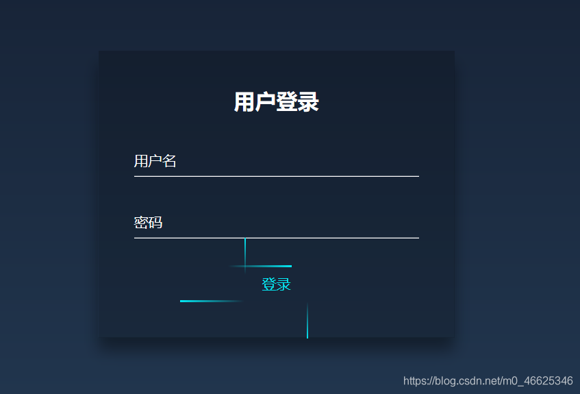
Click the user name or password with the mouse, the font will slide up, adjust the size and highlight.
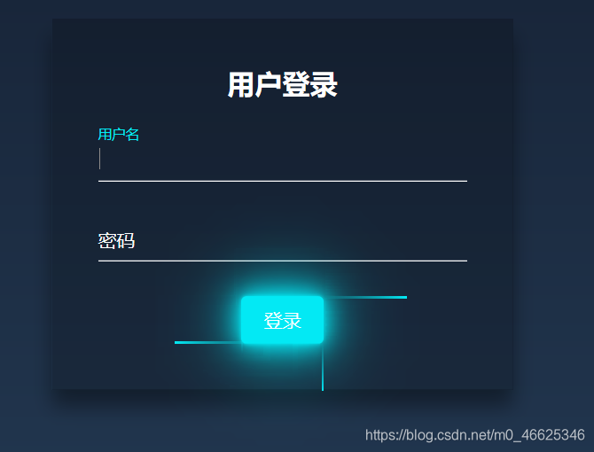
Mouse over the login button, the button can be highlighted!
Here is the HTML code:
<!DOCTYPE html>
<html lang="zh-CN">
	<head>
		<meta charset="utf-8" />
		<meta name="viewport" content="width=device-width,initial-scale=1.0" />
		<title>用户登录</title>
		<link rel="stylesheet"  href="index_log.css" />

	</head>

	<body>
		 <div class="login">
		 	<h2>用户登录</h2>
			<div class="login_box">
				<!-- required就是不能为空  必须在css效果中有很大的作用 -->

				<input type="text" name='name' id='name' required  />
				<label for="name" >用户名</label>
			</div>
			<div class="login_box">

				<input type="password" name='pwd' id='pwd' required="required">
				<label for="pwd">密码</label>
			</div>
			<a href="javascript:void(0)">
				登录
				<span></span>
				<span></span>
				<span></span>
				<span></span>
			</a>

		 </div>

	</body>
</html>
Here is the CSS code:
*{


	/*初始化 清除页面元素的内外边距*/
	padding: 0;
	margin: 0;
	/*盒子模型*/
	box-sizing: border-box;
}
body {


	/*弹性布局 让页面元素垂直+水平居中*/
	display: flex;
	justify-content: center;
	align-items: center;
	/*让页面始终占浏览器可视区域总高度*/
	height: 100vh;
	/*背景渐变色*/
	background: linear-gradient(#141e30,#243b55);

}
.login{


	/*弹性布局 让子元素称为弹性项目*/
	display: flex;
	/*让弹性项目垂直排列  原理是改变弹性盒子的主轴方向
	父元素就是弹性盒子  现在改变后的主轴方向是向下了*/
	flex-direction: column;
	/*让弹性项目在交叉轴方向水平居中  现在主轴的方向是向下
	交叉轴的方向是与主轴垂直 交叉轴的方向是向右*/
	align-items: center;
	width: 400px;
	padding: 40px;
	background-color: rgba(0, 0, 0, 0.2);
	box-shadow: 0 15px 25px rgba(0, 0, 0, 0.4);

}

.login h2{


	color: #fff;
	margin-bottom: 30px;
}
.login .login_box {


	/*相对定位*/
	position: relative;
	width: 100%;
}
.login .login_box input{


	/*清除input框自带的边框和轮廓*/
	outline: none;
	border: none;
	width: 100%;
	padding: 10px 0;
	margin-bottom: 30px;
	color: #fff;
	font-size: 16px;
	border-bottom: 1px solid #fff;
	/*背景颜色为透明色*/
	background-color: transparent;
}

.login .login_box label{


	position:absolute;
	top: 0 ;
	left: 0;
	padding: 10px 0;
	color: #fff;
	/*这个属性的默认值是auto 默认是这个元素可以被点击
	但是如果我们写了none  就是这个元素不能被点击,就好像它可见但是不能用
	可望而不可及*/
	/*这个就是两者的区别*/
	pointer-events: none;
	/*加个过度*/
	transition: all 0.5s;
}
/*: focus 选择器是当input获得焦点是触发的样式 + 是相邻兄弟选择器
	去找与input相邻的兄弟label*/
/*:valid 选择器是判断input 框的内容是否合法,如果合法会执行下面的属性代码,
	不合法就不会执行,我们刚开始写布局的时候给input框写了required 我们删掉看对比
	当没有required的话   input框的值就会被认为一直合法,所以一直都是下方的样式,
	但是密码不会,密码框的值为空,那么这句话就不合法,required不能为空
	当我们给密码框写点东西的时候才会执行以下代码

*/
.login .login_box input:focus + label,
.login  .login_box input:valid + label{


	top: -20px;
	color: #03e9f4;
	font-size: 12px;
}

.login a{


	/*overflow: hidden;*/
	position: relative;
	padding: 10px 20px;
	color: #03e9f4;
	/*取消a表现原有的下划线*/
	text-decoration: none;
	/*同样加个过渡*/
	transition: all 0.5s;
}
.login a:hover {


	color: #fff;
	border-radius: 5px;
	background-color: #03e9f4;
	box-shadow: 0 0 5px #03e9f4,0 0 25px #03e9f4,0 0 50px #03e9f4,0 0 100px #03e9f4;
}
.login a span{


	position: absolute;
}
.login a span:first-child {


	top: 0;
	left: -100%;
	width: 100%;
	height: 2px;
	/*to right 就是往右边 下面的同理*/
	background: linear-gradient(to right,transparent,#03e9f4);
	/*动画 名称  时长 linear是匀速运动 infinite是无限次运动*/
	animation: move1 1s linear infinite;

}
.login a span:nth-child(2){


	right: 0;
	top: -100%;
	width: 2px;
	height: 100%;
	background: linear-gradient(transparent,#03e6f4);
	/*这里多了个0.25s其实是延迟时间*/
	animation: move2 1s linear 0.25s infinite;
}

.login a span:nth-child(3){


	right: -100%;
	bottom: 0;
	width: 100%;
	height: 2px;
	background: linear-gradient(to left,transparent,#03e9f4);

	animation: move3 1s linear 0.5s infinite;
}

.login a span:last-child{


	left: 0;
	bottom: -100%;
	width: 2px;
	height: 100%;
	background: linear-gradient(#03e9f4,transparent);
	animation: move4 1s linear 0.75s infinite;
}
/*写一下动画 */
@keyframes move1{


	0%{


		left: -100%;

	}
	50%,
	100%{


		left: 100%;
	}
}

@keyframes move2{


	0%{


		top: -100%;

	}
	50%,
	100%{


		top: 100%;
	}
}

@keyframes move3{


	0%{


		right: -100%;

	}
	50%,
	100%{


		right: 100%;
	}
}

@keyframes move4{


	0%{


		bottom: -100%;

	}
	50%,
	100%{


		bottom: 100%;
	}
}
Thank you for your support. Your one-click three-connection is the biggest driving force for Ganggang students!
One button three consecutive One button three consecutive One button three consecutive One button Three consecutive One button Three consecutive One button Three consecutive