Foreword: I recently learned a super beautiful and super advanced background design effect, and I can’t wait to share it
Applicable situation: When using a picture as the background, integrate the pop-up frame and the background
1. Basic design (previous implementation method)
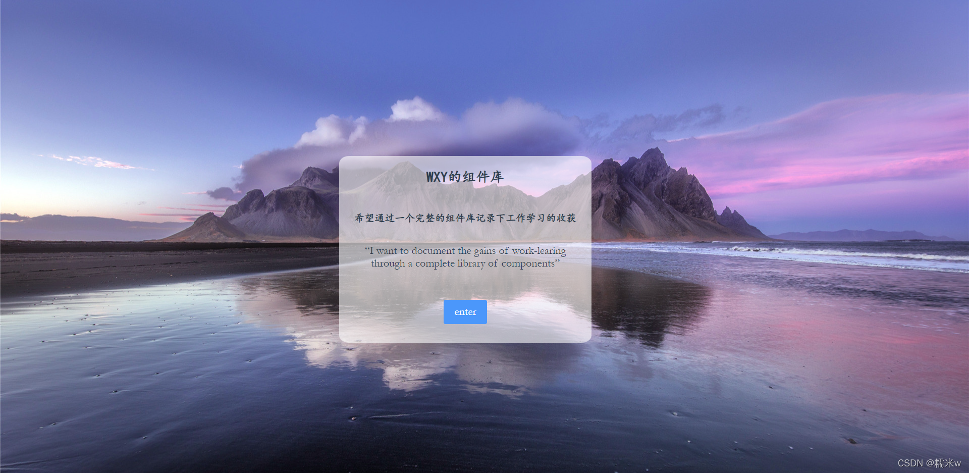
background-imageThe page is very simple, put the background image in the outer div definition, and
put the relevant text in the inner div definition bullet box information
html code
<template>
  <div class="login-container" :style="{backgroundImage:`url(${loginBg})`}">
    <div class="login-main">

      <div class="normal-font title">WXY的组件库</div>
      <div class="normal-font content">希望通过一个完整的组件库记录下工作学习的收获</div>
      <div class="english-font content">“I want to document the gains of work-learing through a complete library of components”</div>
      <el-button type="primary" class="button english-font" @click="onEnter">enter</el-button>
    </div>
  </div>
</template>
css code
.login-container {


  height: 100vh;
  background-repeat: no-repeat;
  background-color: #6b81ca;
}

.login-main {


  position: absolute;
  top: 33%;
  left: 35%;
  width: 35%;
  min-height: 370px;
  min-width: 350px;
  max-width: 500px;
  background: hsla(0, 0%, 100%, 0.6);
  border-radius: 4%;
  text-align: center;
}
-
Outer layers are tiles that design the entire picture, rather than repeating
-
The inner layer designs the position of the display frame and the background color, etc.
It can be seen that the content of the bullet box can see the background of the background. This is because the
login-mianstyle of this div is set to be translucent, just to achieve the effect of echoing the background, but also because part of the background is revealed. So I feel that the text is not very clear, and the whole page looks very dull.hsla– Define background color with transparencyhsla(hue, saturation, lightness, alpha)
Define color, saturation, brightness, opacity separately
2. Advanced design
Follow Apple's background design to achieve a background blur effect
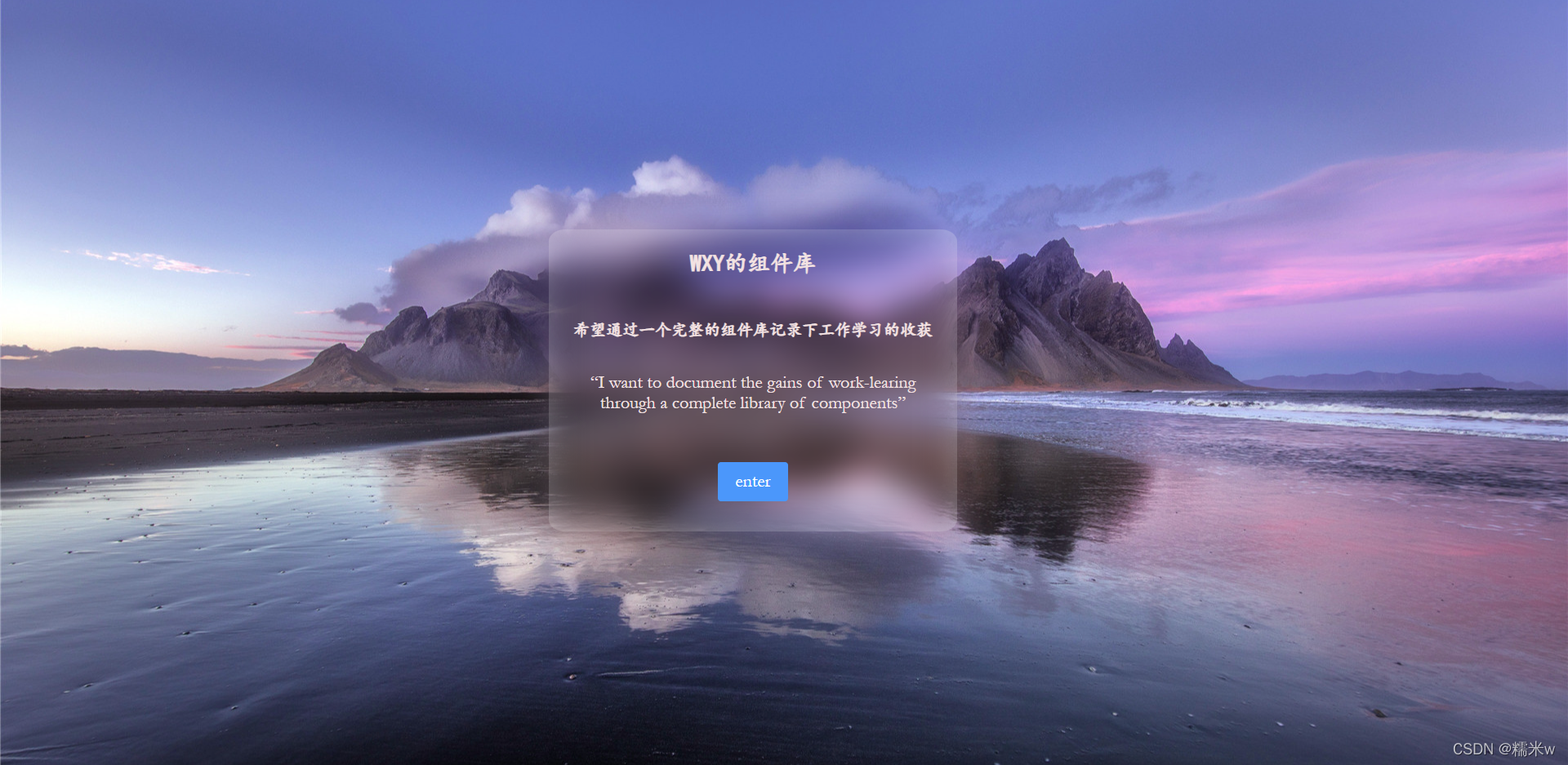
Realization principle
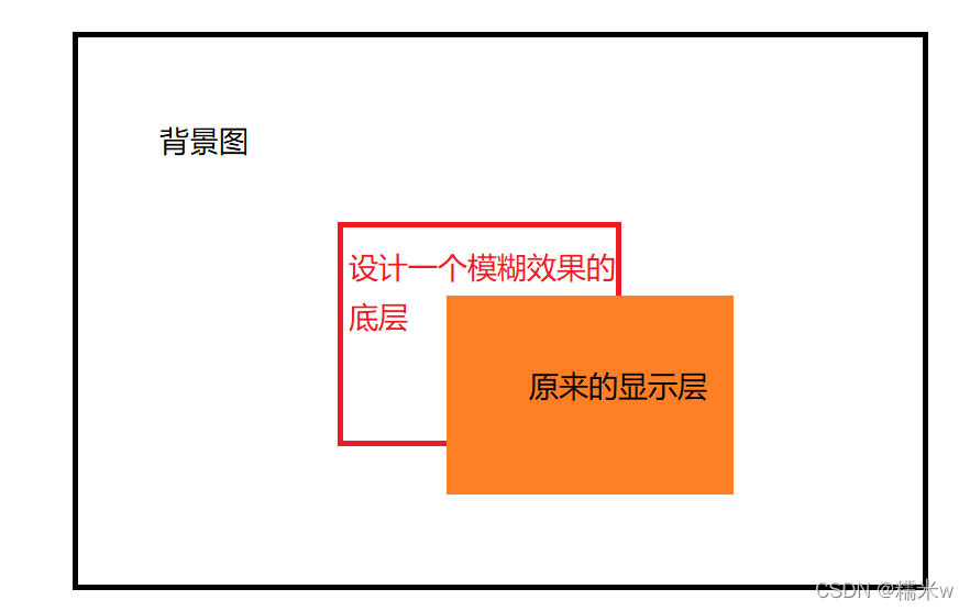
On the basis of the original, a middle blur layer is added to achieve the effect of frosted glass
CSS code
.login-container,
.login-main-two::before {


  background: url('../assets/images/background.png') 0 / cover fixed;
  z-index: -1;
}
.login-main-two {


  z-index: 5;
  position: absolute;
  top: 30%;
  left: 35%;
  width: 500px;
  height: 370px;
  border-radius: 4%;
  text-align: center;
  background: hsla(0, 0%, 100%, 0.3);
  color: #f2e2e2;
}

.login-main-two::before {


  content: '';
  position: absolute;
  top: 0;
  right: 0;
  bottom: 0;
  left: 0;
  filter: blur(20px);
}
::before layer is the fuzzy layer information implemented
The background image definition layer needs to be written to the outer layer at the same time because it involves the z-axis positioning relationship
When multiple pages are superimposed, it needs to be introduced
z-indexto judge the sequence, which is onlyabsolute、relative、fixeduseful for positioning
filterThe property provides a blurring effect and is often used to adjust the rendering of images, backgrounds and borders