PyGWalkerJupyterData analysis and data visualization workflows for notebooks can be simplified by pandaconverting data frames into Tableaustylized user interfaces for visual exploration.
PyGWalker(pronounced like " Pig Walker", just for fun) is named an acronym for " Graphic Walkerbind Python". It integrates with JupyterNotebook (or other JupyterNotebook-based) and Graphic Walker, which is Tableauanother open source alternative. It allows data scientists to analyze data and visualize patterns with simple drag and drop.
Install
Before using pygwalker, make sure to install the package via the command line using pip.
pip install pygwalker
For early access, you can use
pip-install-pygwalkerInstall –Upgrade to keep your version up to date with the latest version, and evenpip-install-git+https://github.com/Kanaries/pygwalker@mainget the latest features andbugfixes.
In Jupyter notebook usepygwalker
Import pygwalkerand pandaimport into your Jupyternotebook to get started.
import pandas as pd
import pygwalker as pyg
You can use it without breaking your existing workflow pygwalker. For example, you can call LoadDataFrame's with Graphic Walker:
df = pd.read_csv('./bike_sharing_dc.csv', parse_dates=['date'])
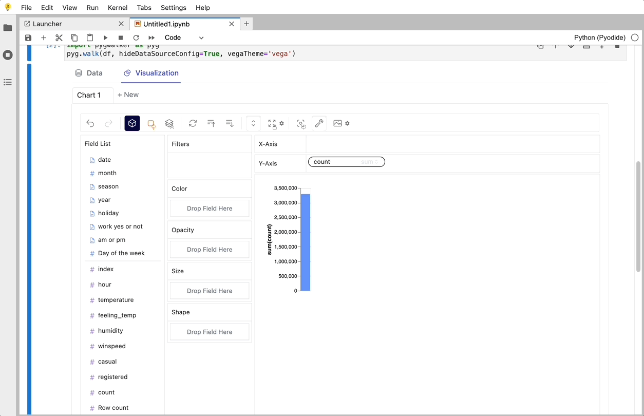
gwalker = pyg.walk(df)
You can even try it online, just visit Binder, Google Colabor Kaggle Code.

That's it. Now you have a similar Tableauuser interface to analyze and visualize data by dragging and dropping variables.
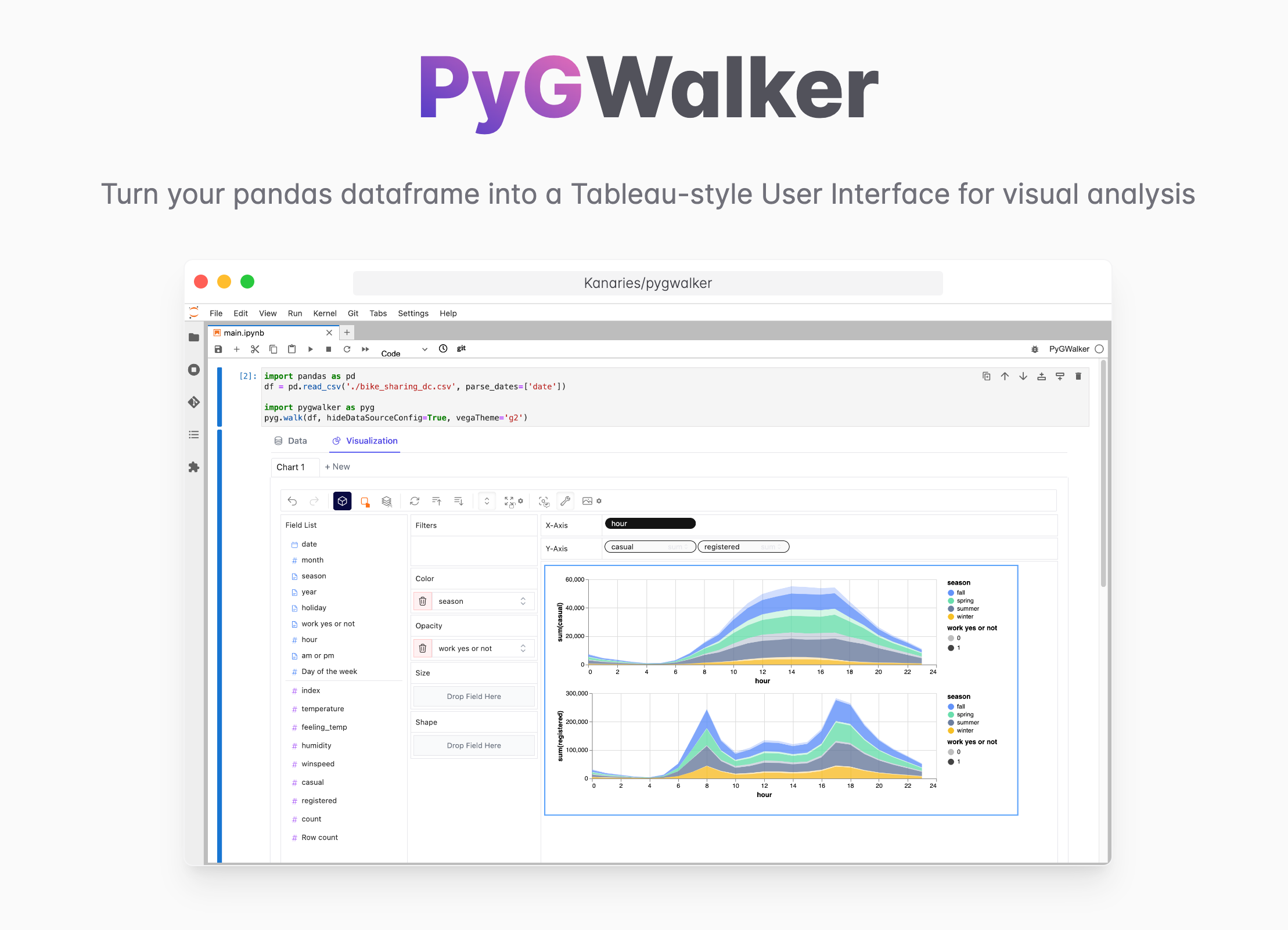
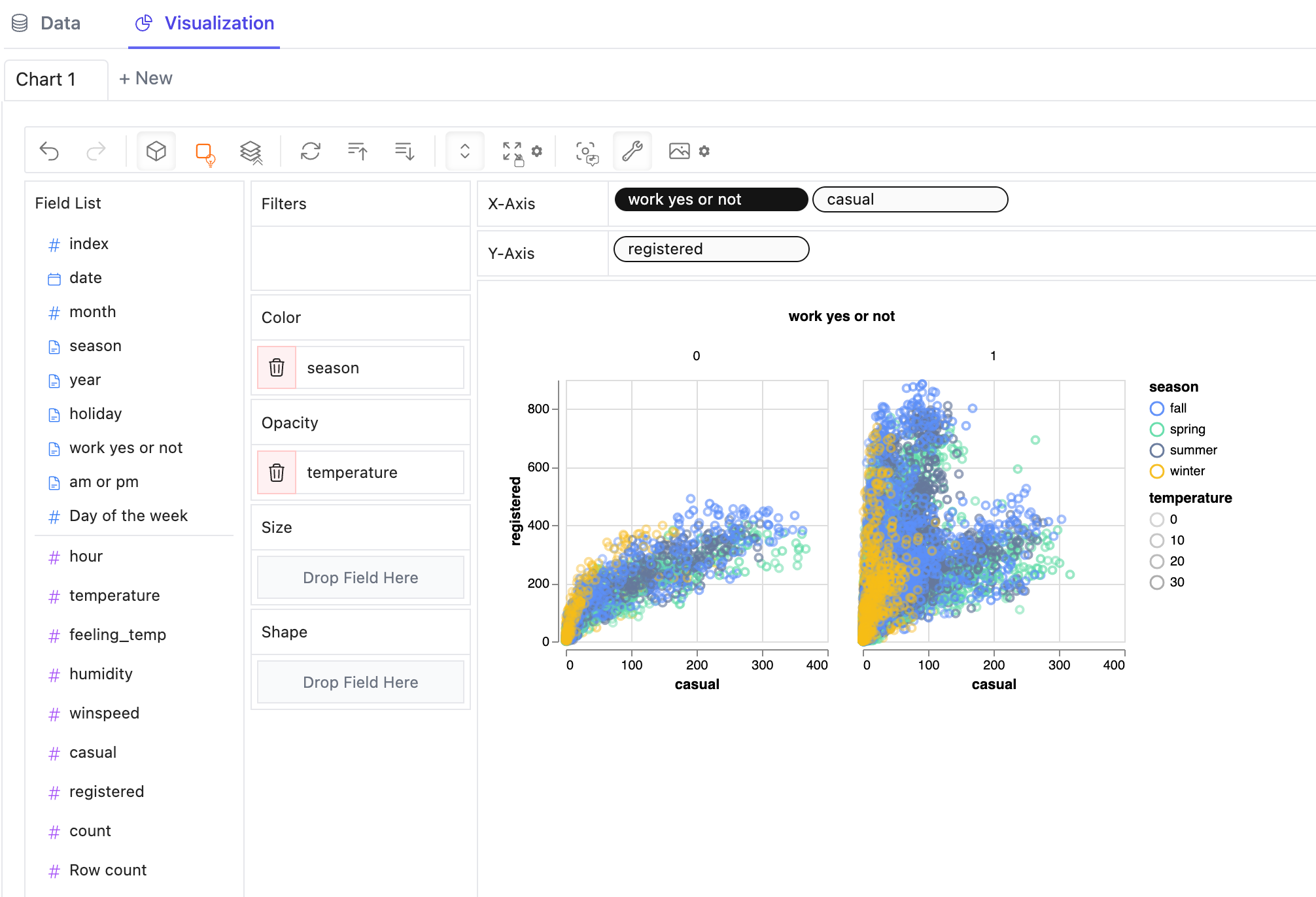
You can do some cool things with Graphic Walker:
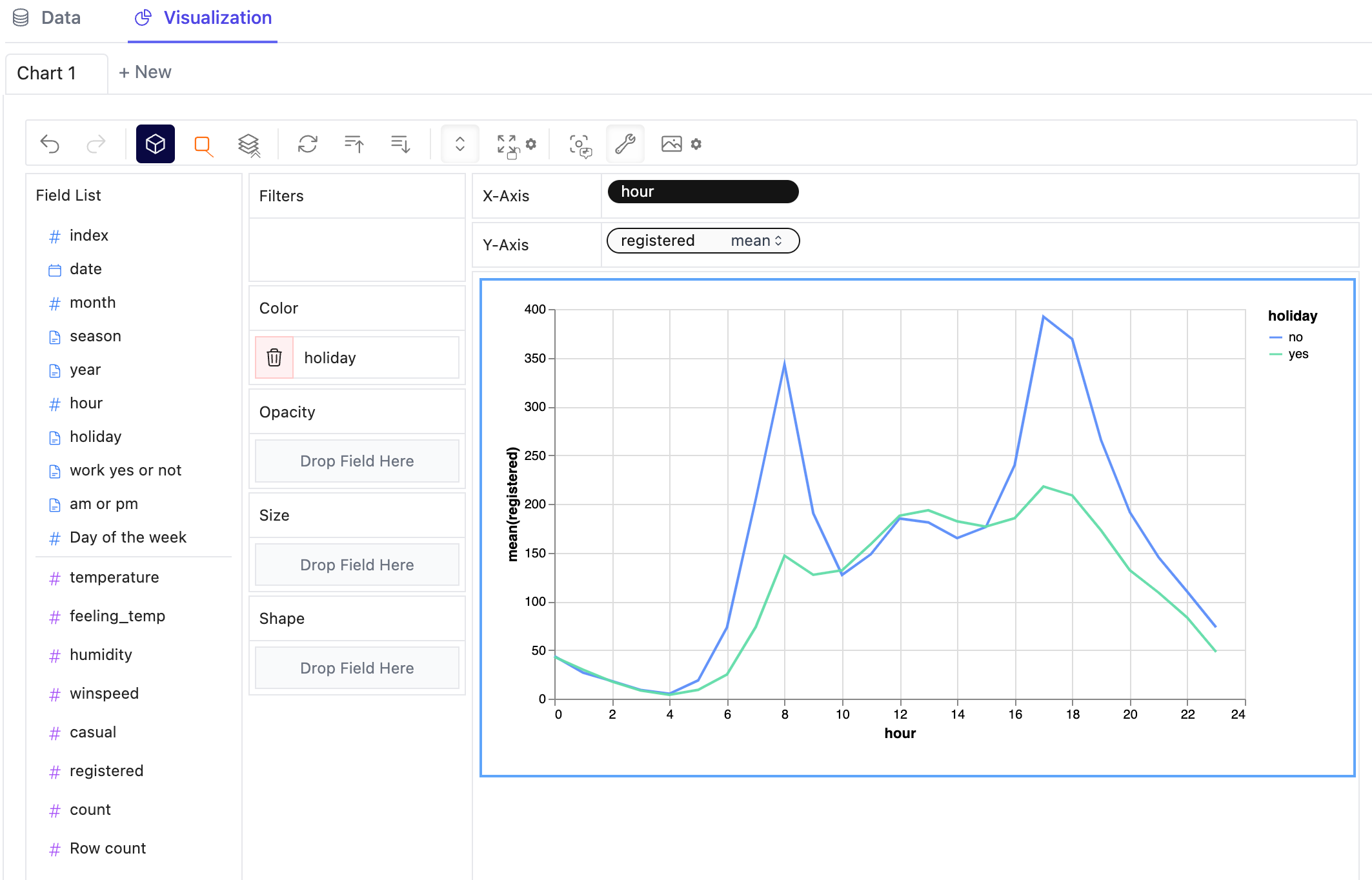
- You can change the marker type to other types to make different charts, for example, a line chart:
- To compare different measures, you can create a concave view by adding multiple measures into rows/columns.
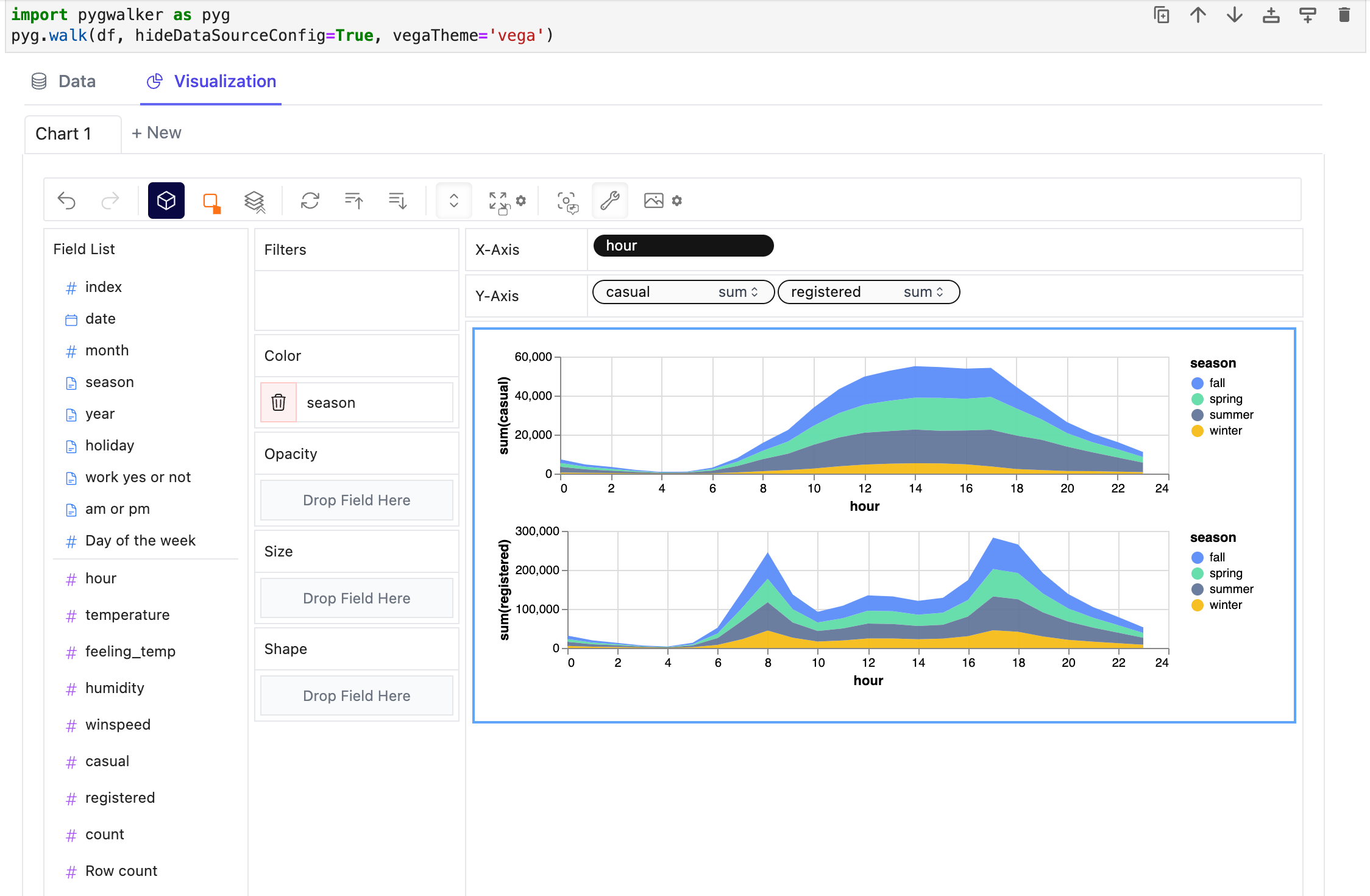
- To create a faceted view of multiple subviews divided by values in a dimension, put the dimensions into rows or columns to create the faceted view. The rules are similar to Tableau.
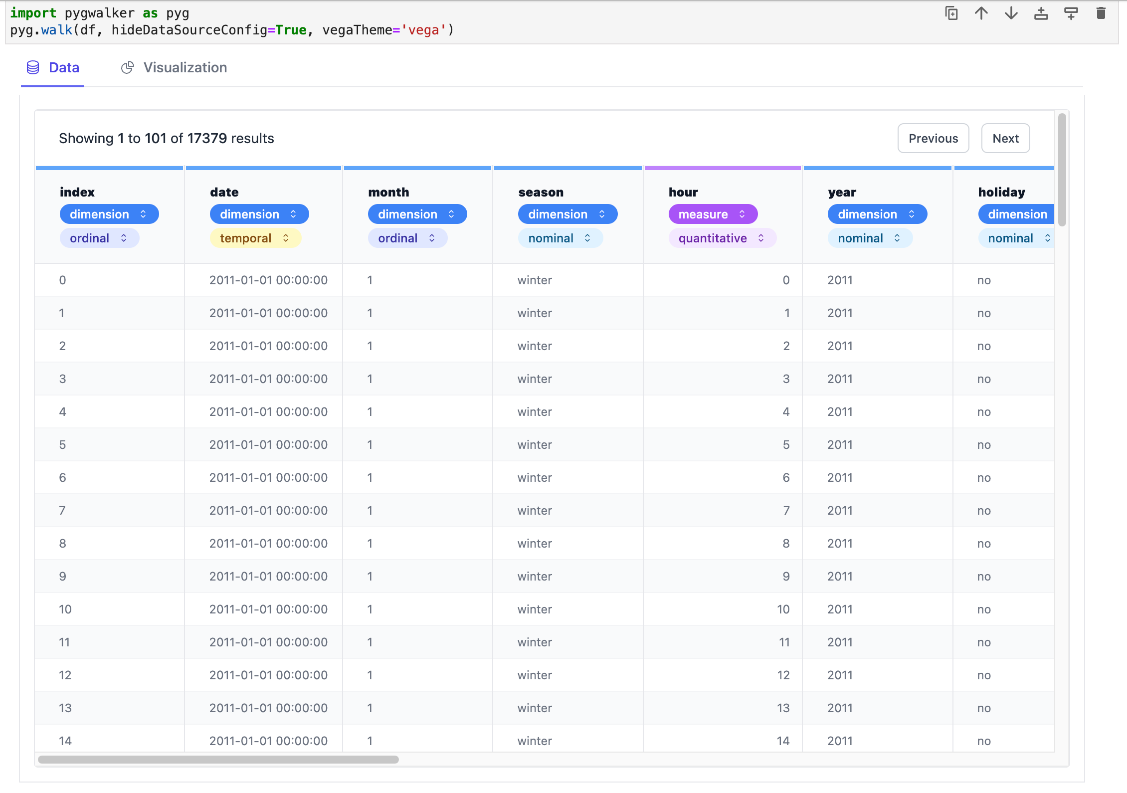
- You can view the data frame in the table, and configure the analysis type and semantic type.