Table of contents
What is Responsive Web Layout
Responsive layout is a concept proposed by Ethan Marcotte in May 2010. In short, it means that a website can be compatible with multiple terminals-instead of making a specific version for each terminal. This concept was born to solve mobile Internet browsing.
Responsive layout can provide users of different terminals with a more comfortable interface and better user experience, and can layout different interface effects according to different mobile devices. Different mobile devices have different screen sizes, which can be designed through media queries.
media query
What are media queries?
The English name of the media query is " Media Query", which refers to setting different style rules for different media types, and setting different styles for different screen sizes.
grammar:
@media 媒体类型 关键字 (媒体特性){
      CSS
}
Media type (mediatype)
Function: Used to distinguish device types, such as screen devices, printing devices, etc., among which mobile phones, computers, and tablets are all screen devices.
| Screen | screen | device with screen |
|---|---|---|
| Printing preview | print preview mode | |
| Reader | speech | screen reading mode |
| Type indifferent | all | Default value, including the above 3 situations |
keywords
Role: Logical operator, connecting media types or multiple characteristics together as the condition of media queries.
- and: multiple media features can be connected together
- not: negate the result of a media type
- only: only indicates a specific media type
media feature
Function: Used to describe the specific characteristics of the media type, such as the width and height of the current screen, resolution, horizontal screen or vertical screen, etc. Set different styles according to different media type characteristics.
| Characteristic name | Attributes | value |
|---|---|---|
| viewport width and height | width、height | value |
| viewport minimum width and height | min-width、min-height | value |
| viewport maximum width and height | max-width、max-height | value |
| screen orientation | orientation | portrait: vertical screen, landscape: horizontal screen |
Import method
Outlined imports:
<link rel="stylesheet" href="css文件" media="媒体类型 关键字 (媒体特性)">
Introduced directly in style:
@media 媒体类型 关键字 (媒体特性){
      CSS
}
The media type generally uses the default value, and other attributes are only used in specific scenarios, and keywords are also used, so the general writing method is:
@media 媒体类型(媒体特性){
      CSS
}
case:
<!DOCTYPE html>
<html lang="en">
<head>
<meta charset="UTF-8">
<meta http-equiv="X-UA-Compatible" content="IE=edge">
<meta name="viewport" content="width=device-width, initial-scale=1.0">
<title>Document</title>
<style>
/*
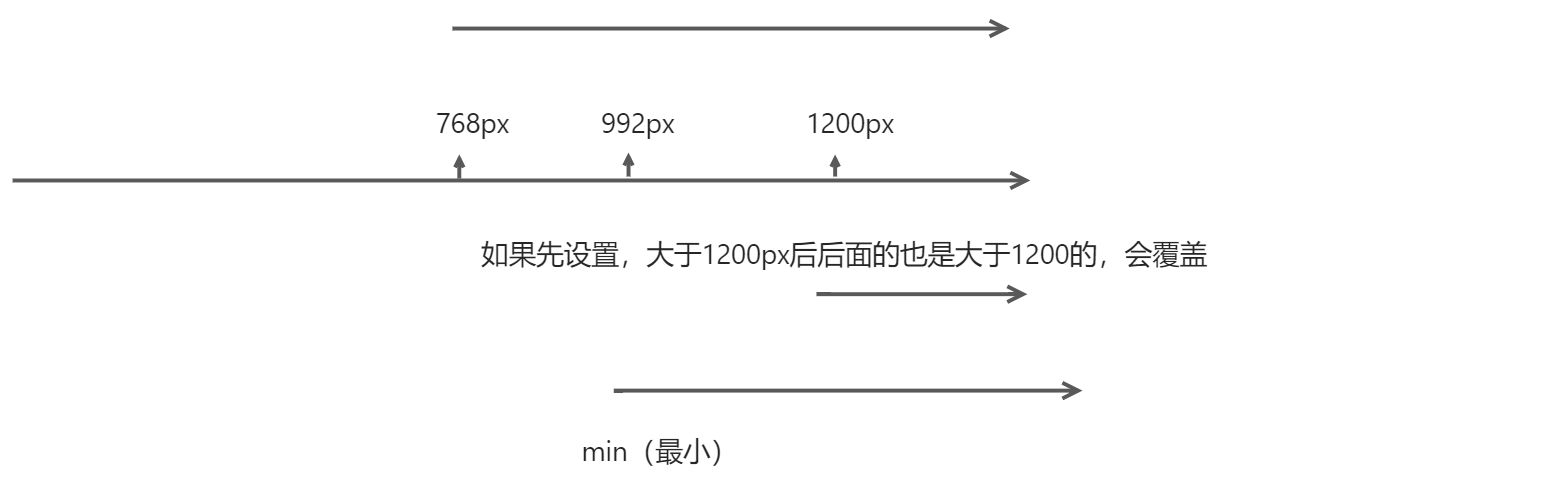
视口宽度 >= 768px,网页背景色是 粉色
视口宽度 >= 992px,网页背景色是 绿色
视口宽度 >= 1200px,网页背景色是 skyblue
*/
/* 不能设置在这,css属性的层叠性会覆盖 */
/* @media (min-width: 1200px) {
body {
background-color: skyblue;
}
} */
@media (min-width: 768px) {
body {
background-color: pink;
}
}
@media (min-width: 992px) {
body {
background-color: green;
}
}
@media (min-width: 1200px) {
body {
background-color: skyblue;
}
}
</style>
</head>
<body>
</body>
</html>
BootStrap
Introduction
Bootstrap is a front-end UI framework developed and maintained by Twitter. It provides a large number of well-written CSS styles, allowing developers to quickly write fully functional web pages and common interactive effects combined with certain HTMLstructures and styles.JavaScript
Role: Used to develop responsive layout, mobile device-first WEB projects, making development faster, easier and more stable.
Chinese official website: https://www.bootcss.com/
Steps for usage
- download bootstrap
- Introduce the css code provided by bootstrap
min.css is the compressed css code, which can make the webpage smoother.
<link rel="stylesheet" href="./lib/bootstrap/css/bootstrap.min.css">
- Call the style provided by bootstrap
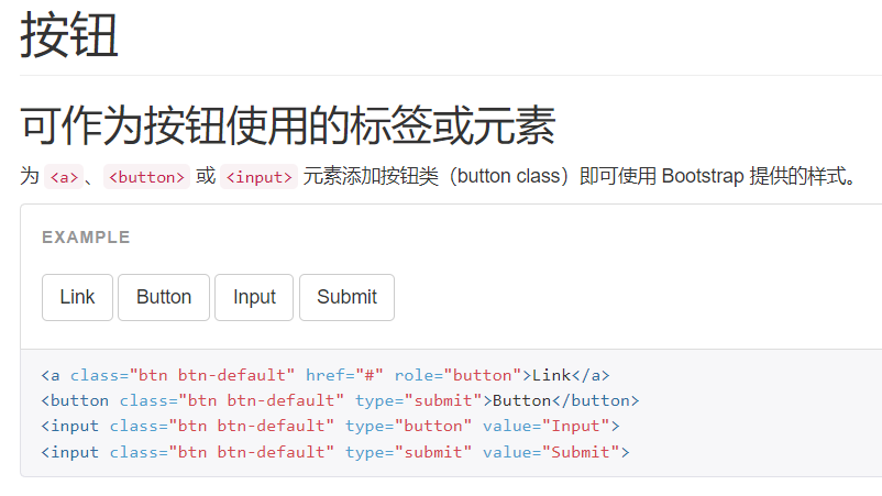
There are many styles in the global CSS style, you can call its class directly, and use the container class to center the version.
If you use the button, you can directly copy it to generate:
grid system
viewportBootstrap provides a responsive, mobile-first fluid grid system that automatically divides into up to 12 columns as the screen or viewport ( ) size increases.
The grid system is used to create page layouts through a series of row ( row) and column ( column) combinations, and your content can be placed in these created layouts.
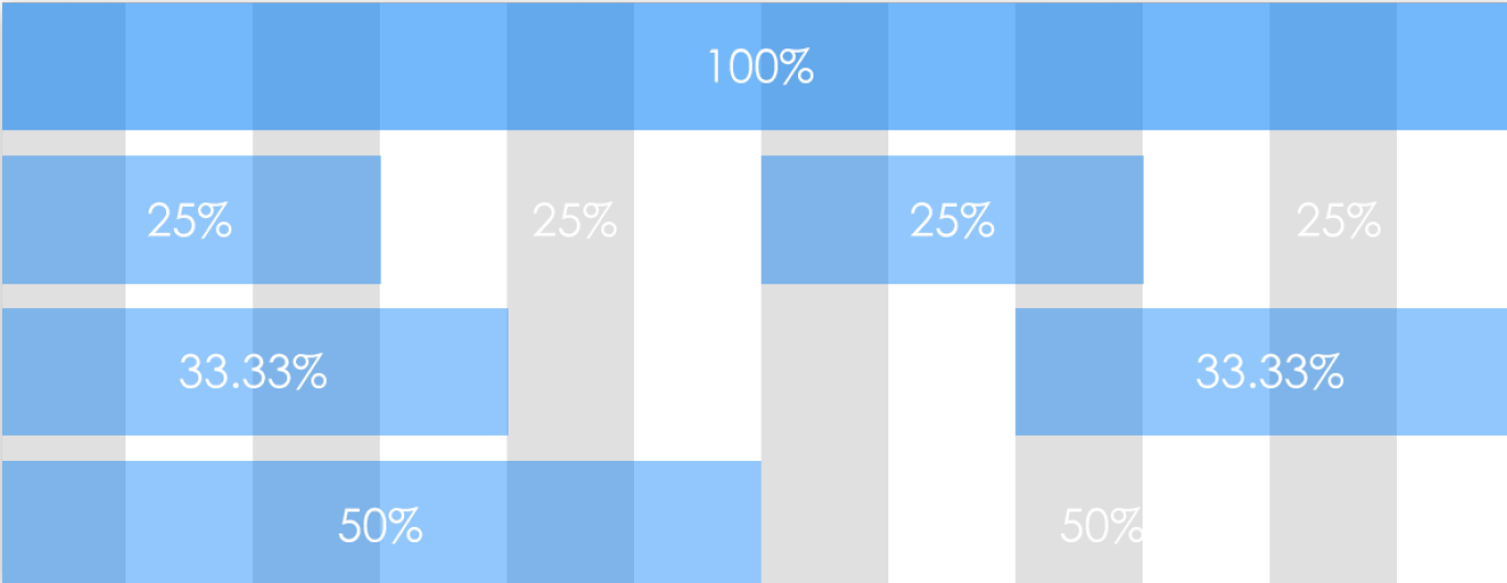
Grid parameters:
| Ultra small screen phone (<768px) | Small screen tablet (≥768px) | Medium screen desktop monitors (≥992px) | Large screen large desktop display (≥1200px) | |
|---|---|---|---|---|
| Grid System Behavior | horizontal arrangement | start out stacked and become horizontal when larger than these thresholds | ||
| .container maximum width | None (auto) | 750px | 970px | 1170px |
| class prefix | .col-xs- | .col-sm- | .col-md- | .col-lg- |
| English prefix | extremely small | samll | middle | large |
| Groove width (column gap) | 30px (15px left and right for each column) |
Use predefined classes that can be used to quickly create grid layouts:
<!DOCTYPE html>
<html lang="en">
<head>
    <meta charset="UTF-8">
    <meta http-equiv="X-UA-Compatible" content="IE=edge">
    <meta name="viewport" content="width=device-width, initial-scale=1.0">
    <title>栅格布局</title>
    <link rel="stylesheet" href="./bootstrap-3.4.1-dist/css/bootstrap.min.css">

    <style>
        .container div {


            height: 50px;
            background-color: pink;
        }
    </style>
</head>
<body>
    <!--大屏: 一行排列4个内容; 中屏:一行排列2个内容 -->
    <div class="container">
        <div class="col-lg-3 col-md-6 col-xs-12">1</div>
        <div class="col-lg-3 col-md-6 col-xs-12">2</div>
        <div class="col-lg-3 col-md-6 col-xs-12">3</div>
        <div class="col-lg-3 col-md-6 col-xs-12">4</div>
    </div>

</body>
</html>
container class:
.containerIt is a class name specially provided in Bootstrap. All the boxes to which this class name is applied have a specified width and are centered by default.
.container-fluidIt is also a class name specially provided in Bootstrap. All boxes applying this class name have a width of 100%
components
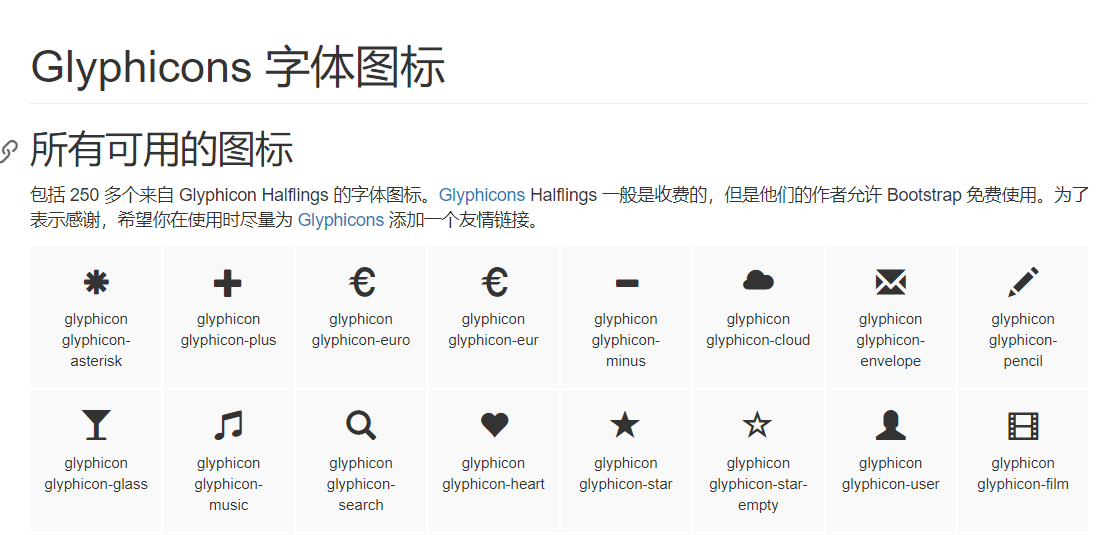
Bootstrap comes with a large number of reusable components, including font icons, drop-down menus, navigation, alert boxes, pop-up boxes, and more.
The method of use is just to call its class name (of course, css style needs to be introduced)
JavaScript plugin
The introduction of JavaScript plug-ins can make web pages have interactive functions, such as simulation boxes, drop-down menus, carousels, etc.
Import method:
can be imported individually (using a single *.js file Bootstrapprovided by ), or all at once (using bootstrap.jsor a compressed version bootstrap.min.js). It is recommended to use the compressed version of JavaScriptthe file , which contains all the plugins.
Because of plugin dependencies, all plugins depend on it jQuery, so jQueryit must be introduced before all plugins:
    <script src="./lib/js/jquery.js"></script>
    <script src="./lib/bootstrap-3.4.1-dist/js/bootstrap.min.js"></script>
custom made
LessBootstrap can customize your own Bootstrap by customizing Bootstrap components, variables and jQuery plug-ins.
the case
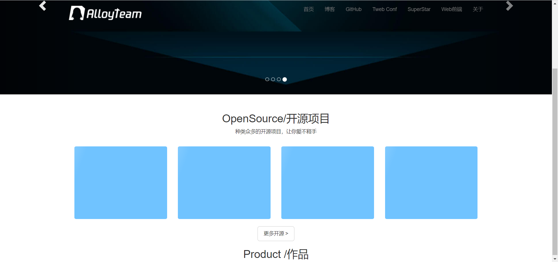
Tencent front-end web home page
Navigation page: Call the corresponding navigation class, add, delete, and delete
Carousel map: Find Carouselthe class call, replace it with a picture
Banner area: Grid system arrangement