foreword
1. Layout introduction
Layout: layout comprehensive planning and arrangement of things
Page Layout: Formatting text, graphics or tables on the page. Including font, font size, color paper size and orientation, margins , etc.
Web page layout: use html to build structure and content, use CSS to add decoration
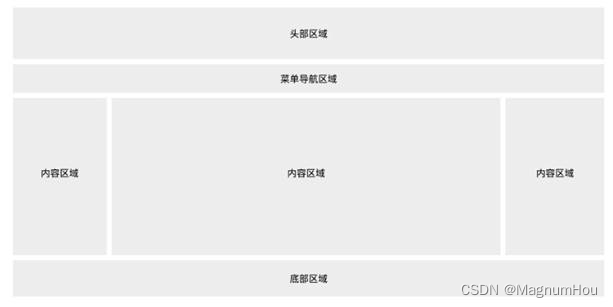
There are many ways of web page layout, generally divided into the following parts: header area, menu navigation area, content area, bottom area.
**Note:**All page layouts are based on the box model.
2. Currently commonly used web page layout
-
Fixed layout (the most basic layout)
-
Flow Layout (Percentage Layout)
Flow layout is also called percentage layout. Change the width, height, margin, and padding of elements from fixed values to percentages, so that the height, margin, and padding of elements will be adjusted at any time according to the size of the page to achieve the purpose of adapting to the current page.
have to be aware of is:
- The percentage is calculated based on the size of the element's parent;
- The horizontal or vertical spacing of the element is calculated relative to the width of the parent. (margin&padding)
- Border cannot be set with percentage
Advantages and disadvantages:
Use percentage as the main form to make the screen self-adaptive. This layout method is flexible in definition and can change according to the situation of the screen. However, the effect of this design method is not easy to control. Generally, mobile terminals are more combined with rem, and PC terminals are used. Not very many.
-
Elastic layout (flexible layout)
CSS3 introduces a new layout mode - Flexbox layout, which is the flexible layout box model (FlexibleBox), which is used to provide a more efficient way to formulate, adjust and distribute the layout of items in a container, even if their sizes are unknown or dynamic , here is referred to as Flex.
Flexbox layout is often used to design more complex pages. It can easily maintain the relative position and size of elements when the screen and browser window size change, and reduce the need to rely on floating layout
to realize the size ofWhen flexbox layout defines the size of the flex item, the flex container will reserve some available space, allowing you to adjust the relative size and position of the flex item. For example, you can ensure that the extra space in the flex container
distributes multiple flex items evenly. Of course, if your flex container does not have enough space for the flex items, the browser will reduce the size of the flex items according to a certain ratio, making it Does not overflow the flex container. In general
, the Flexbox layout function mainly has the following points:- First, the layout can be flexibly adjusted when the size of the screen and browser window changes;
- Second, you can adjust the size of the flex item by specifying that the flex item allocates additional space proportionally along the main axis or side axis (flex container extra space);
- Third, you can specify that the flex item distributes the extra space of the flex container along the main or side axis before, after, or between the flex items;
- Fourth, you can specify how to distribute the extra space perpendicular to the element's layout axis around the element;
- Fifth, you can control the layout direction of elements on the page;
- Sixth, elements on the screen can be reordered in a different order than specified by the Document Object Model (DOM). That is to say, in browser rendering, the order of flexible items can be rearranged not according to the order of document flow.
There are many versions of the Flexbox specification, and browsers have different support for this syntax.
-
floating layout
This layout has demonstrated the floating layout above, so I won’t do code demonstration here. The floating layout keyword, float, can be set to left or right. It makes the element out of the document flow and achieves the purpose of the layout. It is also a relatively mainstream layout method at present
. , but after using the float, don't forget to clear the float -
positioning layout
Positioning layout is also a commonly used layout method at present, keywords:
- position: fixed; Fixed layout, which fixes the elements in one position and does not move with the page movement
- position: relative; Relative positioning, relative to the positioning of the element itself, does not break away from the document flow, which is equivalent to defining a reference object, generally used in combination with absolute positioning
- position: absolute; Absolute positioning, separated from the document flow, is generally used in combination with relative positioning. If no relative definition is defined, it will be positioned relative to the entire browser. Therefore, positioning layouts are generally a combination of relative positioning and absolute positioning. , Relative positioning is equivalent to delineating a sphere of influence, formulating a closed container block, and then absolute positioning is enough for relative positioning, so as to achieve an effective layout.
-
responsive layout
Use @media media queries to toggle different styles for devices of different sizes and media. Excellent response range design can provide a good experience for devices within the adaptation range
-
rem layout (mobile terminal)
The new rem layout of CSS3. The principle is to design the page according to the fixed height and width first, then convert it to rem unit, and use js to query the screen size to change the font-size of html, and finally make the so-called perfect self-adaptation.
1. Responsive layout
1.1 Overview of Responsive Layout
-
Historical origin:
Responsive layout is a concept proposed by Ethan Marcotte in May 2010. In short, it means that a website can be compatible with multiple terminals, rather than making a specific version for each terminal. This concept was born to solve mobile Internet browsing.
-
concept
Responsive layout can provide users of different terminals with a more comfortable interface and better user experience, and with the current popularity of large-screen mobile devices, it is not an exaggeration to describe it as "the general trend". As more and more designers adopt this technology, we not only see a lot of innovation, but also some patterns taking shape.
-
Advantages and disadvantages:
Responsive layout solves the differential display between different devices, allowing a website to be compatible with devices with different resolutions, giving users a better visual experience. But at the same time, there are also some shortcomings, such as: more compatibility codes, heavy workload, and affected loading speed
-
The implementation ideas and advantages and disadvantages of responsive web design
- The simplest way of Css3-Media Quary (handheld devices generally support it, but traditional PC-side old browsers may not support it)
- Browsers that do not support Css3 use js to achieve high cost and are not recommended
- The use of third-party open source frameworks (for example: BootStrap (Twitter), UIKit) can well support the design of browser responsive layout
-
Principles of Responsive Design
-
Mobile first: In the early stage of design, it is necessary to consider how the page can be displayed on multiple terminals. When making a responsive website, be sure to add the following statement to the head of the page
<meta name="viewport" content="width=device-width, initial-scale=1.0, minimum-scale=1.0, maximum-scale=1.0,user-scalable=no">width=device-width The width defined in the style is equal to the width defined in the device
initial-scale=1.0 scaling 1
minimum-scale=1.0 Maximum reduction ratio 1
maximum-scale=1.0 Maximum zoom ratio 1
Note : In HTML, there is no closing tag for meta tags, meta tags define the name or value associated with the document. Provides meta information about the page.
-
Progressive enhancement: give full play to the hardware capabilities of hardware devices (for example, the latest browsers support Css3 animations to increase user experience)
-
1.2 Media Query Media Quarry
-
The concept of media queries
- Media queries allow us to set CSS styles based on the characteristics of the device display (such as viewport width, screen ratio, device orientation: landscape or portrait). Media queries consist of media types and one or more conditional expressions that detect media characteristics composition.
- The media features available for detection in media queries are width, height, and color (among others).
Using media queries, you can customize the display effect for some specific output devices without changing the content of the page .
-
Meaning of media queries
Without CSS3's media query module, it is not possible to set specific CSS styles for device characteristics (such as viewport width)
-
Implementation of media queries
-
The media query is written at the end of the CSS style code. CSS is a cascading style sheet. Under the same specificity, the later styles will overlap the previous styles
-
First, you need to add the following code in the html document to be compatible with the display effect of mobile devices
<meta name="viewport content="width=device-width,initial-scale=1,maximum-scale=1,user-scalable=no"/>width=device-width: the width is equal to the width of the current device
initial-scale=1: initial scaling (default is 1)
maximum-scale=1: allow the user to zoom to the maximum scale (default is 1)
user-scalable=no: the user cannot manually scale
-
There are several ways to write CSS responsive media queries in CSS files:
-
Use link to import css files
<link type="text/css" rel="stylesheet" href="" media="only screen and (max-width:480px)"/> -
Limit screen size in linked css files
<link type="text/css" rel="stylesheet" href=""/>css file code:
@media only screen and (max-width:480px){ 样式:样式值; } @media only screen and (min-width:900px){ 样式:样式值; } -
Limit screen size in embedded css file
<style type=text/css> @media only screen and (max-width:480px){ 样式:样式值; } @media only screen and (min-width:900px){ 样式:样式值; } </style> -
Imported
<style type="text/css" media="screen and (min-width:600px) and (max-width:900px)">
    @import url("css/style.css");
</style>
-
-
-
Introduction to common attributes
- device-width, device-height screen width and height (device physical width and height)
- width, height rendering window (viewable area such as browser window) width and height
- viewport viewport
- content content
- initial-scale initial-scale
- minimum-scale minimum-scale
- maximum-scale maximum-scale
- media media
- query query
- orientation Device orientation (horizontal screen, vertical screen)
- resolution device resolution (resolution is determined by dpi)
Two, Bootstrap
Official website: https://www.bootcss.com/
2.1 Overview
Bootstrap is the world's most popular front-end framework for building responsive, mobile-first websites.
Bootstrap is divided into several main parts such as "global css style", "component", and "javascript plug-in".
Set global css styles: basic html elements can be styled and enhanced by class; there is also an advanced grid system.
Components: Countless reusable components, including font icons, drop-down menus, navigation, alert boxes, pop-up boxes, and more.
javascript plugin: The jquery plugin gives "life" to the components of bootstrap. You can simply import all plugins at once, or add them to your page one by one.
2.2 Introduction to Bootstrap introduction
npm needs to install the environment node.js
cdn online mode, need to be connected to the Internet
Download and import into your own website offline
2.3 Mobile devices first
Bootstrap is mobile-first . To ensure proper drawing and touch scaling, add the viewport metadata tag<head> to the .
<meta name="viewport" content="width=device-width, initial-scale=1, maximum-scale=1, user-scalable=no">
2.4 Introduction to Global CSS Styles
-
container
The class name.container gives different schemes according to different viewports, but they all have the effect of centering the page
class name.container-fluid width 100%
<div class="container border2">
  <!-- content here -->
  <h1>这是bootstrap</h1>
  <h2>这是bootstrap</h2>
  <h3>这是bootstrap</h3>
  <h4>这是bootstrap</h4>
  <h5>这是bootstrap</h5>
  <h6>这是bootstrap</h6>
</div>
Note: The title tag unit rem changes the w3c standard style
-
media query
In the grid system, we use the following media query in the Less file to create key breakpoint thresholds.
/* 超小屏幕(手机,小于 768px) */
/* 没有任何媒体查询相关的代码,因为这在 Bootstrap 中是默认的(还记得 Bootstrap 是移动设备优先的吗?) */

/* 小屏幕(平板,大于等于 768px) */
@media (min-width: @screen-sm-min) { ... }

/* 中等屏幕(桌面显示器,大于等于 992px) */
@media (min-width: @screen-md-min) { ... }

/* 大屏幕(大桌面显示器,大于等于 1200px) */
@media (min-width: @screen-lg-min) { ... }
We also occasionally include in our media query code
max-widthto limit the effect of the CSS to a narrower range of screen sizes@media (max-width: @screen-xs-max) { ... } @media (min-width: @screen-sm-min) and (max-width: @screen-sm-max) { ... } @media (min-width: @screen-md-min) and (max-width: @screen-md-max) { ... } @media (min-width: @screen-lg-min) { ... } -
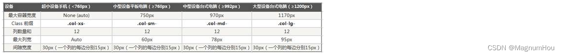
Grid parameters
Use the table below to see in detail how Bootstrap's grid system works on various screen devices.
Ultra small screen phone (<768px) Small screen tablet (≥768px) Medium screen desktop monitors (≥992px) Large screen large desktop display (≥1200px) Grid System Behavior always horizontal Starts stacked together, becomes horizontal when greater than these thresholds C .containermaximum widthNone (auto) 750px 970px 1170px class prefix .col-xs-.col-sm-.col-md-.col-lg-number of columns 12 Maximum column width automatic ~62px ~81px ~97px Gutter width 30px (15px left and right for each column) nestable yes Offsets yes column sort yes -
grid layout
The grid system is used to create page layouts through a series of combinations of rows and columns, and your content can be placed in these created layouts
The class name row must be contained in
.container(fixed width) or.container-fluid(100% width) in order to give it a suitable alignment and paddingClass name col- column, column creates a group of "columns" in the horizontal direction through "rows", and the content should be placed in the "columns", and only "columns" can be used as A direct child element of "row"
There are 12 columns in one line, if there are more than 12 columns in a line, it will automatically wrap
Responsive :
- .col-
- .col-sm-
- .col-md-
- .col-lg-
- .col-xl-
Offset value:
- offset-
-
sheet
Default style.table
optional style.table
-striped provides a zebra crossing style for the
table.table-bordered adds a border to the
table.table-hover gives each row in the table a hovering style. A background color will be added when the mouse is over.
.table-condensed The padding of each cell is halved to make the table more compact. -
form
-
button

- card crumbs

<div class="container">
    <div class="row">
        <div class="col-4">
            <div class="card" style="width: 18rem;">
              <img class="card-img-top" src="images/1.jpg" alt="Card image cap">
              <div class="card-body">
                <h5 class="card-title">Card title</h5>
                <p class="card-text">Some quick example text to build on the card title and make up the bulk of the card's content.</p>
                <a href="#" class="btn btn-primary">Go somewhere</a>
              </div>
            </div>
        </div>
    </div>
</div>

2.4 Component Introduction
2.5 JavaScript plugins
Carousel

<!DOCTYPE html>
<html>
	<head>
		<meta charset="UTF-8">
		<title></title>
		<link rel="stylesheet" type="text/css" href="bootstrap-4.0.0-dist/css/bootstrap.css"/>
		<script src="https://cdn.bootcss.com/jquery/3.2.1/jquery.slim.min.js" integrity="sha384-KJ3o2DKtIkvYIK3UENzmM7KCkRr/rE9/Qpg6aAZGJwFDMVNA/GpGFF93hXpG5KkN" crossorigin="anonymous"></script>
		<script src="https://cdn.bootcss.com/popper.js/1.12.9/umd/popper.min.js" integrity="sha384-ApNbgh9B+Y1QKtv3Rn7W3mgPxhU9K/ScQsAP7hUibX39j7fakFPskvXusvfa0b4Q" crossorigin="anonymous"></script>
		<script src="https://cdn.bootcss.com/bootstrap/4.0.0/js/bootstrap.min.js" integrity="sha384-JZR6Spejh4U02d8jOt6vLEHfe/JQGiRRSQQxSfFWpi1MquVdAyjUar5+76PVCmYl" crossorigin="anonymous"></script>
	</head>
	<body>
		<div class="container">
			<div id="carouselExampleIndicators" class="carousel slide" data-ride="carousel">
			  <ol class="carousel-indicators">
			    <li data-target="#carouselExampleIndicators" data-slide-to="0" class="active"></li>
			    <li data-target="#carouselExampleIndicators" data-slide-to="1"></li>
			    <li data-target="#carouselExampleIndicators" data-slide-to="2"></li>
			  </ol>
			  <div class="carousel-inner">
			    <div class="carousel-item active">
			      <img class="d-block w-100" src="images/1.jpg" alt="First slide">
			    </div>
			    <div class="carousel-item">
			      <img class="d-block w-100" src="images/2.jpg" alt="Second slide">
			    </div>
			    <div class="carousel-item">
			      <img class="d-block w-100" src="images/3.jpg" alt="Third slide">
			    </div>
			  </div>
			  <a class="carousel-control-prev" href="#carouselExampleIndicators" role="button" data-slide="prev">
			    <span class="carousel-control-prev-icon" aria-hidden="true"></span>
			    <span class="sr-only">Previous</span>
			  </a>
			  <a class="carousel-control-next" href="#carouselExampleIndicators" role="button" data-slide="next">
			    <span class="carousel-control-next-icon" aria-hidden="true"></span>
			    <span class="sr-only">Next</span>
			  </a>
			</div>
		</div>
	</body>
</html>
3. Mobile terminal layout
Prelude: Introduction to Viewports
Resolution : It is the number of screen pixels, such as 1600*900, which means that there are 1600 pixels in the horizontal direction and 900 pixels in the vertical direction. The so-called pixel is the smallest light-emitting unit of a physical component.
What is the resolution of the phone? Very large: the current mainstream resolution is 1920×1080
If the mobile phone really uses its own real resolution to render the web page, this is the case: it is very like being at an altitude of 3000 meters, overlooking the entire page. The text is very small and the h1 is huge.
Some students said that this is very good, just to see the whole webpage at a glance. Jobs thought so too. Jobs said that mobile phones can present computer webpages, but webpage creators have no time to make them, so at this time I
If we set the width of the mobile phone to 980px, but the actual page center is mostly the same, wouldn't the mobile phone just block the entire page center? Jobs ordered the engineers on the iPhone 1 to make the browser of his mobile phone think that he was 980px wide, not the pixel width. This width is the viewport .
Let's do an experiment and use this JS statement to test the width of the browser:
var h1=document.getElementsByTagName("h1")[0];

h1.innerHTML =document.documentElement.clientWidth;
Show 980! And the number of pixels in the horizontal direction of the iphone is not 980!
We found that all the equipment of all the students in the class, the result of this test is 980.
This number is the viewport width , viewport. 980 is the initial viewport width for all devices. The browser will render the page with a width of 980.
In other words, we do front-end development, there is no need to care about the resolution of mobile phones!
But 980 is also big for mobile phone pages. So Gangzhu Qiao made another exquisite design, which is to allow the developer of the page to customize the viewport width of the mobile device.
You can set the width of the viewport with a meta tag like this :
<meta name="viewport" content="width=300px" />
Once set, the browser will now consider itself to be 300px wide. At this point, the page will be rendered with a width of 300px. This thing works so well, we can actually dictate how wide the viewport thinks it is.
We found that: different viewport sizes, rendering the same page, give people a different feeling, especially when looking at the text, the default font size of h1 is 32px. If your viewport is 980px, the text looks very small at this time. At this time, if the viewport is around 320, it is just right at this time:
At this point there is a conversion relationship, what is the relationship?
If you let a 300px box look on the computer, it will have the same physical length as on the mobile phone! That is, we use a ruler to measure, and they are the same width.

At this point there is a ppi thing. ppi is pixel per inch. How many pixels per foot. For example, the ppi of the iPhone is 534 pixels per foot.
phone ppi >> computer ppi.
Computer resolution / computer ppi = mobile phone resolution (viewport width) / mobile phone ppi
Resolution of brand A mobile phone (or viewport width) / mobile phone ppi = resolution of brand B mobile phone (viewport width) / mobile phone ppi
Therefore, if any mobile phone wants to display the same width as a computer, it must set different viewports according to its own resolution and ppi.
If we add:
<meta name="viewport" content="width=device-width" />
At this time, the viewport width of each mobile phone is the "viewport constraint width". The viewport constraint width of each mobile phone is different, this is to give people the same physical feeling:
Viewport width after each device constrains the viewport (300-400)
You will find that the widths are different, but people look and feel the same at this time. The font size is the same size.
When making a mobile page, be sure to add
<meta name="viewport" content="width=device-width" />
At this time, if you write a p with font-size: 14px; don't worry about whether users can see it clearly! Users must be able to see it for real! At this point, the manufacturer has already calculated a so-called viewport constraint width. 14px and 14px feel exactly the same!
Generally speaking, after the mobile phone viewport is constrained, it is between 320 and 420. The resolution is basically 1000 1200, that is to say, the so-called 1px after constraining the viewport, in fact, the mobile phone uses more than 2 pixels to render. The pictures in the mobile phone must be zoomed in twice, so that they can be finer.
<meta name="viewport" content="width=device-width, initial-scale=1.0, minimum-scale=1.0, maximum-scale=1.0,user-scalable=no" id="viewport" />不用背诵
width=device-width constrains the viewport
initial-scale=1.0 The initial viewport multiplier is 1 times
minimum-scale=1.0 The minimum allowed viewport width is 1 times
maximum-scale=1.0 The maximum allowed viewport width is 1 times
3.1 Introduction to px, em, rem, vm and other units
-
background introduction
In traditional project development, we only use the units of px, %, and em, which can be applied to most project development and have relatively good compatibility. but you know what? Starting from css3, the browser's support for logical units has been improved to another level, adding some new length units such as rem, vh, vw, vm, etc. We can use these new units to develop relatively good responsive pages. Then it covers a variety of terminals with different resolutions, including mobile devices. Now let's look at the difference between these length units.
-
Unit Analysis
-
px pixel unit, English pixel abbreviation. px is the smallest point of a picture, and a bitmap is composed of tens of thousands of such points. For example, the computer pixel that is often heard is 1024x768, which means 1024 pixels in the horizontal direction and 1024 pixels in the vertical direction. is 768 pixels.
-
The em character unit, the reference is the font-size of the parent element, which has the characteristics of inheritance. If the font-size is defined by itself (the default font of the browser is 16px), 1em in the entire page is not a fixed value.
-
The rem CSS3 new unit, relative to the font-size of the root element html (web page), will not depend on the font size of the parent element like em, causing confusion.
-
% Percentage, generally speaking broadly relative to the parent element, but not very precise.
- For ordinary positioning elements, it is the parent element we understand
- For position: absolute; elements are relative to the positioned parent element
- For position: fixed; elements are relative to ViewPort (visual window)
-
vw css3 new unit, abbreviation of viewpoint width, viewport width, 1vw is equal to 1% of viewport width
vh css3 new units, relative to the viewport's width or height, whichever is smaller. The smallest of them is divided into 100 units of vm
浏览器宽度1200px, 1vw = 1200px/100 = 12px 浏览器高度900px, 1vh = 900px/100 = 9px- vh / vw is the window width (innerwidth) that does not include the page scrollbar, % includes the width of the scrollbar inside (outerwidth)
- In general, % can meet the needs of most adaptive designs. You can use height: 100vh to make an adaptive height that fills the screen without scroll bars.
- The size set with vw / vh is only related to the size of the window, so it is quite appropriate to use this unit for developing applications with multiple screen devices
-
3.2 Introduction to Mobile Adaptation Rules
- According to the ratio of the design draft to the device width, dynamically calculate and set the size of the html root tag
font-size; - In CSS, the width, height, relative position and other values of design draft elements are converted to the
remvalue of the unit according to the same ratio;
| Technical solution 1 | Technical solution 2 |
|---|---|
| media query | flexible.js |
| rem | rem |
| less | vscode plugin cssrem |
移动端屏幕宽除以设计图宽得到比例,比如屏幕宽等于750px,设计图宽等于1000px,750除以1000得到0.75px,等于说是设计图的1px,在浏览器上展示的大小为0.75px,这里我们要继承这个比例大小,采用rem的方法,继承html的font-size大小的方法去实现,设置html的font-size等于 0.75px(屏幕的0.75px相当于设计图的1px),rem会继承html的font-size大小,所以我们在页面里面使用的1rem就等于设计图的1px,后面可以忽略(为了方便我们可以把得到的设计图和屏幕宽的比例乘以100,等于75,现在1rem等于设计图的100px,0.01rem等于设计图的1px。
公式 屏幕宽度 / 设计图宽度 * 100 = html font-size(0.01rem 等于设计图的 1px)
Compatibility: Ios6 and above and android2.1 and above, basically covering all popular mobile phone systems
3.3 Simple and efficient rem configuration flexible.js
-
Adaptation principle
The simple and efficient mobile terminal adaptation library produced by the mobile phone Taobao team.
Its principle is to divide the current device into 10 equal parts, but the ratio is still the same under different devices. What
we need to do is to determine the html text size of our current device. It’s ok.
For example, the current design draft is 750px, then we only need to set the html text size to 75px (750px/ 10).
The rem value of the page element inside: the px value of the page element / 75
and the rest, let flexible.js come and go Calculate -
Page element value formula
① rem value of page element = page element value (px) / (screen width/number of divisions))
② screen width/number of divisions is the font-size of html
③ rem value of page element = page element value (px) / html font-size font size -
Steps for usage
-
Download flexible.js
GitHub download address: https://github.com/amfe/lib-flexible
-
index.jsThe middle principle is to divide the current device into 10 equal parts// set 1rem = viewWidth / 10 function setRemUnit () { var rem = docEl.clientWidth / 10 docEl.style.fontSize = rem + 'px' } -
Set meta tags
<meta name="viewport" content="width=device-width, initial-scale=1.0, maximum-scale=1.0, minimum-scale=1.0, user-scalable=no"> -
Import flexible.js
<script src='js/flexible.js'></script> -
Initialize style
<style>
  /* 如果屏幕超过了750px,那么我们就就按照750px设计稿来走,不会让页面超过750px ,使用媒体查询来设置*/
  @media screen and (min-width: 750px) {
    html {
      font-size: 75px !important;
    }
  }

  body {
    min-width: 320px;
    max-width: 750px;
   /* flexible.js把设计稿750px进行10等分,所以html文字大小设置为75px(750px/ 10),页面元素rem值:页面元素的px值/ 75(750px/75)*/
    width: 10rem;
    margin: 0 auto;
  }
</style>
This is done, and then you can develop on the mobile terminal according to the design draft of 750.
Similarly, if the design draft is 640, you need to set the html root font cssroot to 64 -
auxiliary tool
VSCode px to rem plugin cssrem
Configuration:

application:
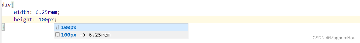
important point:
- Function: When writing code, automatically calculate how much rem is equal to according to the written px unit
- Note: The default html font size of cssrem cssroot is 16px, so it needs to be modified to 75px at this time;
- Modification method: Find cssroot in the vscode setting, set it to 75, restart vscode after the setting is complete, see the configuration diagram above
-
flexsible.js source code
(function flexible (window, document) {
  var docEl = document.documentElement
  var dpr = window.devicePixelRatio || 1

  // adjust body font size
  function setBodyFontSize () {
    if (document.body) {
      document.body.style.fontSize = (12 * dpr) + 'px'
    }
    else {
      document.addEventListener('DOMContentLoaded', setBodyFontSize)
    }
  }
  setBodyFontSize();

  // set 1rem = viewWidth / 10
  function setRemUnit () {
    var rem = docEl.clientWidth / 10
    docEl.style.fontSize = rem + 'px'
  }

  setRemUnit()

  // reset rem unit on page resize
  window.addEventListener('resize', setRemUnit)
  window.addEventListener('pageshow', function (e) {
    if (e.persisted) {
      setRemUnit()
    }
  })

  // detect 0.5px supports
  if (dpr >= 2) {
    var fakeBody = document.createElement('body')
    var testElement = document.createElement('div')
    testElement.style.border = '.5px solid transparent'
    fakeBody.appendChild(testElement)
    docEl.appendChild(fakeBody)
    if (testElement.offsetHeight === 1) {
      docEl.classList.add('hairlines')
    }
    docEl.removeChild(fakeBody)
  }
}(window, document))
-
Expand knowledge: the difference between max-device-width and max-width
-
max-device-width is the width of the device, i.e. the real device screen width.
-
max-width is the width of the target display area, for example, the browser width.
-
If max-device-width is used, when browsing the webpage on a PC browser, CSS will not be executed when the browser is reduced or enlarged, because the "PC device" does not change. But if max-width is used, CSS is executed when the browser is reduced or enlarged, because the "display area", that is, the size of the browser, has changed.
-
If max-device-width is used, CSS will not be executed when the phone changes from vertical to horizontal, because the "mobile phone width" has not changed. If max-width is used, then when the phone changes from vertical to horizontal, CSS is executed because the "display area" has changed.
-
Typically, use max-device-width for "mobile device" users and max-width for "PC device" users.
/*==== 移动设备 ==== */
@media screen and (max-device-width: 480px){
    /* CSS 代码 */
}

/*==== PC ==== */
@media screen and (max-width: 1024px){
    /* CSS 代码 */
}