One: Responsive development
It is to use media queries to set the layout and styles for devices of different widths to adapt to the purpose of different devices.
| Screen division | Size range | Usually set |
|---|---|---|
| Ultra small screen (mobile phone) | <768px | 100% |
| Small screen device (tablet) | >=768px~ < 992px | 750px |
| Medium screen ((desktop monitor) | >= 992px~ <1200px | 970px |
| Widescreen devices (large desktop monitors) | >= 1200px | 1170px |
1.1: Responsive layout container
Responsive requires a parent as a layout container to cooperate with child elements to achieve change effects.
Media query -> layout container size -> the size of the arrangement of child elements
Different screen styles
Two: Bootstrap framework
Concept (Baidu): Provides html+css coding specifications; provides a set of concise, intuitive, and powerful components; has its own ecosystem, constantly updates and iterations; makes development easier and improves development efficiency

Rapid development: Bootstrap front-end development framework
Mobile, responsive
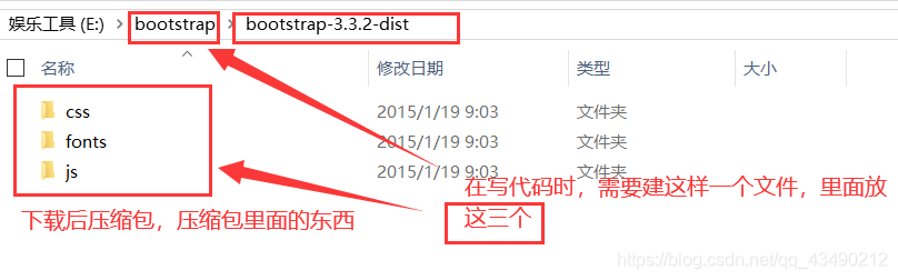
Download bootstrap
1:

2:

3:
 4:
4:
 [Chiji wow wow] bootstrap must have other functions, but I don’t know it yet, I will add it later
2.1: The use of bootstrap
- Create a folder structure


- Create html skeleton, import files (bootstrap, css, other etc. that need to be imported) (the official website has the code, you can also go there to copy)
<head>
    <meta charset="utf-8">
    <meta http-equiv="X-UA-Compatible" content="IE=edge">
    <meta name="viewport" content="width=device-width, initial-scale=1">
    <!-- 上述3个meta标签*必须*放在最前面,任何其他内容都*必须*跟随其后! -->
    <title>Bootstrap 101 Template</title>

    <!-- Bootstrap -->
    <link rel="stylesheet" href="./bootstrap/css/bootstrap.min.css">

    <!-- HTML5 shim 和 Respond.js 是为了让 IE8 支持 HTML5 元素和媒体查询(media queries)功能 -->
    <!-- 警告:通过 file:// 协议(就是直接将 html 页面拖拽到浏览器中)访问页面时 Respond.js 不起作用 -->
    <!--[if lt IE 9]>
      <script src="https://cdn.jsdelivr.net/npm/[email protected]/dist/html5shiv.min.js"></script>
      <script src="https://cdn.jsdelivr.net/npm/[email protected]/dest/respond.min.js"></script>
    <![endif]-->
</head>

- Write content
directly use Bootstrap's pre-defined styles.
Modify Bootstrap's original styles and pay attention to the weight.
The key to learning Bootstrap well is to know which styles it defines and what effects these styles can achieve
2.2: Layout container
Bootstrap needs to wrap a .container container for the page content and grid system. It provides two classes for this purpose.
- Container class
· Fixed width of container with responsive layout
· Large screen (>=1200px) width set to 1170px
· Medium screen (>=992px) width set to 970px
· Small screen (>=768px) width set to 750px
·Ultra small screen (100%) - The container-fluid class
, the 100% width of the fluid layout container, the container that
occupies all the viewports.
·Suitable for independent mobile development
2.3: Grid system: the system divides the page into columns of equal width
Bootstrap provides a responsive, mobile device-first streaming grid system. As the screen or viewport size increases, the system will automatically be divided into up to 12 columns
① Row (column)
| Ultra small screen (mobile phone) <768px | Small screen device (tablet) >=768px | Medium screen (desktop monitor)>=992px | Widescreen device (large desktop display)>=1200px | |
|---|---|---|---|---|
| xs-extra small | sm-small | md-medium | lg-large | |
| Class prefix | .col-xs- | .col-sm- | .col-md- | .col-lg- |

-
Each column has 15px padding by default

-
If the column is greater than 12, the elements in the extra column will be taken as a whole and arranged on a new line

-
The column is greater than 12, the element of the few columns is blank,

-
You can specify the class names of multiple devices for a column at the same time, so as to divide the number of copies
<div class="col-sm-1 col-md-8">3</div>
- Style upward compatible
② Column nesting
The grid system built into the grid system nests the content again. The simple understanding is that a column is divided into several small columns. We can add a new .row element and a series of .col-sm-* elements to the existing .col-sm-* elements.
 [叽叽歪歪] Add a row to nested columns, remove the padding value of the parent element, and the height is automatically as high as the parent
③ Column offset
Use the .col-md-offset-class to offset the column to the right. These classes actually add a left margin to the current element through the use of selectors.
- Code

- operation result

- [Talking Sketch]
 Can only go to the right and it will have an impact
④ Column sort
By using the .col-md-push- and .col-md-pull- classes, the order of the columns can be easily changed.
<!-- 列排序 -->
<div class="row">
<div class="col-lg-4 col-lg-push-8">左侧</div>
<div class="col-lg-8 col-lg-pull-4">右侧</div>
</div>
2.4: Responsive layout
| Class name | tiny | small | in | Big |
|---|---|---|---|---|
| .hidden-xs | × | √ | √ | √ |
| .hidden-sm | √ | × | √ | √ |
| .hidden-md | √ | √ | × | √ |
| .hidden-lg | √ | √ | √ | × |
- √ Visible × Invisible
- visible-xs, visible-sm, visible-md, visible-lg are just the opposite of the above

【叨叨】Mobile layout over ❀