WeChat applet (component – view component case)
outline
(1) Slider view container swiper and slider swiper-item components
(2) Small program scroll-view to realize horizontal scrolling navigation
(3) Scroll-view full screen scrolling
(4) Scrolling Tab
view container component
(1) Slider view container swiper and slider swiper-item component
Wechat applet swiper realizes sliding zoom in and out effect

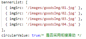
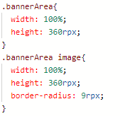
① Write out the basic carousel first, and turn on the seamless connection mode circular
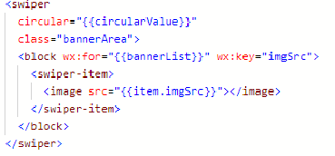

②Enable indicator point
property:
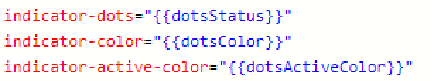
value:
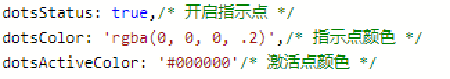

③ Customize the style of the indicator point


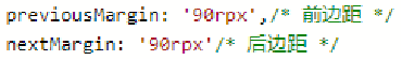
④Add front and rear margins
Attributes:
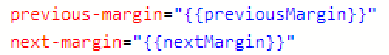
value:

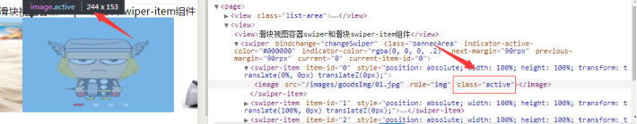
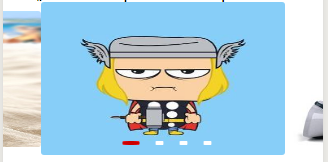
⑤ Set the class name active of the intermediate activation block

⑥ Separately set the active state and normal state styles, and add transition effects

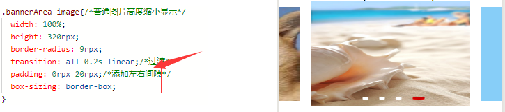
⑦ Add gap
⑧Enable automatic carousel

Write the zoom class carousel steps
①Write out the basic carousel diagram and turn on the seamless connection mode circular
②Open the indicator point
③Customize the indicator point style
④Add front and rear margins ⑤Set
the class name active of the middle activation block
⑥Set the active state and normal state styles separately, and add Transition effect
⑦ Add gap
⑧ Turn on autoplay
(2) Small program scroll-view realizes scrolling navigation

① The small program scroll-view realizes scrolling navigation

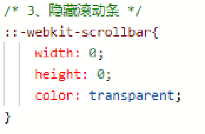
② Remove the horizontal scroll bar
Sometimes, the style given by the design diagram does not contain a horizontal scroll bar, so it needs to be removed
③Add the corresponding activation style

data initialization data
④ Add the activation style corresponding to the click

⑤ Solving the problem of some models
Sometimes when you click to switch the state, you will find that some models will have a background, as shown below

Solution: Add -webkit-tap-highlight-color: rgba(0,0,0,0); in wxss
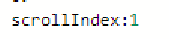
⑥ Dynamically set the position of the horizontal scroll bar
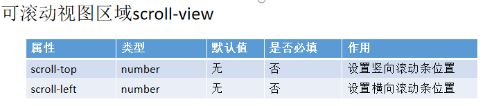
First add the scroll-left attribute to set the initial position of the horizontal scroll bar

Next, add the JS method to set the scroll-view scroll bar to automatically scroll with the click


⑥ Dynamically set the position of the horizontal scroll bar
. After automatic scrolling, it is found that there is no gradient animation effect when scrolling. Add the scroll-with-animation attribute to scroll-view to enable gradient animation.


(2) The small program scroll-view realizes the final effect of scrolling navigation

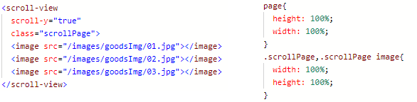
(3) scroll-view full screen scrolling
Sometimes, in response to customer needs, some pictures need to be full screen scrolling.
Directly setting height: 100 is not very useful, because there is no reference for this height. In the past, the development of web pages was to set the height of the body. Here the applet page rendering container is Page, so first set the height of Page to 100%, and then set the height of scroll-view to 100%, and the problem is solved.
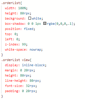
(4) Scroll the Tab tab—order page
Analysis:
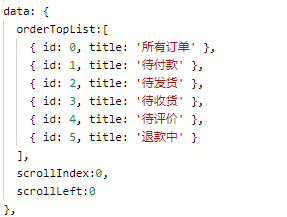
order-related tab switching pages: all orders, pending payment, pending delivery, pending receipt, pending evaluation, and refunding
① Realize the switching effect of clicking on the top navigation. When clicking, the corresponding activation will be activated, and the scroll

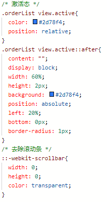


bar will scroll accordingly.

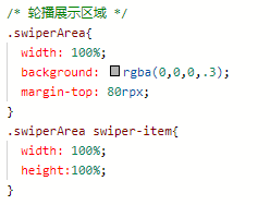
②Set the swiper carousel area under the navigation, focus: the swiper is highly adaptive


③The carousel activation item is associated with the navigation activation item, that is, when the carousel is manually switched and slid, the corresponding activation state of the navigation changes;


At this time, slide the carousel map, and the navigation will also switch when switching
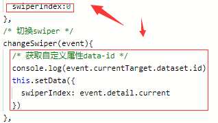
④The carousel activation item is associated with the navigation activation item, that is, when the corresponding option is clicked in the navigation, the bottom carousel is also switched accordingly
Analysis: When clicking the tab button corresponding to the navigation, the carousel below switches to the corresponding display page, where the current attribute of the swiper is needed

④The carousel activation item is associated with the navigation activation item, that is, when the navigation clicks on the corresponding option, the carousel below is also switched accordingly


④The carousel activation item is associated with the navigation activation item
At this time, when sliding the carousel image, the navigation corresponding button will also switch; when the navigation button is clicked, the bottom carousel image display area will also switch

⑤ When switching the carousel, the above navigation can be switched, but the scroll bar does not slide correspondingly, so add the monitoring scroll bar to slide

⑥ So far, when sliding the carousel, the above navigation scroll bar can realize the corresponding scrolling, but the last one When switching back to the first one, the above button cannot correspond

At this point, when you slide down the last page, the navigation button will return to the first page
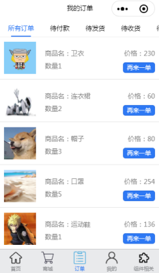
⑦ At this point, scrolling the Tab tab to switch pages is realized, that is, the two-way binding combination of tab and swiper, which is also one of the common effects
Next, add relevant display information in the swiper display page
⑧Add display information to the swiper display page
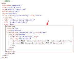
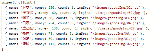
⑧Add display information to the swiper display page
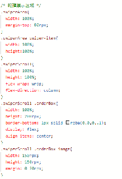

⑧Add display information to the swiper display page and render the result