WeChat Mini Program (Component – Custom Component)
foreword
Reason:
The interface of the applet is composed of a series of components. The Mini Program Basic Library provides a set of basic components to meet the basic needs of developers. However, as the development of small programs becomes more and more complex, it becomes more and more inconvenient to simply use basic components for development.
For example, more complex applets often have some common interactive modules, such as "drop-down selection list", "search box", "date picker" and so on. These interface interaction modules may be used in multiple pages, and the logic is relatively independent. However, it is very cumbersome to implement such a module with traditional applet development methods.
Custom components:
Faced with this situation, the Mini Program Basic Library provides the feature that allows developers to create interface components themselves, which are called "custom components". Through this feature, developers can abstract such interaction modules into interface components, making the interface code organization very flexible.
Version requirements:
Starting from version 1.6.3 of the applet base library, applets support simple component-based programming. Developers can abstract the functional modules in the page into custom components for reuse in different pages; they can also split complex pages into multiple low-coupling modules, which is helpful for code maintenance.
Note: Custom components are very similar to base components when used
Each custom component is composed of four code files:
①json file is used to place some basic component configurations
②wxml file component template
③wxss file component style, which only takes effect on the internal nodes of the component (this file is optional ④ js file JS code of the component, carrying the main logic of the component
These four files are very similar to the four files used when writing a page, but there are differences. Next, we will introduce how to use these four files to write a simple custom component.
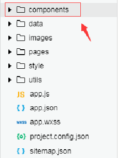
(1) Folder location
First of all, you need to determine the location of the file. The official does not specify where to put the custom component files, but for the convenience of yourself or the team, it is recommended that you create a components directory under the root directory to store all custom components.
(2) Create a group file
Create a new myComponent group file under the components folder to hold custom components, as shown below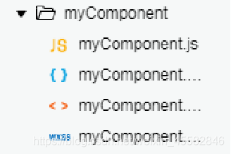
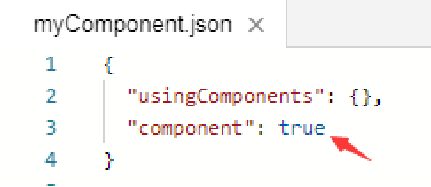
(3) Component configuration
Similar to a page, a custom component consists of 4 files: json, wxml, wxss, and js. To write a custom component, you first need to declare the custom component in the json file (set the component field to true to set the group of files as a custom component) and configure the json
file
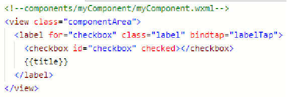
(4) Component template
Write the component template in the wxml file, and add the component style in the wxss file. Their writing method is similar to that of the page.
The component template is written in the same way as the page template, and this template will render a checkbox and a label in the component
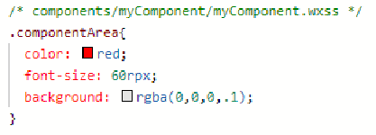
(5) Component style
Similar to pages, the style of component nodes can be specified in the wxss file. The styles in it only take effect inside the component. Note that styles can only be specified via class selectors (such as .the-class-name ).
Note:
① Components and pages referencing components cannot use id selectors (#a), attribute selectors ([a]) and tag name selectors, please use class selectors instead.
②The use of descendant selectors (.a .b) in components and pages referencing components may have unexpected performance in some extreme cases. If so, please avoid using them.
③ Inherited styles, such as font and color, will be inherited from outside the component to inside the component.
④ In addition to inheriting styles, the styles in app.wxss and the styles of the page where the component is located are not valid for custom components (unless the component style isolation option is changed)
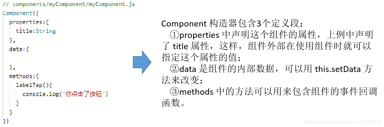
(6) Component definition
The component definition must be included in the component's JS file. Use the Component constructor when defining:
(7) Call custom components
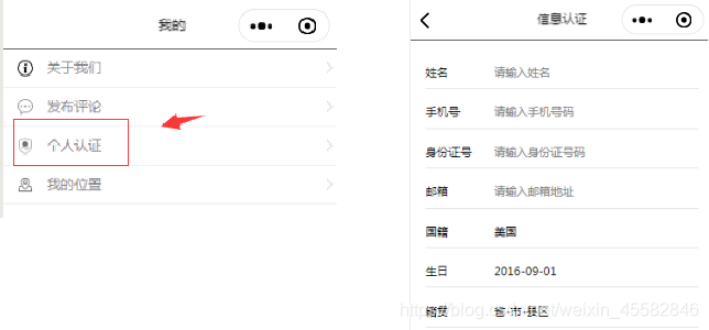
Case: Introduce a custom component (pages/myself/check) to the personal authentication page.
Step 1 Step 1:
Add a custom component declaration to the json file corresponding to the page that needs to use this component.
For example, call and introduce custom components on the personal authentication page 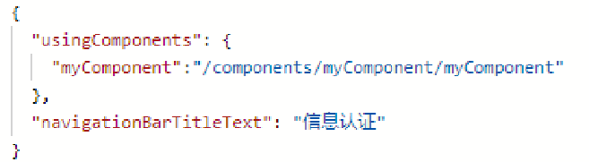
Step 2 Step 2:
Just use it in the wxml file corresponding to the page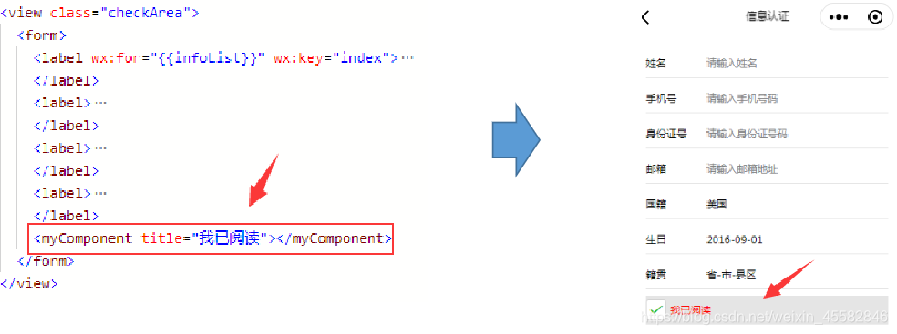
Summarize
This section mainly introduces the creation and calling of custom components
①Create a folder and determine the folder location of the custom group file
②Create the group file of the custom component
③json component configuration, open the component properties, that is, set the component field to true
④wxml component Template writing
⑤Wxss component style writing
⑥Component definition, use Component constructor (properties attribute list, data data, methods method)
⑦Call custom components (①json add custom component declaration; ②wxml template file call)