Article directory
[WeChat applet] selector component picker
Definition of picker component
The picker component is a scroll picker that pops up from the bottom.
The type of the picker component
In the official document, there are five types of picker components, such as common selector, multi-column selector, time selector, date selector and province/district selector.
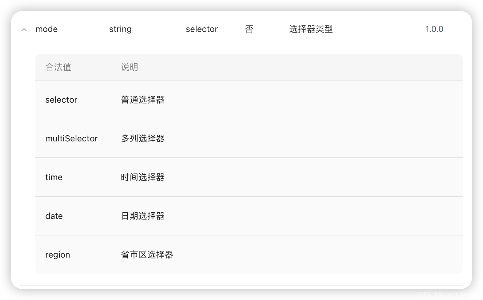
(Guess that these selectors are of a different and commonly used type, thus producing a fixed template).
And in terms of writing, it is written like this, <picker mode="multiSelector" 其他属性>
picker attribute
The picker component needs to record the current selection, the allowable range of the selection, etc., and these are some related properties of the picker.
common attributes
- The picker provides multiple choices for the user, but the user needs to select one of them, and the value records the value currently selected by the user. (it initializes the value of the selector)
- The picker provides users with multiple choices, but sometimes for the convenience of constructing the content of the picker, the picker may provide more than the actual range that the server can serve, so in some pickers, some attributes can be used to limit the user's choice , so that it locks to the actual range.
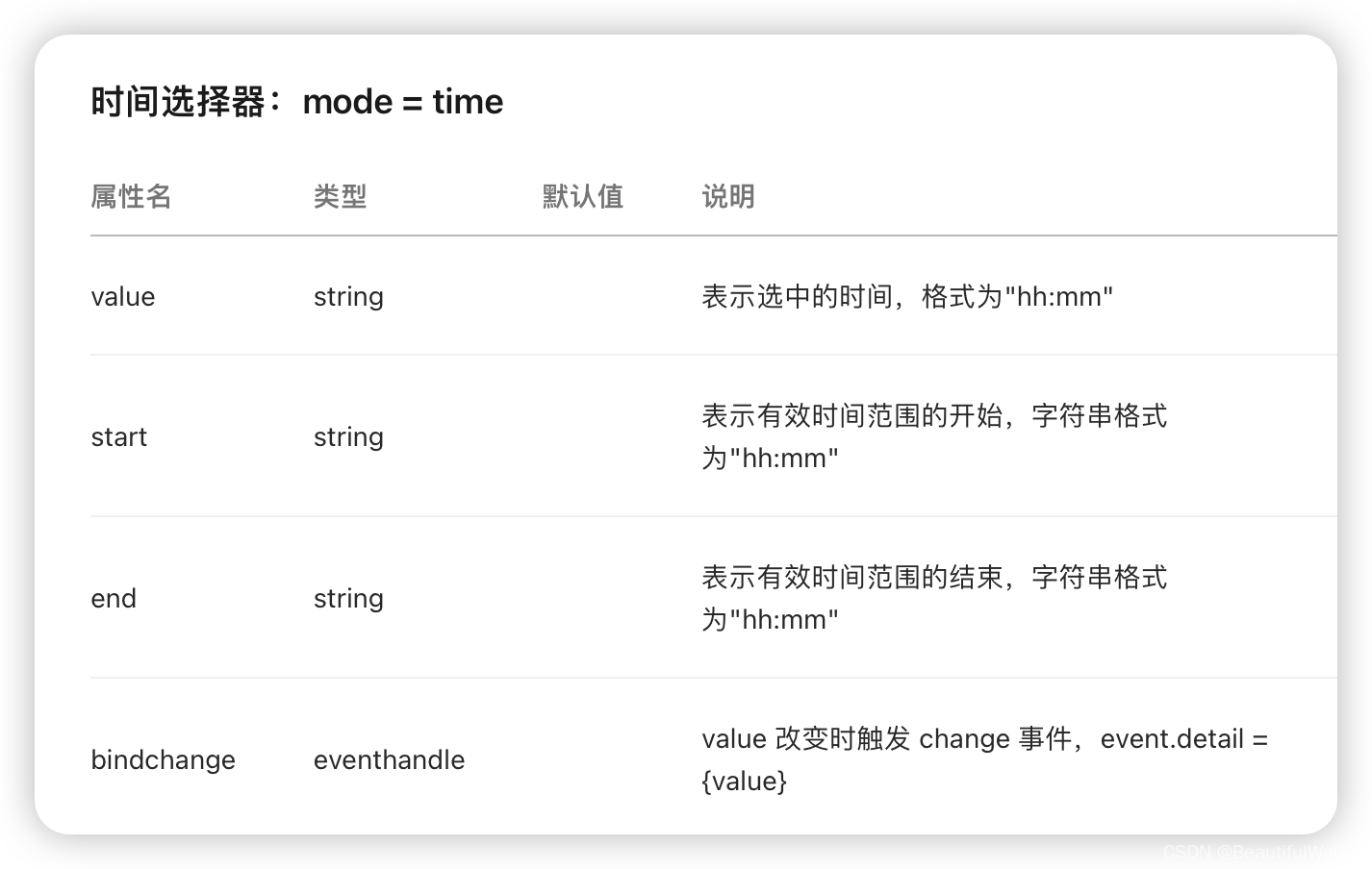
- For example, in the time selector time, start indicates the beginning of the valid range within a day, and the end attribute indicates the end of the valid time range within a day. For example, the suggestion for tooth extraction is to come in the morning. If you write an appointment system for tooth extraction, it can
end="12:00"be used to limit the end time.
- For example, in the time selector time, start indicates the beginning of the valid range within a day, and the end attribute indicates the end of the valid time range within a day. For example, the suggestion for tooth extraction is to come in the morning. If you write an appointment system for tooth extraction, it can
- The picker provides users with multiple choices, and the user chooses one of them, but there is still something to tell the background user what to choose. So there is bindchange, which means that when the user chooses a different choice from the original choice, the corresponding function will be triggered.
- Because the WeChat applet uses data binding technology, generally bindchange will modify the corresponding value in the js file.
- The data binding technology can be simply understood as a technology to obtain a certain data in the data field of the js file from the wxml file, such as
{
      {data}}
time picker time

wxml
<view class="section">
    <h2>时间选择器</h2>
    <picker mode="time" value = "{

   {Time}}" start="9:00" end="12:00" bindchange="bind_ChangeTime">
         {

   {Time}}
    </picker>
</view>
js file
Page({
  data:{
    Time:"9:00"
  },
  bind_ChangeTime:function(e){
      console.log(e.detail.value)
      this.setData({
        Time:e.detail.value
      })
  }
})
wxss
page{
  background-color: navy;
}
.section{
  text-align: center;
}
.section_title{
  display:flexbox;
  font-family:'Times New Roman', Times, serif;
  color: aliceblue;
}
.section_picker{
background-color: white;
}