foreword
In Androidthe interface drawing of , the shadow of the control is an interface element that we often deal with, especially Buttonon controls that need to attract users' attention, such as buttons. The axisAndroid property of the control is natively provided for the shadow effect, but this effect will not be satisfied by , such as our company, it will not be accepted.ZelevetionUI
Common problems such as not supporting a specific shadow shape or size, or not allowing full customization of the color or transparency of the shadow, cutting the image is one way, but the effect of custom View drawing will be better, after all, the cutting image will be real The size of apkthe package will increase, and the screen adaptation will also be a hidden problem.
Combined with my experience, I simply encapsulated it and shared the ShadowView I am currently using
use
rounded rectangle shadow
-
normal shadow
<?xml version="1.0" encoding="utf-8"?>
<androidx.constraintlayout.widget.ConstraintLayout
    xmlns:android="http://schemas.android.com/apk/res/android"
    xmlns:app="http://schemas.android.com/apk/res-auto"
    xmlns:tools="http://schemas.android.com/tools"
    android:layout_width="match_parent"
    android:layout_height="match_parent"
    tools:context=".MainActivity">

    <com.randalldev.shadowview.ShadowView
        android:layout_width="0dp"
        android:layout_height="0dp"
        app:layout_constraintBottom_toBottomOf="@id/btn_target"
        app:layout_constraintEnd_toEndOf="@id/btn_target"
        app:layout_constraintStart_toStartOf="@id/btn_target"
        app:layout_constraintTop_toTopOf="@id/btn_target"
        app:shadowBottomHeight="16dp"
        app:shadowCardColor="#FF7043"
        app:shadowColor="#FFEE58"
        app:shadowLeftHeight="16dp"
        app:shadowRadius="16dp"
        app:shadowRightHeight="16dp"
        app:shadowRound="8dp"
        app:shadowTopHeight="16dp" />

    <Button
        android:id="@+id/btn_target"
        android:layout_width="wrap_content"
        android:layout_height="wrap_content"
        android:background="@android:color/transparent"
        android:paddingStart="40dp"
        android:paddingEnd="40dp"
        android:paddingTop="20dp"
        android:paddingBottom="20dp"
        android:text="target button"
        android:textColor="@color/purple_700"
        app:layout_constraintBottom_toBottomOf="parent"
        app:layout_constraintEnd_toEndOf="parent"
        app:layout_constraintStart_toStartOf="parent"
        app:layout_constraintTop_toTopOf="parent" />

</androidx.constraintlayout.widget.ConstraintLayout>
复制代码
Aside from color matching, this effect is not bad.
-
normal shadow + offset
<?xml version="1.0" encoding="utf-8"?>
<androidx.constraintlayout.widget.ConstraintLayout
    ···
        app:shadowLeftHeight="16dp"
        app:shadowOffsetX="8dp"
        app:shadowOffsetY="4dp"
        app:shadowRadius="16dp"
    ···
</androidx.constraintlayout.widget.ConstraintLayout>
复制代码
round shadow
The circular shadow can also be considered as a special rounded rectangle shadow, which can continue to use the rounded rectangle method, or add shadowShapeattributes .
If you want to use the rounded rectangle method, you need to determine the size of the target control in advance, which may encounter screen adaptation problems, so I will directly demonstrate the way to use shadowShapethe attribute
-
normal shadow
<?xml version="1.0" encoding="utf-8"?>
<androidx.constraintlayout.widget.ConstraintLayout
    ···
        app:shadowCardColor="#FF7043"
        app:shadowColor="#FFEE58"
        app:shadowRadius="16dp"
        app:shadowShape="1" />

    <Button
        android:id="@+id/btn_target"
        android:layout_width="wrap_content"
        android:layout_height="0dp"
        android:background="@android:color/transparent"
        android:padding="20dp"
        android:text="target button"
        android:textColor="@color/purple_700"
        app:layout_constraintBottom_toBottomOf="parent"
        app:layout_constraintDimensionRatio="1:1"
    ···

</androidx.constraintlayout.widget.ConstraintLayout>
复制代码
It's very simple. Compared with the rounded rectangle configuration, there is one more
shadowShapebut lot less size settings.shadowRaduisYou only need to set one.It should be noted that I have
ConstrainLayoutusedratiothe attribute of to set1:1to achieve a square target control, because when drawing a circle, the center of the control is used as the center of the circle to draw, if it is not a square, there may be problems. -
normal shadow + offset
<?xml version="1.0" encoding="utf-8"?>
<androidx.constraintlayout.widget.ConstraintLayout
    ···
        app:shadowCardColor="#FF7043"
        app:shadowColor="#FFEE58"
        app:shadowRadius="16dp"
        app:shadowOffsetX="4dp"
        app:shadowOffsetY="4dp"
        app:shadowShape="1" />

    ···
</androidx.constraintlayout.widget.ConstraintLayout>
复制代码
This is quite convenient to use, you only need to set the target control
paddingto leave enough space to draw the shadow effect.并且不需要再写
drawable文件设置控件的背景了。当然也不是没有缺陷,目前还是只能兼容圆角矩形和圆形。异形的暂时没用到,可能也不会去做支持。
实现
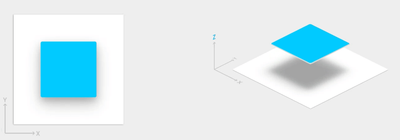
什么是阴影
首先,阴影是什么?
在真实世界中,阴影是物体遮挡住光源的光路出现的现象;在 Android View 体系中则是 Z 轴高度,Z 轴高度越高,阴影范围越大,颜色越深。
但是仅仅通过 elevetion 属性设置 Z 轴高度实现的阴影视效上往往只能说满足有无的问题,毕竟国内谁按照 MD 风格去设计界面啊。
那么,阴影是什么?
当我们自定义 View 去绘制阴影的时候,其实也可以是一圈从边缘向四周放射式扩散的渐变色层,从而造成一种视觉的阴影效果。
那偏移又是什么?
偏移其实就是表达光源的位置,偏移为 0,即光源在正中心光线直射,阴影效果是从边缘均匀的向四周逐渐变淡。
X 偏移为正,则光源在中心偏右,Y 偏移为正,则光源在中心偏下。 若为负数则相反。视觉上则会出现某一或两轴方向上的阴影区域偏少。
上代码
初始化
这段很简单,就是读取 attrs 属性,设置硬件加速
init {
    initView(context, attrs)
    //设置软件渲染类型,跟绘制阴影相关,后边会说
    setLayerType(View.LAYER_TYPE_SOFTWARE, null)
}
复制代码
绘制阴影
这里创建了一个画笔 Paint 的实例,画笔的颜色是目标控件的背景色;绘制模式设置的是 FILL 表示填充模式,还有 STROKE 描边模式,FILL_AND_STROKE 描边加填充模式;AntiAlias 设置为 true 标识开启抗锯齿。
这里就是使用 Paint 的 setShadowLayer() 方法创建阴影效果,其中:
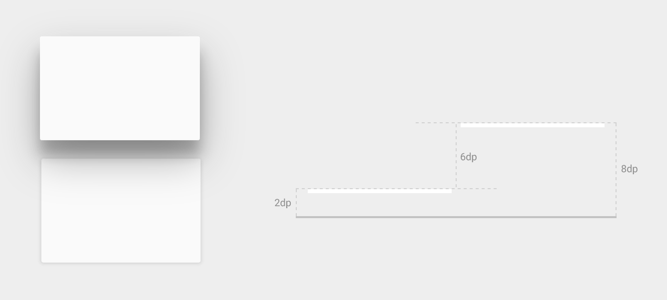
radius:阴影半径,值越大阴影越模糊,值为0时阴影消失。dx:阴影在水平方向的偏移量,正值表示向右偏移,负值表示向左偏移。dy:阴影在垂直方向的偏移量,正值表示向下偏移,负值表示向上偏移。shadowColor:阴影颜色。
Canvas 可以理解为画布,基于 shadowShape 属性在画布上对应的绘制圆角矩形和圆形两种不同形状。
drawRoundRect()用于在Canvas上绘制一个圆角矩形。该方法需要传递四个参数,分别是矩形左上角的X坐标,矩形左上角的Y坐标,矩形右下角的X坐标和矩形右下角的Y坐标。此外还需要提供两个额外参数,分别是圆角的X半径和Y半径。canvas.drawCircle()用于在Canvas上绘制一个圆形。该方法需要传递三个参数,分别是圆心的X坐标,圆心的Y坐标以及圆的半径。
创建一个 RectF,也就是一个矩形对象,表示一个浮点数精度的矩形。在绘制操作,比如指定绘制区域、裁剪画布等经常会用到。其构造函数包含4个浮点型成员变量:left、top、right、bottom,分别表示矩形左边界、上边界、右边界和下边界的坐标值。
override fun dispatchDraw(canvas: Canvas) {
    // 配置画笔
    val shadowPaint = Paint()
    shadowPaint.color = shadowCardColor
    shadowPaint.style = Paint.Style.FILL
    shadowPaint.isAntiAlias = true
    val left = shadowLeftHeight.toFloat()
    val top = shadowTopHeight.toFloat()
    val right = (width - shadowRightHeight).toFloat()
    val bottom = (height - shadowBottomHeight).toFloat()
    // 配置阴影的范围,偏移,颜色
    shadowPaint.setShadowLayer(shadowRadius.toFloat(), shadowOffsetX.toFloat(), shadowOffsetY.toFloat(), shadowColor)
    if (shadowShape == 0) {
        // 如果绘制圆角矩形的阴影,用 drawRoundRect
        val rectF = RectF(left, top, right, bottom)
        canvas.drawRoundRect(rectF, shadowRound.toFloat(), shadowRound.toFloat(), shadowPaint)
    } else {
        // 如果绘制圆形的阴影,用 drawCircle
        val radius = measuredHeight.toFloat() / 2 - shadowRadius
        canvas.drawCircle(measuredHeight.toFloat() / 2, measuredHeight.toFloat() / 2, radius, shadowPaint)
    }
    shadowPaint.utilReset()
    canvas.save()
}
复制代码
总结
在 Android 界面绘制中,阴影是常见的 UI 元素之一,而 Android 原生提供的 elevation 属性虽然可以实现阴影效果,但往往不能满足 UI 设计的要求。因此,自定义 View 绘制阴影的方式更为灵活和实用。本文介绍了 ShadowView,它可以方便地绘制圆角矩形和圆形的阴影,且支持颜色、透明度和阴影形状的自定义。此外,本文还提供了使用 ShadowView 绘制阴影的示例代码,可供读者参考和使用。通过使用 ShadowView,可以更加方便地实现复杂、美观的阴影效果,提高 Android 应用的用户体验。