table of Contents
- 1. Use matplotlib for data visualization
- 2. Use Pandas for data visualization
- 3. Use seaborn for data visualization
- to sum up
- Attachment: the choice of visual graphics
Python's data visualization tools mainly rely on matplotlib, pandas and seaborn.
1. Use matplotlib for data visualization
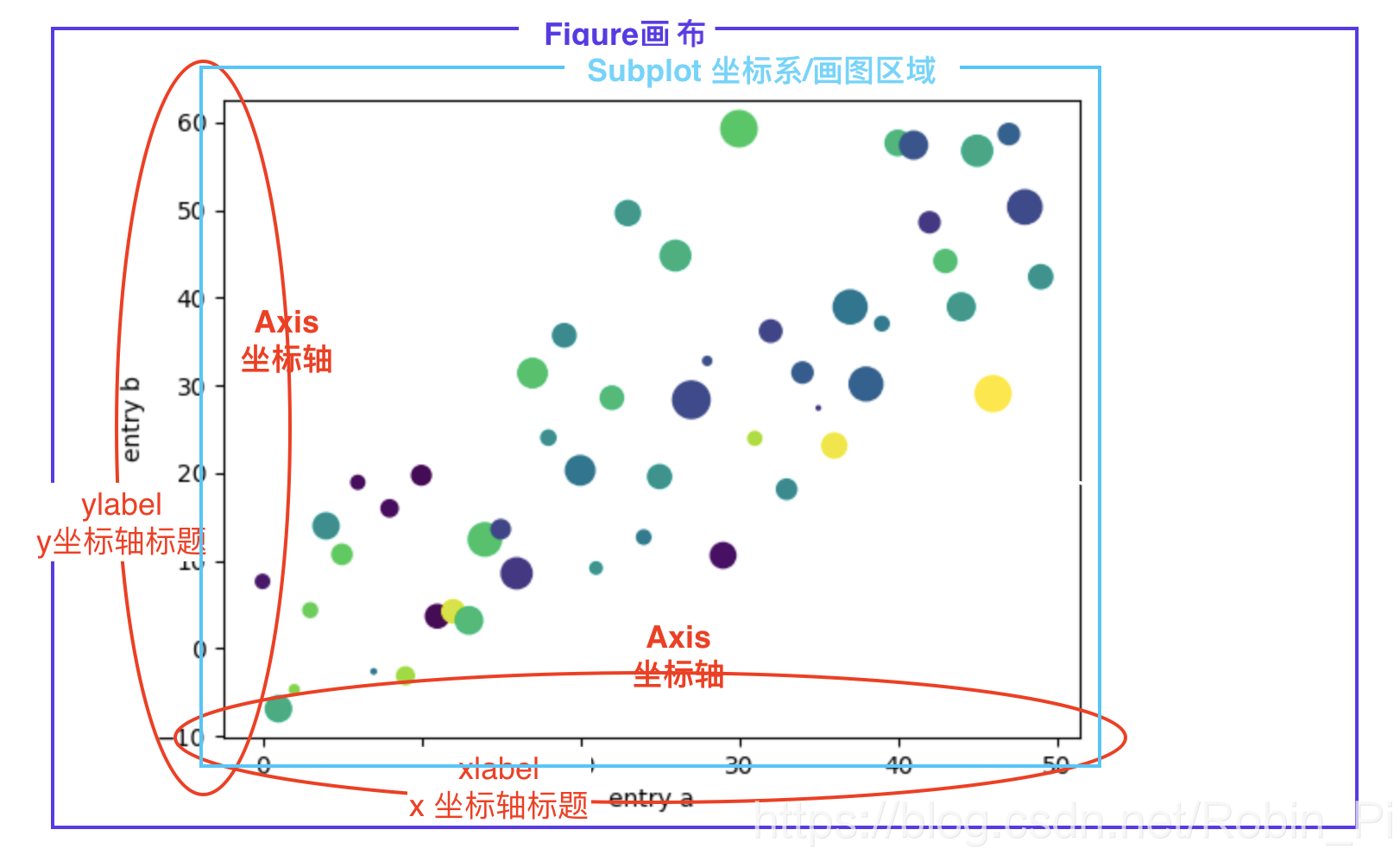
1.1 Basic concepts
- Canvas/Painting Board
- Coordinate system/drawing interval
1.2 Core Steps: Three Steps to Drawing a Picture
Take line chart as an example
- Define coordinate points (prepare data)
plot(x, y)Draw a graph (the default is a line graph)plt.show()Display graph
Note: No matter how many, x and y in the plot correspond one-to-one and appear in pairs .
1.3 Detailed introduction:
Remember:
if you don’t specify the 画板figure()sum 子图subplot, a drawing board and a subgraph will be created by defaultfigure(1)subplot(1,1,1)
1. Build the canvas
Create canvas + set canvas size : plt.figure()
you can also pass in the canvas size parameter figsize = (8, 6)to adjust the canvas size!
2. Establish a coordinate system (determine the drawing area)
There are several different methods:
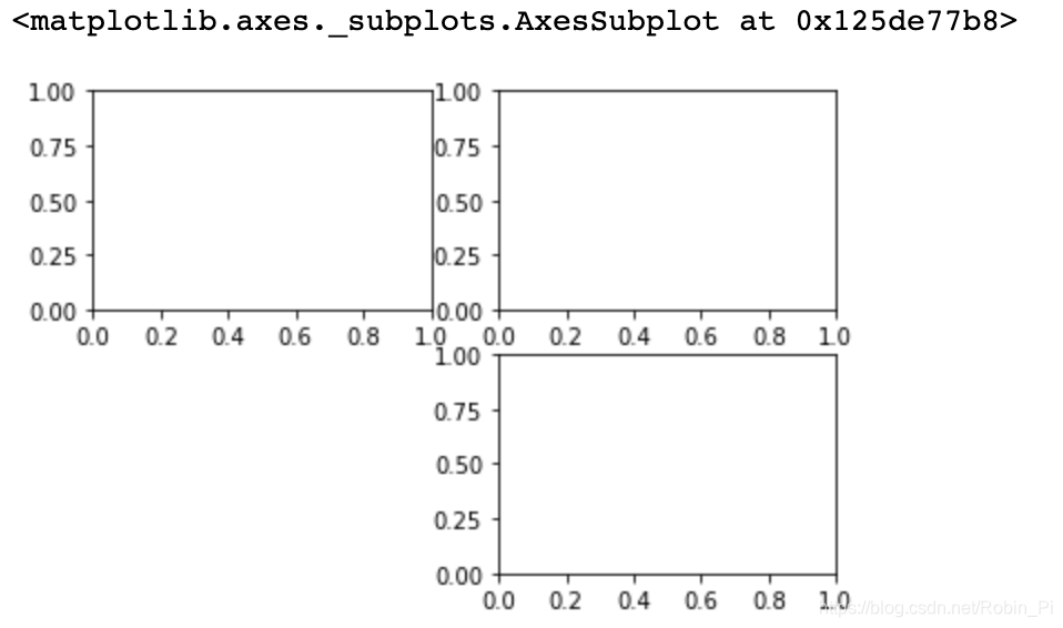
2.1 Canvas segmentation + return to all coordinate systems
plt.subplots()
The method subsequent passes axes[x,y]is plotted to indicate a coordinate system which
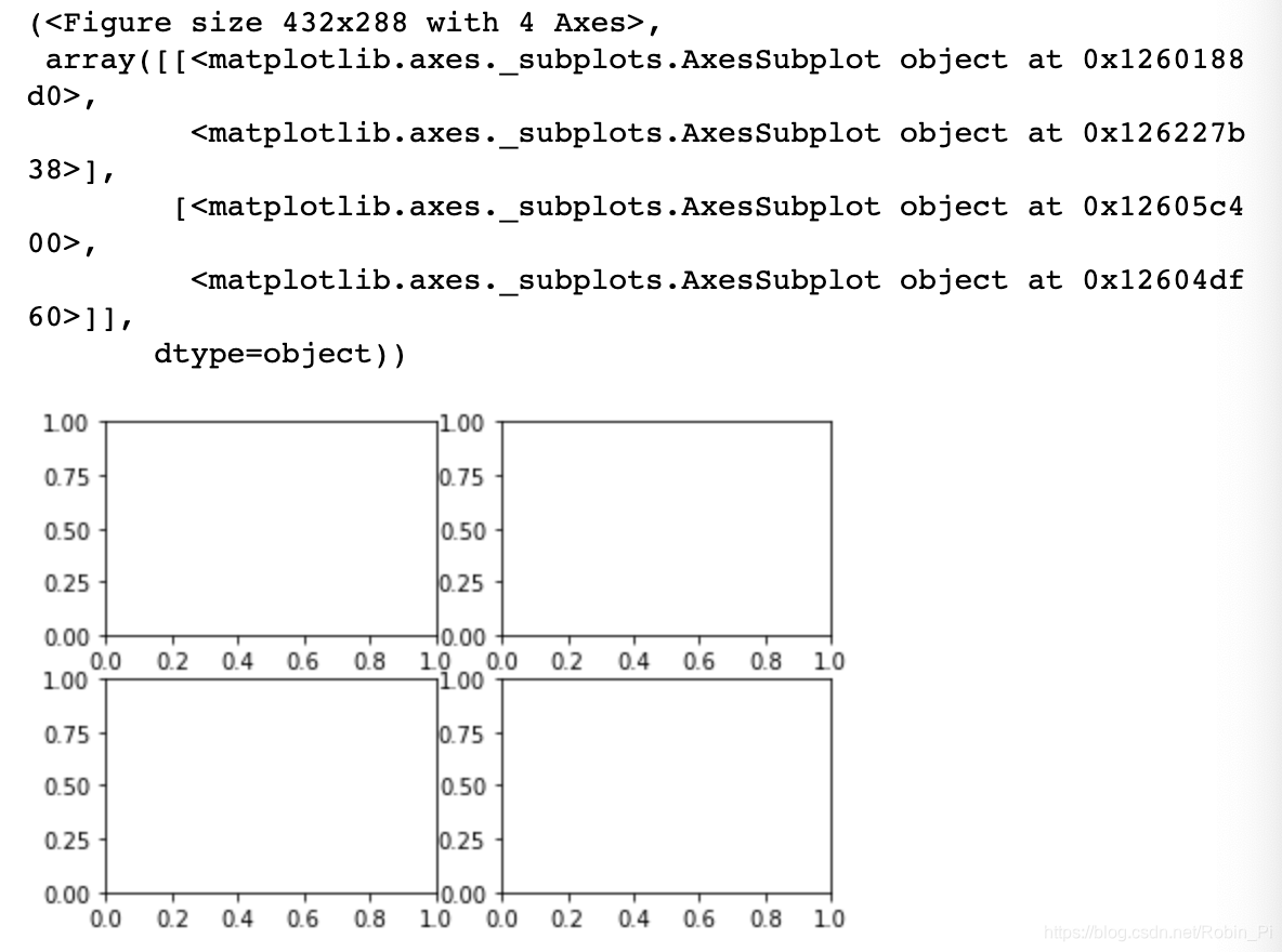
2.2 Canvas segmentation + designated coordinate system position (to return)
ax= fig.add_subplot()
plt.subplot2grid()
plt.subplot()
The first method belongs to object programming, the latter three belong to functional programming
The following three code examples:
plt.subplot2grid()
plt.subplot2grid((2,2),(0,0))
plt.subplot2grid((2,2),(0,1))
plt.subplot2grid((2,2),(1,1))
Control the position of the coordinate system by coordinates

subplot()
plt.subplot(2,2,1)
plt.subplot(2,2,2)
plt.subplot(2,2,4)
By digital control of position coordinates
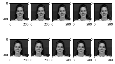
combat:
for i in range(len(crops)):  # crops 为 10 张堆叠的图片 , 大小:(10, 224, 224, 3)
    plt.subplot(2,5,i+1)
    plt.imshow(crops[i, :, :, :])
result:
subplots()
plt.subplots(2,2)
Return all (2x2) coordinate systems
3. Set the coordinate axis
Set the title of the axis
plt.xlabel("str")
plt.ylabel("str")
plt.title('str')
Parameters labelpadmay also set the title to axis distance;
other input parameters can stringbe set
Set the scale of the axis
Customize which scales to display the scale value
plt.xticks(ticks,labels)
plt.yticks(ticks,labels)
Tip: You can hide the values of the x/y axis
by passing in an empty list to ensure data security .
plt.xticks([])
plt.yticks([])
Set the range of the coordinate axis
plt.xlim()
plt.ylim()
You can directly pass in the two numbers of the starting point and the ending point as parameters.
Or use a simpler method:,
axis[xmin, xmax, ymin, ymax]for example,
plt.axis([0, 6, 0, 20])
Note that although the input here is in the form of a list, it will actually be converted to a numpy array form internally to make it easier for us to process the data.
other settings
-Turn off the axis display:plt.axis('off')
-Open grid line: plt.grid(b = 'True')
also can be passed in axis参数, specify to open only the specified axis
- the legend
on plt.plot()the incoming label parameters , such as the label = ‘str’
then plt.legend()displayed
...
5. Draw a chart
-Line chart: plt.plot(x,y)
-Histogram: plt.bar(x,y)
-Scatter chart: -Heat plt.scatter(x,y)
map: plt.imshow(x,cmap)
…
- Optional parameters used in drawing 2d diagrams:
6. Icon display
plt.show()
1.4 Frequently Asked Questions
- Is to solve the problem of not displaying the image
%matplotlib inline
- Solve Chinese garbled
plt.rcParams['font.sans-serif']='SimHei'
1.5 Minimal code implementation
import numpy as np
import matplotlib.pyplot as plt
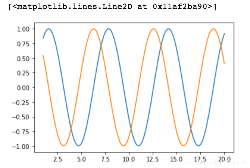
A coordinate system
As mentioned earlier, some operations can be omitted
x = np.linspace(1, 20, 100)

y1 = np.sin(x)
y2 = np.cos(x)
plt.plot(x, y1)
plt.plot(x, y2)
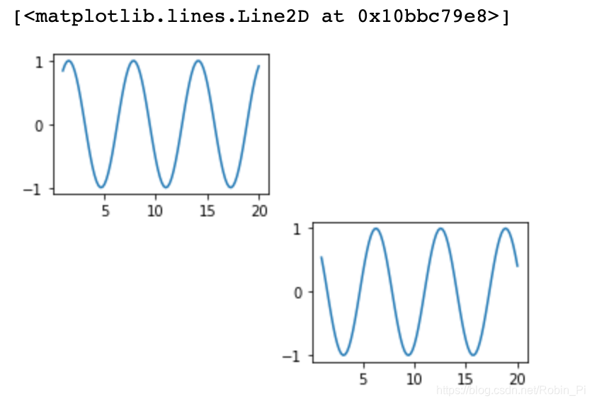
Multiple coordinate systems
x = np.linspace(1, 20, 100)

y1 = np.sin(x)
y2 = np.cos(x)
plt.subplot(2,2,1)
plt.plot(x, y1)
plt.subplot(2,2,4)
plt.plot(x, y2)
2. Use Pandas for data visualization
PandasThe drawing is a matplotlibpackage made on the
basic syntax is:
df.plot(x='列名1', y='列名2', kind='图形类型', label=‘图例名称’)
line graph
from numpy.random import randn
np.random.seed(1)

df = pd.DataFrame(np.random.randn(20,3),index=np.linspace(0,19,20), columns=list('ABC'))

df.plot()
Bar graph
from numpy.random import randn
np.random.seed(1)

df = pd.DataFrame(np.random.randn(5,3)+10,index=np.linspace(0,4,5), columns=list('ABC'))

df.plot.bar()
Histogram
from numpy.random import randn
np.random.seed(1)

df = pd.DataFrame({

    'A':np.random.randn(100),'B':np.random.randn(100)+1,'C':np.random.randn(100)+2})

df.hist(bins=20)
Box plot
from numpy.random import randn
np.random.seed(1)

df = pd.DataFrame(np.random.rand(10, 5), columns=['A', 'B', 'C', 'D', 'E'])
df.plot.box()
Scatter plot
from numpy.random import randn
np.random.seed(1)

df = pd.DataFrame(np.random.rand(50, 4), columns=['a', 'b', 'c', 'd'])
df.plot.scatter(x='a', y='b')
Pie chart
from numpy.random import randn
np.random.seed(1)

df = pd.DataFrame(3 * np.random.rand(4), index=['a', 'b', 'c', 'd'], columns=['x'])
df.plot.pie(subplots=True)
3. Use seaborn for data visualization
Use Seaborn for data visualization
to sum up
- One-dimensional graph:
(not directly meaningful) one-dimensional data
box plot - Two-dimensional graphs
Scatter graphs , line graphs, histograms, bar graphs - Three-dimensional diagram:
bubble diagram
To be continued~