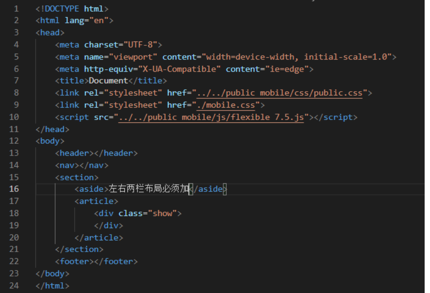
1. The overall structure of the frame layout:
2. Note:
Which then css style, all have a movable end mold must first be strange box model ,
section{width:100%;height:100%;padding:上 0 下 0}
article{width:100%;height:100%;overflow:auto}
Everything on the page to be rendered everything is written in the following article which can be div.
Welt appeared content phenomenon, just add padding to the article inside.
(C): the bottom of the footer text inside the icon word icon and regular text with the wording:
In fact, very simple just to convert into a flexible footer box, and then write a few inside several boxes icon, the icon and the word written in every regular text inside the box,
Each box is then converted into a flexible cartridge,
The vertical line is switched to the spindle; "column".
As such, mobile end rem layout easy to get! ! ! !