Along with the process of visualization, a "word cloud map" appeared. A word cloud, also known as a word cloud, is composed of words in a cloud-like color graphic. By repeating one or more keywords, with different font sizes and colors, and irregularly arranged to make it look similar to a picture of a certain shape, it is a reference to the "keywords" that appear frequently in the text. For a visual display, the word cloud image filters out a large amount of low-frequency and low-quality text information, so that the viewer can grasp the main point of the text by just scanning the text. Keyword cloud map generator, as a tool for generating cloud maps, simplifies the production process.
So, what should the word cloud map do?
I found a BI software-Smartbi Sematic
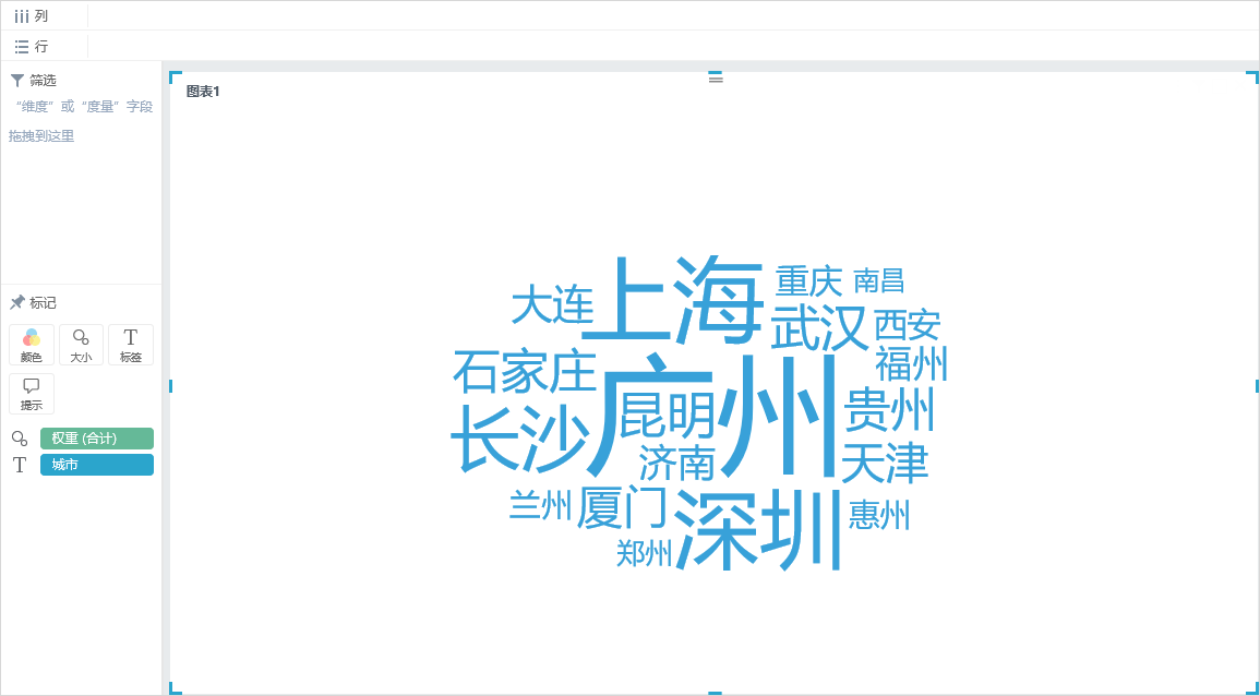
The following is a word cloud map of popular search cities.

The steps for a word cloud diagram like this:
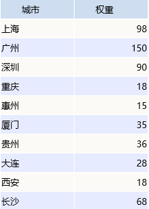
The data sources of the above business scenarios are as follows:

Our basic data is stored in the form of a detailed list, and the above "weights" are automatically summarized and calculated by the input data system.
1. Double-click the "City" and "Weight" fields, and the system will automatically assign the dimensions to the "Label" marked items and the metric to the "Size" marked items to get the following word cloud map:

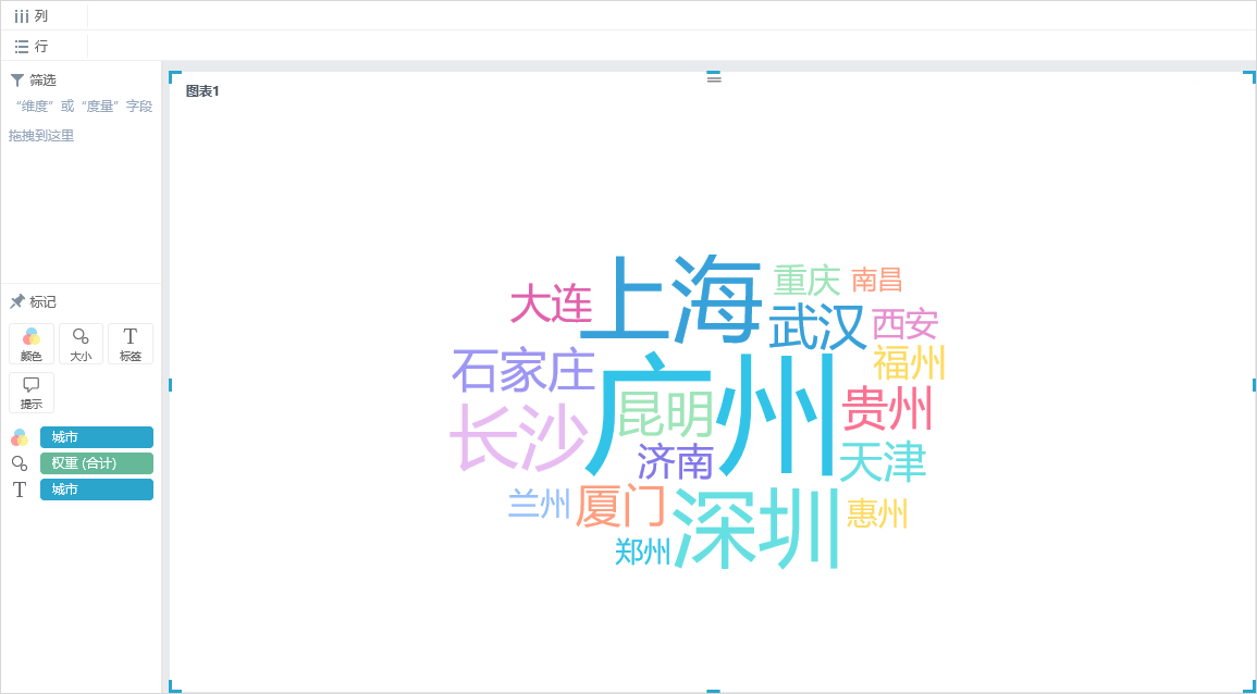
2. Add a "color" tag item (optional, it is recommended to perform this operation, the figure shows the content is clearer), drag the "city" field to the "color" tag item, the system distinguishes topics by color.

From the picture above, we can see that Shenzhen, Guangzhou, and Shanghai have the highest search interest.
So, what is the role of word cloud diagrams?
The keyword cloud is a visual highlight of the "keywords" that appear frequently in the mass text content, that is, the more "keywords" that appear, the larger the font. For example, you can perform word frequency statistics based on thousands of news items to get a lot of "keywords", and then sort them according to the number of times the keywords appear. The more prominent "keywords" appear more frequently in all news content.
From the initial "new coronavirus, infection, fever" to the current "general warfare, recovered patients, plasma, and resumption of work", the hot words in the public opinion field surrounding the epidemic have quietly changed. Hot words represent the aspirations of the majority of netizens and also show the evolution of the fight against the epidemic. According to the tracking collection and statistical analysis of the Smartbi big data analysis platform of Sematic software, Internet hot words have shown a clear trend of linkage changes along with the epidemic prevention and control situation. In the initial stage, the new crown pneumonia epidemic was raging. The words "pneumonia" and "new coronavirus" were the most popular words, and the words closely related to the epidemic such as "game", "bat" and "fever" were "hot search".
Therefore, word cloud images can visually highlight the "keywords" that appear frequently in web texts, not only allowing readers to quickly extract important content of the text, but also through the comparison of word clouds of different texts to achieve the purpose of data analysis.
Web page online generation tools and desktop software to make word cloud diagrams are essentially the same. I recommend that you use BI tools to do it. Professional data visualization analysis software, like Smartbi Sematic, can generate other empirical data besides word cloud diagrams. The visualization effect is very simple, suitable for data analysts to get started.