FusionCharts Suite XT is a comprehensive cross-platform, cross-browser JavaScript charting package, including FusionCharts XT, PowerCharts XT, FusionWidgets XT, FusionMaps XT. Support ASP, ASP.NET, PHP, JSP, ColdFusion, Ruby on Rails, JavaScript, and even simple HTML pages. It is your trusted JavaScript charting solution. At present, 450,000 users worldwide choose Fusioncharts to make professional JavaScript charts.
Download the latest version of FusionCharts [Huidu.com]
Create a zoomed line chart
For example, we will create a zoom line chart to plot the number of unique website visits to harrysfoodmart.com and harrysfashion.com for each day of the past year.
To create a zoomed line chart, perform the following steps:
In the JSON data, set the attributes and their corresponding values in the format "<attributeName>": "<value>".
Use the type attribute to specify the chart type. To render a zoomed line chart, set zoomline.
Use the renderAt property to set the container object.
Use the width and height attributes to specify the size of the chart.
Use the dataFormat property to set the data type (JSON/XML) to be passed to the chart object.
Set the compactDataMode property to 1 to specify the JSON data as a compact format.
Set the pixelsPerPoint property to specify the number of pixels that will be used to render the data point. A larger number of pixels will result in a higher quality display. This property is also used to set the distance between consecutive data graphs.
Set the pixelsPerLabel property to specify the number of pixels that will be used to render the data label.
Use the lineThickness property to specify the thickness of the line on the char.
The anchor points in the zoomed line chart cannot be clicked because FusionCharts does not include a supporting API for defining external URLs for data points.
The zoomed line chart created in this way is as follows: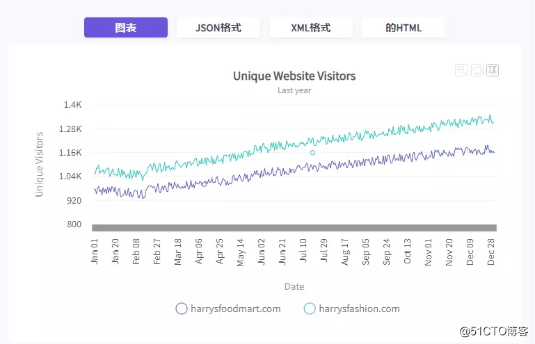
As shown in the figure above, when rendering, the zoomed line chart shows a macro view of the data. The data is neatly compressed, so all data fits the width of the chart. When the user selects a part of the line chart by dragging the mouse cursor on the canvas, the selected part will expand to occupy the entire width of the chart.
At this point, the scroll bar comes into play, allowing the user to view the data before or after the selected data section. To analyze the data in more detail, the user can repeat the selection and zooming process several times (until no further zooming is possible). Click the button on the Reset Chart toolbar to restore the chart to its original macro display mode.
The statistical graph can be switched to the fixed mode in the fixed mode-the ghost of the selected line segment will be printed on the canvas, so that the user can scroll to compare the fixed segment with the rest of the chart. The fixed line segment can be dragged to any part of the canvas.
The performance of the zoom line chart is based on the technical capabilities of the browser. A typical zoomed line chart can render up to 10,000 data points without any performance issues.
The anchor points in the zoomed line chart cannot be clicked, because FusionCharts does not include a supporting API for defining external URLs of data points.
Show value in tooltip
By default, the useCrossLine attribute is set to 1, which is enabled. When useCrossLine is hovering over a data point, the chart is enabled to display data values. For all series, the chart displays these values in tooltips aligned with the vertical line in descending order. When useCrossLine is set to 0 (disabled), hovering it over a data point only displays the value of that data point.
To set, useCrossLine please refer to the following code:
{
"chart": {
"useCrossLine": "1"
},
}
Create a dual Y-axis chart with zoom lines
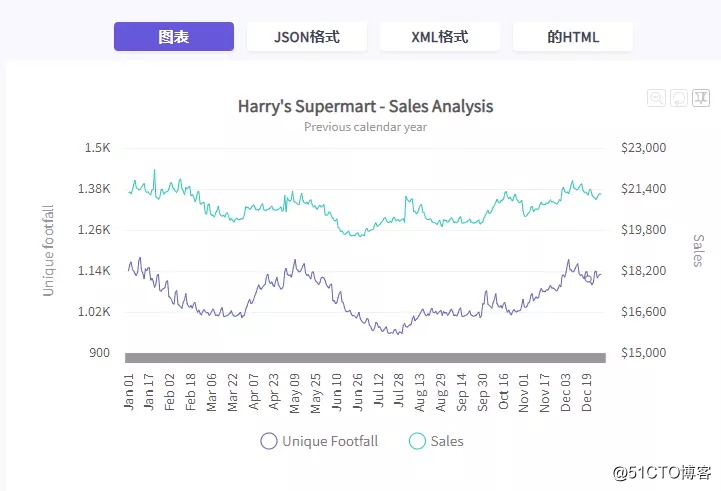
FusionCharts Suite XT zoom line double y-axis chart is the same as zoom line chart, used to analyze macro and micro level data. Using dual y-axes, this chart can be used to plot data belonging to data sets with different numerical units on the same chart, which has advantages compared to using conventional zoom line charts.
Another advantage of using a double Y-axis chart with zoom lines is that when you want to compare two data sets, the values of one data set are distributed in a small time interval, while the values of the other data set have a larger time interval. In this case, if you use a zoomed line chart, the data set with smaller intervals will be drawn as a straight line.
To create a dual Y-axis chart with zoom lines, set the type attribute to zoomlinedy.
For a detailed list of attributes, please refer to the chart properties page zoomlinedy of the chart.
The figure below shows a zoomed dual Y-axis chart used to compare unique traffic and sales (in U.S. dollars) for each day of the previous year.

Limit the number of data tags
By default, the zoomed line chart displays as many data labels as possible without causing confusion.
However, it is also possible to limit the maximum number of data labels visible at any given time by specifying the number in the numVisibleLabels attribute. In the example given below, the number of labels presented on one screen is 12. To view the front or back tabs, you will need to use the scroll bar.
Please refer to the code given below:
{
"chart": {
"numVisibleLabels": "12"
},
}
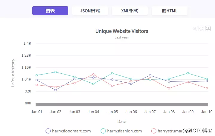
The zoomed line chart that limits the maximum number of labels is as follows: The 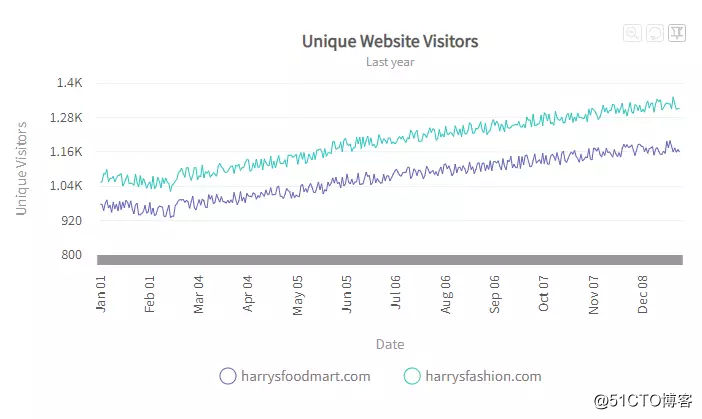
numVisibleLabels property only limits the number of visible data labels; it does not affect The number of visible data points.
Set the distance between data graphs
In a zoomed line chart, use the pixelsPerPoint property to set the distance (in pixels) between consecutive data graphs. A larger number of pixels will result in a higher quality display.
Please refer to the code given below:
{
"chart": {
"pixelsPerPoint": "40"
},
}
The anchor point in the zoomed line chart cannot be clicked, because FusionCharts does not include a supporting API for defining the external URL of the data point.
Set anchor display conditions
To reduce confusion, anchors can only be made visible when the distance between consecutive data points reaches a certain minimum. For example, you can instruct the chart to show anchors only when 25 pixels are separated by consecutive data points.
If the chart contains a lot of data, the anchor point will not be visible in a macro view where the distance between consecutive data points is less than 25 pixels. The anchor points are only visible when the chart is zoomed, and the distance between consecutive data points is increased to 25 pixels or more.
To specify the minimum distance between consecutive data points, set the anchorMinRenderDistance attribute value in pixels.
Please refer to the code given below:
{
"chart": {
"anchorMinRenderDistance": "15"
},
}
Pre-select the number of visible data graphs
By default, the zoomed line graph displays all data graphs on one screen. However, you can pre-select the maximum number of data graphs visible on a single screen during rendering.
To pre-select the number of data graphs on the screen, follow these steps:
Set the displayStartIndex property to specify the index of the data label that will be displayed on the leftmost side of the chart.
Set the displayEndIndex property to specify the index of the data label, which will be displayed on the far right of the chart.
Please refer to the code given below:
{
"chart": {
"displayStartIndex": "49",
"displayEndIndex": "253"
}
}
A zoomed line chart with a preselected number of data charts is shown below: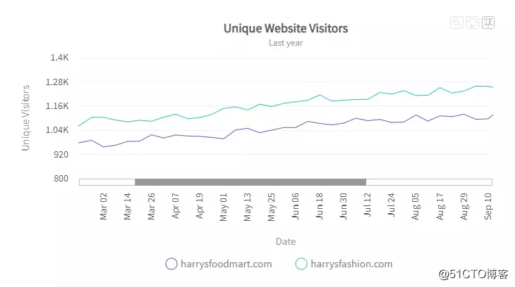
Customize the appearance of the zoomed line chart
FusionCharts Suite XT contains several options for customizing the appearance of the zoomed line chart. You can configure the appearance of chart elements, such as scroll bars and toolbars.
The attribute used to configure the toolbar button is:
use the setting hexadecimal code toolbarButtonColor to specify the color of the toolbar button.
Set the showToolBarButtonToolText property to 0 to disable the tooltip display of the toolbar buttons. The default value of this attribute is 1.
Please refer to the code given below:
{
"chart": {
"toolbarButtonColor": "ff0000",
"showToolBarButtonToolText": "0"
}
}
The chart is shown in the following figure: 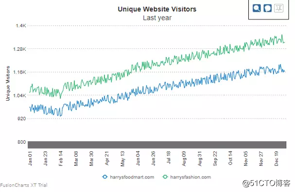
To configure the zoom and pan of the chart:
use the zoomPaneBgColor property to set ten A hexadecimal code to specify the background color of the zoom pane.
Use the zoomPaneBgAlpha property to set the transparency of the zoom pane (range from 0 to 100).
Please refer to the code given below:
{
"chart": {
"zoomPaneBgColor": "#a7d7f9",
"zoomPaneBgAlpha": "50"
}
}
To set the pin translation of the chart:
use the pinLineThicknessDelta property to specify the thickness of the fixed line. The pin line will only be displayed when the chart is placed in pin line mode.
Use the pinPaneBgColor property to specify the hexadecimal color code of the background.
Use the pinPaneBgAlpha property to specify the transparency of the pushpin pane (range between 0 and 100).
Please refer to the code given below:
{
"chart": {
"pinLineThicknessDelta": "5",
"pinPaneBgColor": "#87919b",
"pinPaneBgAlpha": "50"
}
}
The list of properties that set the zoom mode of the zoom out button is :
Specify the btnResetChartTooltext property to replace the default tool text of the "Reset Chart" button with the provided string.
Specify the btnZoomOutTooltext property to replace the default tool text of the "Zoom Out" button with the provided string.
Specify the btnSwitchToZoomModeTooltext property to replace the default tool text of "switch to zoom mode" with the provided string.
Specify the btnSwitchToPinModeTooltext property to replace the default tool text of the "Switch to Pin Mode" button with the provided string.
Please refer to the code given below:
{
"chart": {
"btnResetChartTooltext": "Want to Reset? Go for it.",
"btnZoomOutTooltext": "Zoom Out the Chart",
"btnSwitchToZoomModeTooltext": "Yes",
Set the hexadecimal code to scrollColorattribute to specify the color of the scroll bar.
Use the scrollHeight property to specify the height of the scroll bar.
Please refer to the code given below:
{
"chart": {
"scrollColor": "#bdbdbd",
"scrollHeight": "15"
}
}
Custom peak data limit
Zoomline chart shows a large number of data sets. For example, you can use it to plot the daily income of two or more departments over the past 10 years.
However, you cannot see all the data values plotted in the initial display of the chart. Instead, you will see multiple values wisely selected from the data set. In this way, you can quickly determine the value trend. This process can also reduce resource consumption and improve chart performance. To gain insight into the data, simply zoom in to focus on the individual plot points.
FusionCharts uses its own logic to intelligently determine the chart displayed in the initial display. In this way, it can eliminate outliers or peaks. Therefore, try to pay attention to whether certain values exceed the expected results. For example, if income fell sharply or grew more than expected in the month before returning to normal, look for outliers.
In the above cases, you can use 3 attributes in the Zoomline chart:
showPeakData: use a boolean value
maxPeakDataLimit: use a number as the value
minPeakDataLimit: use a number as the value The
first attribute informs the chart that you want to define the conditions for peak data, and the other two Each attribute defines the conditions. Any value greater than maxPeakDataLimit (provided by you) is regarded as peak data and included in the initial display of the zoom line graph, while minPeakDataLimit defines the opposite condition.
scene 1
To display all values greater than a specific value in the chart, do the following:
Set the value of showPeakData to 1.
Set the value of maxPeakDataLimit to the minimum value of the graph that should be displayed on the graph.
Please refer to the following code:
{
"chart": {
...
"showPeakData": "1",
"maxPeakDataLimit": "1000"
},
}
Scheme 2
To display all values less than a specific value in the chart, please do the following :
Set the value of showPeakData to 1.
Set the value of minPeakDataLimit to the maximum value of the graph that should be displayed on the graph.
Please refer to the following code:
{
"chart": {
...
"showPeakData": "1",
"minPeakDataLimit": "900"
},
}
Scenario 3
To display all values less than the minimum limit and greater than the maximum limit, please do the following:
Set the value of showPeakData to 1.
Set the value of minPeakDataLimit to the maximum value of the graph that should be displayed on the graph.
Set the value of maxPeakDataLimit to the minimum value of the graph that should be displayed on the graph.
Please refer to the following code:
{
"chart": {
...
"showPeakData": "1",
"minPeakDataLimit": "900",
"maxPeakDataLimit": "1000"
},
}
Option 4
In some cases, a specific value range is more important to you than a specific outlier. For example-you may need to include all values in the range of 500-1000 in the initially displayed zoom line chart, as well as the values detected by smart.
Starting from FusionCharts v3.12.1, this goal cannot be achieved. But starting from v3.13.0, FusionCharts supports a new feature where you can reverse the min-max condition by setting the min value to be greater than the max value. Then, the chart will contain all the values in the range. For example, in v3.13.0, to include all values in the range of 500-1000, do the following:
To display all values greater than the minimum limit and less than the maximum limit, do the following:
Set the value of showPeakData to 1.
Set the value of minPeakDataLimit to 1000.
Set the value of maxPeakDataLimit to 900.
Please refer to the following code:
{
"chart": {
...
"showPeakData": "1",
"minPeakDataLimit": "1000",
"maxPeakDataLimit": "900"
},
}
If you want to purchase a genuine license of FusionCharts Suite XT, Or for more product information, please [Consult Huidu Online Customer Service]