We can install Bootstrap4 in the following two ways:
- Use Bootstrap 4 CDN.
- Download Bootstrap 4 from the official website.

Bootstrap 4 CDN
It is recommended to use the library on the Staticfile CDN in China:
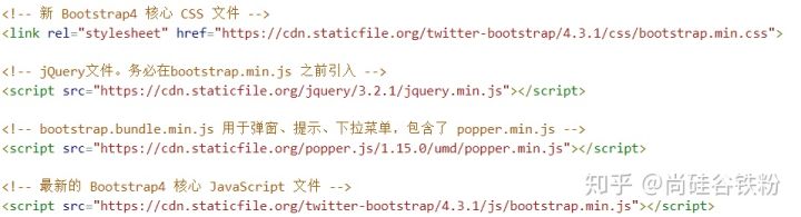
Note: popper.min.js is used to set pop-up windows, prompts, and drop-down menus. Currently bootstrap.bundle.min.js already includes popper.min.js.
Download Bootstrap 4
You can go to the official website https://getbootstrap.com/ to download the Bootstrap4 resource library.
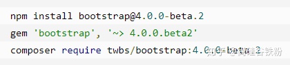
Note: In addition, you can also install through package management tools npm, gem, composer, etc.:
Create the first Bootstrap 4 page
1. Add HTML5 doctype
Bootstrap requires HTML5 file type, so you need to add HTML5 doctype declaration.
HTML5 doctype is declared in the document head and the corresponding encoding is set:
<!DOCTYPE html>
 <html>
  <head>
  <meta charset="utf-8">
  </head>
</html>
Mobile first
In order to make the website developed by Bootstrap friendly to mobile devices and ensure proper drawing and touch screen zooming, you need to add the viewport meta tag in the head of the web page, as shown below:
<meta name="viewport" content="width=device-width, initial-scale=1, shrink-to-fit=no">width=device-width Indicates that the width is the width of the device screen.
initial-scale=1 Indicates the initial zoom ratio.
shrink-to-fit=no automatically adapt to the width of the phone screen.
Container class
Bootstrap 4 requires a container element to wrap the content of the website.
We can use the following two container classes:
- The .container class is used for containers with fixed width and responsive layout.
- The .container-fluid class is used for containers that are 100% wide and occupies the entire viewport.