1. Titel
1.1. Stil
bootstrap kann traditionelle Titelelemente schöner machen, damit sie zum Inhalt Ihrer Webseite passen.
Wirkung:

Quellcode:
<body class="container">
    <h1 class="display-1">Display 1</h1>
    <h1 class="display-2">Display 2</h1>
    <h1 class="display-3">Display 3</h1>
    <h1 class="display-4">Display 4</h1>
</body>
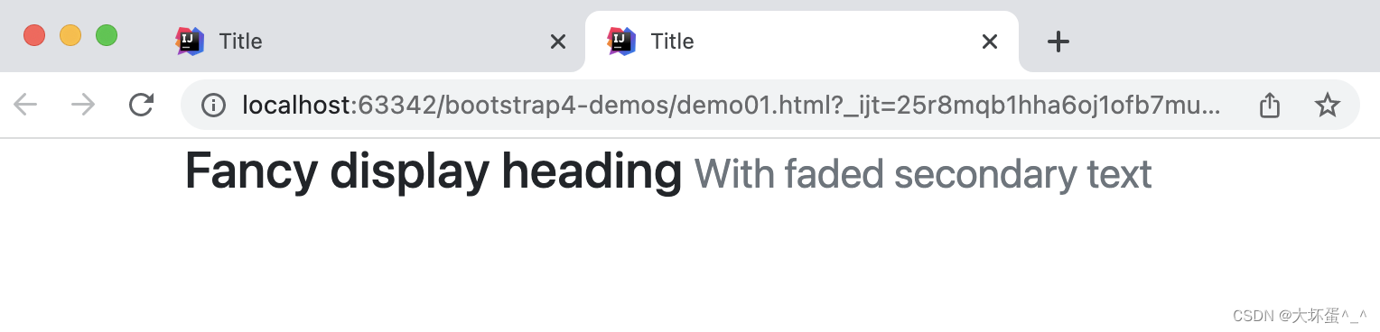
1.2. Hilfstiteltext
Erstellen Sie mithilfe der enthaltenen Dienstprogrammklasse einen kleinen sekundären Titeltext aus Bootstrap neu.
Wirkung:
Quellcode:
<body>
    <div class="container">
        <h3>
            Fancy display heading
            <small class="text-muted">
                With faded secondary text
            </small>
        </h3>
    </div>
</body>
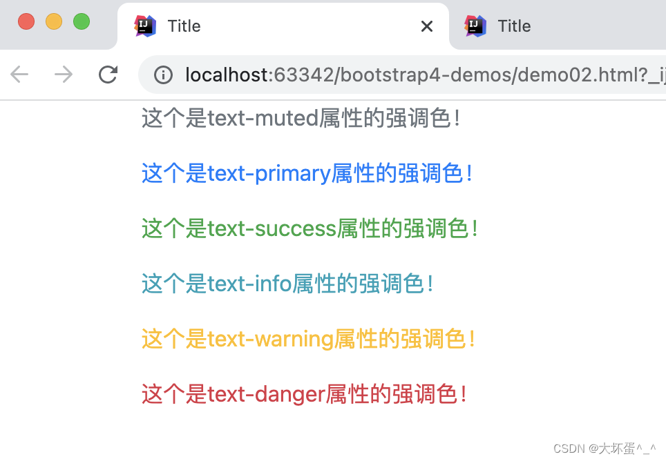
Erweiterung: Textakzentfarbe
Wirkung:
Quellcode:
<body class="container">
    <p class="text-muted">这个是text-muted属性的强调色!</p>
    <p class="text-primary">这个是text-primary属性的强调色!</p>
    <p class="text-success">这个是text-success属性的强调色!</p>
    <p class="text-info"> 这个是text-info属性的强调色!</p>
    <p class="text-warning">这个是text-warning属性的强调色!</p>
    <p class="text-danger">这个是text-danger属性的强调色!</p>
</body>
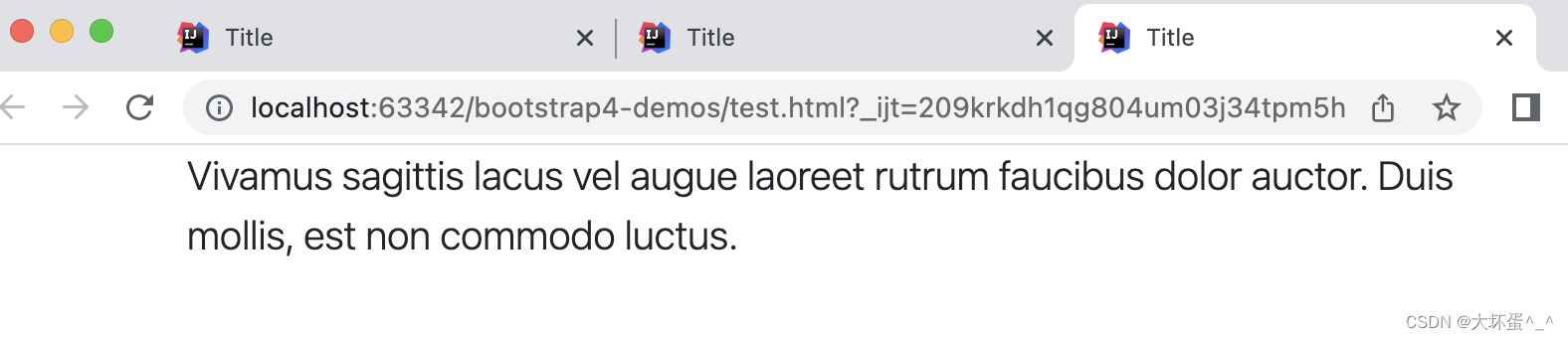
2. Absatz
Durch Anwenden des .lead-Stils können Sie einen zentralen Absatz definieren, um anzuzeigen, dass es sich um einen zentralen oder wichtigen Inhalt handelt.
Stileffekt:
Quellcode:
<body class="container">
    <p class="lead">
        Vivamus sagittis lacus vel augue laoreet rutrum faucibus dolor auctor. Duis mollis, est non commodo luctus.
    </p>
</body>
3. Ausrichtung
- .text-center: Text in der Mitte ausrichten
- .text-right: Text rechtsbündig
Stileffekt:
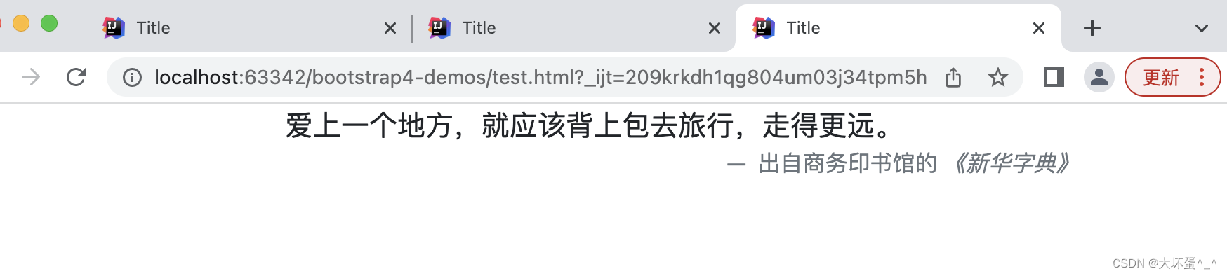
Quellcode:
<body class="container">
    <blockquote class="blockquote">
        <p class="mb-0 text-center">爱上一个地方,就应该背上包去旅行,走得更远。</p>
        <footer class="blockquote-footer text-right">
            出自商务印书馆的 <cite title="Source Title">《新华字典》</cite>
        </footer>
    </blockquote>
</body>
4. Liste
4.1. Keine Stilliste
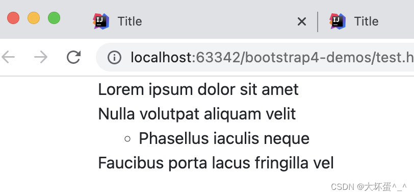
Durch die Verwendung von .list-unstyled auf ul (oder ol) können der standardmäßige Listenstil und der linke Rand bei Listenelementen entfernt werden. Dies wirkt sich nur auf direkte Unterlistenelemente aus und hat keine Auswirkungen auf Ihre verschachtelten Unterlisten.
Stileffekt:
Quellcode:
<body class="container">
    <ul class="list-unstyled">
        <li>Lorem ipsum dolor sit amet</li>
        <li>Nulla volutpat aliquam velit
            <ul>
                <li>Phasellus iaculis neque</li>
            </ul>
        </li>
        <li>Faucibus porta lacus fringilla vel</li>
    </ul>
</body>
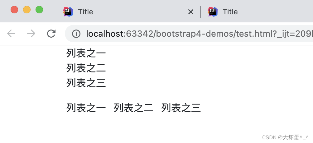
4.2. Reihenweises oder mehrspaltiges Nebeneinander-Layout
- .list-inline: mehrere Zeilen
- .list-inline-item: mehrere Spalten
Stileffekt:
Quellcode:
<body class="container">
	<ul class="list-inline">
	    <li class="list-inline">列表之一</li>
	    <li class="list-inline">列表之二</li>
	    <li class="list-inline">列表之三</li>
	</ul>
	<ul class="list-inline">
	    <li class="list-inline-item">列表之一</li>
	    <li class="list-inline-item">列表之二</li>
	    <li class="list-inline-item">列表之三</li>
	</ul>
</body>
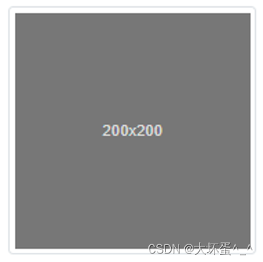
5. Bilder
5.1. Responsive Bilder
Fügen Sie dem Bild den .img-fluid-Stil hinzu oder definieren Sie den Stil max-width: 100%, height: auto;, um ihm Reaktionsfähigkeit zu verleihen, und die Bildgröße wird synchron mit der Größe des übergeordneten Elements skaliert.
Stileffekt:
Quellcode:
<img src="1.jpg" class="img-fluid" alt="Responsive image" >
5.2. Miniaturbildverarbeitung
Verwenden Sie das Attribut .img-thumbnail, um dem Bild automatisch einen Miniaturansichtstil mit abgerundeten Ecken und einem 1-Pixel-Rand hinzuzufügen.
Stileffekt:
Quellcode:
<img src="..." alt="..." class="img-thumbnail">
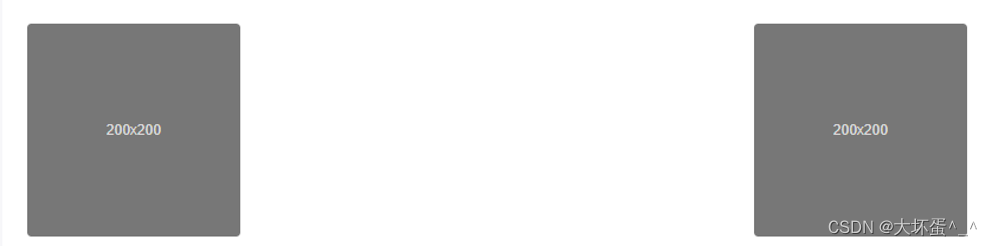
5.3. Bildausrichtungsverarbeitung
Für Blockbilder mit dem .block-Attribut können wir auch Floating-Definitionsspezifikationen oder Textausrichtungsspezifikationen verwenden, um eine Bildausrichtung und Floating-Steuerung zu erreichen. Bilder mit dem .block-Attribut können automatisch das Positionsausrichtungsattribut von .mx-auto erhalten.
Stileffekt:
Quellcode:
<img src="..." class="rounded float-left" alt="...">
<img src="..." class="rounded float-right" alt="...">
Stileffekt:

Quellcode:
<img src="..." class="rounded mx-auto d-block" alt="...">
6. Formular
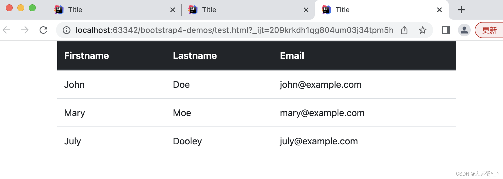
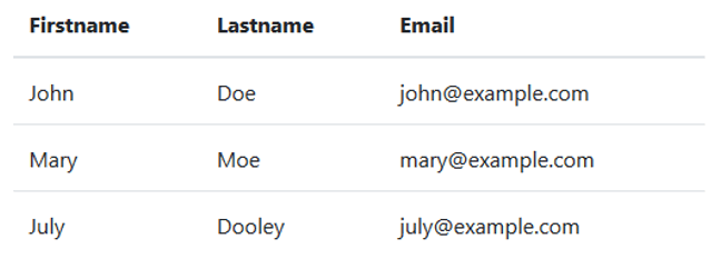
6.1. Head-Header-Verarbeitung
- .thead-light: Header in heller Farbe (grau).
- .thead-dark: Dunkler (schwarzer) Header
Stileffekt:
Quellcode:
<body class="container">
    <table class="table">
        <thead class="thead-dark">
        <tr> <th>Firstname</th> <th>Lastname</th><th>Email</th></tr>
        </thead>
        <tbody>
        <tr> <td>John</td> <td>Doe</td> <td>[email protected]</td>   </tr>
        <tr> <td>Mary</td> <td>Moe</td> <td>[email protected]</td> </tr>
        <tr> <td>July</td> <td>Dooley</td><td>[email protected]</td> </tr>
        </tbody>
    </table>
</body>
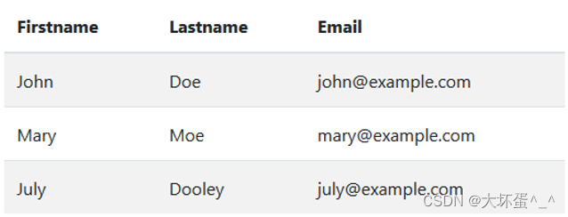
6.2. Streifentabelle
Mit der .table-striped-Stildefinition können Sie Zeile für Zeile einen Tabellenstil mit starkem Farbkontrast erstellen (und eine Umkehrung hinzufügen).
Stileffekt:
Quellcode:
<table class="table table-striped">
      <thead >
             <tr> <th>Firstname</th> <th>Lastname</th><th>Email</th></tr>
      </thead>
      <tbody>
             <tr> <td>John</td> <td>Doe</td> <td>[email protected]</td>   </tr>
             <tr> <td>Mary</td> <td>Moe</td> <td>[email protected]</td> </tr>
             <tr> <td>July</td> <td>Dooley</td><td>[email protected]</td> </tr>
      </tbody>
</table>
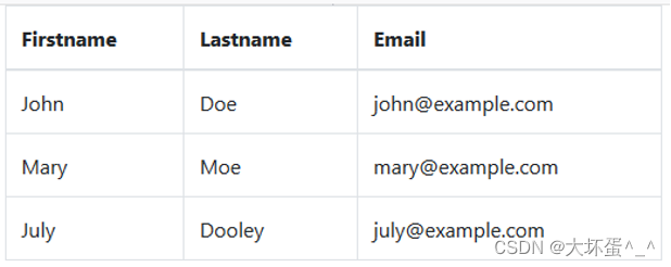
6.3. Grenztabelle
Durch das Hinzufügen der Klasse .table-bordered entsteht ein Tabellenrahmen- und Lückensystem.
Stileffekt:
Quellcode:
<table class="table table-bordered">
      <thead >
             <tr> <th>Firstname</th> <th>Lastname</th><th>Email</th></tr>
      </thead>
      <tbody>
             <tr> <td>John</td> <td>Doe</td> <td>[email protected]</td>   </tr>
             <tr> <td>Mary</td> <td>Moe</td> <td>[email protected]</td> </tr>
             <tr> <td>July</td> <td>Dooley</td><td>[email protected]</td> </tr>
      </tbody>
</table>
6.4. Hover-Effekt-Tabelle
Wenn Sie .table-hover wie oben definieren, kann es zu einem Zeilen-Hover-Effekt kommen (eine Statusaufforderung wird angezeigt, wenn die Maus über eine Zeile bewegt wird).
Effektstil:
Quellcode:
<table class="table table-hover">
      <thead >
             <tr> <th>Firstname</th> <th>Lastname</th><th>Email</th></tr>
      </thead>
      <tbody>
             <tr> <td>John</td> <td>Doe</td> <td>[email protected]</td>   </tr>
             <tr> <td>Mary</td> <td>Moe</td> <td>[email protected]</td> </tr>
             <tr> <td>July</td> <td>Dooley</td><td>[email protected]</td> </tr>
      </tbody>
</table>
6.5. Kompressionstabelle
Durch das Hinzufügen von .table-sm kann der Füllwert der Tabelle um die Hälfte reduziert werden, wodurch die Tabelle kompakter wird.
Stileffekt:
Quellcode:
<table class="table table-sm">
      <thead >
             <tr> <th>Firstname</th> <th>Lastname</th><th>Email</th></tr>
      </thead>
      <tbody>
             <tr> <td>John</td> <td>Doe</td> <td>[email protected]</td>   </tr>
             <tr> <td>Mary</td> <td>Moe</td> <td>[email protected]</td> </tr>
             <tr> <td>July</td> <td>Dooley</td><td>[email protected]</td> </tr>
      </tbody>
</table>
6.6. Responsives Formular
Sie können .table-responsive zu .table hinzufügen, um eine reaktionsfähige Leistung zu erhalten.
Stileffekt:
Quellcode:
<div class="table-responsive">
     <table class="table">
           ...
     </table>
</div>